Houzz Tour: Chic, Cozy and Creative in San Francisco
The owners of this three-story San Francisco home worked long hours, and they wanted their place to be a true getaway. When they opened their front door at the end of the day, they wanted to feel as though they were walking into a chic boutique hotel lounge that was also cozy, refined and functional.
The couple loved the open-plan design of the main floor, but within that they also wanted to create distinct yet related spaces. Interior designer Paige Loczi achieved those with custom details that set off each area. “This design is all about texture and natural materials used in a really architectural way,” Loczi says. “Using each material with restraint allowed each one to have its own moment.” Now their home makes first-time visitors say, “Wow! Where did you get that idea?” At the same time, it’s a calming retreat for the owners.
Photos by Jesse Goff
Houzz at a Glance
Location: Castro neighborhood of San Francisco
Size: 2,700 square feet (251 square meters); 3 bedrooms, 3½ bathrooms
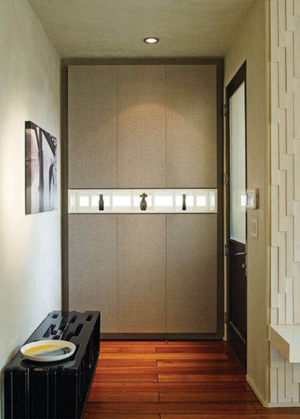
Loczi played with positive and negative space throughout the home, starting at the entryway. The sculptural powder-coated metal bench has rhythmic recesses, and the display niche cuts through the wall with the coat closet cabinet. The space is both artistic and functional: The bench is a great spot for removing shoes, and the 2-foot-deep cabinets can accommodate jackets on hangers.
The cabinet doors are covered in Corsica weave fabric and framed with a walnut border. Loczi used walnut throughout the house to add rich texture and create continuity from room to room.
Son of a Bench: Blu Dot
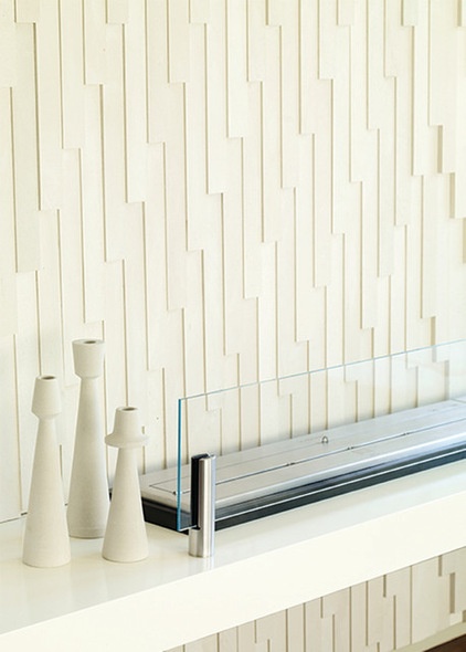
Just to the right of the entryway is a lounge with a cascading stone fireplace wall. A dress from the Alexander McQueen Savage Beauty exhibition at the Metropolitan Museum of Art inspired Loczi. She was struck by McQueen’s impeccable tailoring and the way he played with hard and soft. “The way he took elements out of their natural forms and made something out of them was genius,” she says. The wall is a nod to his iconic razor-clam dress.
Fireplace stone: V2, Island Stone
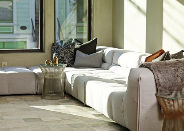
A sumptuous sofa from B&B Italia provides loads of comfort, and cashmere and fur pillows and throws add softness. A Platner side table brings gleaming metal into the mix. A patchwork cowhide rug picks up on the lighter colors from the McQueen dress used as inspiration and, along with the dynamic tile wall, creates a sense of movement.
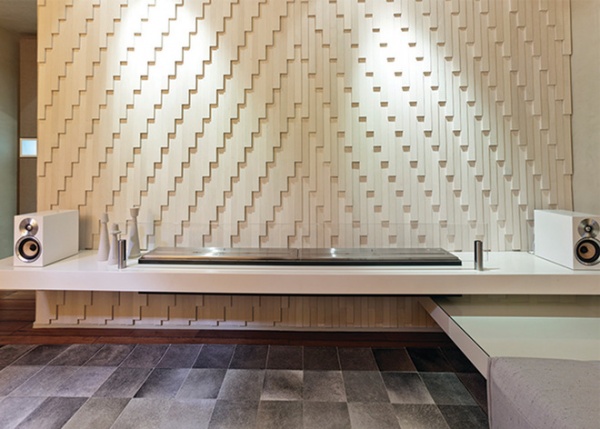
The fireplace is composed of two EcoSmart bioethanol burners placed side by side. A matching lacquered bench creates an L-shaped seating area. The front lounge is one of the homeowners’ favorite spaces for unwinding. Though the room’s tone-on-tone palette is sedate, its textures and materials cause it to look different depending on the light, hour and angle of viewing.
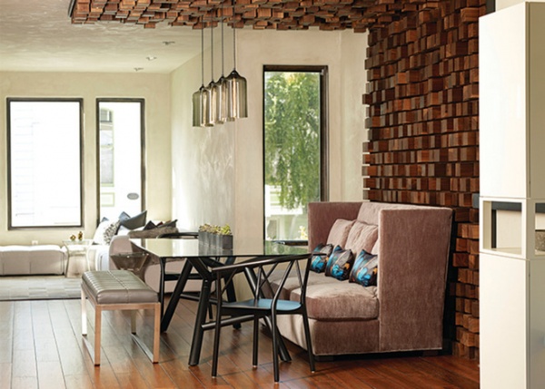
The dining area is another favorite feature of the homeowners. Loczi designed a canopy crafted of walnut wood blocks to create a showstopping element in the open floor plan.
“It’s all about architectural scale and using different proportions,” Loczi says. The canopy delineates a chic dining area and adds texture and movement to the neutral plaster backdrop.
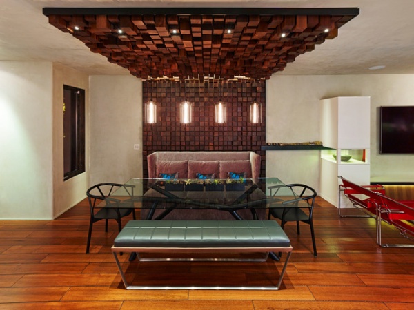
The dining canopy’s pleasing proportions come from a grid based on fours. Each block’s face is 4 by 4 inches. Individual blocks are 4, 6 or 8 inches deep, creating movement and rhythm. There are three layers of light — a row of LED lights that washes down the block wall, small LED pin lights in the wood toward the end of the canopy and four pendant lights equally spaced. These change up the mood of the space at night.
An upholstered bench, a high-backed banquette and dining chairs surround a glass-topped table, completing the tableau. “The dining space is the first thing you see when you enter. Most people simply say, ‘Wow!’ followed by ‘Where did you get the idea?’” one of the homeowners says.
Valerie Dining Chairs; Otto Dining Table; pendant lights: Niche
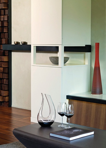
The steel framework around the canopy extends around the room, creating a connection to the overall living area. Larger blocks of white casework complement the dining area’s wood-block wall rather than competing with it. The shelving and casework are a mix of lacquer, walnut and steel.
These cabinets store media and audio equipment as well as large platters and other serving pieces. Loczi played with the concept of positive and negative space by adding an open display area in the middle of this columnar cabinet.
Steel framework design, engineering and blacksmithing: Magnus Schevene; casework (here and throughout the house): Tom Clossey
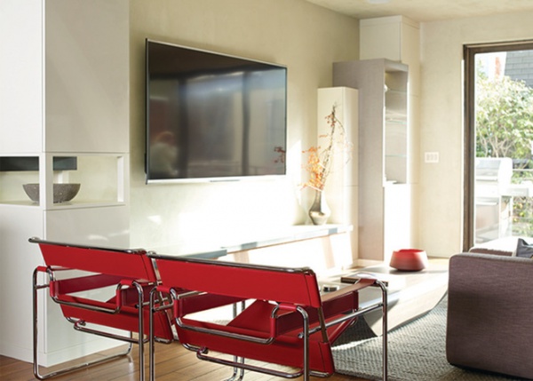
Carefully edited pops of red spice up the neutral background. Wassily chairs add color via the red leather and also introduce tubular metal. Between the pair of tall cabinets, a bench-shelf helps ground the wall-mounted TV; without it the TV would be floating on a big blank wall.
The homeowners say that Loczi’s design allows them to entertain and live the way they like to. It offers enough variety in feeling and experience that they can entertain both large and small groups and enjoy the space themselves no matter the mood or occasion.
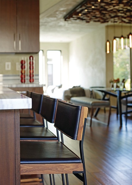
The use of rich wood continues into the kitchen. The leather, walnut and blackened-steel stools were crafted by Skram Furniture Studio.
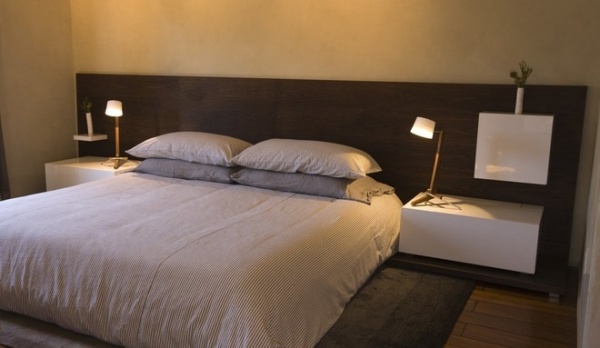
The collaboration between Loczi and the clients began in the master bedroom; the goal was a luxurious yet comfortable boutique hotel feel. Thrilled with the results, the owners extended the project to the main floor, where they translated the aesthetic to suit the more public areas.
Silva Table Lamps: Cerno
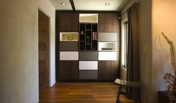
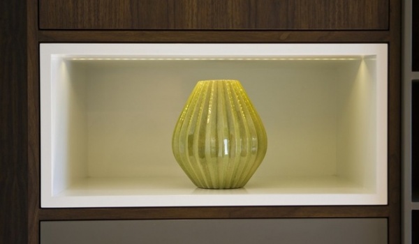
The use of walnut and lacquer began in the master bedroom, where a custom wall unit provides space for storage and display. Display niches lit with LED lights continue the play between positive and negative space.
Casework: Tom Clossey; drapery rods: custom, Magnus Schevene
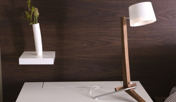
Walnut anchors the bed and ties it to the nightstands. Small details like a white lacquered shelf bring in contrast. “They both have exceptional taste and were wonderful collaborators,” Loczi says of her clients. “Their home needed to provide them with an off switch after work. … Now it provides comfort and ease because all of these natural elements are in the right place.”


