Mondrian Inspires a Modern Addition
http://decor-ideas.org 08/14/2014 00:13 Decor Ideas
It’s a dream for architects to build their own houses. “You always want to do something extraordinary,” says John Marx, a principal at Form4 Architecture. In this case it was an addition. The house, a 1907 Edwardian in San Francisco, had a history of inhabitants who had built a trail of renovations into its DNA — from a famed local author who built the home’s current dining room to a photographer who installed a darkroom in the backyard (rumored to have been used by Ansel Adams). Now Marx and his wife, Nikki Beach, both artists, have left their mark on the house too.
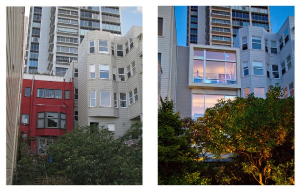
Shown: The couple’s house before and after the addition
Houzz at a Glance
Who lives here: Architect John Marx and his wife, tree artist Nikki Beach
Location: San Francisco
Size: Original house: 1,900 square feet (177 square meters); addition: 1,400 square feet (130 square meters)
Marx and Beach bought the 1,900-square-foot house in San Francisco’s Russian Hill neighborhood in 1994. The house had always felt a little too small, but the couple didn’t want to move. Instead, they added three rooms on three floors to the home’s rear, almost doubling its size.
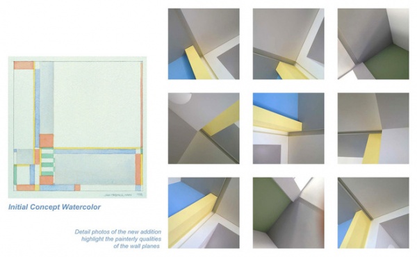
This concept watercolor was painted in the 1980s, many years before the home was even purchased. Its use of color to break up space is clear and reinforced when shown beside detail photographs of the built project.
The De Stijl movement relied on simple geometry and colors to reflect complex thinking, and inspired Marx’s design for the home. Initiated in the Netherlands in 1917, De Stijl (meaning “the style” in Dutch) united painters, artisans and architects in a quest for stripped-down aesthetics. It broke away from the previous century’s design excesses and moved towards the 20th century’s modern style. Marx used concepts from the movement to break down space with color and to bridge the new addition with the original home. Features act as independent planes, all working in harmony.
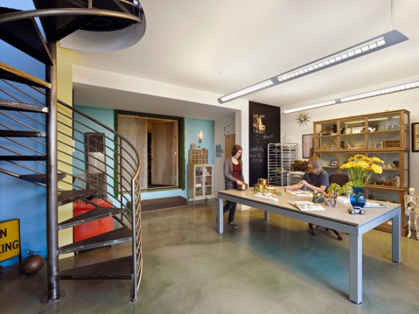
AFTER: Have you ever wondered who landscape architect Peter Walker of PWP calls when he needs trees and shrubs for his firm’s architectural models? Beach, who runs her studio for designing custom model trees on the addition’s first floor, counts PWP, along with other renowned architecture firms, among her clients. Beach’s small staff, including her daughter (shown here with Beach), was responsible for creating models of all 412 swamp white oak trees Walker used in his design for the 9/11 memorial in Manhattan.
Her studio connects directly to the garage on the first floor, making it easy for her staff to come and go without walking through the entire house. Concrete floors provide a durable surface for the workroom.
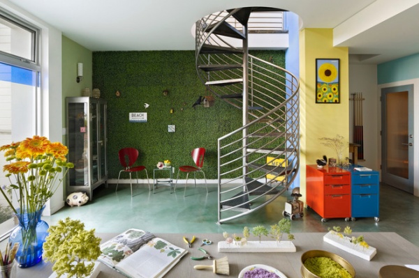
In the foreground we see some of the trees Beach is currently working on. Each tree is made of copper wire, which she solders and embellishes with steel wool and flocking. Beach installed an artificial topiary wall in reference to the work done here, nestled with birds and other artistic critters. The studio overlooks the backyard garden, which perhaps serves as inspiration for her work.
On the yellow wall next to the topiary is a painting done by a neighbor. She painted until she was 99 and had lived in the neighborhood since 1936, when she bought her house for $10,000. She recently passed away, but shared a lot of history about this house and its inhabitants with Marx and Beach.
Wall paint: Diamond White, Blue Sky, Lemon Burst, all by Kelly Moore
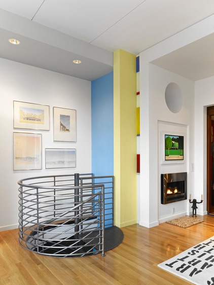
The blue and yellow walls from the first floor follow you as you take the spiral staircase to the second floor. Along with the gray ceiling, these three planes reinforce the house’s De Stijl influence. The addition relies on planes that intersect and converge through color or form, like the watercolor shown previously, to bring the home’s large rooms down to the human scale.
Inlaid glass next to the yellow column references one of De Stijl’s most famous proponents, Piet Mondrian, and his blue, yellow and red compositions. Marx softened this color palette for the walls, instead using blues, grays, greens and yellows inspired by California mornings.
Staircase: Kenny Reeve
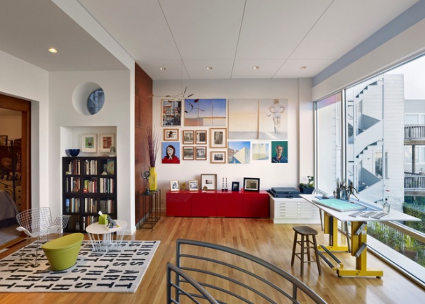
Like the blue and yellow walls, the wood paneling in the far corner here stretches through the addition’s three floors (on the first floor it’s a chalkboard) as another independent plane.
The second floor serves as the couple’s painting studio, yoga room and dance studio. This room connects directly to the master bedroom and provides them with a spontaneous creative refuge. When designing the addition, the couple knew they needed space for Beach’s studio and wanted their top floor to include an expansive living room, but they weren’t sure what to do with the second floor. They couldn’t leave a hole between the two floors, so they decided to have fun with this space and leave it relatively empty and loosely defined.
Marx and Beach both come from families of painters, and the art on their walls champions their heritage. Beach painted the two pieces on the top right, and Marx painted the triptych to the left of that. Paintings by other family members cover walls throughout the house.
Rug, Fuel Red Credenza: CB2: wire table: Zanotta
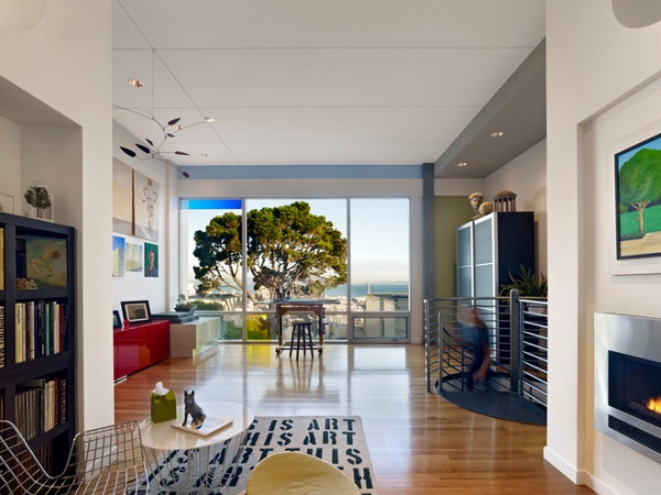
Subtle reveals accent the ceiling, projecting out to the spectacular bay view and prismatic window design. Marx worked with glass artist Dan Winterich, who installed dichroic glass panels in front of the home’s main windows. Dichroic glass features a coating that causes the glass to change colors depending on the angle you look at it and even the time of day. These panes are glazed and sit in front of the clear window panes.
Windows: Western Window Systems
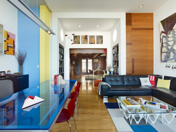
Upstairs, the living room, accessed via the home’s main staircase, crowns the addition and showcases the bridge between old and new. Primary-colored furniture and colored glass counterbalance the Arts and Crafts dining room in the background. Four paintings done by Beach’s dad in the late 1940s hang above the dining room, marking the threshold between old and new.
Here we see the Mondrian-esque wood paneling from the second floor carried up to the third floor. We also see where the blue and yellow walls continue through the house.
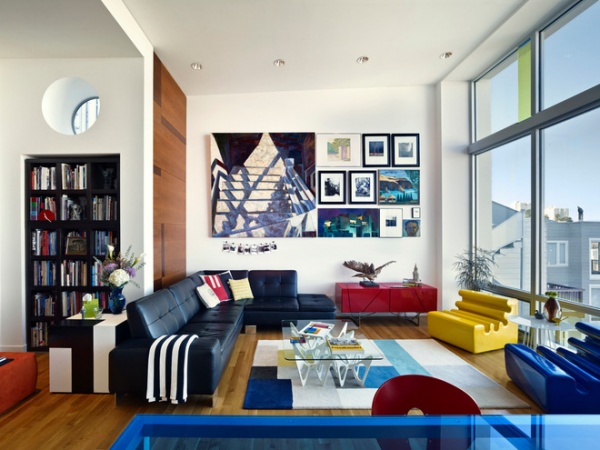
The ceiling is angled slightly up, opening the room up to the view.
Lines Credenza: Ligne Roset; Francesca Leather Sectional: Scandinavian Designs; area rug: CB2; coffee table: Zanotta
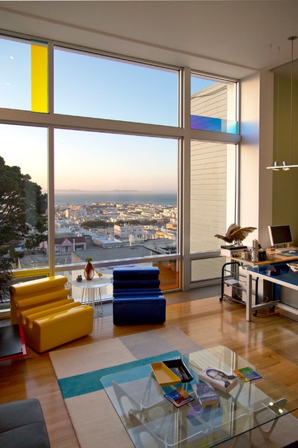
The blue and yellow chairs are by Zanotta.
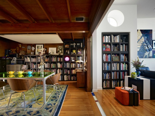
The new living room connects to the dining room, built in 1938 by Charles Caldwell Dobie, a prominent San Francisco writer and a previous owner of the house. The couple retained the dining room’s original Arts and Crafts details but added a modern dining set and used the same bookcase in both rooms to tie it in with the rest of the house. The Mondrian-inspired seismic joint bridges these two rooms, as De Stijl bridged Arts and Crafts and modern design.
The black cube side table in the living room was designed by architect Dan Solomon. Marx says Solomon was over at their house one day, picking up model trees, saw the cube and tried to get it back from the couple. It’s still in their living room.
Bookcase: West Elm; table: 3 form; chairs: Lips, Wolfgang Mezger; rug: Mission Motif, Donegal Carpets

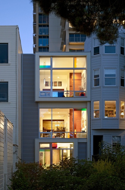
The home’s rear view shows the addition’s three floors, with the tree workshop on the ground floor, the painting studio above and the living room on the top floor. Winterich’s glass panels glow in the evening light.
In section and elevation, the home reflects De Stijl’s reduction to horizontal and vertical lines and surfaces. “I couldn’t afford the curves,” says Marx. Instead, it’s rich in color.
More: Must-Know Modern Homes: The Rietveld Schröder House
Related Articles Recommended


