Houzz Tour: Baroque Minimalism in New Jersey
http://decor-ideas.org 08/10/2014 23:13 Decor Ideas
The four-story, 1890s brownstone in Hoboken, New Jersey, had potential. The problem was that the once-gracious home had been carved into three dim, grim apartments. Architect Jensen Vasil and interior designer Isabelle Peribere collaborated to restore the brownstone to a single-family home for a well-traveled couple who’d just relocated to the area. The designers stripped away walls and decades worth of shoddy materials, and lovingly saved and restored original crown moldings, fireplaces and other architectural details. A light and airy style and a two-story addition then modernized the classic home, creating a look that Vasil calls baroque minimalism.
Photos by Jennifer Brown
Houzz at a Glance
Location: Hoboken, New Jersey
Size: 4 bedrooms, 4½ bathrooms
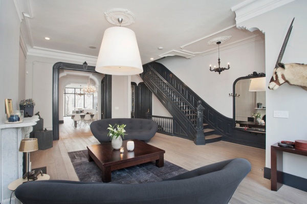
Removing a partition wall opened the staircase to the main level, which was reconfigured to include the entry and the living, dining and kitchen spaces. The mirror at the foot of the stairs is original to the house.
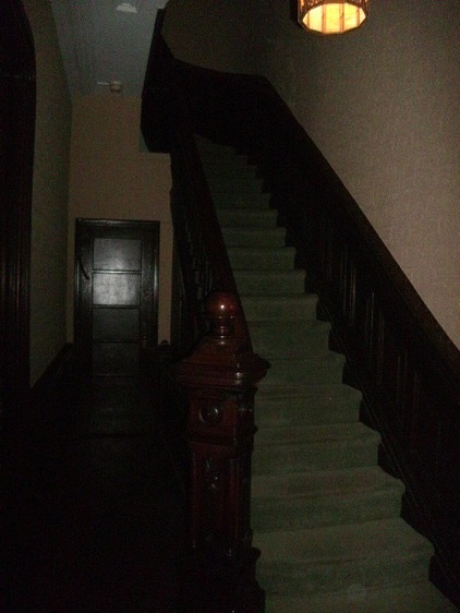
Before, a dark interior stairway was walled off from the main level and connected the three former apartments.
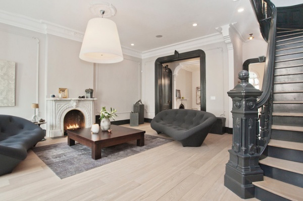
AFTER: Vasil and Peribere worked with a simple gray palette ranging from pale, silvery hues to deep, stormy tones in order to highlight architectural elements such as the sculptural staircase and archway. The living room’s original fireplace is a backdrop for a seating area that includes Ligne Roset sofas.
Pendant light: FontanaArte; flooring: European white oak, LV Wood Floors
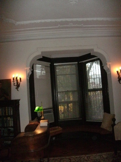
When they built the addition that includes the kitchen, the team removed the bay windows that once overlooked the backyard. The archway became a passage between what is now the dining room and the new kitchen.
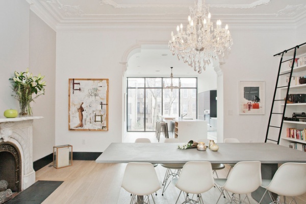
AFTER: Here you can see the archway leading to the kitchen addition. Modern furniture in the dining room contrasts with more ornate elements, such as the fireplace and chandelier.
Dining chairs: Herman Miller Eames Chair
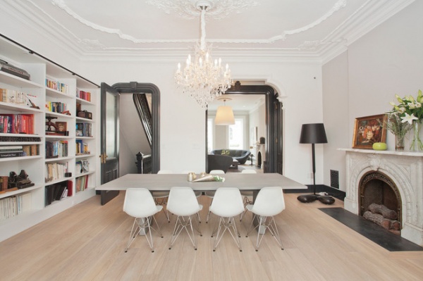
The dining room doubles as the home’s library, thanks to new bookshelves and a library ladder.
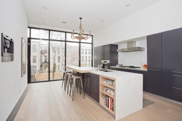
The kitchen addition overlooks the backyard. High-gloss gray lacquer custom cabinets keep with the modern minimalist look, while a baroque chandelier gives a hint to the past.
Placing the espresso system on the blank wall made it a feature rather than just another piece of equipment, says the architect. Plus, the machine takes advantage of the wall depth provided by the pantry that extends behind it.
Cabinetry: NYKB; cooktop, exhaust hood: Wolf; built-in espresso system: Miele; bar stools: Marais, Tolix
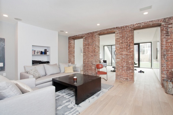
The lower (garden) level includes guest quarters, a media room and, beyond the brick walls (where the original home ends), an exercise room in the addition.
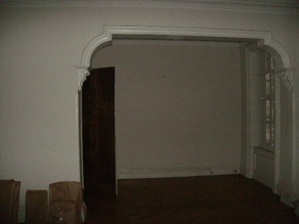
On the second floor, an alcove in what was originally a large bedroom was likely a sitting area or nursery.
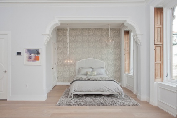
AFTER: The master suite now takes up the entire second floor, with the bed tucked into the alcove. The home’s original shutters, which slide into pockets at the sides of the windows, were stripped of paint and restored.
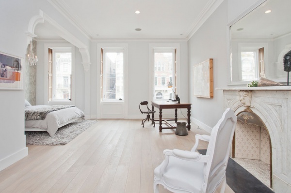
The master suite includes a desk and a sitting area. The home’s old double-hung windows were replaced with energy-efficient French casement windows.
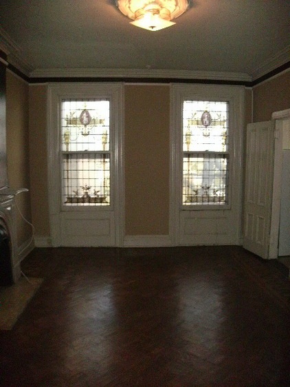
Leaded glass windows at the rear of the second floor were salvaged and used as a backdrop for the new master bath.
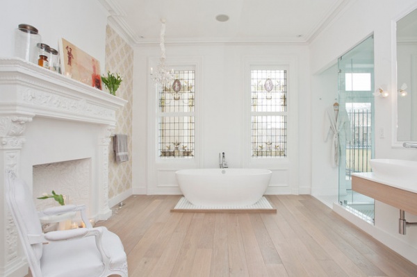
AFTER: A Victoria + Albert tub anchors the new master bath. The tub’s platform helps create a level base on the uneven 1890s floor beams.
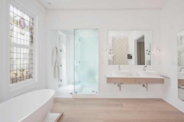
A frameless glass shower and a toilet enclosure now occupy what was once a small bathroom in the old second-floor apartment. The custom vanity includes Victoria + Albert sinks and Aquabrass faucets.
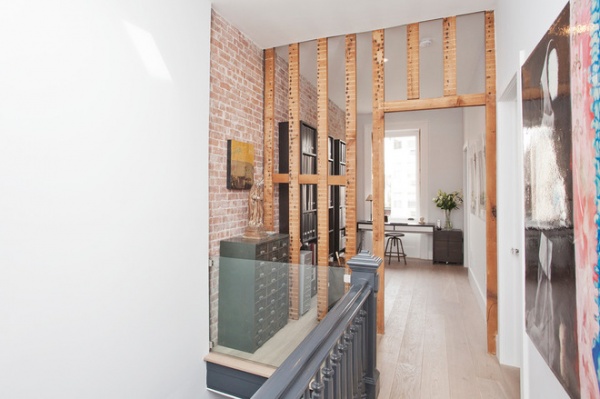
The third level now includes two bedrooms and baths, as well as this small office, carved out of what was once a small bedroom at the top of the stairs. Vasil and Peribere left the brick walls and the framing exposed as a reminder of the home’s structure.
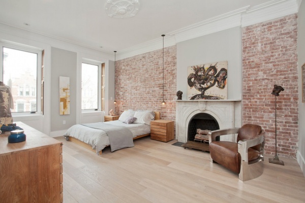
Exposed brick walls and an original fireplace provide a backdrop for an airy, third-floor bedroom and its eclectic furnishings.
Chair: Sinclair Club Chair
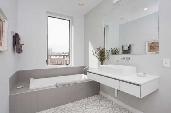
Natural light illuminates one of the third-floor bathrooms.
Sink: Victoria + Albert; faucets: Aquabrass; floor tile: Granada Tile
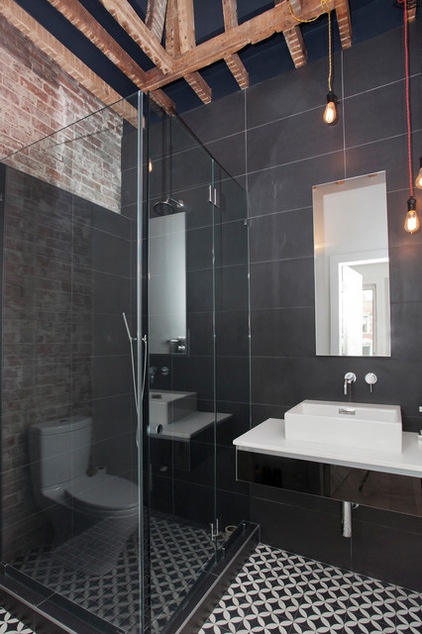
In another third-floor bathroom, the team kept part of the original brick wall exposed, as well as the framing for an old skylight.
Sink: Victoria + Albert; faucets: Aquabrass; floor tile: Cement Tile Shop
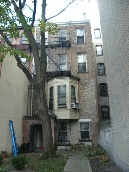
Here you can see the bay window that came off when the addition was built.
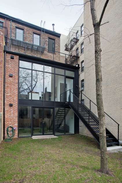
AFTER: The two-story modern addition to the back of the house ties into the original home with the use of brick, and includes an exercise room at the garden level and a kitchen on the main level. The windows are a commercial storefront system by Kawneer. The architect left part of an old fire escape on the top level as an architectural element.
Architect: Jensen C. Vasil Architect PC
Interior design: L’Atelier Isabelle Peribere
Builder: Robert Jenny Design
Related Articles Recommended


