Kitchen of the Week: Seeking Balance in Virginia
http://decor-ideas.org 08/08/2014 23:14 Decor Ideas
A difficult layout, an off-center window, a looming refrigerator and a weird ceiling were a few issues facing the family who wanted to update this Virginia kitchen. The solution was to introduce a sense of balance and employ a few design tricks to unify the zones, says interior designer Lauren Levant Bland. Her fixes included a more neutral, richer palette and a smarter layout.
Kitchen at a Glance
Location: McLean, Virginia
Size: 300 square feet (28 square meters)
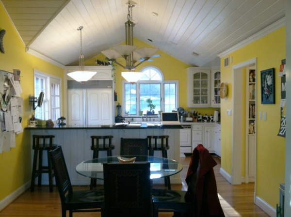
A long peninsula dominated the left side of the old yellow and white kitchen and impeded traffic flow. Meanwhile, the large refrigerator felt too big for the space. The disjointed peaks and valleys of the ceiling also needed to be addressed.
Photos by Bod Narod
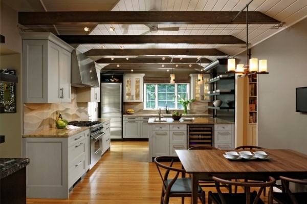
AFTER: Looking at the new kitchen from the same angle, we can see how floating beams unify the ceiling lines. This feature “distracts the eye from noticing the off-center window, and it brings warmth and interest to the upper part of the room,” says Levant Bland, who worked on the project while employed at Jennifer Gilmer Kitchen & Bath. Parallel track lighting creates a harmonious feel, while the nonstructural beams make a big statement and visually widen the room.
Wood beams: natural pine with custom stain; track lighting: Tiella Lighting; chandelier: Hubbardton Forge; floor: oak (existing)
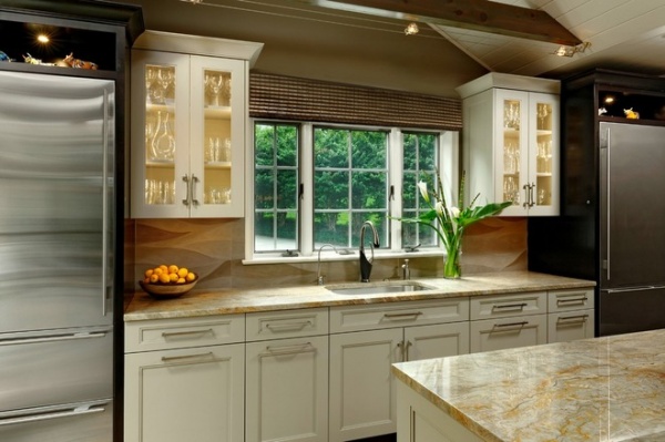
Smaller (27-inch-wide) twin Sub-Zero units replaced the previous large refrigerator and flank the sink window. “They give the window the appearance of being centered on the wall, even though it’s not centered in the room,” Levant Bland says. Open shelves with LED downlights over the refrigerators provide storage.
The frameless maple cabinets on the sink wall are a custom soft oatmeal color that complements the natural tones of the Nacarado quartzite countertops and oak floor. Upper cabinets with glass fronts and lights inside make the sink wall feel more open and spacious.
See more on quartzite countertops
Cabinetry: Decor Cabinet Company; hardware: Top Knobs; sink: Julien; faucet: Brizo
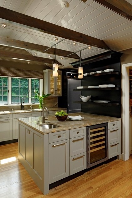
Moving the peninsula from one side of the kitchen to the other improved the layout and freed up space for a larger range area. The upgraded peninsula is shorter and wider, with a prep sink, a wine cooler and drawers and cabinets on the side that faces the dining and entertaining space.
Wine cooler: U-Line; pendants: Hubbardton Forge; prep sink: Julien; prep sink faucet: Brizo
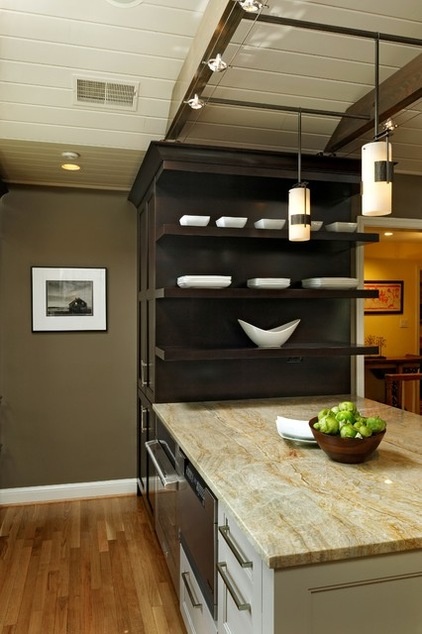
The sink-facing side includes a microwave drawer, an integrated warming drawer and an oven. Floating shelves at the end of the peninsula store and display dishes and platters.
Wall paint: Stardust, Benjamin Moore; ceiling paint: Abalone, Benjamin Moore; microwave drawer: Dacor; warming drawer: Dacor; oven: Electrolux
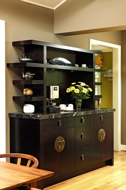
A rich fossil-brown granite tops the handsome coffee station, which has an espresso stain. “My client tells me that her son loves pointing out all the prehistoric shells and fossils now living in their kitchen,” Levant Bland says. The dark stand-alone coffee station balances the kitchen’s lighter finishes; its details add a modern and soft Asian flair.
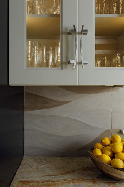
The sculpted limestone tile backsplash’s wave-like design lends wonderful movement. “It’s not a pattern; it’s three-dimensional texture,” says Levant Bland. “It’s something completely different that combines polished and nonpolished stone.”
Backsplash: Architectural Ceramics
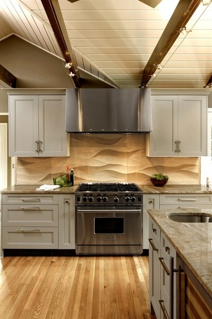
Removing a side window allowed room for an ample new cooking area. A custom stainless hood above the range creates a striking focal point for that side of the kitchen. “Since these beams were not structural, we could locate them anywhere, and with that total freedom, I could center them on the range,” explains Levant Bland. “I wanted it to be symmetrical and dramatic.”
Range: Wolf; ventilation hood: Rangecraft
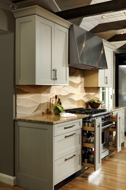
Pullouts on each side of the range keep spices and condiments handy.
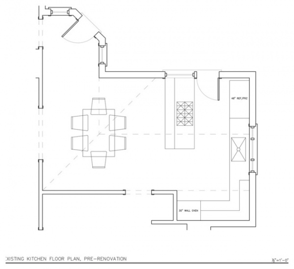
This floor plan of the old kitchen shows the circulation challenges the family faced before the renovation.
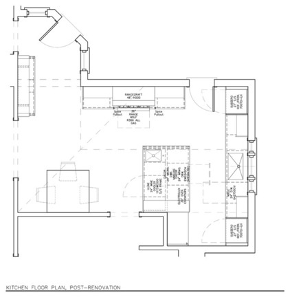
AFTER: The improved layout emphasizes good flow. The kitchen, which won an award from the National Kitchen & Bath Association in 2014, is now more user friendly and warmer.
“To me this project is a true before-and-after transformation, because it deals so well with the problems of an awkward space,” says Levant Bland. “It proves however awkward you think a space might be, there are always opportunities to bring in beauty, originality and balance.”
See more Kitchens of the Week
Related Articles Recommended


