So Your Style Is: American Gothic
http://decor-ideas.org 08/06/2014 22:13 Decor Ideas
In 1930 artist Grant Wood was tooling around Eldon, Iowa, looking for inspiration when he stumbled upon the Gothic-style farmhouse that was then known as the Dibble House. Legend has it that Wood, an Iowan himself, sketched the home on the back of an envelope. Years later his biographer claimed the painter was struck by the fact that builders would place a “pretentious” Gothic window on a “flimsy wooden house.” The iconic painting that resulted, “American Gothic,” has influenced American style and popular culture for 84 years.
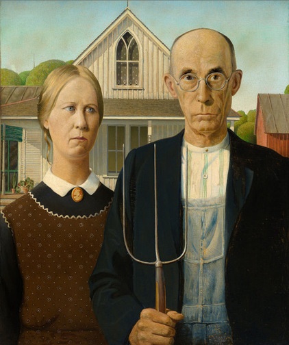
‘American Gothic,’ by Grant WoodWood decided to paint the house along with the kind of people he imagined living there. He used his sister, Nan Wood Graham, and their family dentist, Byron McKeeby, as models. After the painting was completed, it won a prize in a competition at the Art Institute of Chicago. The institution purchased it, and that is where it hangs today. Although Wood meant the painting to be a positive image of American values, it was viewed by many critics as a satire on farm life. Only later did it become a symbol of steadfastness and strength. As it says in a recent guide to the institute: “The man and woman, in their solid and well-crafted world … represent survivors.”
What it is: This style is characterized by the Early American symbols and imagery found in the painting: Gothic windows, board and batten siding, standing-seam metal roofs, pitchforks, aprons and the colors barn red, denim blue and black.
Why it works: There’s a reason so many children’s books deal with farm life or are set on a farm. Farms remind us of a less complicated time when life was easier, at least in our collective imagination. There’s also an industrial spirit to yesteryear’s farm structures that makes them almost modern.
You’ll love it if … Your style is more unfussy than elaborate, you secretly consider aprons and overalls ideal daywear, or you think a touch of Puritan is sexy.
Style Secret: Gothic Forms
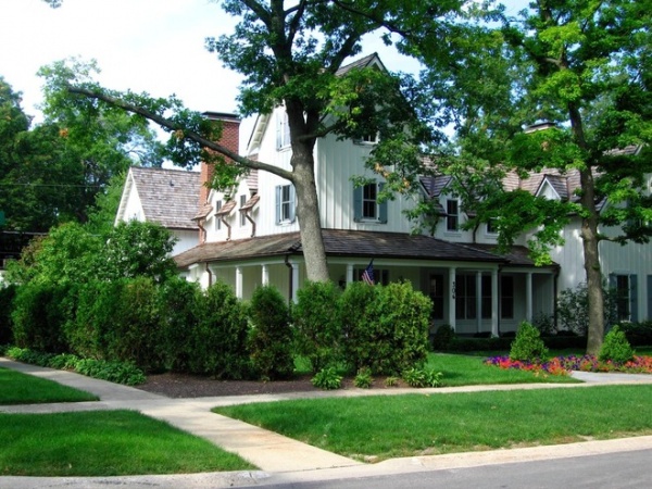
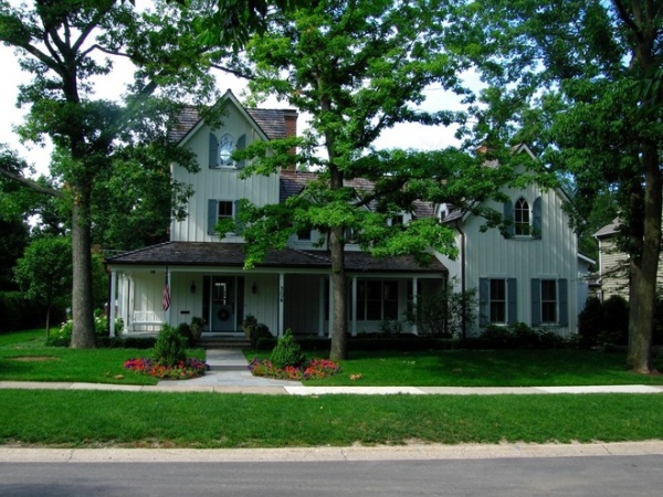
This house, designed by Edward Deegan Architects, is clearly a reference to the painting. In fact, the architects call it American Gothic Farmhouse. Although it’s bigger than the original, this version contains the same Gothic windows on the top level and simple two-over-two-style windows on the lower story.
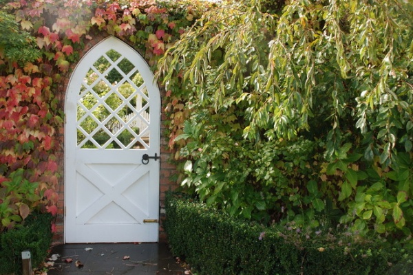
Landscape designer Andrew Renn made a smaller but no less dramatic Gothic statement with this garden gate.
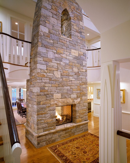
It’s easy to bring that Gothic peak into the interior, as the architects at Polhemus Savery DaSilva did with this stone fireplace.
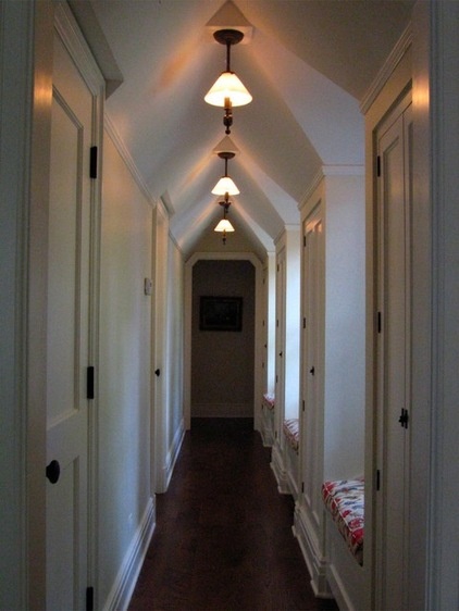
And Edward Deegan Architects repeated the form in a long hallway.
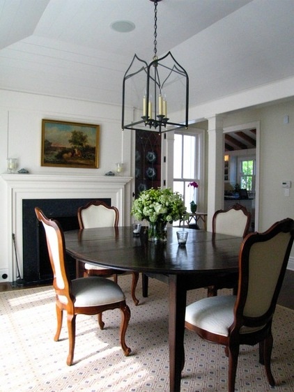
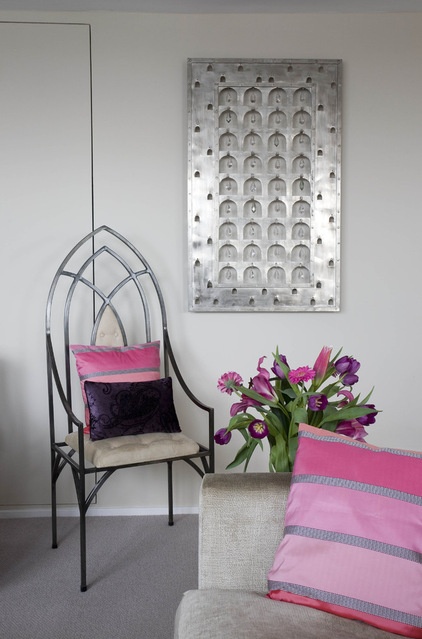
Something different: Not willing to make a lasting architectural statement? Try using changeable features, such as the light fixture here, installed by Edward Deegan Architects, or the arched chair below, selected by interior designer Celia James.
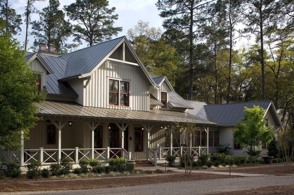
Style Secret: Bold Board and Batten
In the house that inspired Wood’s painting, there is nothing shy about the classic board and batten siding. To mimic the style, use the same dimensions, as seen here on a house by Wayne Windham Architect.
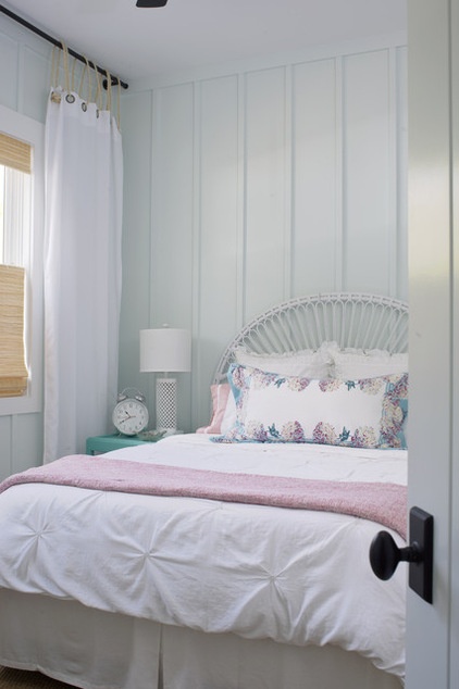
Something different: Many designers opt for shiplap paneling to impart a farmhouse feel. But board and batten can happily occupy the interior as well, as seen in this bedroom by Rethink Design Studio.
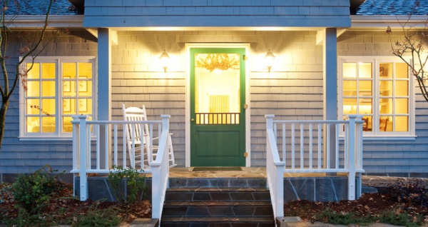
Style Secret: Green Screen
Look closely at the house in the painting, and you’ll see a bright green screen door making a colorful statement. Given the dour expressions and conservative clothes of the subjects, it’s akin to a woman in a scarlet evening dress driving a hearse. Adding a little color gives classic architecture a cheeky exclamation point. A similar look is seen on the front porch of the home here, by Sutro Architects.
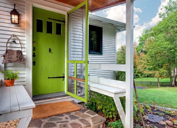
A lighter, more lime-y version coats the screen door on this cottage.
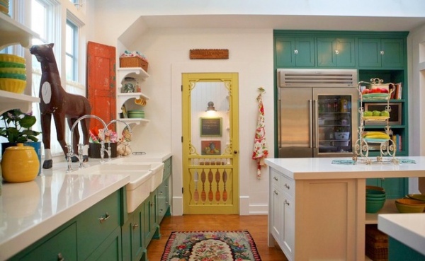
Something different: Who says screens are for the exterior only? The designers at Alison Kandler Interior Design made a strong farmhouse statement in this kitchen using a classic (and unexpected) interior screen door.
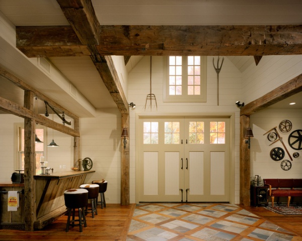
Style Secret: Tools of the Trade
Want to look like a farmer? Then roll like a farmer by proudly displaying your pitchfork. That’s what the homeowner did in this interior by Studio Agoos Lovera.
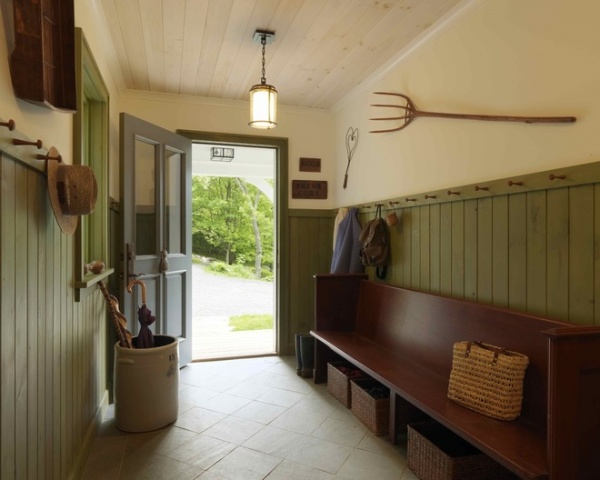
After all, McKeeby — the Cedar Rapids, Iowa, dentist used as one of the models for Wood’s painting — likely didn’t look agrarian until the artist painted him in overalls with a pitchfork in his hand. The classic farm implement makes a simple statement in the house here, by Joan Heaton Architects.
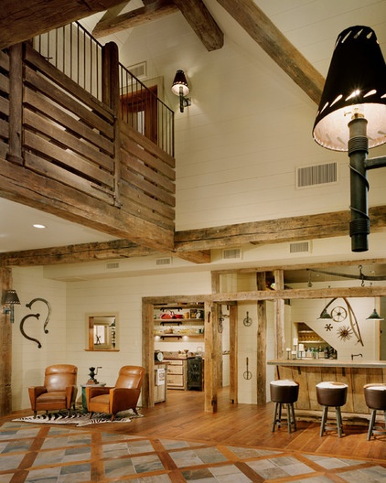
Something different: Want to try the down-home move but feel that the interiors of the world have enough pitchforks? Try using other farm tools. Their classic shapes lend an almost steampunk vibe, as in this space, by Studio Agoos Lovera.
Style Secret: A Lightning Rod
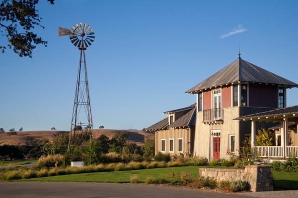
Stand before Wood’s painting at the Art Institute of Chicago, and you’ll notice a small lightning rod just visible at the top of the house. On the farms of yesteryear, the rods were a necessity, as the buildings on the plains were the tallest things around and an inviting target for a bolt of lightning. A wire system directed the electricity from the metal rod to the ground. A similar rod and ball model is used on this home, by Tom Meaney Architect.
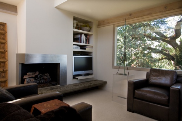
Something different: Vintage lightning rods can be found online and at antiques stores and flea markets. Try using them as a sculptural element indoors. It’s a look not limited to a vintage interior; check out this weathered spire in a home by modern house architects.
Style Secret: Turned Porch Columns
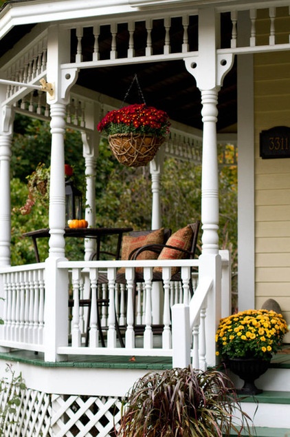
In the background of Wood’s painting, you can spot turned porch columns (after all, this is a humble farmhouse with pretensions). There’s something romantic about the architectural move. This porch seems to invite passersby to have a seat and a glass of sweet tea or lemonade.
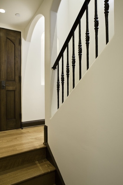
Something different: Bring the look inside and give it an edge with metal stair balusters, seen here in a home by Claudio Ortiz Design Group.
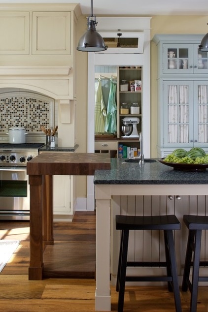
Style Secret: Don’t Cut the Apron Strings
In the painting the woman wears her apron with what is perhaps her best dress and cameo pin. The man also mixes his utilitarian clothes with a suit jacket. Let your workaday aprons hang on display to add color, pattern and texture to a modern kitchen.
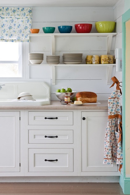
Something different: A flowered apron hangs at the ready on a hook in this kitchen; the flowered window covering adds a similar playful pattern.
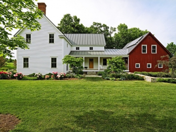
Style Secret: Real Barns Wear Red
Nothing evokes a tranquil Midwestern farm like a red barn, and the “American Gothic” spread is no exception. You see the building to the right, over the man’s shoulder. It’s very close to the house, just as this barn addition hugs a classic farmhouse structure in Charlotte, Vermont.
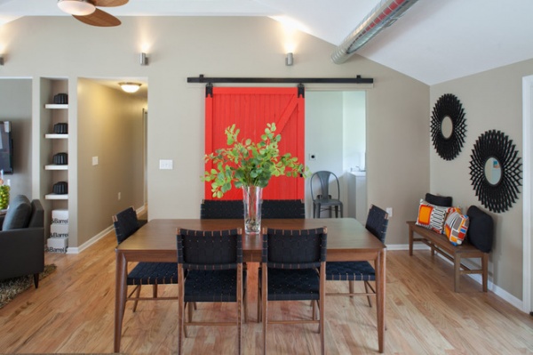
Something different: The lack of an actual barn or barn-shaped addition is no barrier to adding a dash of the farm-friendly color to an interior. A red barn door speaks volumes in this room, by Nest Designs.
Related Articles Recommended


