Houzz Tour: Pools and Martinis Inspire a Palm Springs Remodel
What lures people to Palm Springs, California, a desert where temperatures can top 116 degrees? Oh, probably a cool pool, Frank Sinatra and a few martinis. That’s what designers Howard Hawkes and Kevin Kemper had in mind when they rehabilitated this dilapidated midcentury home. “We really tried to give off the sense that this was an ultimate Palm Springs getaway,” Kemper says.
The two, who own H3K Design together, specialize in revamping neglected homes from the 1950s and ’60s in the Palm Springs area. Their homes rarely stay on the market for more than a week, and sometimes the buyers love what Hawkes and Kemper have done so much, they even spring for the furnishings the designers outfitted the homes with, as was the case here. “There’s so much in this desert that’s wonderful and fun,” Kemper says. “It’s amazing to take a home that has been abused for so many years and put life back into it. It’s a little Frankensteinish.”
Houzz at a Glance
Location: Palm Springs, California
Size: 2,100 square feet (195 square meters); 4 bedrooms, 3 bathrooms
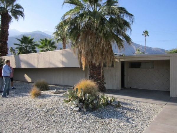
Though the exterior of the 1958 home was in OK shape, parts of the ceiling were caving in, most of the windows were broken, and the home hadn’t been cleaned in years.
Photos by Patrick Ketchum
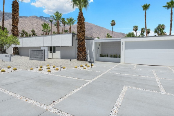
AFTER: Kemper and Hawkes preserved the facade, including the “sun flap,” a common element used in the 1960s to keep sunshine from hitting inside the house and heating it up too much.
They took the rest down to the studs and added new stucco, plumbing, electrical work and insulation and a new roof. “It was a big preservation effort on our part,” says Kemper. “There was some unusual architecture, and we were afraid someone would tear it down or alter it and you wouldn’t be able to recognize the home.”
They also added new landscaping, tilework and paint, working to maintain a sort of unnoticeable exterior. “We purposefully kept the outside very minimal, because the house is meant to kind of sleep on the street in stealth mode,” says Hawkes. “You wouldn’t look twice at the house. But the vibe definitely changes as soon as you walk in the door.”
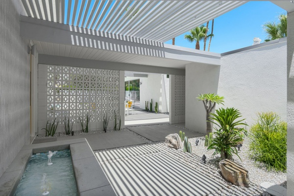
At some point this breezeway had been sealed up and converted into living space. The designers added concrete deco block, a fountain and a pathway that leads to the front door (on the left) or straight through to the pool. “In true Palm Springs fashion, sometimes when you have guests over, they just make a beeline to the pool anyway,” says Hawkes.
“The end vision is always to make these homes fit into the Palm Springs lifestyle,” adds Kemper. “So when you’re walking into the property, it’s like you’re walking into a vacation getaway.”
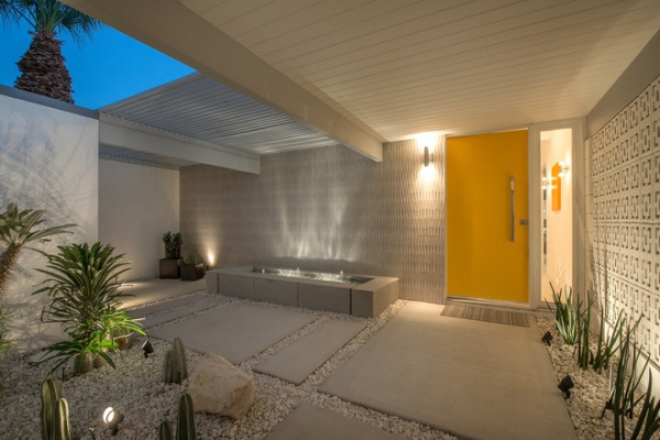
Gray Porcelanosa Zeus large-format tiles create a mosaic-like wall over the fountain.
Door paint: Sunshine, Benjamin Moore
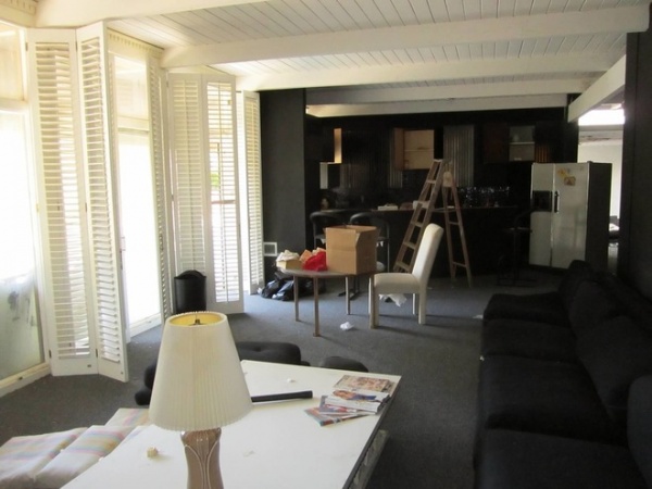
Kemper suspects that the house was remodeled in the 1980s. The living room had black padded, tufted vinyl wallpaper. “Everything was black on black on black,” he says.
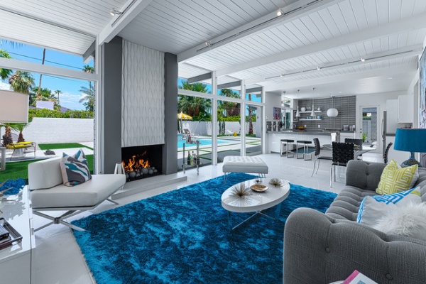
AFTER: The layout of the living room pretty much stayed the same. The original tongue and groove ceiling got a coat of fresh paint and new track lighting tucked behind the beams. The furnishings are a mix of pieces from local stores, online shops and national chains. After purchasing the home, the new owners signed a separate contract to buy all the furnishings just the way Hawkes and Kemper had arranged them.
Sofa: Nova Steel Linen, Sackville; chair: Xert Modular, Zuo Modern Contemporary; ottoman: Varr cowhide, Plummers; rug: Indochine in Peacock, Z Gallerie; coffee table: Oyster, Pangea
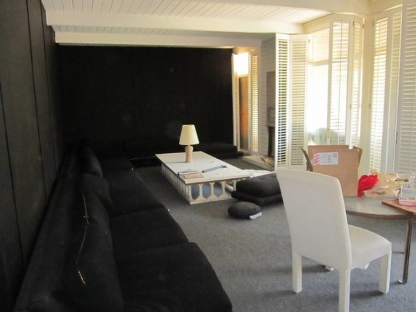
From another angle you can see how dark of the living room was with the black vinyl wallpaper, black sofa and gray carpet.
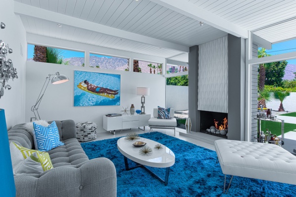
AFTER: Though the fireplace is original, the designers added midcentury decorative panels and columns for a more vintage look. They replaced the windows with dual-pane, low-e windows. This allowed them to remove the second sun flap on the rear of the home and open up the views to the pool and mountains.
Here you can see how the track lighting is hidden from view on the other side of the beams.
Credenza: Eldridge Media Center, Modloft; bar cart: Ernest, CB2; sculpture: “Raindrops,” Design 849
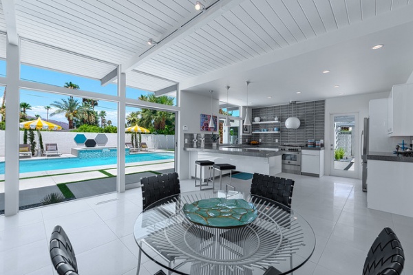
Hawkes and Kemper kept the dining area small to maintain a more open and airy layout. Large 24- by 24-inch ceramic tiles with a mix of high-gloss and matte finishes also helps push this effect. “We wanted to exaggerate the light in the house,” says Kemper.
Table: Wetherby, Zuo Modern; chairs: Criss Cross in black, Zuo Modern
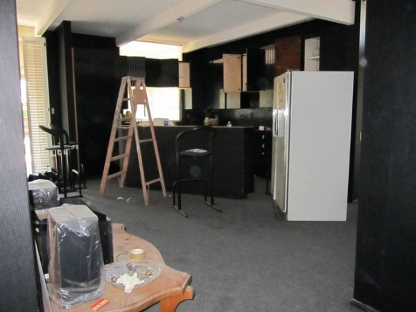
The previous owners hadn’t finished remodeling; it was probably 80 percent complete, Kemper says. The kitchen had custom black painted cabinets with black lacquer striping. The counter and backsplash were black tile. “Very ’80s,” Kemper says.
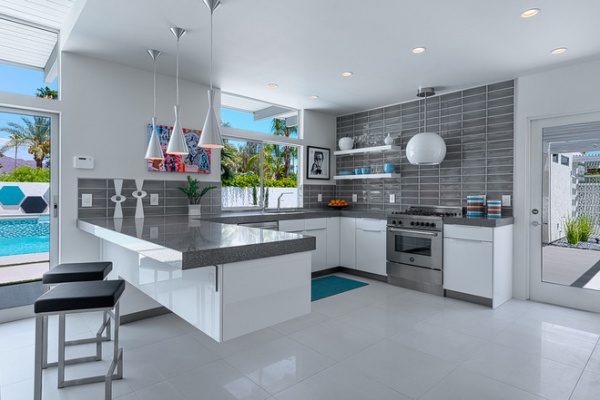
AFTER: The designers added a completely new kitchen, with a dropped ceiling for lighting that wouldn’t disturb the original tongue and groove ceiling.
The floating island required an extensive custom welded steel framework. Hawkes and Kemper believed this and the unique globe range hood were important to making the home stand out, and they always leave room in their budget for a few splurge items like this. The cantilevered peninsula is a conversation piece, “but it’s also quite functional in terms of storage and cleaning underneath,” Hawkes says.
The glass door to the right leads to an outdoor dining area and a 500-square-foot addition.
Stove/oven: Bertazzoni; pendant lights: Bronx pendant, Eurofase; barstools: Darwen, Zuomod
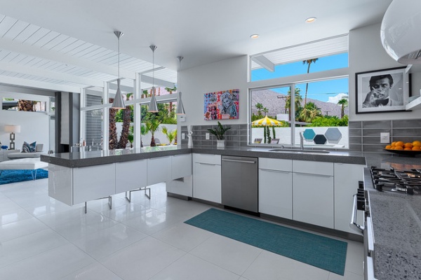
For the backsplash they laid 4- by 10-inch gray tile in a stacked bond pattern.
Counters: Silestone in Chrome; dishwasher: Master Series, Bosch
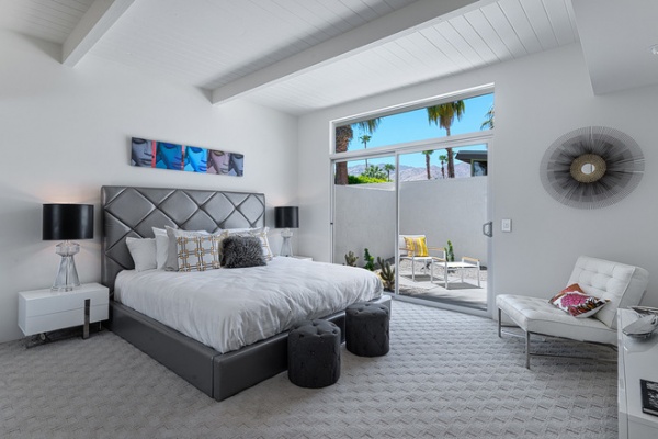
They took about 2 feet of space out of the sizable master bedroom to enlarge the bathroom. The designers say they prefer putting carpet in bedrooms for all their projects. “It just cozies up the room,” Hawkes says. “Modern houses can be so minimal and white and icy, so it’s nice to have a respite to go to.”
Bed: Verona king in grey, Casabianca; bedside tables: Collins End Table, Casabianca; lamps: Wayfair.com; poufs: Windward Stool, ZuoMod
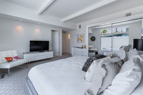
Expanding into the bedroom also allowed for a half wall of privacy for the entry door.
Dressers: Zen, Casabianca
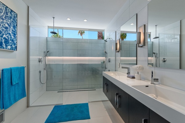
Clerestory windows in the bathroom capture mountaintop views. The curbless shower has dual rain showerheads with handhelds and an extra-long shower niche with LED lights.
Vanity: Savio, The Interior Gallery; faucets: polished-chrome lever, PoP; wall sconces: Mila, Murray Feiss; shower fixtures: S Collection, Hansgrohe
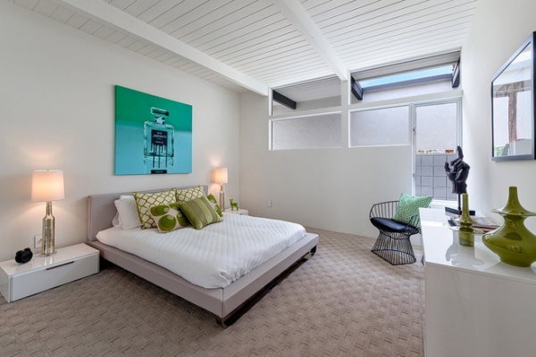
To get more light into this guest bedroom, where the front exterior sun flap blocks light through the windows, the designers cut out a portion of the roof.
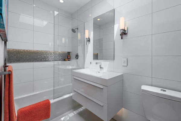
Large 12- by 25-inch white porcelain tile in a contemporary stacked pattern establishes a clean aesthetic in the guest bathroom. A shampoo niche extends across the entire shower wall and has LED lighting.
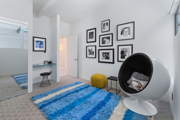
The designers turned the smallest bedroom in the house into a music room and removed a portion of the closet to create a desk niche.
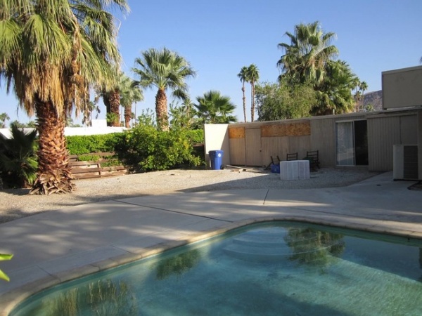
Here you can see the back of what was originally a breezeway, which the previous owners had filled in for extra living space. The unused ground space was perfect for adding square footage to the home.
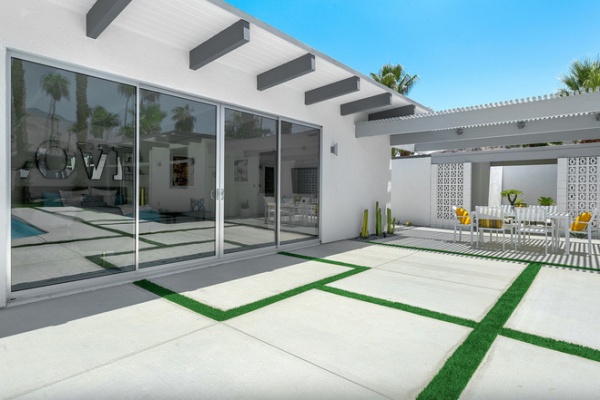
AFTER: They added a 500-square-foot casita that can function as a separate one-bedroom apartment — or as a game room, pool house, party room etc. Beyond the outdoor dining table is the rehabilitated entry breezeway.
Artificial grass helps break up the expanse of concrete pavers.
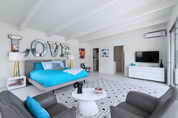
Hawkes and Kemper call the addition “the love shack.”
Zack king bed in grey: Casabianca; A-832 accent chairs: Blueprint; rug: Alonso, Joss & Main; white acrylic coffee table: Design 849; “Love” letters: Ammable Lettering, Design 849; Ludlow Nightstands: Modloft; lamps: Century, Z Gallerie; dresser: iL Vetro, Casabianca
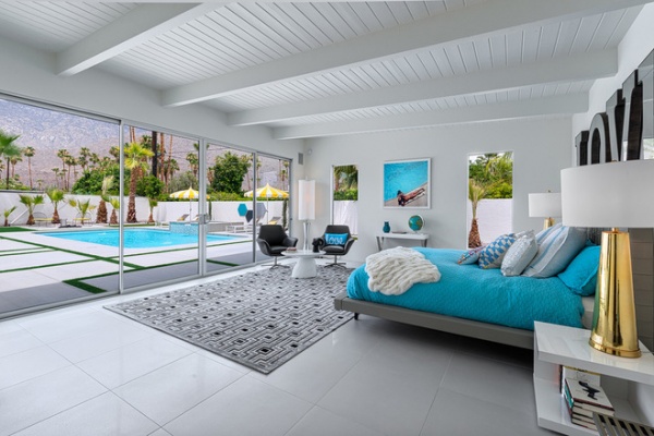
Inside the casita the roof is pitched slightly upward to take full advantage of the sweeping mountain views.
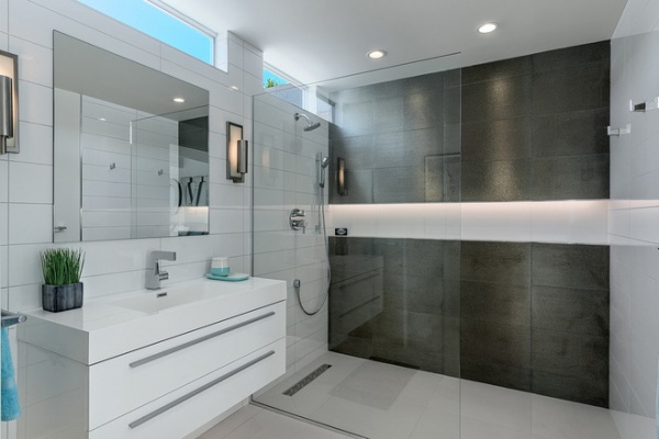
The casita’s bathroom echoes the bathrooms found in the main house, with a curbless shower, a long niche and a floating vanity. A door just out of view leads to an outdoor shower that wraps around to the pool.

When the previous owners walled in the breezeway, they also filled in a door that led from the kitchen to the outdoor area.
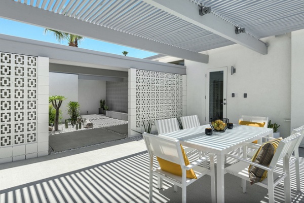
AFTER: Hawkes and Kemper revealed the door again to make a connection to the new outdoor dining area.
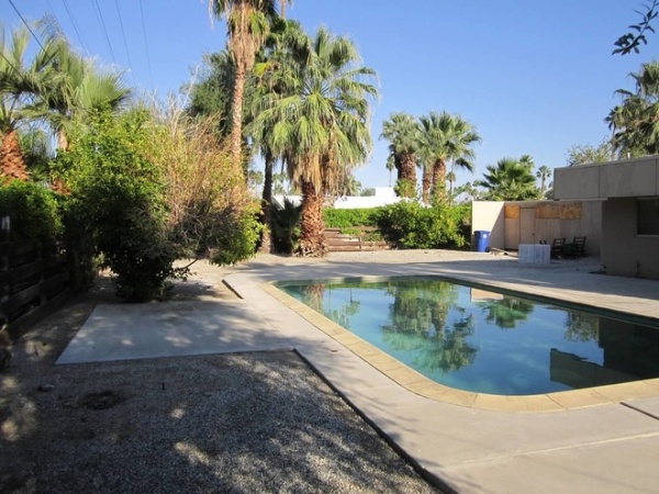
The original pool was in good shape, but some minor alterations and landscaping were needed.
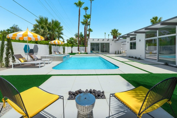
AFTER: The shape and location of the pool stayed the same. They added a hot tub in the center with a waterfall feature and deck jets. They also added a new stuccoed wall and removed corner steps in the pool to create a shallow lounge area for chairs and an umbrella.
The pair created a fire pit flush with the ground so the area could be used for other purposes. “When it’s raised, that space can really only be used when the fire is on, which is less than 1 percent of the time,” Kemper says. “When it’s a zero level, you can put a bar over it during a party or a dining table — when the fire is off, of course.”
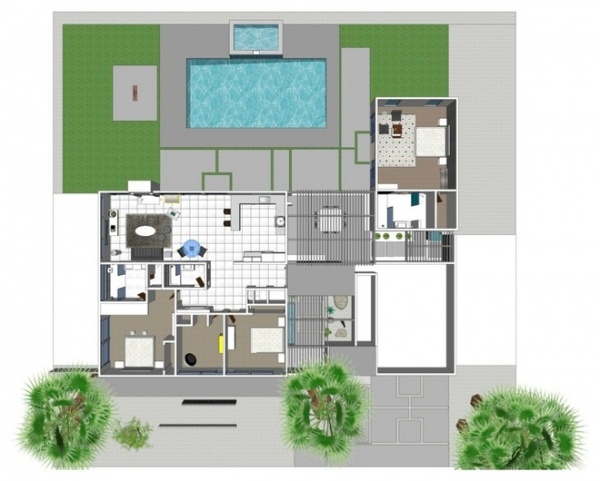
While Hawkes and Kemper love fixing up houses, it can be tough selling after they’ve put so much time and effort into them. “Especially when they buy all the furniture too; it’s like it’s literally being ripped out from under us — boom, all gone,” says Hawkes. “But it’s nice to remember the house at this stage.”
He says it takes a few hundred thousand dollars to fix up houses in this condition. But for them it’s worth it. “It’s an addiction,” Kemper says. “We love to see the transformation of where we started to where we are today. You feel like you’re an artist in a way.”
More: How to Get Midcentury Modern Style Today
General contractor: Hoyt Construction
Tile supplier and installer: Triton Tile
Windows and glasswork: Architectural Glazing


