Room of the Day: Editing and Evolving in Philadelphia
http://decor-ideas.org 08/05/2014 00:13 Decor Ideas
When a family of four moved into this Philadelphia home, they had about 15 years’ worth of furniture and accessories, and a lot of it simply did not work in their new house. “The move made them realize that they had grown and their style had changed,” says interior designer Bridget McMullin. “They wanted to add some liveliness and bright color with a neutral background.”
Now that the two children were teenagers, the family was ready to transition out of the design phase that came with having young kids around. McMullin incorporated some of their existing pieces with new ones, creating an urbane transitional style. She also worked on the rest of the first floor and added color that helps the home flow from room to room.
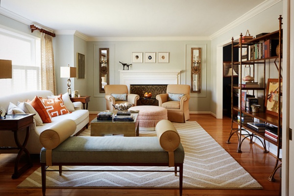
The house was built in the 1980s and was a fairly blank slate. It did have existing crown and baseboard molding and a fireplace, which gave McMullin a good start; her work in here was almost purely cosmetic.
A rug in a bold chevron pattern in neutral tones serves as a base for the room, pulling the furnishings and accessories together in a welcoming group. The Eiffel-style metal and wood shelves are actually a large TV and media stand she dressed up with accessories instead.
This project involved looking through many of her clients’ boxes of belongings and selecting the things that worked — most of the accessories she used already belonged to them and meant something to them. “They love books; they have lots of them, and they have read all of them,” she says — though she does admit she culled their fanciest-looking books for this more formal room.
Shelves: Stanley; bench: Pearson (customized with chenille fabric)
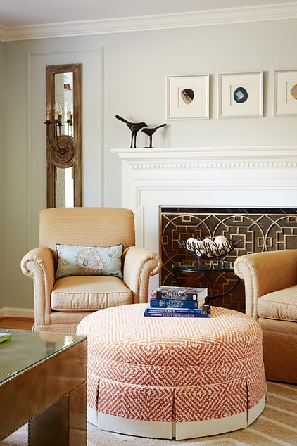
These two armchairs already belonged to the couple, and their warm neutral upholstery was absolutely fine as is. The new ottoman adds a big splash of tangerine and a geometric pattern, which plays off the new brass fireplace screen. It also provides a great spot to prop up feet when someone is reading. “This is a quiet zone,” McMullin says. Pocket doors close it off from the kitchen, and a home office is located just to the right of the area seen here.
The room had no integrated lighting, and the budget didn’t allow for it. Instead, McMullin flanked the fireplace with hardwired, long mirror-backed sconces and added millwork around them. This gives them a strong presence, provides and reflects the light for reading, and adds symmetry around the fireplace wall. She also added table lamps on either side of the sofa and maximized the natural light coming through the windows.
Sconces: Regina Andrews
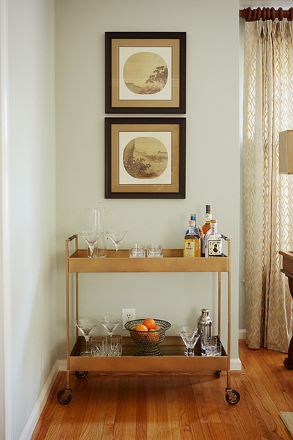
A combination of metal accents adds interesting texture. A champagne glint enhances the bar cart’s simple lines. The bronze-colored coffee table, brass table lamps and fireplace screen, and blackened bench legs and shelf supports all add to the mix.
When figuring out what stays and what goes, McMullin helps her clients decide what’s important. She designed around quality pieces like the armchairs and accessorized with timeless pieces like this artwork, while relegating things that were bought at a big-box stores 10 years ago to the basement.
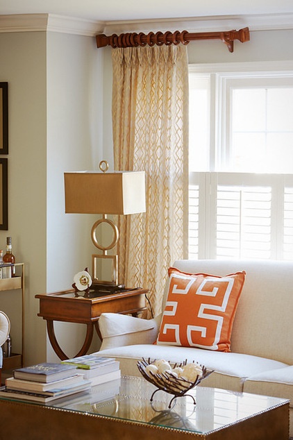
The metal coffee table has chunky geometric heft and was a budget saver. McMullin had a piece of glass cut to protect the top.
Before, heavy draperies blocked a lot of the natural light. “Because privacy was not a big issue, we added half shutters and just a lighter sense of panels on either side of the windows,” she says.
The table lamps and Greek key throw pillows add large-scale geometric touches, while the drapery panels are more subtle.
Greek key throw pillows: customized, Ryan Studios; drapery fabric: Robert Allen; table lamps: Rashawn, Uttermost
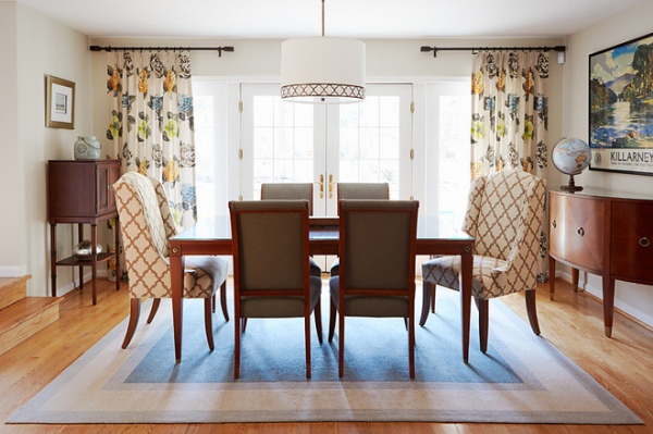
A glimpse into the dining room shows how McMullin used color to connect the first-floor rooms. “There is a cohesive flow throughout the home that doesn’t use identical colors, but is tied together with the idea of color,” she describes. In this room the client provided the dining table and side chairs. McMullin added the host and hostess chairs, floral drapes, light fixture and rug.
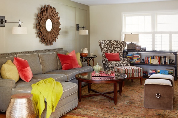
The family room has amped-up colors and a more casual look (including the more casual-looking books). Mixed metals, wood pieces and related colors continue the pleasing flow throughout the house.
See more Rooms of the Day
Related Articles Recommended


