Houzz Tour: Loving the Old and New in an 1880s Brooklyn Row House
http://decor-ideas.org 08/01/2014 13:43 Decor Ideas
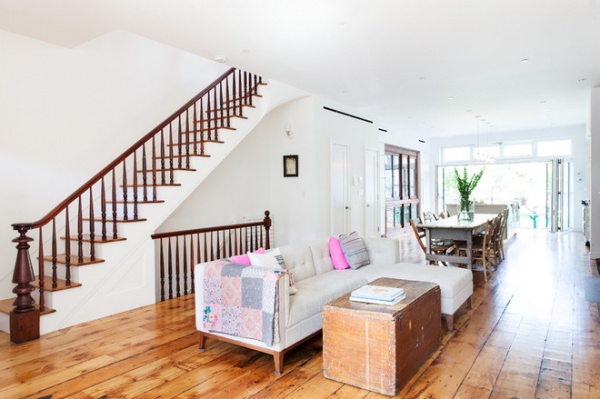
Photos by Hulya Kolabas
Houzz at a Glance
Location: Cobble Hill neighborhood of Brooklyn, New York
Who lives here: Odette Williams, a children’s clothing designer; her husband, Nick Law, a chief creative officer at R/GA; their 4 kids; and their dog, Hero
Size: 2,600 square feet; 5 bedrooms, 2½ bathrooms
That’s interesting: This original row house was built in the 1880s and is 20 feet wide by 52 feet long
A surprise inside: A 12-foot wall of glass doors opens to an ipe wood dining terrace off the kitchen
A family had previously lived in this building for 60 years and had carved it into four apartments. Architect Lorraine Bonaventura took everything down to the brick structure and converted the house into two units — a three-level home on top of an apartment now rented to a young family.
The first floor of the main house, which is up seven steps from the street and referred to as the parlor, combines the living, dining and kitchen areas in one 20-foot-wide by 52-foot-long space.
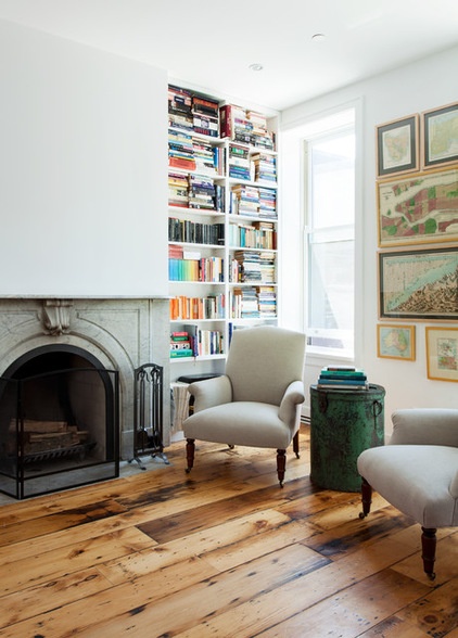
Bonaventura pulled up several layers of linoleum and found original pine floors — nail marks and all — that she restored and placed in varying color tones and sizes. “They really wanted to keep what could be reclaimed and turn the rest into a modern, open envelope that they could fill with vintage things,” Bonaventura says.
The fireplace mantel was rebuilt using materials reclaimed from a remodeled house in Manhattan’s West Village neighborhood. Books about art, design and cooking fill a nearby shelf.
See how to remodel your fireplace
Chairs: John Derian
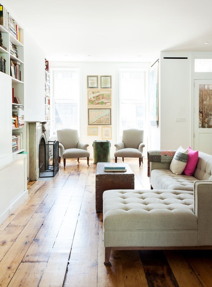
The homeowners, Nick Law and Odette Williams, wanted the furnishings to evoke a vintage feel that somewhat nodded to the original home’s age. Apart from that, they wanted to have a space that was airy and clutter free. “There’s only one rug in the house, and that’s in the bedroom,” Bonaventura says. “Otherwise it’s just floorboards.”
Sofa: Vitra
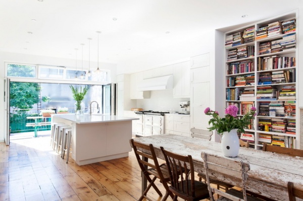
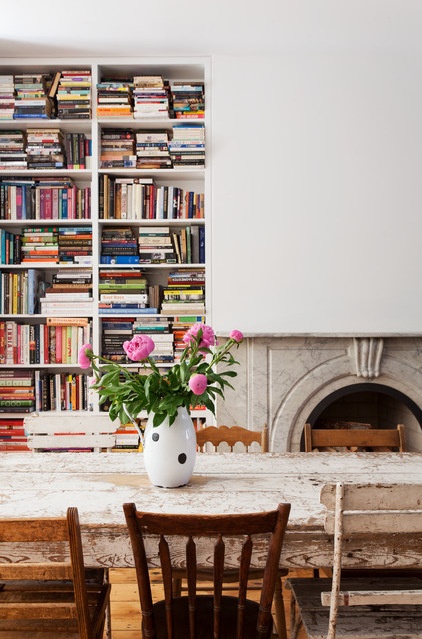
Though Law, Williams and Bonaventura debated about doing an all-white kitchen, they eventually settled on it to make the space sunny and open. “I like white kitchens, and the owners really wanted to go with white appliances,” the designer says. “We thought about doing the vent hood in black, but at 66 inches, it would have been too stark.”
The owners picked out the vintage dining table along with a different chair for each person. Books on cooking and traveling fill a nearby custom bookcase.
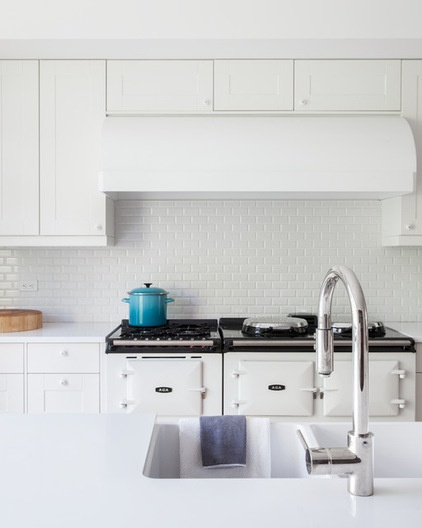
Law requested the Aga range from GB. At 5 feet long and 550 pounds, it took four people to carry it into the place. “I was hesitant, but the owner likes the way it cooks,” Bonaventura says. “It has separate cooking ovens for baking, roasting and warming.”
Two-by-4 subway tile with a crackly pattern and beveled edges forms the backsplash. A seamless quartz tops the 10-foot island. The cabinets are from Ikea; Bonaventura slightly customized them.
See more on quartz countertops
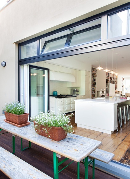
Glass folding doors open 12 feet of wall space to connect the kitchen to an ipe wood dining terrace. The vintage table with green legs folds up to make more room on the 8- by 20-foot space.
Island pendant lights: Schoolhouse Electric
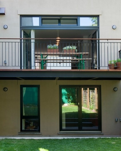
The terrace extends over the lower apartment, which opens to a garden.
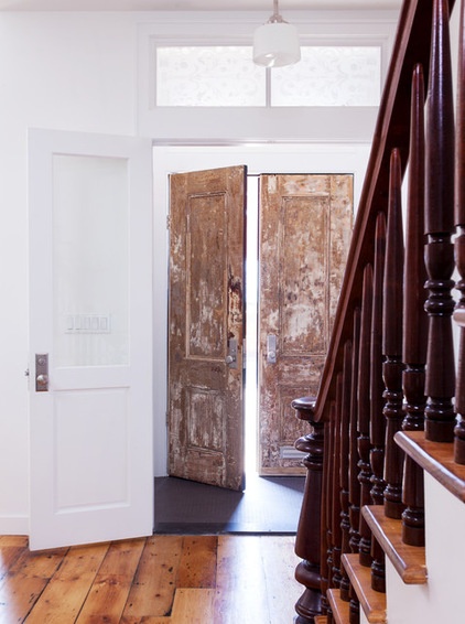
Carpenters replaned and patched the original front doors. The owners liked how they looked stripped and raw, so they chose not to paint them on the interior.
Bonaventura had the original mahogany staircase taken apart, all of the spindles stripped and everything rebuilt.
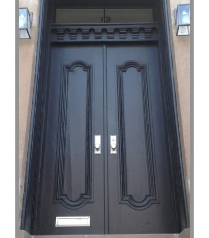
The exterior of the entry doors is painted black. Around the side of the entry steps, a path leads to the garden-level apartment.
What color should you paint your front door?
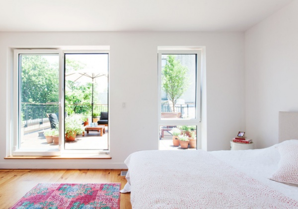
The simple approach to decor continues in the second-floor master bedroom. “There’s virtually just two side tables, a bed, one carpet, some artwork and the closets,” Bonaventura says.
Law and Williams enjoy coffee on an outdoor living space located above the kitchen.
Bed: Room & Board; outdoor furniture: Ikea
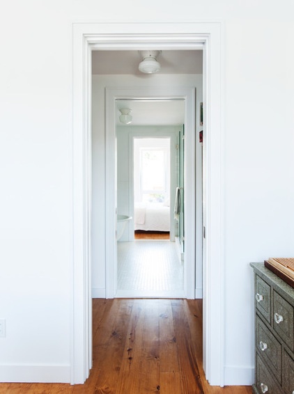
Bonaventura used all pocket doors on the second floor to let the light travel from the front and back into the inner spaces.
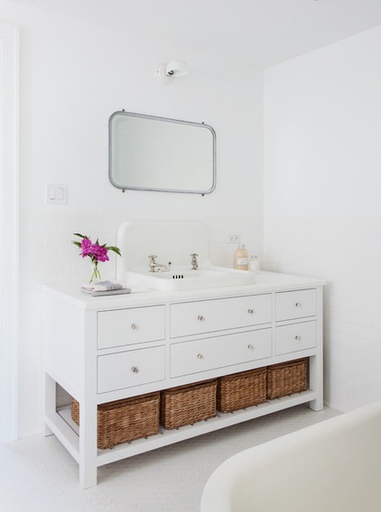
In the master bathroom, a vintage mirror hangs over a custom vanity with polished nickel fixtures. Most of the vintage pieces in the home, including the mirror, came from Irreplaceable Artifacts in Manhattan.
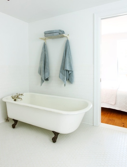
Bonaventura stripped the paint off the feet of a vintage bathtub for a little dollop of contrast. The owners found the vintage towel rack online.
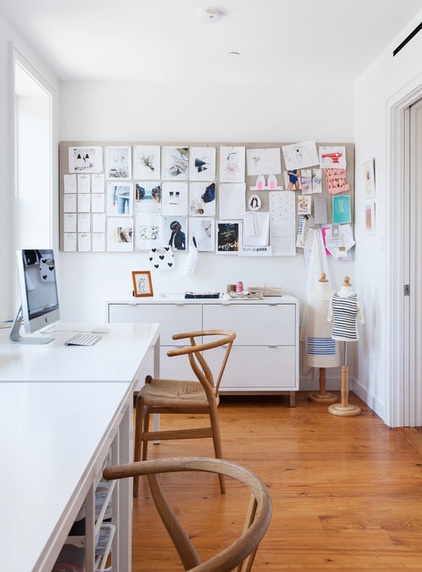
Williams runs her eponymous business, designing kids’ organic clothing, from this home office.
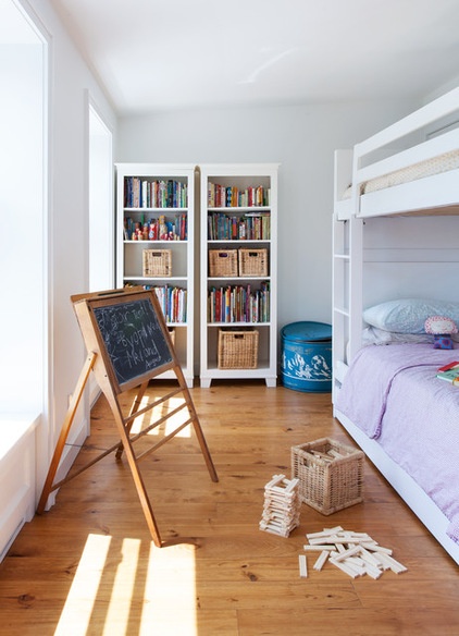
The kids’ rooms are on the third floor. The two youngest, a boy and girl, asked to share a room.
See more great ideas for shared kids’ rooms
Bunk bed: Room & Board
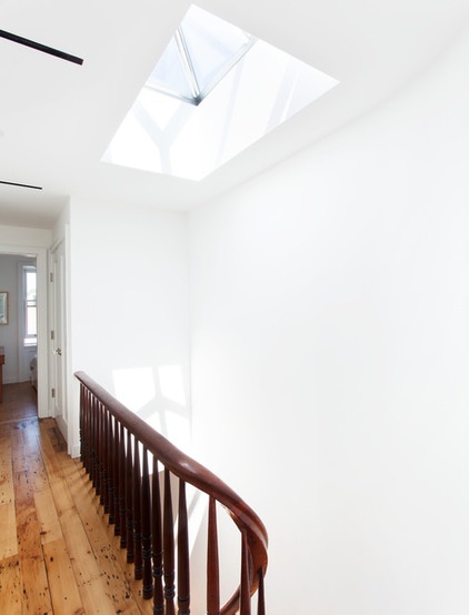
A new skylight pulls light into the three levels.
How to add a skylight
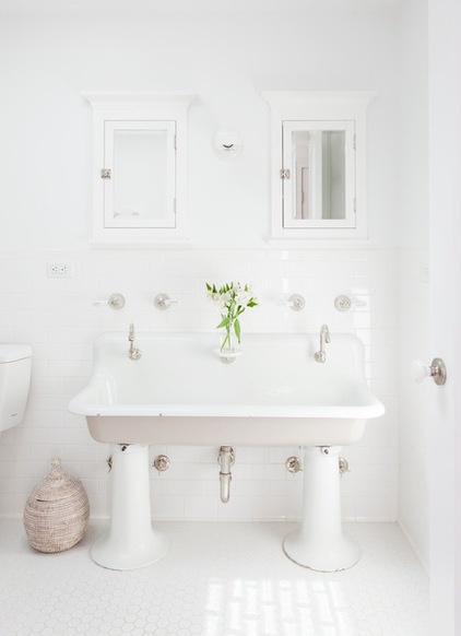
In the shared kids’ and guest bathroom, an old trough sink from a school sits at a low level for easier access. “When the kids grow, the owners will figure out what to do then,” Bonaventura says.
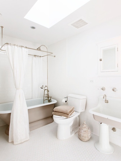
A custom canopy shower rod and curtain over a vintage tub complete the throwback look.
Medicine cabinet: Restoration Hardware; fixtures: Strom Plumbing; tub: Irreplaceable Artifacts
Browse more homes by style:
Small Homes | Colorful Homes | Eclectic Homes | Modern Homes | Contemporary Homes | Midcentury Homes | Ranch Homes | Traditional Homes | Barn Homes | Townhouses | Apartments | Lofts | Vacation Homes
Related Articles Recommended


