Houzz Tour: A New Look for Former Student Digs
http://decor-ideas.org 07/29/2014 19:14 Decor Ideas
“Students don’t tend to look after houses,” says architect Kieron Roberts, of Riach Architects, “and to be honest, this building was a bit of a wreck when we first saw it.” The student residents of this grand Victorian house had lived in a rabbit warren of rooms and what Kieron calls “generally sad-looking interiors.” But the potential for a complete overhaul and space for a generous extension led a family of six to buy the house and work with Kieron to create a beautifully proportioned home.
Houzz at a Glance
Who lives here: A family of 6
Location: Oxford, England
Designer: Riach Architects
Size: 5 bedrooms, 7 bathrooms
“Luckily, the owners were very ambitious,” says Kieron. “We already had planning permission to build a sizable extension at the back of the house, but they wanted to explore the possibility of adding a basement to create a den for their four children as well.”
The completed home provides generous living space split over five floors, and a unique blend of contemporary and traditional styles that respects the building’s Victorian heritage.
“We made a lot of structural alterations to the old part of the house,” says Kieron. “It’s a Victorian building and was designed for a different era. Back then people wanted smaller, independent living spaces. We had to knock down a number of walls to create the wide, open-plan areas we have now.”
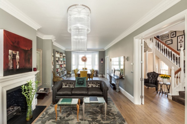
The client wanted to respect the traditional features in the original house without their overpowering the space. “She had a lot of ideas about what she wanted to achieve, and we worked closely together to create this formal but comfortable entertaining area,” says Kieron. The client was particularly passionate about lighting, and statement chandeliers and pendants add visual interest throughout the home. In the space seen here, good lighting is essential. “This is naturally quite a dark space,” says Kieron. “There is a large tree in front of the window, but the house is in a conservation area, so we had to respect it and leave it there.”
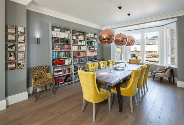
The formal dining space is positioned at the rear of the house, at the opposite end from the open-plan living area. It looks out over the green roof of the modern extension. Tom Dixon pendant lights and dining chairs upholstered with colorful velvet lend plenty of character, while light floods into the room via a large bay window. Kieron sourced the distressed oak flooring from Indigenous, a local company.
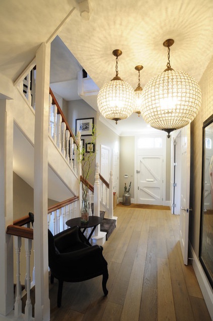
A trio of statement chandeliers hangs in the entrance hallway, and their softly traditional look is sympathetic to this area in the original side of the house.
“When you are working with these kinds of houses, which are Victorian with a modern extension, it’s absolutely key to establish where you mark the transition between the more contemporary side, with its modern elements, and the original period property,” says Kieron.
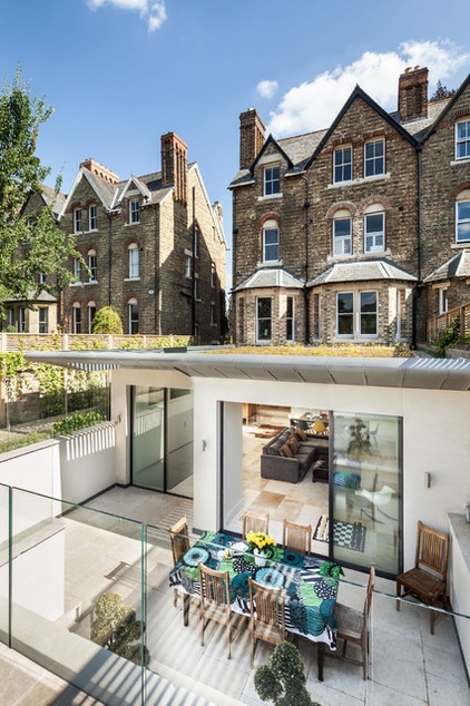
The promise of a sizable extension at the rear was what attracted the family to buy the house. “The owners wanted the space to flow naturally from the old part of the house into the new addition,” says Kieron.
The addition was extended outdoors via an integrated sunken terrace that the family uses as a dining room in summer.
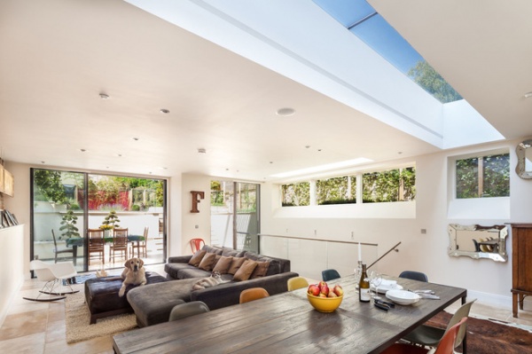
“This lovely open-plan room is where the family comes to relax, watch TV and eat together,” says Kieron. “It is a much less formal space than the upstairs dining and living area and has a more contemporary feel.” Natural light streams into this part of the house via skylights. “We wanted to keep the interiors in here really crisp and clean,” says Kieron, “so we added recessed strip lighting in the skylight rather than add a chandelier here.”
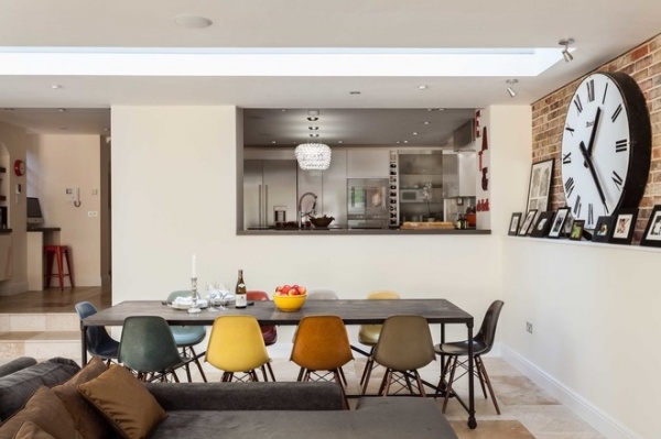
A grand, oversize clock dominates the informal dining area; it was salvaged by the family from an old American train station. After refurbishing and restoring it to full working order, they installed lights behind the facade, which illuminate it at night.
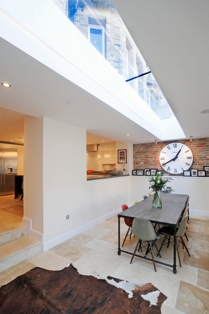
The flooring in the kitchen and downstairs extension complements the exposed brickwork, lending this area a softly industrial vibe. “We laid lovely big limestone flagstones through this part of the house,” says Kieron. “The brickwork you can see here actually extends to the garden wall outside, so there is a play between the internal and external areas.”
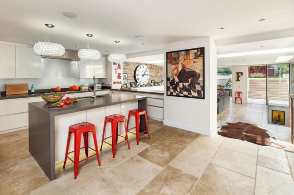
The kitchen, which sits within the original property, has been designed to flow seamlessly into the new extension. With no windows in this area, the owners kept the walls white and chose worktops with a pale finish to reflect as much light as possible. The kitchen was designed by Kitchen Coordination using units made by German company Rational. Red stainless steel bar stools add color, while another trio of pretty pendant lights hints at the glamorous interiors in the more formal parts of the house.
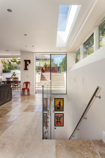
“We decided a glass balustrade leading down to the basement would be inconspicuous and complement the open-plan design best,” says Kieron. “It is one huge piece of glass, going from the top to the bottom of the stairs, so installing it was quite a challenge.”
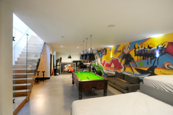
The family’s four kids use the spacious basement as a den. To give this room a unique flavor, the family commissioned a graffiti artist from Ibiza to create a surf-themed artwork along the back wall. The entire family surfs, and they are all represented at various points in the mural.
Logistical challenges prevented Kieron from installing a polished concrete floor in this area, so he decided on a microconcrete finish instead, which looks the same but was simply skimmed over the existing floor. “It is hand finished, so we didn’t have to get any heavy machinery down here,” he says, “but it’s still got that hard-wearing, industrial look we were after.”
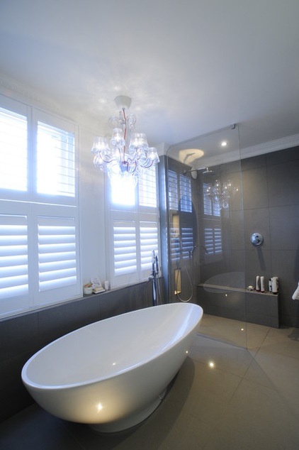
The master bedroom and en suite bathroom are situated at the back of the house. “There is definitely a glamorous and luxurious feel to these rooms,” says Kieron.
The biggest challenge here was finding a chandelier that was suitable for hanging over the bath. “This was something the owner particularly wanted,” he says. “This one is IP rated, which means it is safe to install in a room where water is used, such as the bathroom, and can even be hung outside.”
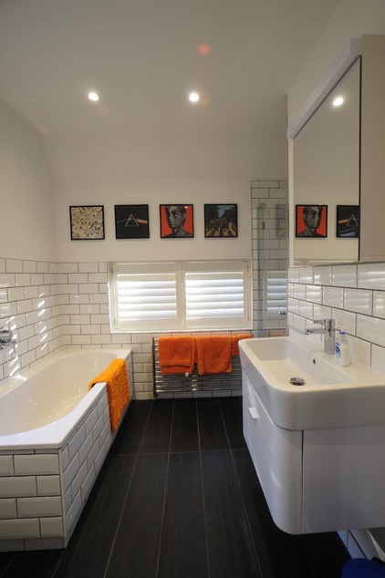
On the top floor, the children’s bathroom has a cool, urban vibe with metro tiles on the walls and splashproof wood-look tiles on the floor. “This room is a bit more fun,” says Kieron, “with the album covers on the walls and pops of orange.”
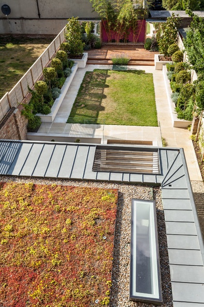
The roof of the extension has been planted with wildflower seeds to appear to flow seamlessly into the garden beyond. “It’s also much nicer to look at from the upper floors than a plain slate roof would be,” says Kieron.
Browse more homes by style:
Small Homes | Colorful Homes | Eclectic Homes | Modern Homes | Contemporary Homes | Midcentury Homes | Ranch Homes | Traditional Homes | Barn Homes | Townhouses | Apartments | Lofts | Vacation Homes
Related Articles Recommended


