Houzz Tour: Old-School Charm With a Contemporary Twist
“When the clients first approached me, the brief was to remodel and extend an existing house they’d bought,” says Martin Back of The Bazeley Partnership, speaking of a home near the town of Bude in Cornwall, England. “But it soon became clear that the building was structurally unstable, so rather than do a patch-up job, we decided to knock it down and start with a clean slate.”
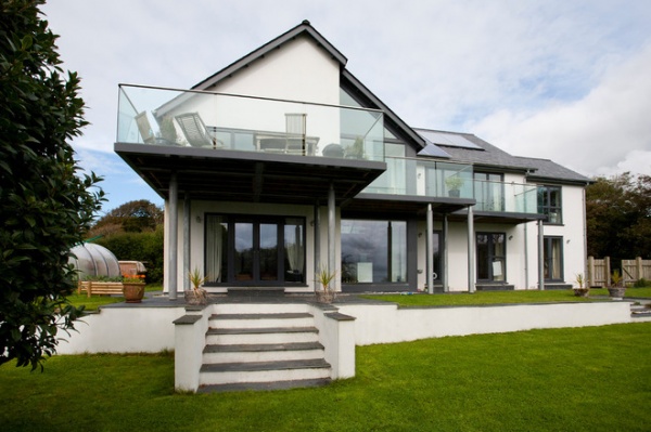
Martin’s new brief was to create a contemporary house that suited the needs of the growing family while incorporating the incredible natural landscape into the design. Merging the outdoors with the interior space was important to the family, so Martin designed an “upside-down” house with a wraparound balcony that would maximize the family’s views of the Cornish hinterland.
It wasn’t all plain sailing, but after navigating his way through various planning constraints, Martin eventually created an airy, bright, contemporary home with a nod to traditional Cornish design. “Juggling the owners’ ambitions with the local authority planning restrictions was a challenge,” he says, “but we got there in the end!”
Houzz at a Glance
Who lives here: A family of 5
Location: Town of Bude in Cornwall, England
Designer: The Bazeley Partnership
Size: 4 bedrooms, 2 bathrooms
The white painted facade is a nod to traditional Cornish homes, which are dotted around the area. The striking wraparound balcony was a little more difficult to get past the local planning authority, but with a few tweaks here and there, Martin managed to steer it through, much to the owners’ delight. “The balcony was really integral to the design,’ he says. “It’s a striking feature, and it was definitely worth fighting for.”
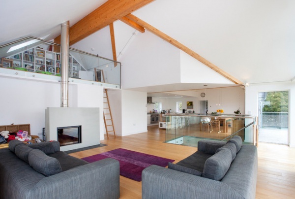
“We decided to keep the first floor — which is the family living space — open plan to allow in as much light as possible and make the most of the views from every aspect,” says Martin. This layout allows the young family to coexist in the space without dividing it into grown-up and kids’ areas, but the clever positioning of furniture identifies different purposes for each zone. The mezzanine level was a late addition to the plans and is used as a library and play area. A large skylight was built in the sloping ceiling to illuminate this nook during the day.
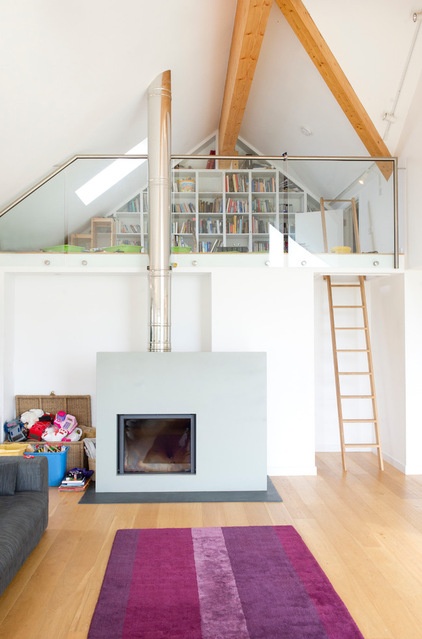
Martin introduced different ceiling heights to add drama; he emphasized the ceilings with timber beams in a natural finish. These complement the engineered oak flooring on the upper level and add some welcome warmth to the bright, crisp interiors. The Jetmaster wood-burning stove, from local company Kernow Fires, is another example of how Martin managed to blend traditional elements with a modern aesthetic: the glazing and surround feel very contemporary, in keeping with the pared-back decor.
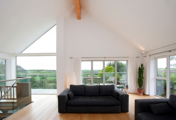
Dramatic windows serve as a canvas for stunning views of the local countryside. Beyond the lush fields, the local beaches are just a 10-minute drive away, allowing the family to enjoy the best of both worlds.
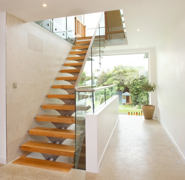
Feature staircases are Martin’s speciality, and this cantilevered structure fits perfectly with the property’s modern aesthetic.
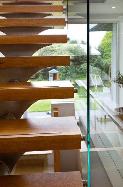
“The open risers and the glass balustrade maximize the light entering this part of the house from the full-length window,” says Martin.
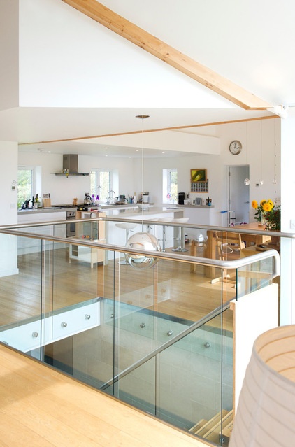
Wherever possible, the clients were keen to use locally sourced materials during the construction to ensure that the house was as sustainable and environmentally friendly as possible. “We’ve created a very green building,’ says Martin. “But it’s balanced — we wanted to use the best renewable technology possible without it costing too much.”
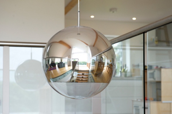
A pendant light, purchased by the owners, is a beautifully simple and striking feature in the stairwell, reflecting light from the floor-to-ceiling windows.
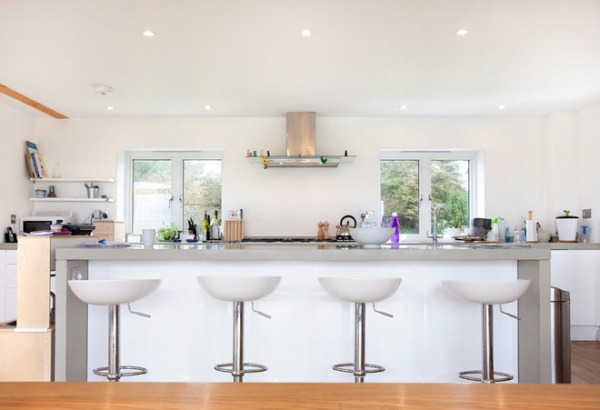
Local designer Christian O’Reilly custom-built the kitchen, incorporating an extra-long island to make the space more family friendly.
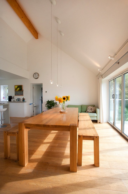
O’Reilly also created the bespoke family dining table to complement the natural wood finish of the beams and oak flooring. The bifold doors here open up to create a seamless transition to the balcony outside.
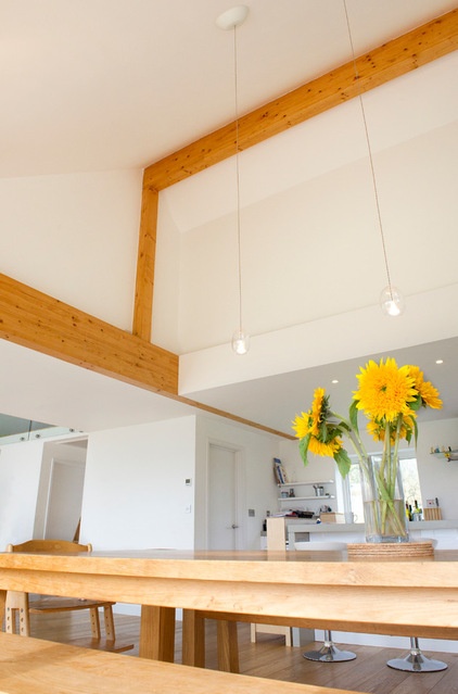
The bench seats complement the family’s relaxed, easygoing nature, while the hanging pendant lights, from Holdcroft Lighting, add a touch of finesse.
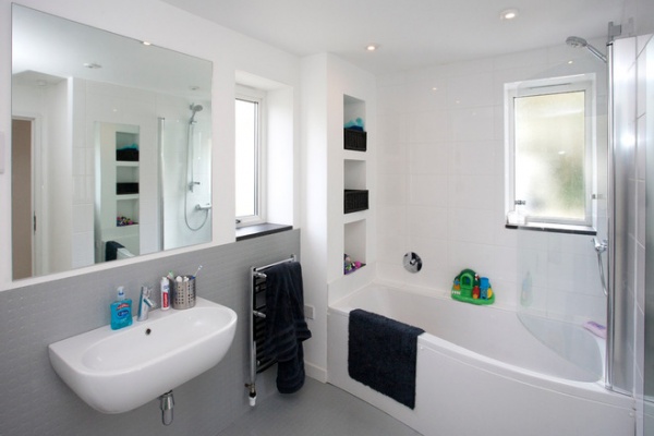
The family bathroom is a bright, functional space designed for heavy use. The owners are fond of slate and white hues, and this is seen here. A wet room on the other side adds a luxurious element.
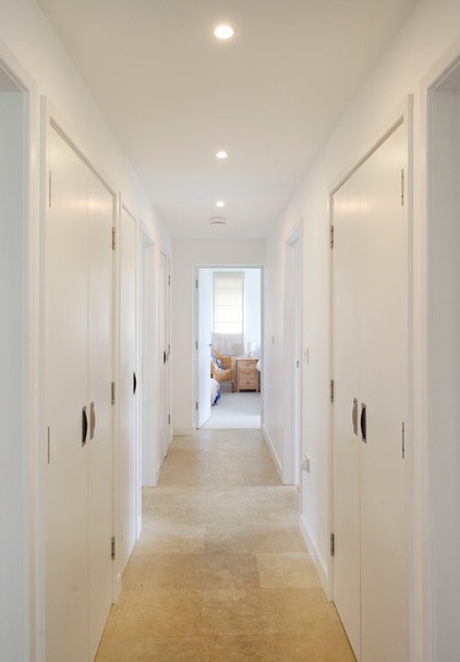
“Because the views are so amazing, we decided to turn the plan upside down and put the bedrooms on the ground floor,” says Martin. Limestone tiles have been used throughout this part of the house, with cozy underfloor heating to keep toes warm.
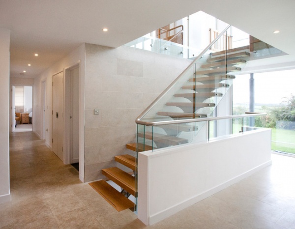
The build took around 18 months to complete, and the clients moved in during 2010. “I worked very closely with the clients, and they were delighted when they saw the finished house,” says Martin. “It was even more airy and bright than they’d hoped.”


