The Secret to the Perfect Throw Blanket: Watch Your Tone
I like to think of the throw as an adult security blanket. Whether we’re a teeny bit cold or just trying to get cozy, there’s something about curling up with a snuggly-soft throw blanket that makes us feel safe and secure. The neat trick of the throw is that it tends to lend those qualities to a room even when it’s not in use — whether it’s folded squarely over the back of a sofa or draped with carefree elegance across the lap of a chaise longue.
It’s the throw’s effortlessness that makes it a key accessory for any seating area. Yet the sheer number of choices available can make choosing the right one feel like a lot of work. Which accent color do you want to pull in? How do you match that color closely enough that it makes sense? Do you opt for a cheerful pop or a soothing neutral?
Fortunately, there’s one solution that not only helps narrow your choices, but also capitalizes on the throw’s easy elegance: tone-on-tone color. A throw that’s the same hue as the piece it’s displayed on subtly highlights patterns and textures to engage the senses and create flow within the space.
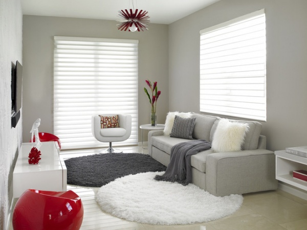
Designer Dawn Causa used tone-on-tone color to highlight differences in texture in this bedroom sitting area. “A sudden and extreme change in texture from one item to the next will create depth and interest to the eye,” she says.
As a rule of thumb, Causa likes to choose hues within two to four shades of each other, as she did with the throw on this sofa. The exception to this rule: monochromatic spaces. In that case the two pieces should be just one shade apart.
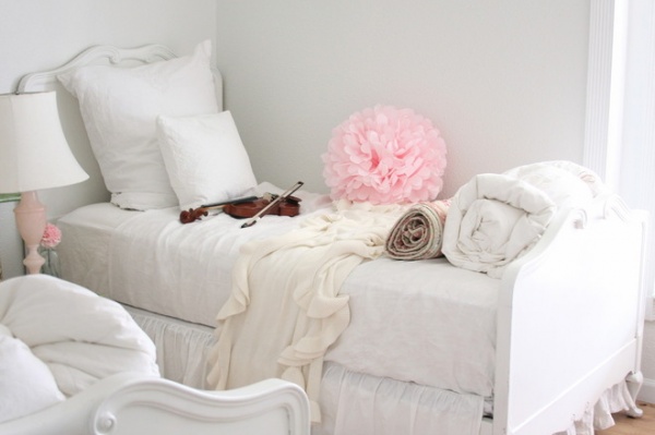
Above is a great example of monochromatic decorating. The cream-colored throw is a full shade off from the bright white of the bed, highlighting the differences in texture while making the color difference seem purposeful.
Another gray-on-gray color scheme is at left. Notice how the difference in color highlights the woolly softness of the throw, adding a sense of casual comfort to a space that might otherwise have felt stiff.
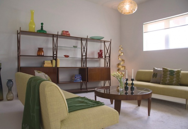
Don’t shy away from tone-on-tone color just because your furnishings aren’t neutral. I love the way this rich green throw highlights the springy color of the sofa. There’s something about this combination that feels garden-like — especially when juxtaposed with wood furnishings.
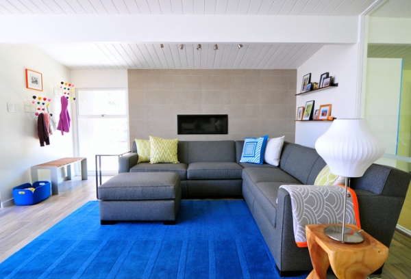
Urbanism Designs’ Pamela Tam used tone-on-tone color throughout this San Francisco living room, so she felt it was important that the throw as well as the pillows add pattern, color and texture.
“In general I find that mixing patterns works if the patterns are different enough, but still have an underlying similarity that ties them together,” says the designer.
In this case the patterned throw works, in part, because it pulls in the gray from the sofa — a different take on tone-on-tone color.
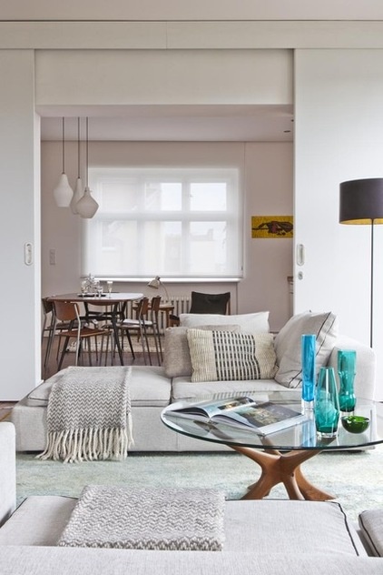
Designer Mike Irastorza used tone-on-tone color with a patterned throw to create a Nordic atmosphere.
Irastorza always looks for common elements to create flow in a space — in this case it’s the gray of the chaise, which he pulled out and repeated in the patterned throw and pillows.
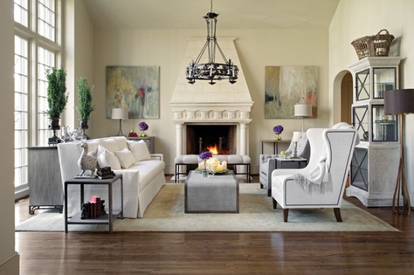
While many of the spaces we’ve looked at so far have been more modern, this strategy works well in more traditional or eclectic spaces, too.
I love the way this white throw is casually tossed across the arm of an otherwise formal-looking armchair. A throw in a contrasting color — say a charcoal gray — would’ve made the space feel too pulled together. But the white on white creates a breeziness that says, “This room was made for relaxing.”
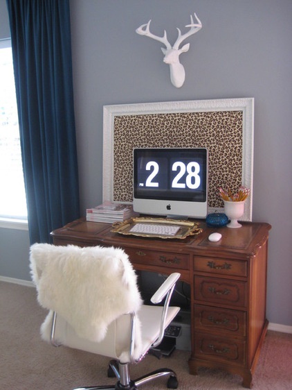
The rich texture of this sheepskin throw creates interest on its own, but there’s something about white on white that evokes an almost spa-like feeling — a welcome touch in a home office.
See more on how to decorate with throw blankets

