Walls Come a-Tumbling Down in a San Francisco Edwardian
http://decor-ideas.org 07/24/2014 00:14 Decor Ideas
Remodels are like any other change; sometimes they happen quickly, sometimes over time. The remodel of this family home in San Francisco’s Noe Valley neighborhood took the slow route, with pieces coming together over a period of months. Be it change or a remodel, the route is sometimes less important than just getting there.
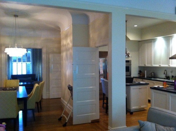
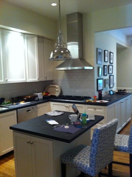
The walls, doors, pillar and soffit seen here (shot from the family room and looking to the kitchen and living room) used to stand between the kitchen, dining room and family room; they did more to hinder than help circulation.
The designer for the project, Ali Davin of Jute Interior Design, says that before the remodel, the kitchen was tight, with a constricted flow.
Photos by Drew Kelly
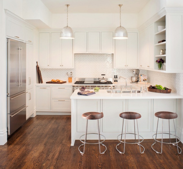
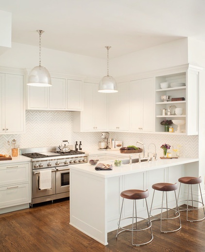
AFTER: Once the space was opened, Davin enlarged and relocated the island, turning it into a long eat-at peninsula. In a game of design musical chairs, the sink and dishwasher were also moved (from the exterior wall to the peninsula), and a range took their place against that wall under cabinetry. (The cabinets screen a new, more undercover ventilation system.) The new layout and appliances eliminated a big ventilation hood and a cooktop; they used to live on the wall and in a countertop across the kitchen from the refrigerator.
The demise of the ventilation hood and cooktop, and also some wall ovens, made way for much-needed storage and counter space. “They didn’t really use the wall ovens,” says Davin. Brighter paint, glossy white tile and improved lighting gave the space a fresh look.
Bar stools: McGuire; tile: Kallista
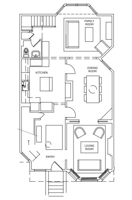
The old layout helps tell the story. The kitchen and dining room were separated by barriers.
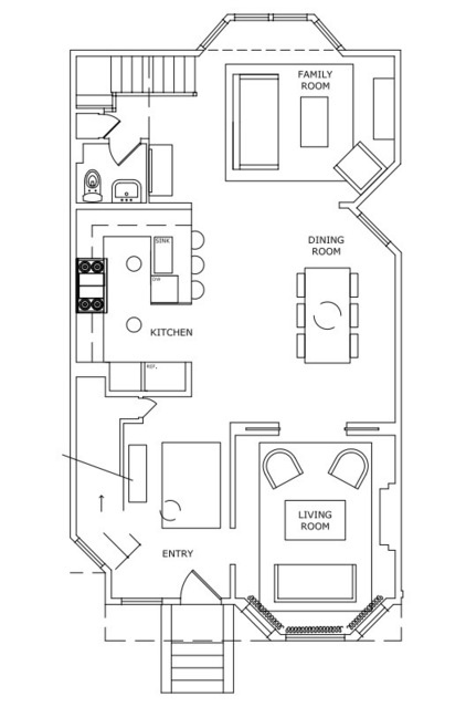
AFTER: In this bird’s-eye view of the floor plan after the remodel, you can see how removing the walls, doors, pillar and soffit made the entire area feel more open.
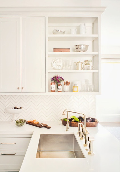
“The owner has a few things she likes to display in the kitchen,” says Davin. “We gave her some open shelving that is in a not-as-easy-to-reach corner to display things she uses once in a while.”
Sink hardware: Kallista
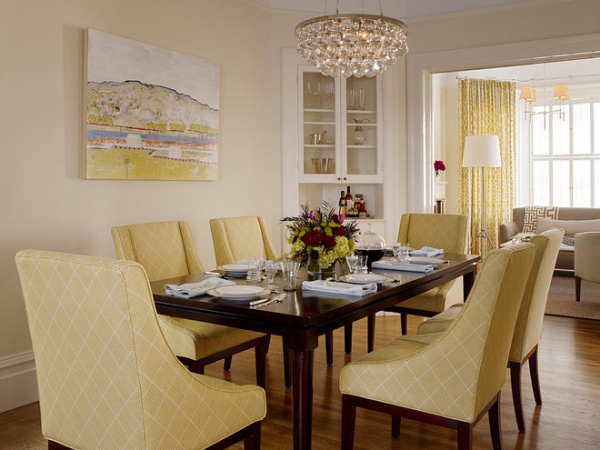
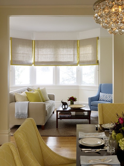
The dining room table, chairs and light fixture were there before the remodel, but a new cream-colored backdrop and the removal of the wall that separated it from the kitchen gave the space a new attitude. “Although they wanted there to be openness between the rooms, it was important to them to keep a formal dining room,” Davin says.
The dining room separates two living areas. This one is the more casual family room, where the owners and their kids gather.
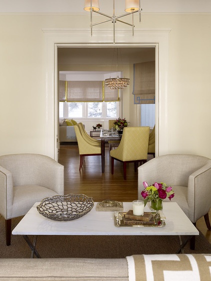
The front living room, designed for entertaining guests, is more formal.
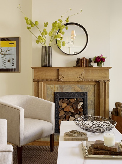
An old, nonfunctioning classic fireplace got a new look with a hip wood stack and modern accessories. “It really needed a shot of texture,” says Davin.
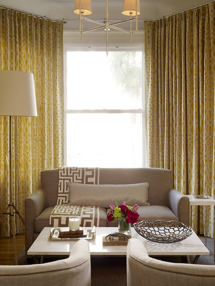
Patterned curtains add another dose of texture and a sunny yellow color.
Curtain fabric: Raoul Textiles; Bryant Small Chandelier: Circa
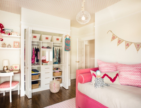
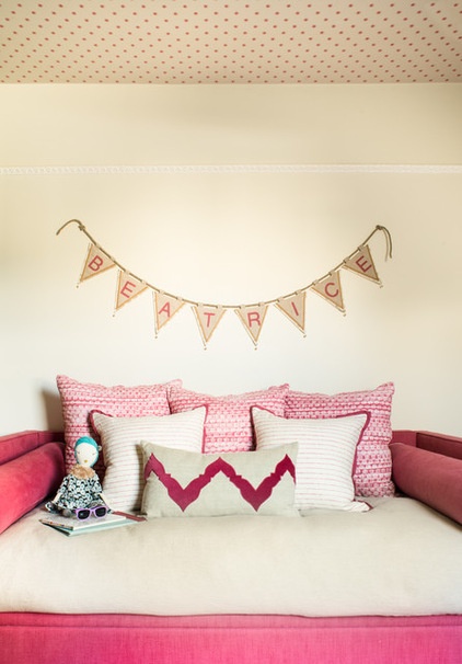
In this girl’s room, the goal was for it to look pretty, but pretty is as pretty does, so function was a big consideration.
The bed can be styled as a daybed, for daytime sitting and play-date entertaining. A new closet is sized for the small set, organized and functional. A pink-patterned wallpaper gives the room pattern and texture, and since it’s on the ceiling, the light-colored paper is removed from the wear and tear of tiny hands.
Read more about wallpapered ceilings
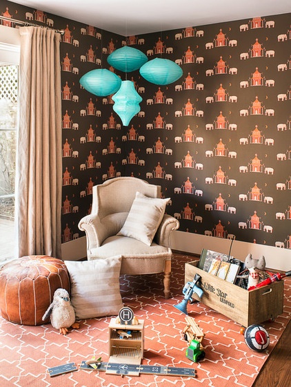
A darker wallpaper, enlivened by a coral-toned rug and turquoise paper lanterns, decks out the basement-level playroom. “Since there is a bank of windows along one side of this room, I felt like it worked,” says Davin.
Wallpaper: Pagoda, Katie Ridder; rug: Madeline Weinrib
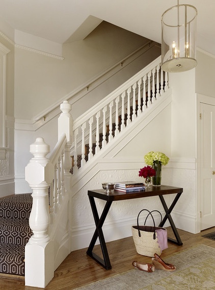
From the entrance, family and guests go up the stairs to reach the living room, family room, dining room and kitchen.
The elaborate newel post and stair rail hint at the home’s age.
Read more about the history of newel posts
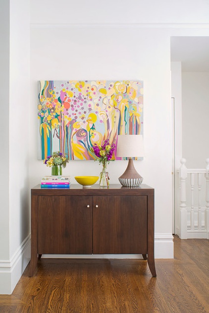
At the top of the stairs, guests are greeted by a console topped with a colorful painting by Lily Martine Baxter, a local artist whose work Davin loves. “This particular piece uses all the colors we used in the house and really brings it all together,” she says.
Davin revels in the fact that this is a family of homebodies. “They spend a lot of time here,” she says. “We tried to give them a more colorful, happy retreat they would enjoy.”
Related Articles Recommended


