Houzz Tour: Asian Elegance With an Industrial Edge
http://decor-ideas.org 07/23/2014 20:15 Decor Ideas
These homeowners made a big lifestyle change when they moved from the Denver suburbs to their Lower Downtown (LoDo) neighborhood. They landed right in the middle of some of the most exciting galleries and restaurants in the city, and are just a few hundred yards from Coors Field. Now it’s just a quick walk to see their beloved Colorado Rockies play.
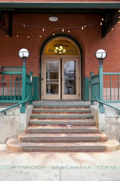
Houzz at a Glance
Location: Lower Downtown Denver
Size: About 1,800 square feet (167 square meters); 2 bedrooms, 2½ bathrooms
Photos by Emily Minton Redfield
The owners needed new furniture and accessories to fit their new home — a two-story loft in a former grocery warehouse. Today the building’s first floor hosts the Wynkoop Brewery Company.
Reminders of the building’s past inside the loft include large beams, exposed brick walls and metal gears and pulleys. Those large architectural features added loads of character and some decorating challenges. Interior designer Laurel Quint helped the owners play off the existing unique architecture while adding softness to the hard edges.
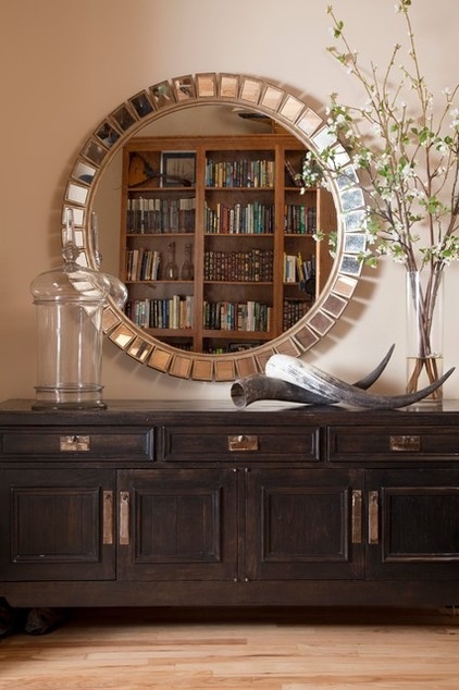
Quint picked up on her clients’ penchant for Asian touches early in the design process; one of the owners has traveled extensively to Japan for work. She added pieces that nod to Asian style, such as this large console in the entryway.
The proportions of the rooms and the overall scale of the apartment presented a design challenge. “Scale is a huge factor,” Quint says. “It was tricky because the rooms aren’t massive, but the overall space is.” She picked pieces that were not overwhelmingly large but that added the right amount of drama.
Mirror: Hickory Chair; console: Bausman and Company
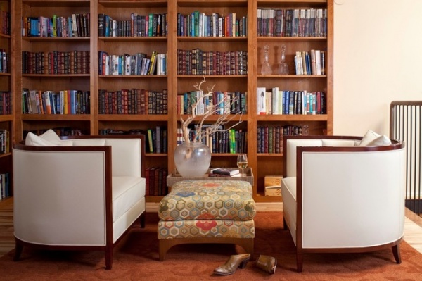
Across from the entry console, Quint carved out this cozy library reading space. “The couple loves their books, and they love to read,” she says. The leather barrel-back chairs have art deco style and are very comfortable. The custom bookshelves are cherrywood, which Quint also used on the kitchen cabinets to warm the space.
She covered the ottoman in a luxe geometric Akris for Clarence House fabric, getting a lot of bang for the buck. “We only needed 2 yards of this expensive fabric, and it really sets the piece apart,” she says.
Ottoman: Holly Hunt; rug: Odegard
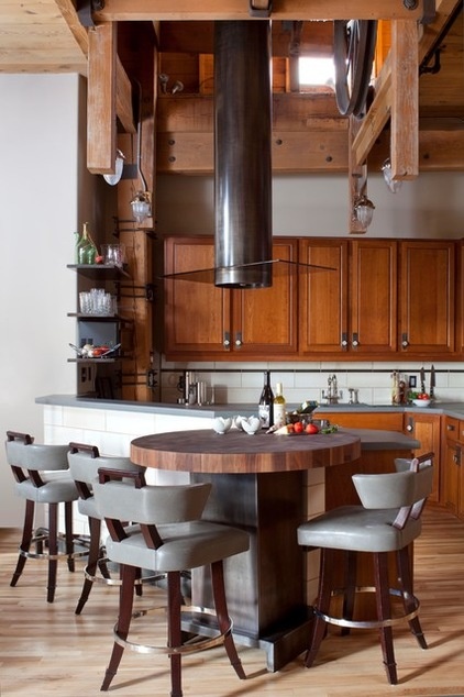
Playing off the gears and pulleys overhead from the original warehouse, Quint added metal in the form of a dramatic industrial vent hood, a high-top table base and floating shelves.
Playing off the building’s history, she added some period touches, including art deco–inspired leather stools, French industrial-style pendants and light bronze backplates with glass pulls on the cabinetry.
Poured concrete countertops add a more contemporary industrial edge.
Cabinet pulls: Rocky Mountain Hardware; lighting: Visual Comfort; butcher block: walnut, Boos Block
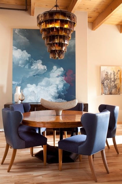
The lack of windows presented another design; the only natural light in the main living space comes from two windows and a skylight.
Quint believes in investing in the local art scene, especially in this neighborhood full of great galleries. As for this large painting, “I dragged my clients over to the big Ian Fisher show at the nearby Robischon Gallery and told them they had to have this,” Quint says. “It makes it feel like there is a window here.”
The walnut table can be extended from a circle for intimate dinners to a large oval that seats 12. There are eight of the blue wingback chairs (Quint found a home for the two extras next to the staircase) and four stackable Donghia Anziano klismos-style chairs stored in a closet.
A large horn chandelier stands up to the high ceilings and helps define the dining area. A buffet provides storage and a serving surface.
Chandelier: Ironies
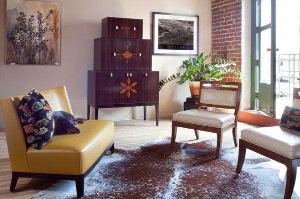
Quint created this seating area just beyond the dining room. A unique bar adds the right amount of chunky massing and drama. The bottom is for liquor; the middle section opens out with a surface for mixing drinks and has mirrored doors on the inside. The top provides storage for glassware and other barware.
Two slipper chairs and a settee create a casual seating area that’s great for enjoying cocktails. The settee is just the right size for two and for Quint’s dog, Ollie.
The artwork on the left is by local artist Heidi Jung. A cowhide rug adds a Western touch.
Settee: The Manderin, Holly Hunt; chairs: Kravet; bar: Objets
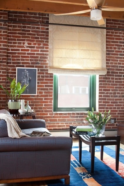
The green paint on the window trim is original to the building; not wanting to deal with getting the approval of the homeowner’s association to change it, the couple decided to live with it.
Quint dressed the window in a simple and flat Roman shade with a lotus blossom pattern to add softness. The couple uses their second bedroom as an office, so she found a sophisticated pullout sofa for guests here.
“The fabric is a fancy denim embroidered in brown,” she describes. The fabric is the right balance of casual and dressed up that’s seen throughout the rest of the loft.
Sofa: Kravet; rug: Odegard; Roman shade fabric: Henry James
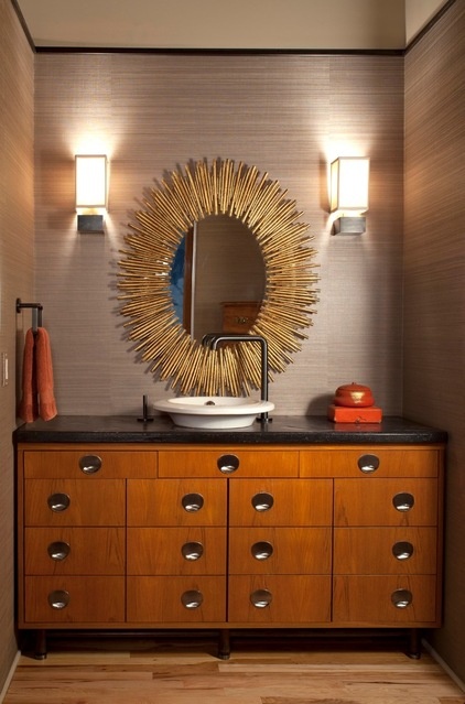
In the powder room, a vintage midcentury modern dresser serves as a unique vanity. The wallpaper is a woven hemp, a favorite of Quint’s.
“It is superelegant and not so rough,” she describes. The mirror adds a burst of glinting drama.
Wall covering: KFI; mirror: Arteriors
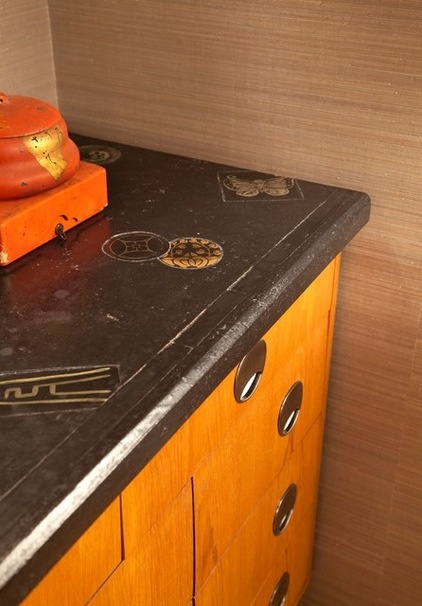
Quint gave the dresser a new custom countertop with Asian touches. “The stained and stamped concrete can truly change the mood of a room,” she says.
Countertop: Ironies
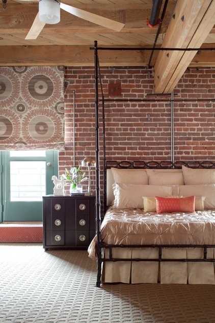
A metal canopy bed helped solve some proportion issues in the bedroom, which is small but has large elements, like the high ceiling, large beams and expansive brick wall. The canopy is “not so grand in scale, but visually it creates a big box,” she explains.
And its metal finish plays off the industrial architecture. “It is one of those pieces that worked even better in person than I thought it would,” she says.
Next she had to find nightstands that could stand up to the size of the bed. Trolling the goods of a favorite 1stdibs seller who has a sharp eye for reasonably priced pieces, she came across this vintage 1930s model with great lines and hardware. Finished in black lacquer, it nods subtly to some of the art deco and Asian touches throughout the loft.
The suzani fabric on the window treatment provides a much-needed large-scale print and helps to soften all of the brick. “This was a splurge, but we had to have it; the scale stands up, and the color is perfect,” Quint says.
Suzani fabric: Donghia; bed: Ironies; nightstand: Century Design Limited, via 1stdibs
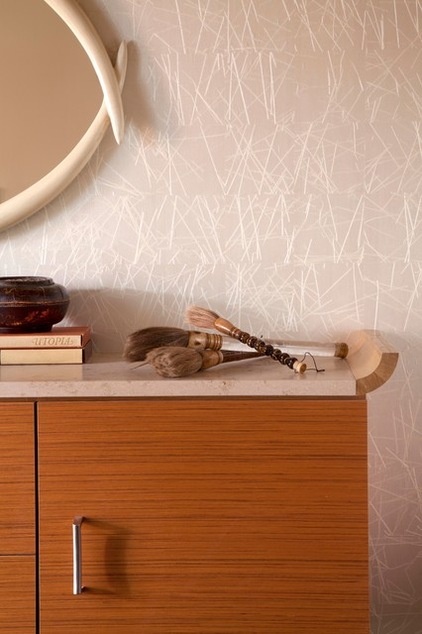
For the open hallway between the bedroom and the bathroom, Quint commissioned this custom cabinet. The travertine top and teak veneer mimic the bathroom cabinets. The piece provides storage for books and linens, and the surface can serve as a coffee bar. The wall covering adds serene color and intricate texture.
Custom cabinet: Kabi; wall covering: Phillip Jeffries
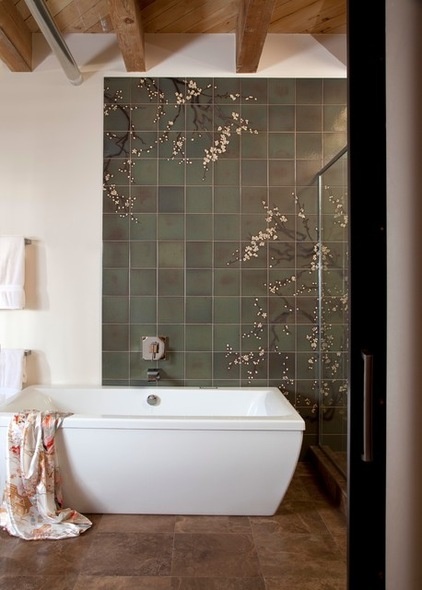
It all began in the master bath. After Quint completed this room, she had the clients’ full trust to finish the rest of the house. She claimed space from an awkward walk-in closet to extend what was a cramped bathroom, gaining enough room for the freestanding bathtub and a large stall big enough for two showerheads.
The hand-painted cherry blossom accent tile adds a serene Asian-inspired touch. Marble tile on the floor and walls cedes the spotlight to the hand-painted tiles.
Bathtub: Americh; tile: Kibak, via Ann Sacks (no longer available)
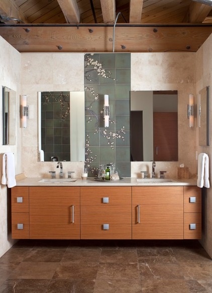
A mix of Asian and contemporary elements provide balance. Blossoms and other patterns on the marble tile soften the clean, modern lines. The custom floating vanity offers a strong horizontal element, while the accent tile balances it with a vertical gesture. The cabinets’ teak veneer runs horizontally, and their hardware completes the contemporary look. The mirror on the left wall conceals a recessed medicine cabinet; the one on the right, a TV.
The final project will be the roof deck. First the stairs must be extended up through the skylight to the roof, and then Quint will complete the outdoor space. She has promised to share it with us when the design is complete.
Custom cabinets: Kabi
Browse more homes by style:
Small Homes | Colorful Homes | Eclectic Homes | Modern Homes | Contemporary Homes | Midcentury Homes | Ranch Homes | Traditional Homes | Barn Homes | Townhouses | Apartments | Lofts | Vacation Homes
Related Articles Recommended


