Houzz Tour: A London Book Tower House Worth a Browse
Creating a versatile living space that included elegant book storage was the challenge facing Patrick Michell of Platform 5 Architects during the renovation of this Victorian house in London’s Hampstead area. The owners had seen the company’s Mapledene Road project and wanted to incorporate some of the same raw materials and brickwork into their new home, which also had to include a separate living area for their grown-up children.
“Not many clients would sacrifice a bedroom to create a double-height library space, but the family decided it should be integral to the design,” says Michell. “It’s a strong, unique architectural feature that works really well with the rest of the property, which is a mix of traditional and contemporary styles.” Michell also managed to retain a number of period details, such as decorative plasterwork and stained glass.
The home was converted from three flats into two, and now it’s the perfect blend of strong architectural design and comfortable living space.
Houzz at a Glance
Who lives here: A family with 4 grown-up children
Location: Hampstead, London
Designer: Platform 5 Architects
Size: 4 or 5 bedrooms; 3 bathrooms
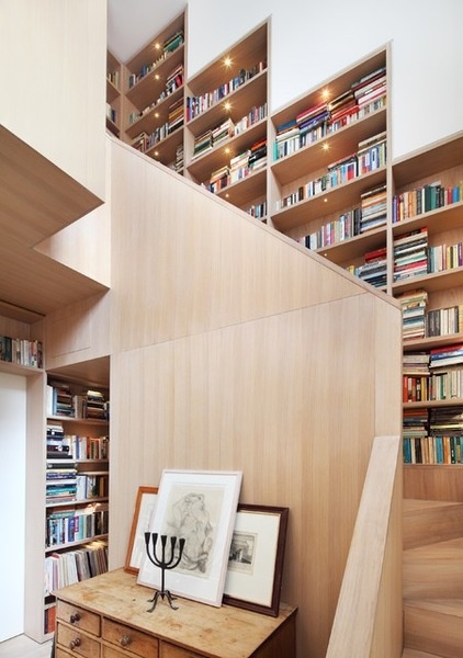
With such an immense book collection, suitable display storage was always going to be a challenge. But rather than squirrel their books away, the family opted to make the bookcase the main feature of their home. The bold, double-height staircase opens up the space, bathing the house in natural light that filters through the entire property. “The staircase is white oak and is essentially one piece of joinery,” says Michell. “The wood is warm but also quite pale, so it helps reflect the light in this part of the house.”
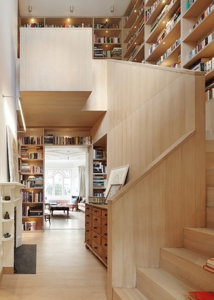
With so much light-colored wood, Michell was mindful to make the staircase not resemble a sauna. “The staircase is the heart of the house, so it was important to get it right,” he says. “I think the white oak works beautifully.”
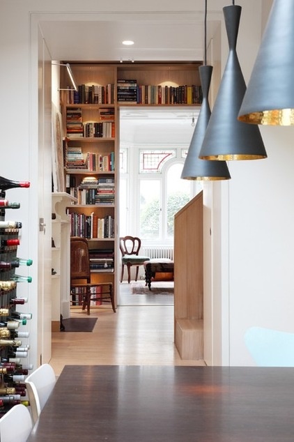
“One reference point the family gave us was their holidays in India,” says Michell. They were keen to incorporate lots of texture into the house, so Michell put together a warm palette of rich oak, exposed brick and concrete. Industrial-style touches, such as these Tom Dixon lights, create an intimate atmosphere in the dining area, while in the living room — just glimpsed — has been refurbished in a traditional Victorian style. “We adopted a very layered approach, with contemporary interventions alongside more straightforward Victorian-style rooms,” says Michell.
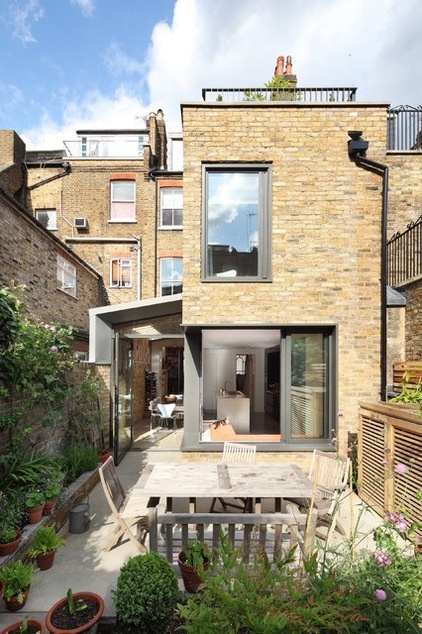
“The extension on the side of the house was a key part of the design,” says Michell. “We wanted to bring more light into the kitchen and dining areas, as this is where the family spend a lot of their time together.” The doors at the back of the house fold back completely, allowing the dining area to merge seamlessly with the garden during the summer.
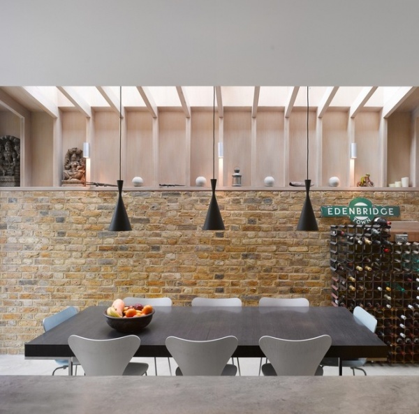
Exposed brick bathed in soft natural light creates a cozy atmosphere in the dining area, which is a popular gathering spot for the entire family. A contemporary table and Arne Jacobsen–style dining chairs ground this part of the house in a modern aesthetic. “Generally, this home is about using architectural elements to create a comfortable and inviting living space,” says Michell. The owner had originally wanted a spiral wine cellar descending into the basement, but budget restraints meant he had to settle for a wrought iron rack instead.
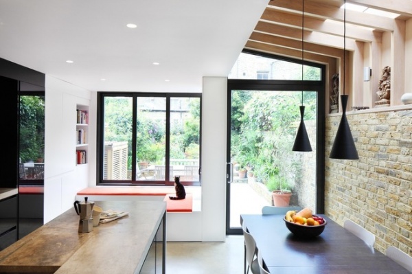
The kitchen combines architectural gestures with a muted palette to create a gentle space for family gatherings. The poured concrete floor is a very livable, hard-wearing surface that has a lovely, soft texture. “The family wanted the warm, muted tones of the concrete and brick to be the main focus in this part of the house,” says Michell. “We’ve hidden away some of the kitchen appliances to avoid it looking too cluttered and detracting from the overall tranquillity of the room,” he says.
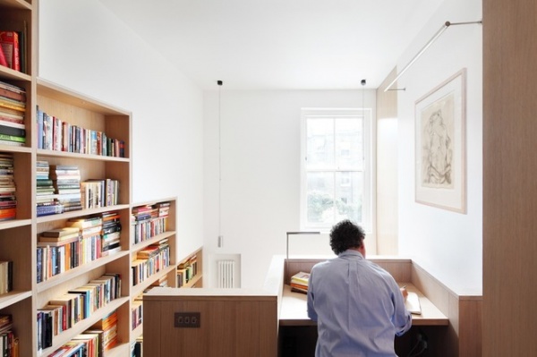
A cantilevered desk at the top of the stairs is designed to be a contemplative space. “It’s about creating a degree of separation while still being connected to the rest of the family,” says Michell. The double-height staircase was key to the strategy of bringing more light into the house. “It’s a deep building, so it would have been quite a dark interior otherwise,” he says.
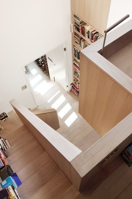
“It’s quite a restrained piece,” says Michell of his masterpiece. “It’s all very well thought out. The bookshelves relate to the stair height, so it accentuates the sense of movement as you flow up and down the stairs.”
More: Reading Shapes a Seattle Home
Browse more homes by style:
Small Homes | Colorful Homes | Eclectic Homes | Modern Homes | Contemporary Homes | Midcentury Homes | Ranch Homes | Traditional Homes | Barn Homes | Townhouses | Apartments | Lofts | Vacation Homes


