My Houzz: Ronnie Wood’s Old Art Studio Gets a Makeover
“We weren’t looking for a project,” says Londoner Nic Farhi, remembering first seeing his flat, “but when I spotted the original floorboards and brickwork in the living room, I knew I had to buy this place.”
Nic and his then-girlfriend (now wife) had spent months scouring Clerkenwell for the perfect home, so he was determined not to let the grotty interior of this flat in a former seamstresses’ factory put him off. The building dates back to the 1880s and is one of the few in the area to have survived extensive bombing during World War II. During the renovation, Farhi discovered another clue to its heritage. An old gas bill revealed that Ronnie Wood of the Rolling Stones had previously owned the flat and had used it as an artist’s studio!
With help from architect Robert Rhodes of robert rhodes architecture + interiors and Benedict Pippet from Bondsbury Construction, plus a little bit of inspiration from Houzz, Farhi transformed the property into a relaxed and stylish home. Now finished, it blends strong original features, such as exposed roof beams, with stylish, contemporary furniture. “Planning our wedding coincided with the renovation work, so it was quite a stressful time,” says Farhi. “I absolutely loved it, though. I can’t wait to do another project!”
Houzz at a Glance
Location: Clerkenwell area of London
Size: 3 bedrooms, 2½ bathrooms
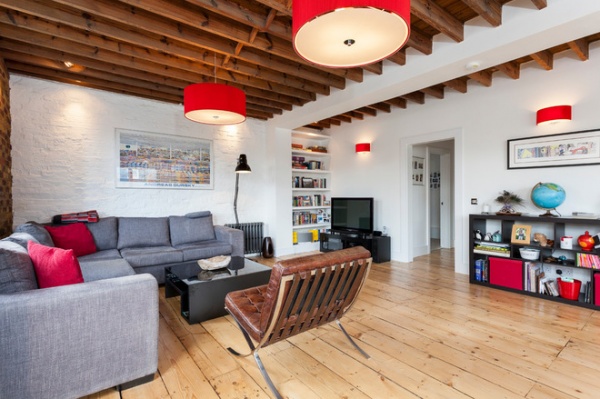
“We were very much inspired by the original features in the living room,” says Farhi. “We wanted the scheme to complement them and not dominate the room.” The original floorboards were covered in paint from when Ronnie Wood used the flat as an art studio, but with a little TLC and some careful stripping back, they became beautiful again. The room was largely configured around the sofa, which Farhi already owned, while the red Zaragoza pendant lights by där lighting were love at first sight. “I found them online, but I knew they’d look absolutely perfect,” says Farhi. He had the reproduction Barcelona chair (originally designed by Mies van der Rohe) covered in distressed brown leather to complement the floorboards.
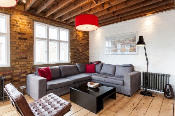
The original brickwork in the living room was one of the features that persuaded Farhi to buy the flat in the first place. “We love the brickwork and have deliberately kept this room feeling pared back,” says Farhi. “It’s quite a relaxed space.” Discreet directional spotlights fitted in the ceiling turn the brickwork into an authentic feature wall, producing a pretty glow against the textured surface at night. The black lacquered coffee table is from Wayfair, and the large Anglepoise floor lamp was a wedding gift from John Lewis.
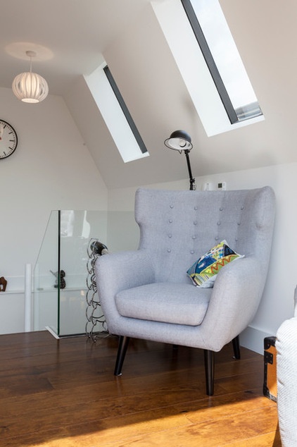
This area by the stairs is bathed in natural light from the large French windows in the kitchen and the skylights. “This little corner gets all the sunshine, so it’s a wonderful spot to sit and read,” says Farhi. The grey Kubrick wingback chair was another Internet purchase from Made.com. “We were so busy planning our wedding at the same time as doing the work on this flat that we had to buy most of our furniture online,” says Farhi. “We would spend a couple of hours scouring the Internet in the evenings looking for pieces we liked.”
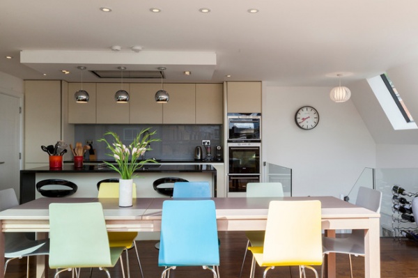
This part of the flat has been completely reconfigured to create a generous kitchen and dining area that is perfect for entertaining. Working with a tight budget, Farhi sourced the kitchen from the London Kitchen Shop. “It looks just as good as a more high-end model,” says Farhi, “but was a fraction of the cost.” Pastel-colored dining chairs from John Lewis complete the look. “They were the cheapest chairs in the store, but they look amazing,” says Farhi. “I’m so pleased with them.”
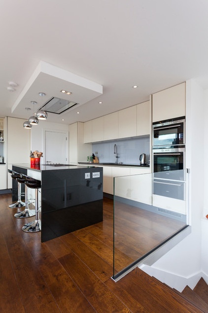
The kitchen units are by Dutch company Keller, from the London Kitchen Shop. The large island is wrapped in black granite that contains tiny flecks that glimmer in the light.
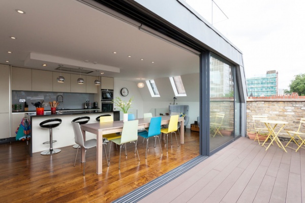
“We have lit the brickwork on the small balcony with spotlights, and when they are turned on, there is an amazing sense of flow between the indoor and outdoor space,” says Farhi. “Even in December, you can be sitting inside, but it feels like you’re having a picnic.” The enormous French windows had to be hoisted in but, reckons Farhi, they speak for themselves. “This part of the flat does not need any other embellishment,” he says.
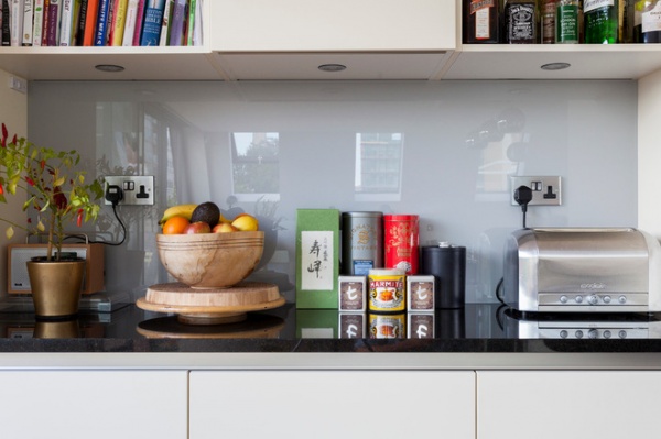
“We thought about going for a more eye-catching color scheme for the kitchen,” says Farhi, “but at some point, we will sell the flat, so we decided to maintain the crisp, neutral palette.” The couple introduced a few glamorous touches, though, including this glass backsplash; they add a dash of character without detracting from the pared-back aesthetic.
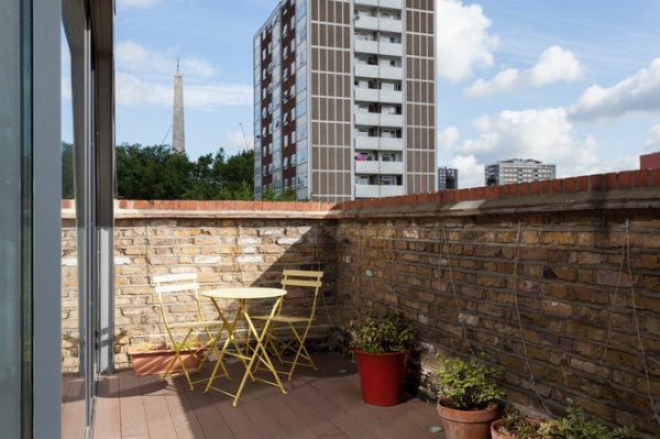
Farhi wanted to keep the decking on the balcony the same height as the oak floor in the kitchen to ensure a seamless flow between these indoor and outdoor spaces.
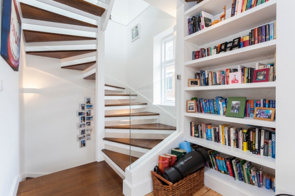
“I found the design for the spiral staircase when I was browsing on Houzz,” says Farhi. “I love the interplay between the white risers and the dark wooden treads. We’re really happy with the way this looks.” The open staircase covers all three floors of the flat, which presented the couple with another challenge. “Apparently, it’s illegal and a fire hazard to have an open staircase over a number of floors,” says Farhi, “so we were required to either close it off or put a sprinkler system in.” The couple went with the sprinkler system. “It was definitely worth it, because the staircase is such a fantastic feature in the flat,” says Farhi.
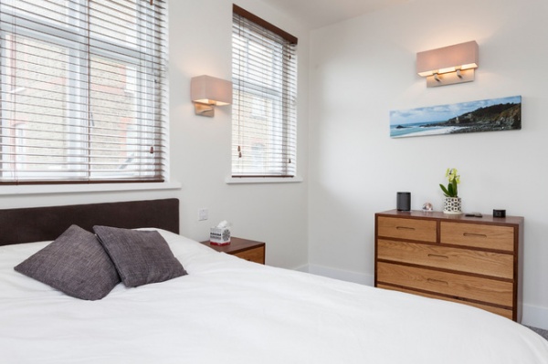
Three large windows flood the master bedroom with light, making it feel airy and spacious. The bed, from the Storage Bed Company, contains storage for Farhi’s little-used bike, while the chest of drawers and bedside cabinets are another Houzz-inspired purchase. “I saw something similar on the website,” says Farhi, “and I took a photograph to Crispin & Gemma Furniture Design in Spitalfields, and they re-created it for me.”
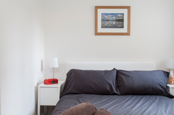
“Strictly speaking, the guest bedroom is not really big enough for a double bed,” says Farhi. “We had to find really narrow bedside tables to fit next to it.” Luckily, these slim units from Ikea fit perfectly.
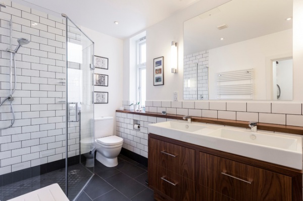
Metro tiles from Fired Earth and a basin from CP Hart form the basis of this New York hotel–inspired bathroom. “The beautiful unit is actually a bespoke piece, which Robert, our architect, had made,” says Farhi.
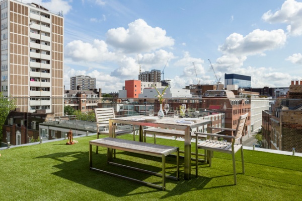
“The roof terrace has to be my favorite spot,” says Farhi. “Sitting up here on a lazy afternoon gives me so much pleasure. We are right in the heart of the city, but it’s so calm up here.” The flat is in a conservation zone, so Farhi had to jump through a number of hoops to keep the local council happy when renovating this space, including installing glass boundary walls that would not be visible from street level. The fake grass (from Easigrass) feels wonderful underfoot, says Farhi. “It’s just great hanging out up here. As it’s a conservation zone, there are few high buildings, so the views are incredible in every direction.”
Browse more homes by style:
Small Homes | Colorful Homes | Eclectic Homes | Modern Homes | Contemporary Homes | Midcentury Homes | Ranch Homes | Traditional Homes | Barn Homes | Townhouses | Apartments | Lofts | Vacation Homes


