Houzz Tour: A Sophisticated Row House in the U.S. Capital
This 19th-century row house was in what a real estate professional would call “move-in condition” when Samantha Friedman’s client bought it. But, as we all know, serviceable doesn’t equal soulful. The homeowner hired Friedman, principal at Samantha Friedman Interior Designs, to make the home to his taste.
The client loved the architectural style of the new home but was less enthusiastic about the traditional wallpapers, gilded chandeliers and black marble bathrooms. “It was all very heavy,” says Friedman. “He wanted us to brighten it up and modernize it.” Friedman created a neutral color palette with layers of texture that made it more exciting than egalitarian. “He wanted a simple palette with little pops of color,” says the designer. “He also wanted a look that felt collected and comfortable. I love that kind of style, as it makes a home feel lived in and inviting.”
Photos by Jesse Snyder
Houzz at a Glance
Location: Near Dupont Circle in Washington, D.C.
Who lives here: A single man in his 40s
Size: About 3,821 square feet (355 square meters), 3 bedrooms, 3½ bathrooms
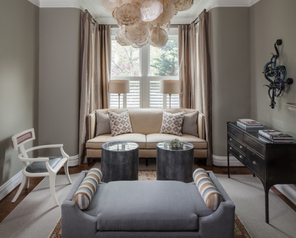
In the living room, two seating areas invite guests to linger. Both are anchored by a large, upholstered bench in the center of the room. On one side, a love seat, an armchair and two small occasional tables make up a conversation area; on the other a coffee table and two armchairs provide another gathering spot.
“In this home the ceilings are high, so we chose to hang statement light fixtures,” says Friedman. “The first thing you see is the large chandelier made of capiz shells. It’s so dramatic, we chose not to hang a large artwork directly over the fireplace.”
The diminutive chair to the left of the window brings in more personality. “We needed a low-profile chair here to save space. We also wanted something that could easily be moved during parties,” says Friedman. “This chair has great lines — our client nicknamed it the Robot Chair. We gave it presence with a red plaid upholstery on the back and made it more durable with a vinyl seat covering.”
Sofa: Oly; coffee tables: Made Goods
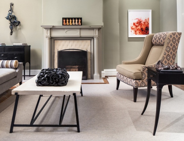
The fireplace got an updated look with a new tile surround and a freshly painted mantel. “It was very dark, and that was bringing everything down,” says Friedman. “I like to put tile with some movement around fireplaces — it adds so much dimension and depth.”
Adding two fabrics to the armchairs on the right of the fireplace was a matter of practicality and style. “We like to put a more durable and neutral seat fabric on chairs, and then a bolder pattern on the sides and back,” says Friedman. “If you get tired of that print in five or six years, it’s a lot less expensive to replace a portion of the upholstery than the whole thing.”
Wall paint: Herbal Escape, Benjamin Moore; coffee table: Oly
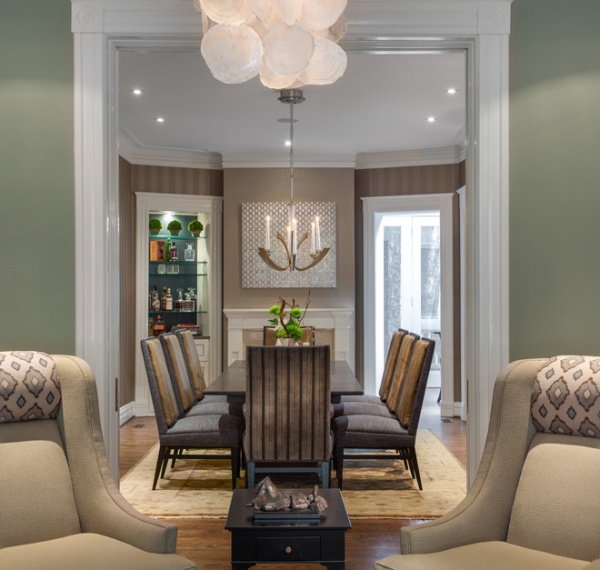
Adjacent to the living room is a long dining room.
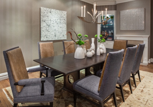
The designer describes her client as a “big man with a big personality” and says that he likes to linger over the dining table, talking with friends. “Because of that, comfortable chairs around the table were essential,” she says. “These chairs have leather backs that are like butter.”
The walls are covered in two different wallpapers that share a color. “It’s a way of making the room more visually interesting,” says Friedman. “It’s a different move, but our client wanted design that didn’t look like it came out of a box.”
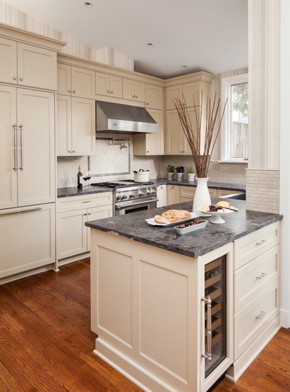
The neutral palette extends to the kitchen, where the cabinets are painted a soft beige. To relate the modern space to the era of the home, the designer chose hardware with a turned-spindle look.
Cabinet paint: Stony Ground, Farrow & Ball
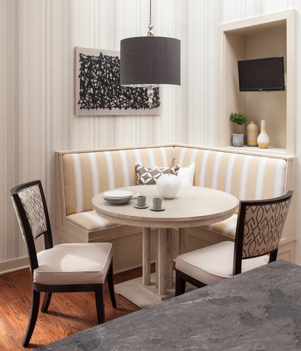
Before the redesign two passageways led from the kitchen to the dining room; Friedman sealed one to make way for a banquette table. The frame of the former doorway allows the television to be at a comfortable viewing distance.
“The wallpaper has zigzag dots that make a striped effect, and this plays off the more defined stripes on the banquette upholstery,” says Friedman.
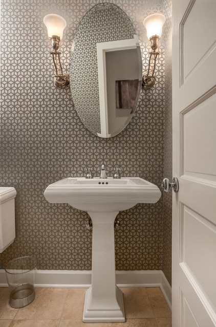
In the nearby powder room, the mirror, pedestal sink and sconces were all there when Friedman’s client took residence. She gave the room a jolt of excitement with a geometric wallpaper whose cube pattern is decorated with glitter. “Every other room is special,” she says. “We wanted to glam it up a bit here.”
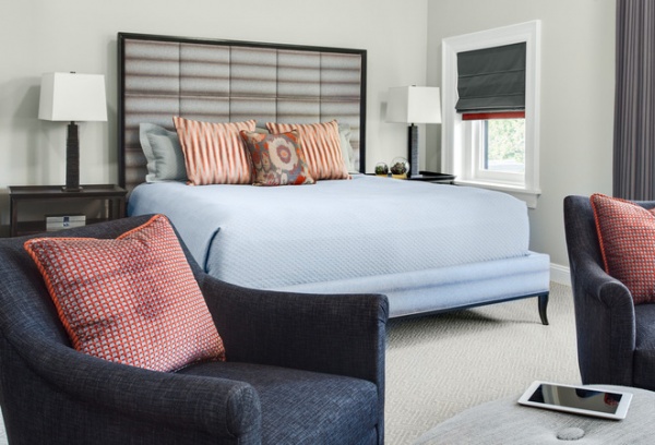
The client’s ideal bedroom description included terms like “masculine,” “clean” and “elegant.” Friedman obliged with a menswear palette of gray, light blue and burnt red-orange.
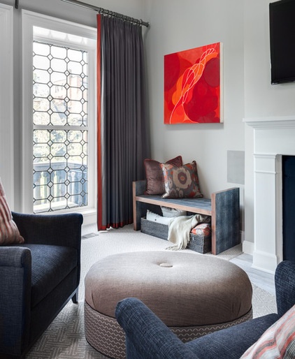
“To me the red accents look like a snappy tie or a pocket square,” she says.
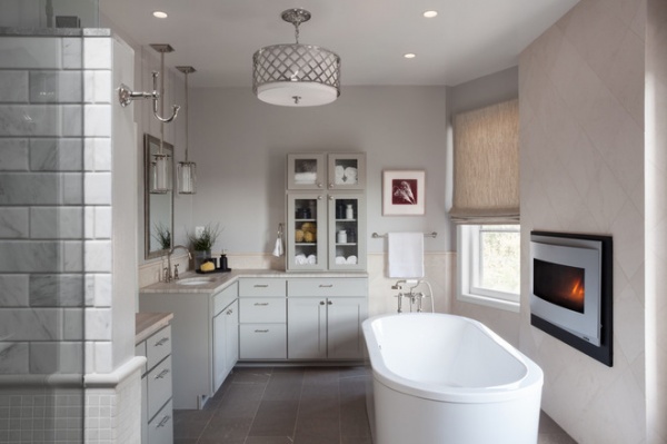
The bedroom originally had a claw-foot tub that was angled toward a gas fireplace.
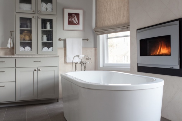
The designer improved the flow of the room by putting the new tub parallel to a new seated-eye-level fireplace. “He travels a lot, and he wanted to come home to a Jacuzzi bathtub,” Friedman says.
Fireplace: Heat & Glo
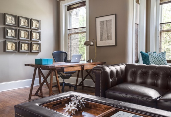
The study is a place of industry and retreat. “My client works a lot, so he needs an office at home,” Friedman says. “But he also needs a space for simply hanging out.”
Artwork: Natural Curiosities
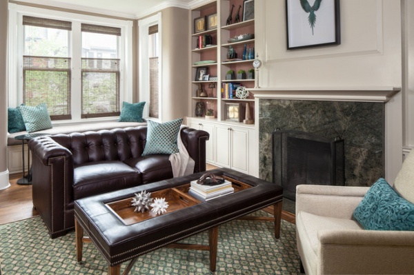
A tufted leather sofa near the desk is where he can sit and relax with a laptop or watch television (the TV, not seen, is on the wall opposite).“This room is also a place for him to do nonwork activities,” says Friedman. “He can plop on the sofa with a laptop and hang out and watch games on TV.”
She sums up, “The finished home feels put together and well edited, but comfortable, inviting and easy to live in. That was our goal.”


