Room of the Day: Newlyweds Embrace a Colorful New Look
http://decor-ideas.org 07/21/2014 21:14 Decor Ideas
Interior designer Jennifer Reynolds had to work hard to sell a recent groom on letting chartreuse into his life. Her newlywed clients were decorating their first home together, and “he was in favor of only using gray and navy,” she says. But she and the bride successfully cajoled him into loving sunny yellows and bright greens.
“He was so glad in the end; the room didn’t come alive until we added the last layer of draperies and accessories,” Reynolds says. Their completed living room offers great lessons in balancing colors, saving, splurging, mixing patterns and textures, and maximizing seating in pleasing arrangements.
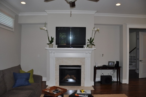
Here you can see that the couple’s blended belongings did not add up to much. Lack of seating and color were two of the biggest drawbacks. “They wanted space for entertaining, good flow and plenty of seating,” Reynolds says.
Their new Craftsman-style house already had good architectural bones, and the media wires were already built into the walls, so Reynolds had a running start.
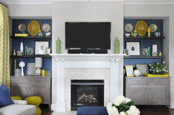
AFTER: The new room is colorful, comfortable, practical and sophisticated. The fireplace served as a strong focal point; Reynolds enhanced the symmetry by flanking it with cabinetry and floating shelves. “Symmetry is important in achieving balance and comfort in a room,” she says. “A room that is heavy on one side can feel off.”
Splurging on grass cloth wallpaper for behind the shelves brought in a strong layer of color and texture. “These days grass cloth is available in the most beautiful colors and even patterns,” the designer says. They were able to use the leftover paper on the dining room’s ceiling coffers, which kept them from wasting any of it and extended the color and texture from one room to the next. If you’re sticking to a smaller budget, Reynolds says that painting behind the shelves is also a good option.
Although the cabinets look like built-ins, they are actually freestanding console pieces. “Built-ins are nice, but everyone has them — we wanted to do something different,” she says. “And the great thing is, if they ever move, they can take these freestanding console pieces with them.” The versatile pieces could also be repurposed in any room of the house.
How to Achieve Balance Using Symmetry in Design
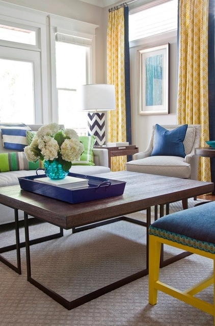
The furniture arrangement posed two challenges: 1. Moving the TV from its spot over the fireplace was not an option, and 2. the French doors needed to be accessible, which narrowed the width they could work with.
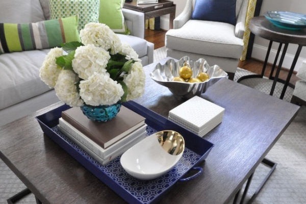
Reynolds began by centering the space with a large coffee table. “I love a large coffee table, as large as the room and other furnishings will allow,” she says. “It is the center point of the room, and I never want it to look like an afterthought or a small postage stamp swimming in the middle of a space.”
She points out that a large coffee table can serve many functions: You can put feet up, set up projects and homework, use it as a serving space during parties and use it as storage. “It’s nice to have enough room for all of your favorite coffee table books, decorative boxes to hide all of the remotes and still have room to use the table as needed,” she says.
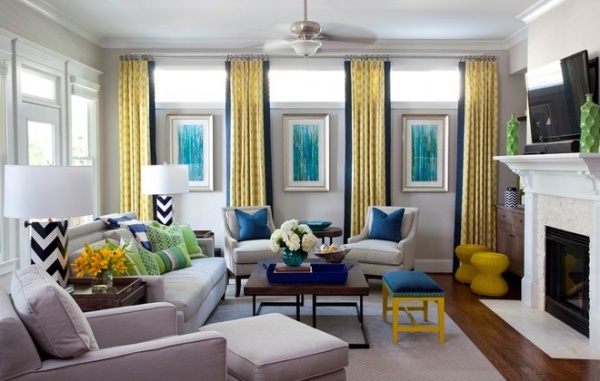
Between the sofa, chaise, upholstered chairs, bench and small yellow ottomans, Reynolds worked in plenty of seating for entertaining.
As for the color palette, she used a careful balance of neutrals and bold colors. Although the groom said he wanted a neutral palette, Reynolds intuited from the inspiration photos he’d chosen that she could stretch him toward bolder hues. “We started with a very neutral base; the large, expensive pieces are very neutral with interesting textures, like linens and solid geometrics,” she says. “Once all of the neutral pieces were installed, we balanced the use of color throughout the room.”
While the room looks sophisticated, Reynolds did not scrimp on practicality. All of the fabrics are stain guarded, the furniture is cushy and comfortable, and the ceiling fan is a must in the South. “I try to keep a fan as simple and modern as the room will allow; the least noticeable the better — no color and no contrast,” she says. The rug is bound stain-resistant carpet with a small geometric pattern. “It’s great for spills and easy on the budget; I love doing this in large rooms,” she says.
All fabrics: Kravet
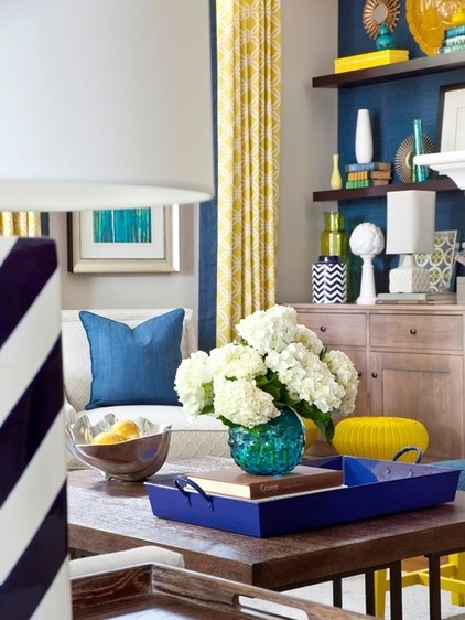
While splurging on larger pieces that the couple will use for many years to come, Reynolds saved on colorful accessories. “I love the Nate Berkus line from Target. Quick tip: If you see something at Target that you love, grab it, because it will be gone!” she says.
When it comes to mixing patterns, Reynolds advises to keep to two or three patterns and then repeat the motif in different colors and scales. Here she chose a chevron pattern and circles — some bold, like the reading lamps, and some very subtle, like on the two accent chairs.
“You just can’t rush good bookcase and shelf styling,” Reynolds says. She mixed propped and hanging items when styling the shelves, which gives them a balanced look. She generally begins with larger objects and then fills in smaller pieces around them, balancing color along the way. “It’s a little tricky, but if you just stand back, you can see where you need a specific scale or color — keep moving things around until you get it just right,” she says.
Decorating Secrets: How to Layer Patterns Right
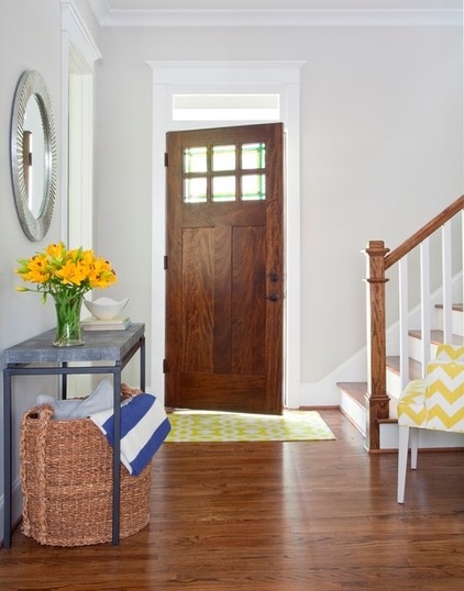
Reynolds loves to draw people into a room with layers of texture; she believes texture is just as important as scale, color and balance. “I think layering texture in any room is so important. I love it when a client sees their room for the first time and they just want to touch everything … the texture is what draws them in,” she says.
Speaking of drawing people in, the adjacent foyer gives visitors an idea of what to expect as soon as they enter the house. An amped-up chartreuse chevron pattern and touches of navy and gray are all part of the first floor’s flow. A faux shagreen console table and a large woven basket extend the rich textures right to the front door.
Related Articles Recommended


