Houzz Tour: A New Lake House Gets a Lived-in Look
http://decor-ideas.org 07/20/2014 03:14 Decor Ideas
When interior designer Sonya Kinkade first talked about this lake house with her clients, she asked what their primary residence was like, then took the project in a completely different direction. “This space was to be a getaway from everyday life,” she says. Inside the beachy cedar-shake-shingled cottage, crisp white and fresh fabrics contrast with warm woods, and new pieces mix with antiques. She combined high- and low-end accessories and finished off the look with found objects, creating the feeling that the home had been furnished over many years. “I think the main key element in any of my cottage designs is to create a space with a sense of everyday ease,” she says.
Houzz at a Glance
Location: Lac Desormeaux, Quebec
Size: About 2,000 square feet (186 square meters); 3 bedrooms, 2 bathrooms
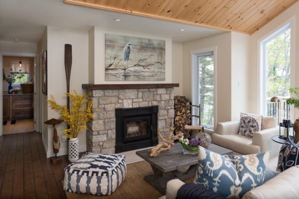
The living room provides large views of the lake. Kinkade used a mix of natural textures to complement the surroundings. The fireplace is natural stone in a thin-cut veneer. The rug is a natural-fiber jute, the cotton pouf is handmade, and the sofa is leather. “I love the warm woods and chippy paint pieces against a fresh backdrop of clean, updated walls and window treatments — it really makes them come alive,” she says.
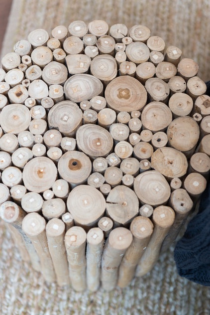
A branch end table adds an organic touch. “Everything in this space reflects what’s outside in the use of color, texture and form,” she says. A mix of fabrics in blues, tans and creams brings an elegant touch to the room.
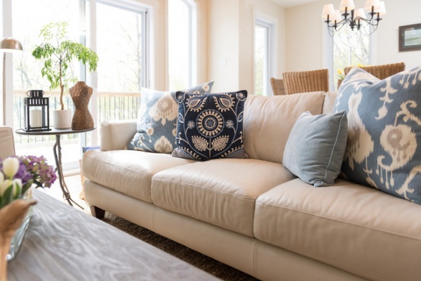
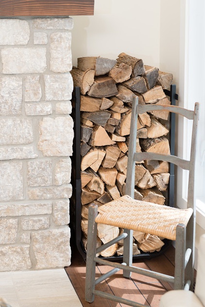
Stacked wood lends a casual feeling to the elegant yet comfortable room. By keeping the room “a bit eclectic,” she says, Kinkade was able to achieve this balance. “I love mixing new with old, vintage with modern, high end with low end,” she says. “I do not like anything too predictable, so I tend to use a lot of mismatched furniture.”
This approach makes the space look like it has been developed over time, like the pieces were chosen at different times through the years. For example, the oar propped against the wall was an antique find, the driftwood piece on the coffee table looks like a found object, and the painting over the fireplace was a lucky HomeSense score.
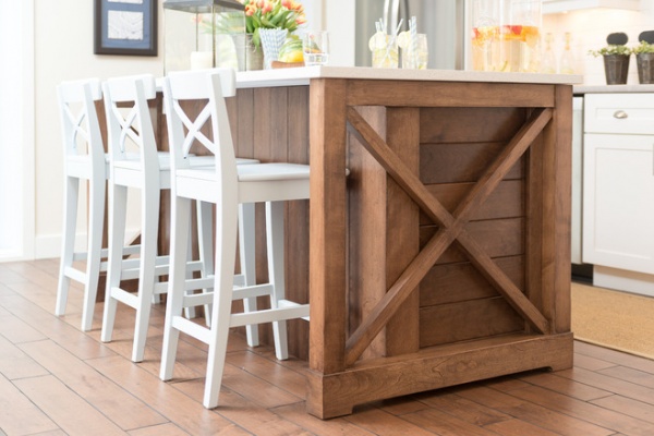
Because the kitchen design is simple, Kinkade wanted the island to make an impact on anyone entering the kitchen from either side. She designed large “X” details on each side of the island to make it stand out.
The other side of the island contains a microwave and storage drawers. Its countertop is quartz, and the wood was stained to match the dark flooring. Kinkade had the Ikea stools painted a very faint light blue hue.
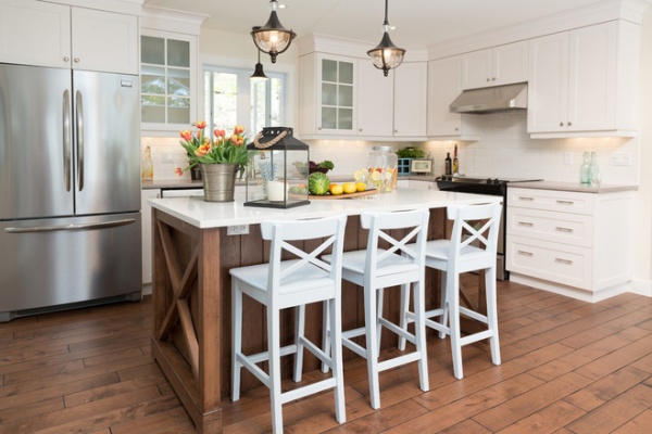
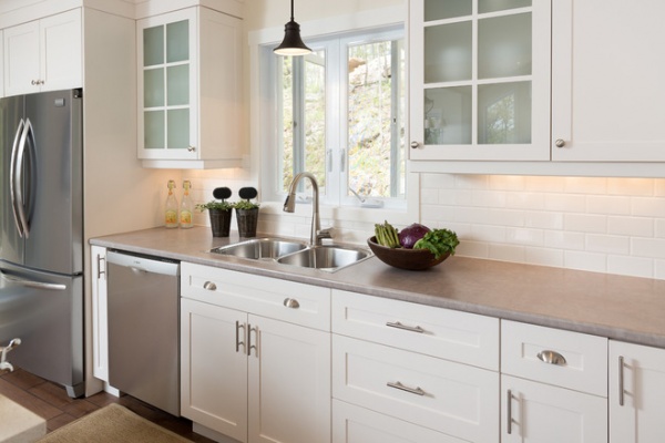
“I added the paned glass to help break up the solid cabinetry,” she says of the clear cabinet doors. “It keeps the kitchen interesting and helps it to feel lighter.”
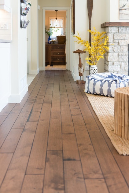
The flooring is all local handmade wide planks, antiqued and finished with a warm stain.
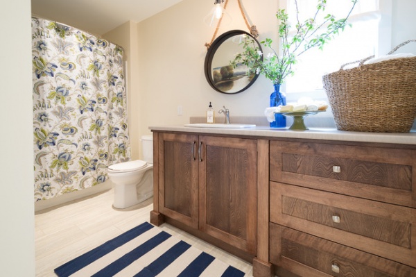
In the main bathroom, the mirror is a slight nod to nautical style. Warm wood contrasts with a blue and white striped rug.
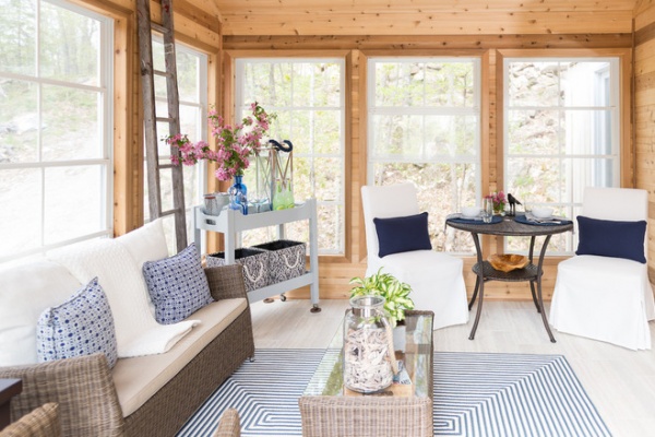
The cozy sunroom is a three-season room. The walls are warm natural knotty pine, and the floors are 12-inch by 24-inch porcelain tile. Woven furniture and a flat rug lend a casual outdoor feeling, while crisp white upholstery keeps things feeling clean and bright.
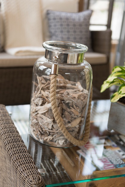
A jar with a nautical rope handle corrals a collection of small driftwood pieces.
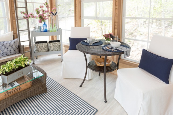
At first the clients didn’t think they would want a table out here, but Kinkade was confident they would wind up loving it. Now they enjoy having meals out on the sunporch.
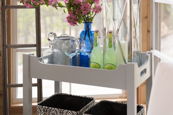
She also made sure they had room for an ice bucket, glassware and bottles for easy drink service.
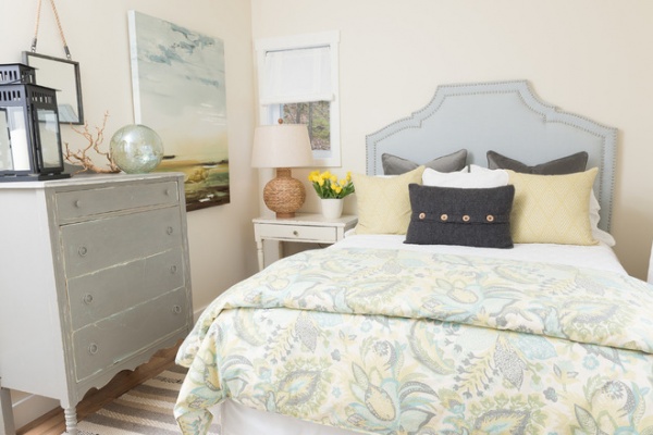
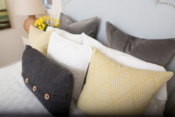
In one of the guest rooms, a mix of bedding creates an inviting bedscape. A soft botanical-print duvet cover sets the color palette of light butter yellow, cream and soft gray-blue. The headboard is upholstered in linen with nailhead trim.
The dresser and nightstand were antique finds. “I really love to mix my fabrics to create interest and lots of texture,” Kinkade says. Both the antiques and the mix of textures create that pleasingly mismatched, bought-over-time feeling.
Duvet cover: Pottery Barn; coverlet: HomeSense
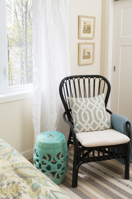
A woven chair, trellis-patterned pillow and ceramic Chinese garden stool are more eclectic touches.
Chair: Ikea; stool: Pier 1 Imports
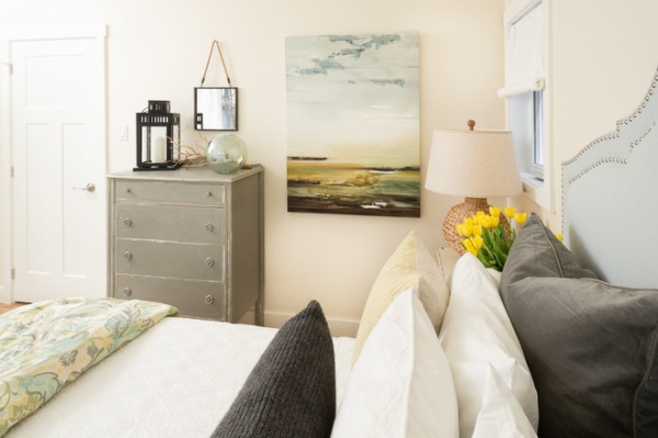
The final touch is another HomeSense score, a landscape that picks up on the room’s color palette.
When it comes to curating antiques, Kinkade offers simple advice. “Just buy what you love, but don’t go overboard,” she says.
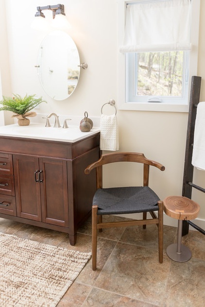
A store-bought vanity saved money but left some awkward space in the guest bathroom. “It was a great opportunity to bring in a little chair and table, making it cozy and creating a great visual from the hallway,” Kinkade says. “The ladder is not only good-looking but practical, because it can hold four towels if need be.”
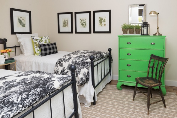
“I really wanted a green room without it actually being green,” Kinkade says of the other guest room. She figured the best way to achieve this was to have one very bold green piece accented by a few smaller dashes of green in the artwork and fabrics — for example, in the botanical prints she found online and finished off with Ikea frames.
The brass beds were a used online find; Kinkade had the frames painted a flat black. The rug adds subtle neural stripes underfoot and helps tone down the green dresser.
Rug: HomeSense
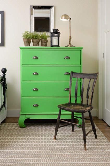
Kinkade found the dresser in a scratched-and-dented section and spray painted it bright pencil green. “I felt to help balance the bright green, I would dull it with black and white,” she says. “When I decided on the black and white, my mind quickly jumped to toile … what is better then a black and white toile, I ask you?” she says.
Apparently, her clients thought a lot of things were better than black and white toile paired with a bright green dresser. At first anyway. “When I presented the plan for this room to my clients, it was not well received — my client really did not like green and especially a green like this,” she says. “But I was sure they would love it.” Because they trusted her, they let her proceed, and now they absolutely love the room, bright green dresser and all.
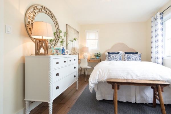
In the master bedroom, things are more serene. “In a cottage it is important to keep it fresh but cozy and warm,” Kinkade says. “The white and pops of blue keep it vivid and fresh, and the warm woods help ground the space.”
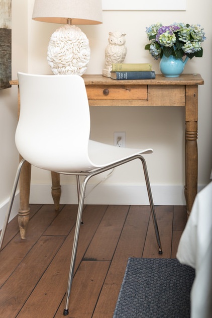
Kinkade squeezed only one bedside table into the cozy room, one that doubles as a small writing desk. Scooting the bed over also allowed her to fit the white dresser into the room.
The lake house provides a truly relaxing getaway for the clients. “In the end a cottage should look lived in and loved, piece by piece … nothing should be too pretentious,” the designer says.
Related Articles Recommended


