Kitchen of the Week: Fine-Tuning a Connecticut Farmhouse
http://decor-ideas.org 07/18/2014 19:15 Decor Ideas
You don’t need all-new appliances, a completely different layout or a major addition to give a kitchen a fresh look and feel. Take this family’s 400-square-foot kitchen in a sophisticated farmhouse in southern Connecticut. The owners liked the location of their sink and range and wanted to keep the breakfast nook. But they were ready to lose their dark counters and old-school cabinets with traditional feet. Quick and painless design moves like adding a pocket door to the dining room, new windows above the sink and custom cabinets helped deliver a powerful update.
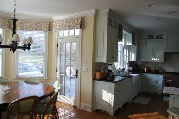
The existing kitchen was attractive and functional but very traditional in flavor (notice the feet on the cabinets and dark counters). The owners and their architect, Jimmy Crisp, set out to give it a more modern look that still respected the home’s architecture.
Photos by Rob Karosis
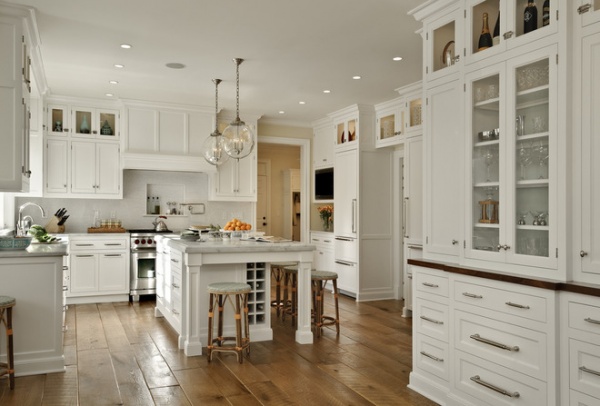
AFTER: A custom island replaced the existing one; it includes a trash center with storage drawers on one side and storage cabinets, tray storage and a built-in recessed wine rack on the other. “We purposely planned it with seating on the outside of the island so the kids or anyone sitting there stays out of the way of the work triangle,” Crisp says.
Posts on the island are both decorative and functional (they allow legroom for those seated). Meanwhile, an extra-thick honed Mother of Pearl quartzite top has a 1-inch overhang that protects the cabinets below.
Custom cabinetry: JEM Woodworking; cabinet hardware: RK International
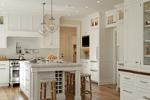
The new custom cabinets add a sort of Shaker simplicity. The upper cabinets have larger glass fronts with lights inside that offer a better look at the collectibles on display. Meanwhile, the sleek new handles, knobs and pulls lend a more contemporary edge.
Learn about choosing cabinet knobs and pulls
The existing vintage oak floor from old-growth trees was in fine shape, but a refinishing provided a wonderful backdrop and a contrast that heightens the brighter details found elsewhere.
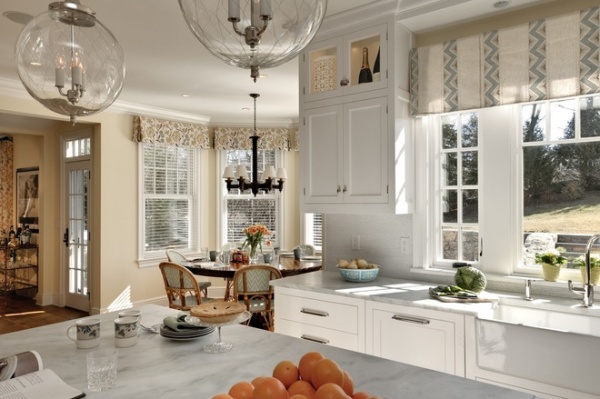
Above the sink, new casement windows and a large picture window offer clear views of the yard outside.
Light fixtures: Sorenson Lanterns, Remains; faucet: Kallista; sink: Rohl; dishwasher: Miele
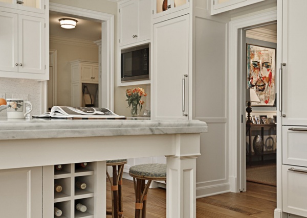
The new pocket door on the right replaces a cased opening to provide more privacy for the kitchen during dinner parties. Two refrigerators with panel fronts and drawers below flank the door. “It became an architectural element to surround the opening with the two refrigerators,” says Crisp. “It also made sense for this family with kids.”
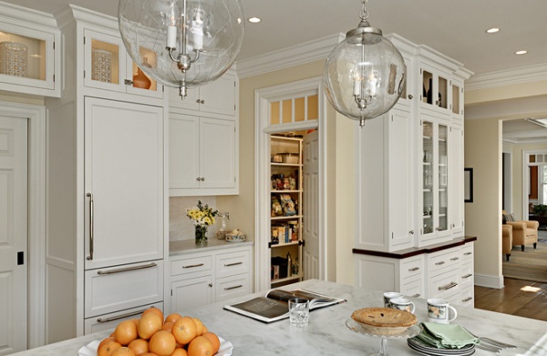
A new door with transom windows updated the pantry. A custom hutch on the side of the pantry gives the homeowners additional glassware storage.
Wall paint: custom cream color (similar to Benjamin Moore’s French Vanilla); ceiling paint: custom white color (similar to Benjamin Moore’s Bavarian Creme)
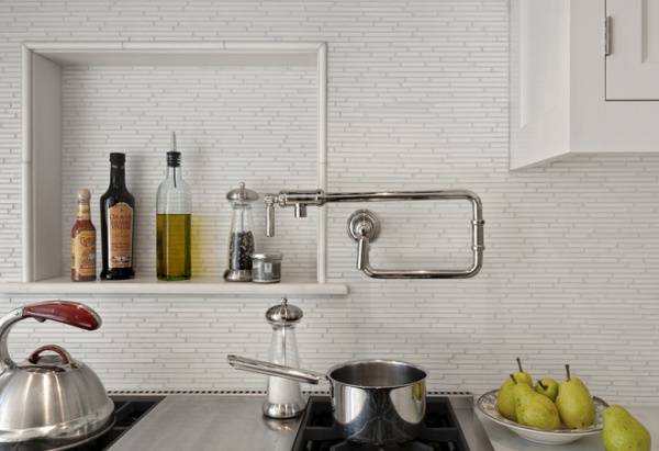
White Carrara marble tiles in a random brick mosaic create a textured backsplash behind the existing range. A niche provides a place for spices and bottles of oil. “A white kitchen becomes a palette, and everything you put into it is emphasized, from interesting lighting to all the little details that add the character,” says Crisp.
Pot filler: Quincy Wall Mount, Kallista
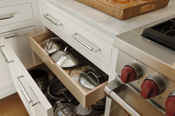
Shallow drawers next to the range offer storage for lids, while deeper drawers below store pans and small pots. Storing pots and pans separately from the lids in drawers is a great way to keep things organized, says Crisp. It also eliminates having to search for lids in the back of a cabinet.
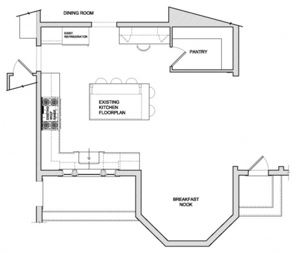
This “before” floor plan illustrates how the previous kitchen had lots of basic components.
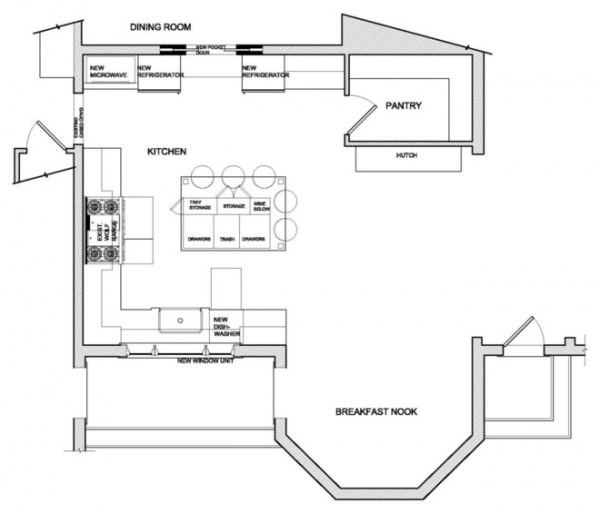
AFTER: Fine-tuning and making the details cleaner built on what the kitchen already offered without reinventing the wheel.
See more Kitchens of the Week
Related Articles Recommended


