Houzz Tour: Reading Shapes a Seattle Home
http://decor-ideas.org 07/15/2014 01:13 Decor Ideas
This house should restore your faith in the printed word. To accommodate his clients’ love of reading in their new home remodel, architect John DeForest took a detailed inventory of every book on every shelf, table and mantel inside the couple’s former house. “We realized we needed at least 300 linear feet of shelving,” says DeForest. He also noted daily rituals around reading — including the newspaper in the morning, with the dogs nearby, before bed and more.
Photos by Benjamin Benschneider
Houzz at a Glance
Who lives here: A pair of avid readers and their 2 dogs
Location: Seattle
Size: 4,400 square feet (409 square meters); 4 bedrooms, 4 bathrooms
Although the Tudor-style home that the couple bought was dark and disconnected from the garden and Lake Washington views, they didn’t want to join the teardown-and-replacement-mansion trend that they felt was occurring all over the neighborhood. “The owners loved aspects of the house and chose to renovate a relatively modest structure,” DeForest says. Beyond the books they wanted to open things up, provide room for their visiting children and grandchildren, and create a “forever” home where they could age in place.
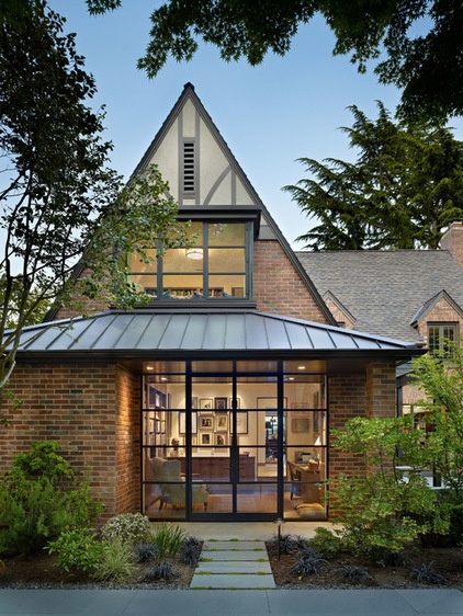
This portion of the facade shows the exterior of stacked his-and-her offices, both with views to a secret courtyard garden.
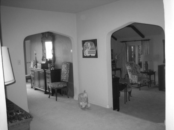
There was nothing dramatic or open about the existing entry hall. Throughout the main floor, there were heavy plaster walls between the entry, kitchen, dining room and living room. They made each room feel dark and small.
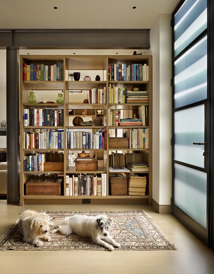
AFTER: “Where the old entry hall was closed and gloomy, the new one is open and light-filled,” DeForest says. The owners’ dogs, Sherman and Emma, rest near the new front door, made with etched glass that provides privacy but lets in natural light.
Working with interior designer Nancy Burfiend, DeForest replaced the plaster walls with steel beams and created permeable walls with rift-sawn oak open bookshelves to store part of the couple’s extensive collection. Minimalist steel windows and doors provide counterpoints to the heavy brick masonry while maximizing light and views.
DeForest created a sense of calm and continuity throughout the entire floor by repeating materials, including stained white oak floors and cabinets, as well as matching interior doors and using natural stone and neutral paint colors.
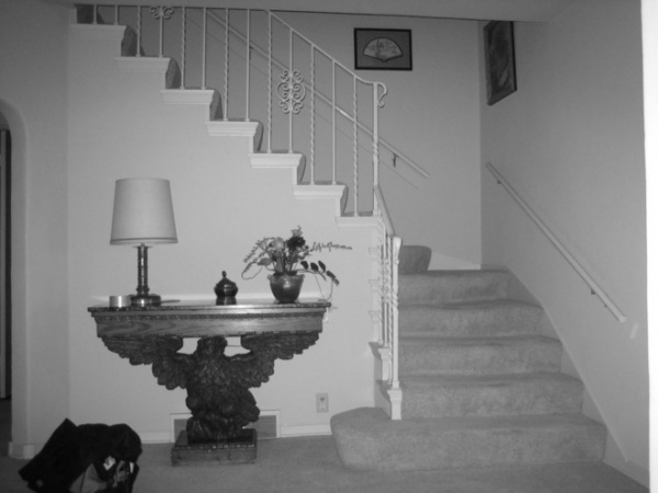
The style of the former home’s interior elements, including the out-of-date staircase, didn’t appeal to the homeowners’ tastes.
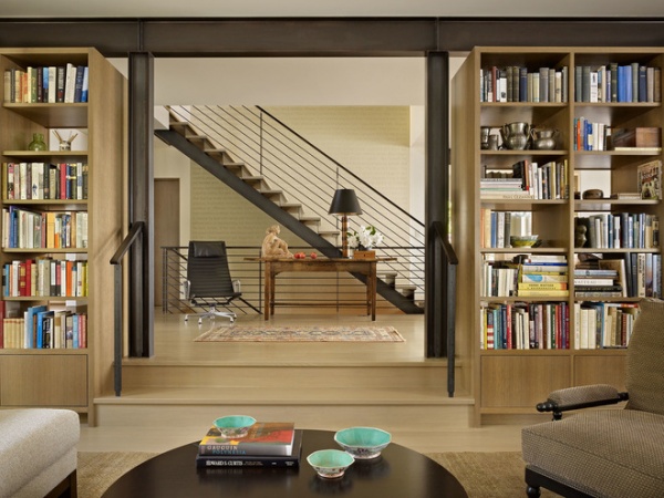
AFTER: The rift-sawn oak bookshelves are set between the main entry and the library/living room. “The warmth of stained white oak plays against crisp blackened steel accents,” DeForest describes. The shelves keep things open between spaces, but the books and other collections partially close the room off, giving it a more intimate feeling than a wide-open floor plan would have.
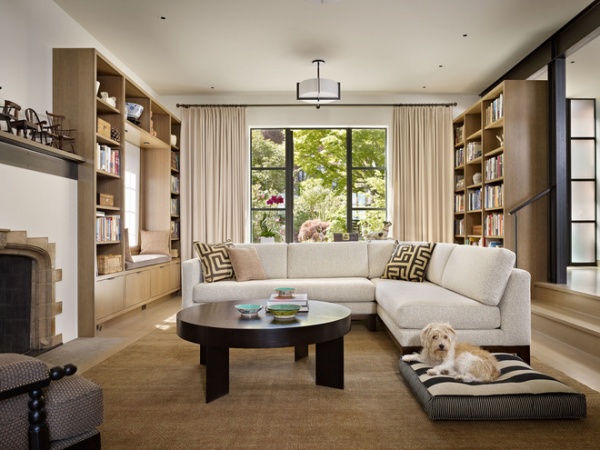
In the living room, DeForest added a steel mantel to the existing fireplace to tie it into the rest of the design. Steel windows extend the material from inside to out. He also removed a drop ceiling and its faux beams to open up and lighten the space.
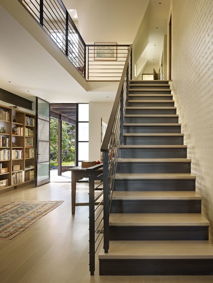
The open door at the back of this photo is the front door. A “word wall” extends three stories to create a major focal point along the staircase. Seventeen family members chose favorite quotes and passages to include on the wall, which has everything from Yogi Berra quotations to beloved family recipes.
The staircase carries the first-floor elements upstairs, including oak treads, structural steel and a blackened steel railing with a stained oak handrail.
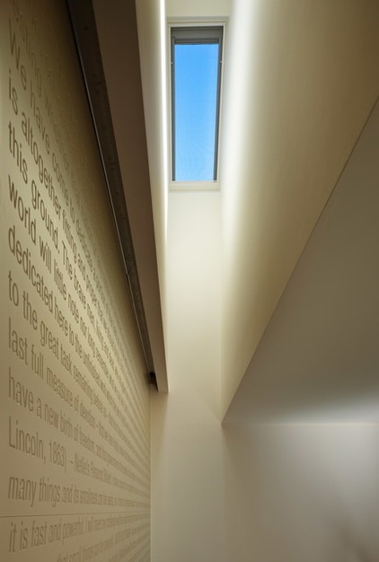
The couple and the design team laid out all of the words and then worked with a local sign shop to have the letters routed into seven 4-foot-high by 12-foot-wide strips of MDF. “The hardest part turned out to be painting all those incised letters neatly,” DeForest says. A skylight bathes the word wall in light.
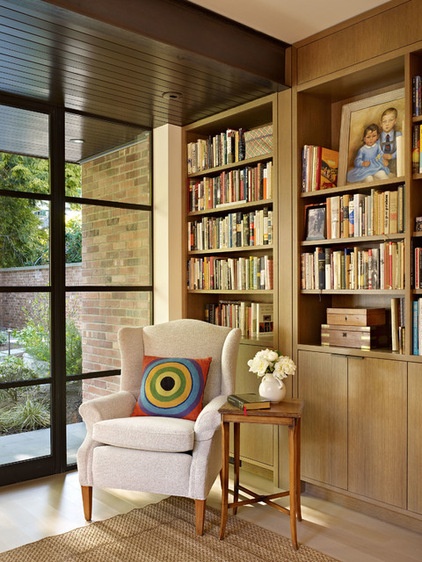
This cozy first-floor office with radiant heat floors used to be the garage. The cabinetry is crafted from rift-sawn oak.
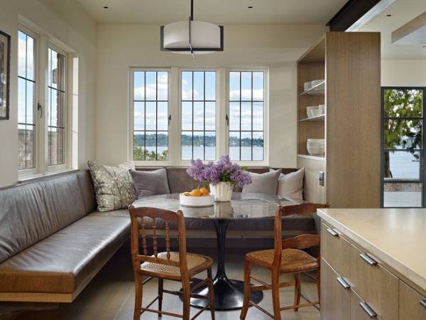
In the kitchen, DeForest and Burfiend designed a built-in banquette with the couple’s morning reading habits in mind. “The banquette was carefully sized and illuminated for reading the morning paper; the recessed ceiling fixtures are aimed at the right spots,” the architect says.
The round table helps accommodate varying numbers of people.
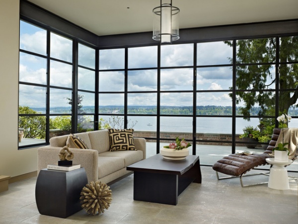
The previous sunroom didn’t take advantage of the vast views of Lake Washington, so DeForest used windows and fold-away doors to open things up.
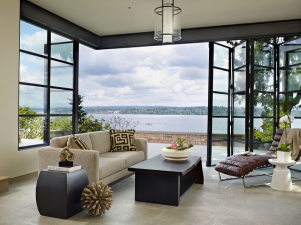
Here you can see how the floor-to-ceiling doors fold away.
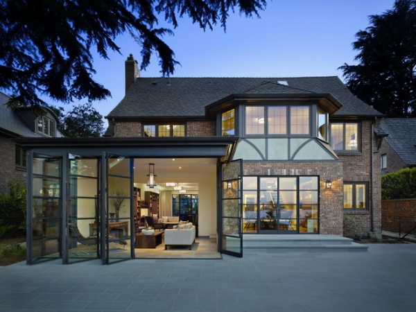
When the doors are open, the sunroom connects to a terrace.
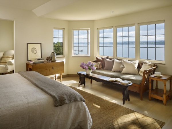
The second floor includes a master suite, seen here, and a guest bedroom and office. An existing bathroom addition had cut off the upstairs views of the lake, so DeForest flipped the master bedroom and bathroom to right this wrong. In a bay that had only two windows, he added more glazing to make the most of the sweeping views. A seating area here and the alcove to the left offer up two more cozy reading spots.
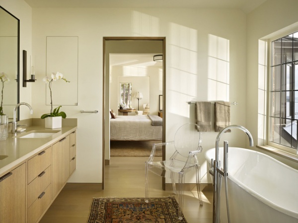
The master bathroom is open, airy and light-filled in its new location. Custom cabinets float off the floor, while a concealed medicine cabinet disappears into the wall and pocket doors save space.
As for aging in place, the homeowners added an elevator and space for any future live-in caretakers. There’s also another bathroom designed with universal design principles in mind.
Read more about designing for aging in place
Countertops: Pental Quartz; bathtub: Iris, Cheviot; tub filler: Tara Logic, Dornbracht
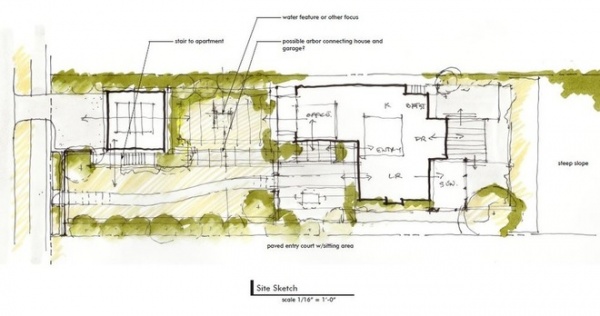
This early site sketch gives you an idea of how the new plan flows and relates to the landscape. (Lake Washington is on the right side of this plan.)
Team:
Architect: DeForest Architects
Interior designer: NB Design Group
Contractor: Prestige Residential Construction
Browse more homes by style:
Small Homes | Colorful Homes | Eclectic Homes | Modern Homes | Contemporary Homes | Midcentury Homes | Ranch Homes | Traditional Homes | Barn Homes | Townhouses | Apartments | Lofts | Vacation Homes
Related Articles Recommended


