Design Workshop: 9 Ways to Open a House to the Outdoors
http://decor-ideas.org 07/14/2014 00:14 Decor Ideas
Spaces that are neither indoors nor completely outdoors are often among the most trafficked spaces in a home. And they make for good design: We use them to negotiate changes in elevation between inside and outside, for entertaining, to reduce the apparent scale of our structures, to temper weather extremes and for visual screening.
By using the most basic architectural devices — columns, rafters, walls and floor planes — these indoor-outdoor buffer zones can be designed to feel every bit a part of the architecture. The examples here range from the tightly enclosed and controlled to the minimal. Let’s take a look at a few approaches to designing transition spaces that successfully unite inside and out.
Outdoor Rooms
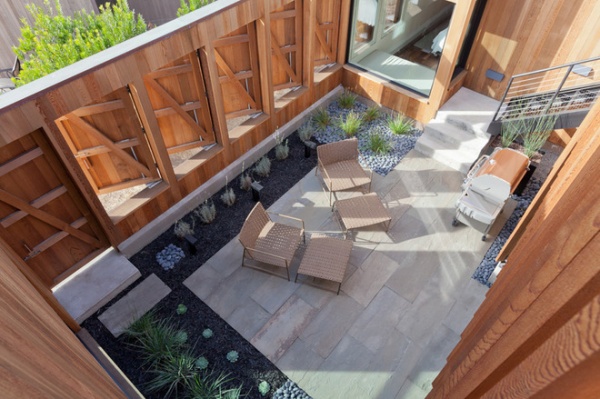
This home overlooks a bluff but sits on a supernarrow lot that’s constrained by neighboring homes on either side. This led to the incorporation of a protected outdoor room that acts as a buffer, preserving privacy for both properties while still permitting an outdoor-focused space for the residents.
To mitigate the proximity issues, the architect simply continued the exterior wall of the house to create a cloistered terrace space. The pivoting shutters open toward the view but act as blinders, screening any sense that the neighboring house is only a few feet away.
The bedroom space at the top of the image shares a connection to the room as well, and the pivoting-shutter idea was borrowed for its outside window. In this transition space, thrifty use has been made of simple architectural elements, walls, pivoting doors and an understated ground plane to create a gathering space where one might not have otherwise been possible.
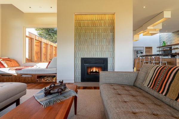
In this view from the living room of the same home, one can appreciate that the interior space benefits equally from the exterior connection, borrowing light and a view to the sky without peering into the neighboring residence.
The kitchen connects directly to the outdoor room (behind the fireplace) allowing for outdoor cooking and eating, and the outdoor room mediates the vertical transition to the rooftop deck. The simple addition of one changeable wall lends great architectural diversity to the plan.
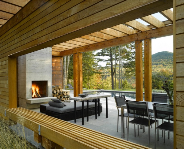
This outdoor room is another example of how a simple transition space can support multiple functions. The linear structure serves as a guesthouse, an outdoor dining area and a screen between the driveway and pool. The solidity of the copper-clad enclosed space dissolves into its component architectural parts — columns, walls and rafters — to define the poolside outdoor dining area.
The large opening in the screening-wall element visually connects the approach to the property via the driveway to the view while maintaining privacy for the dining and pool space.
The trellis overhead defines a place for gathering without the correlating weight of a solid roof.
Courtyards
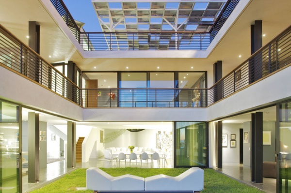
A version of outdoor rooms, courtyards generally feel more inwardly focused and enclosed, bound by the walls of the surrounding architecture. They’re an especially popular strategy in warm climates where the interior courtyard mediates temperature changes, providing shade and acting as a natural ventilation chimney of sorts for the spaces opening onto it. Of course it shares features with the other examples here too: walls, floor plates and even porches, combining them into one large permeable buffer zone. With its glazed walls that slide open, it’s difficult to tell where the interior of this house ends and the exterior begins.
Courtyards are excellent devices to use when privacy is hard to come by, and they’re a great way of introducing natural light into tight sites.
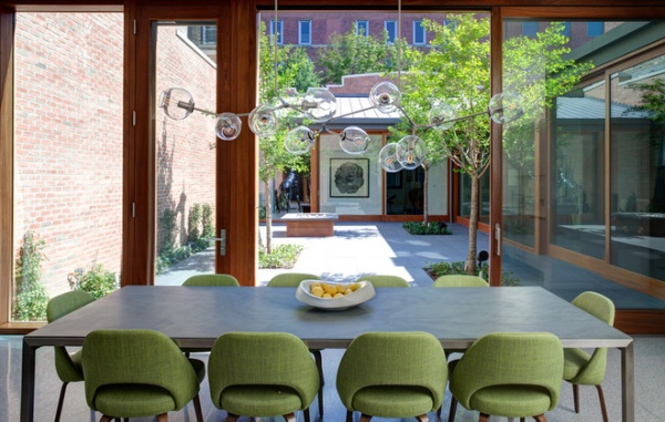
It’s apparent just how strong an organizing device the courtyard can be when viewed from inside this home. In urban areas where typical views are to other structures, a courtyard can provide a vegetated counterpoint. I also like how the architect here has used a brick wall to capture and reflect sunlight back into the interior spaces.
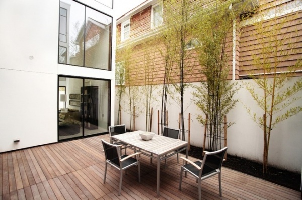
Courtyards bound by neighboring architecture, which we can’t control, can benefit from the introduction of plantings to provide some level of privacy and soften hard edges.
Porches
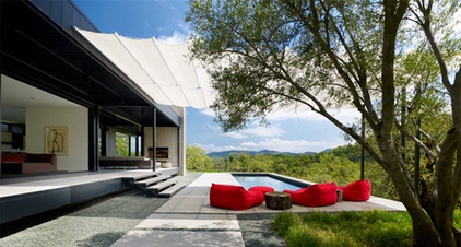
Another common architectural device used to mediate transitions is the porch. Porches can be fully or partially enclosed or much more porous and open, as in this example. They offer shelter from the sun and elements while framing views to the site beyond and a way of navigating the grade difference between the terrace and the house proper.
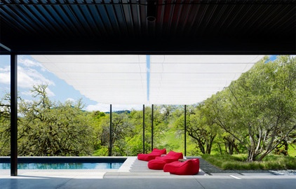
The gauze-like scrim above abstracts the tree canopy here, while the thin columns appears as tree trunks. Note that although the architect used simple rectangular elements, the look doesn’t suffer. These simple shapes are overlapped — the pool edge, the overhead scrim and the terrace seating — to make the design visually complex and dynamic. Even the transition zones overlap from the covered porch to the shaded seating area.
Pergolas
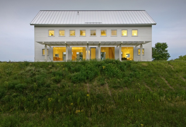
Lighter, more permeable and less protective than typical porches, pergolas make excellent transition elements between interior and exterior. Here one reduces the perceived scale of the two-story home while filtering the sunlight entering the large glazed openings. A solid roofed porch would’ve blocked the light and felt much heavier, but the pergola marks an appropriately sized single-story gathering spot next to an otherwise tall wall.
The overhead plane is an important scale element that establishes how comfortable we feel in an indoor-outdoor space. Here’s it’s aligned naturally with the top of the door, an element whose size we’re familiar and inherently at ease with.
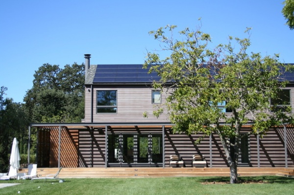
This pergola serves a host of functions. It’s equal parts sunshade, wall screen and scale device. Breaking up the tall wall, it offers a nicely proportioned place to sit on the deck and modulates the sunlight striking the facade. Paired with the deck below, the two elements thoughtfully span the grade difference between inside and out.
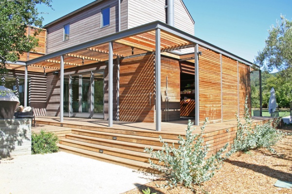
The versatility of it doesn’t end there; the architect has also created a vertical rhythm of support columns in discreet places. Here the wall screening provides privacy for an outdoor shower; a lack of slats in the overhead plane permits light into the shower area. The simple modular system used for this pergola transition zone is infinitely adaptable based on the requirements of the nearby spaces.
Walls
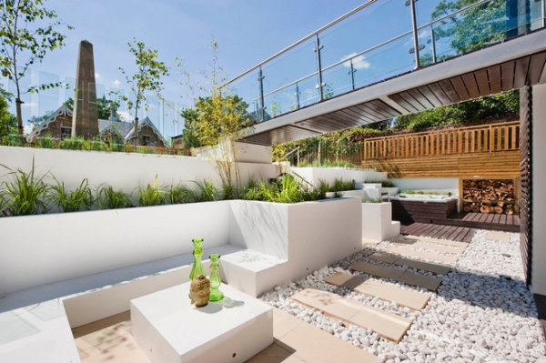
As seen here, walls don’t need to be full height to make great transition spaces. These low walls hold back the grade on the site and provide ample seating for gathering. There’s a reason for them being sized and shaped the way they are, and their terraced design makes for a diverse experience in this outdoor transition space. Site walls such as this can help us to utilize the full vertical space on a lot and markedly enhance privacy. The bridge above adds interest, definition and sense of enclosure as well.
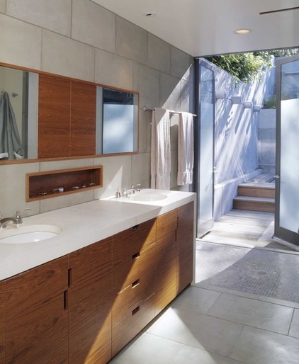
Below-Grade Transitions (Light Wells)
Taking the previous idea one step further, this project proves that even the most private of spaces can benefit from the blurring of interior and exterior space and vertical site development. Here we see an outdoor shower area adjacent to the bathroom. The architect has cleverly used etched glass to handle the privacy concerns while maximizing the vertical space on the site as well as the amount of natural light available to the bathing space.
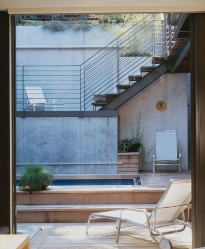
Viewed from the nearby bedroom, the outdoor space is bound by a variety of simple elements; the walls are by far the strongest elements defining the space. The stairs appear carved from the earth at the lowest level and become lighter (and wider) as one moves upward. The layering of these simple elements makes this transition zone so successful. Note that the scale of the space at the lowest and most private zone is appropriately small and intimate.
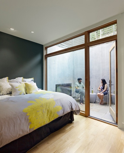
Here’s another light well and outdoor room used on a steeply sloping site to permit daylight in the lower-level bedroom and create a private outdoor sitting space. Transition zones that admit daylight can make small quarters feel much larger.
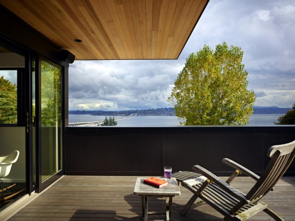
Ceilings
Another means of marking a sheltered transition zone is seen here; it uses a large cantilevered roof plane. It provides protection from the sun or rain when necessary and a frame of reference for the building scale, but also appears weightless and simple, like the brim of a hat. The guardrail wall helps to subtly suggest enclosure and protection too.
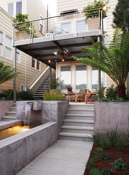
Here the overhead plane doubles as a deck area above to offer varying levels of privacy on a tight lot. Much like the earlier wall example, level changes were manipulated here to enhance privacy and visual separation by changing the horizon line and field of view.
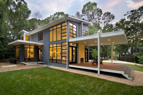
This project has an overhead ceiling plane that transitions the arrival area as well as relaxation areas of the site. It’s echoed in the hovering floor plane and the minimal column supports, achieving a weightlessness and simplicity of form fitting of the architecture.
Decks
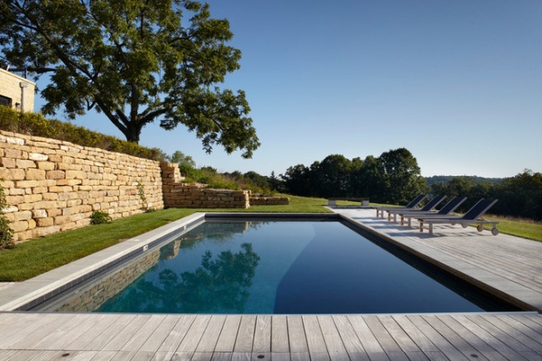
Perhaps the simplest of all transition gestures is manipulating the ground plane. The decking here marks the change from lawn to pool seating. It’s every bit as architecturally crisp as the dry-laid stacked stone retaining wall and the sharp lines of the pool.
Simple deck transitions alone work best when the building isn’t too big or tall.
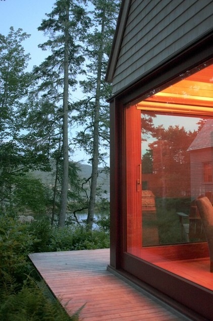
Here the orthogonal geometry of the wood deck plays off the organic site, which brushes up against it. The deck carefully delineates an intimate place for sitting in the forested site and offers a simple means of entering the master bedroom cottage.
Pavilions
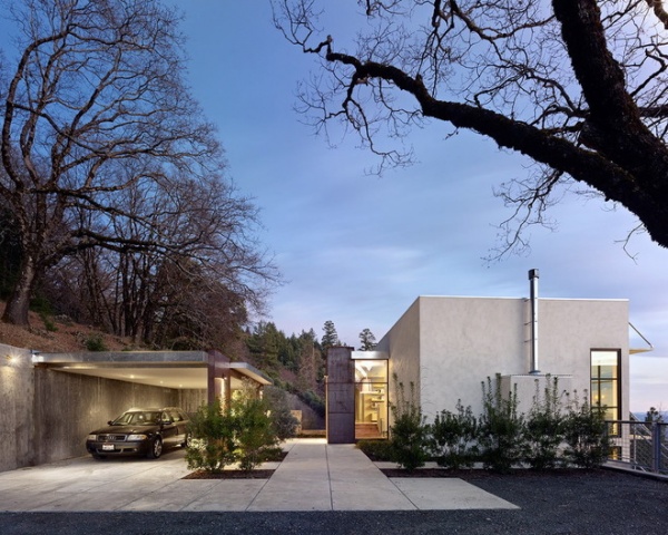
The theme of simple architectural elements continues in this image. Straddling the line between enclosed and open, the pavilion can be deployed almost anywhere in the landscape.
This image reminds us that transitions happen in all aspects of our living environments, not only those used for repose. Carports and porte cocheres are good examples of pavilion transition elements that often act as gateways to arrival. Using them as screens against less desirable views or noisy areas of the site is particularly useful and appropriate.
More: Design Workshop: The ‘Disappearing’ Guardrail
Related Articles Recommended


