4 Homes With Major Storage That Looks Great
http://decor-ideas.org 07/12/2014 20:13 Decor Ideas
A creative designer can hide storage in plain sight, but a bold designer brings it front and center. Many of us put a lot of thought into how we display our collections and organize our countertops, but what about how we store our less decorative items? See four homes that have mastered the art of storage.
A Modern Hearth in Austin
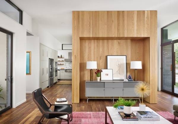
Architect Stuart Sampley reimagined the hearth as a freestanding white oak closet. For a new home he designed in Austin, Texas, Sampley wanted the three common areas — kitchen, dining room and living room — to connect, but didn’t want the house to have an entirely open plan.
Part closet, part flow circulator and room divider, the oak unit sits in the middle of the house. It connects all the main rooms while creating intimate spaces within the nearly open plan. The hearth is the first thing visitors see when they walk into the house. It divides the kitchen and dining room from the living room, allowing guests to focus on one another and the space they’re in.
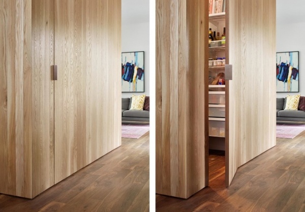
Each room interacts with the storage unit independently. The living room’s credenza sits neatly in a recess, and a hidden pantry is accessible from the kitchen. There’s an additional hidden closet for more storage.
See more of this home
A Jewel Box in New York City
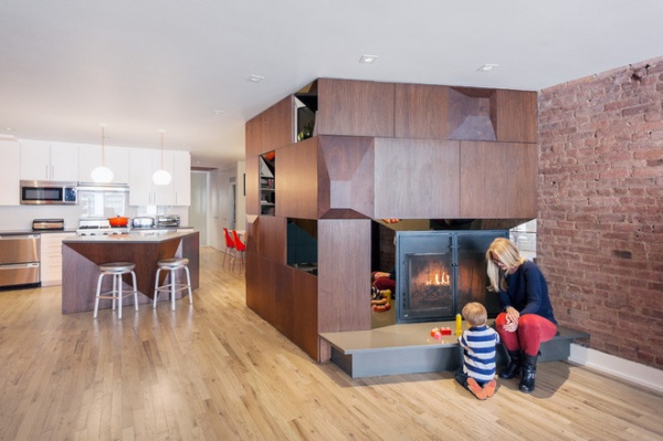
A couple with a young child wanted more than additional storage for their loft in Manhattan’s Tribeca neighborhood — they wanted a piece of architecture. Phu Hoang and Rachely Rotem of Modu were also tasked with bringing more natural light to the core of the deep loft.
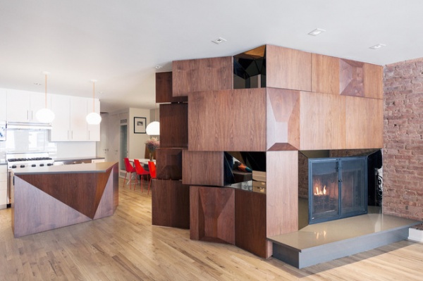
The clients’ love for Brazilian design inspired the designers to build an 8-foot by 6-foot walnut unit. Its unusual angles are replicated in the kitchen island. Flat cabinet doors conceal glassware and other household products. Mirrored cubbies multiply light inside the living space, and a fireplace glows at night.
See more of this home
Shipshape in Vancouver
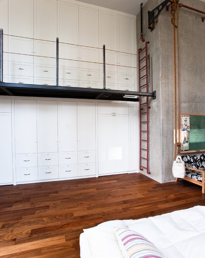
Actor Billy Campbell bought a loft in Vancouver and was stumped by what to do with the unit’s 25-foot by 25-foot alcove. “I was thinking I could shove a sofa in there, but the big space was still going to swallow it up,” Campbell says in the featured ideabook by Mitchell Parker.
Campbell, who is also an avid sailor, realized he could transform this space to work like a ship.
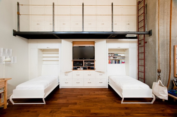
He worked with architect Rick Wilson of Radius Architectural Millwork to build a painted maple storage unit to fill the alcove, complete with Murphy beds and a nautical-inspired steel catwalk. The storage unit holds all of his clothing, audiovisual equipment, books and two Murphy beds. A hand pulley system makes it easy to move things from the top floor to the bottom.
See more of this home
Filling in the Gap in Brooklyn
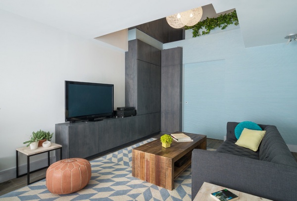
The owners of this apartment in New York City were on a quest to eliminate clutter by being able to put everything away. One of the clients told the designers at BanG Studio that he wanted enough storage space for everything he owns. Designers Henry Grosman and Babak Bryan built that for him.
The apartment’s first floor had an unusual and awkward double-height recess. Bryan and Grosman filled this space in completely to create a 90-square-foot storage room. Instead of matching the walls to the rest of the house, they covered them with half-round wood tambour, painted light blue. Inside the storage room, hanging rods and open shelving store winter wear, luggage and other things that normally go under a bed or in the back of a closet. “Our big design move was to use the storage as a centerpiece, rather than trying to hide it,” says Grosman.
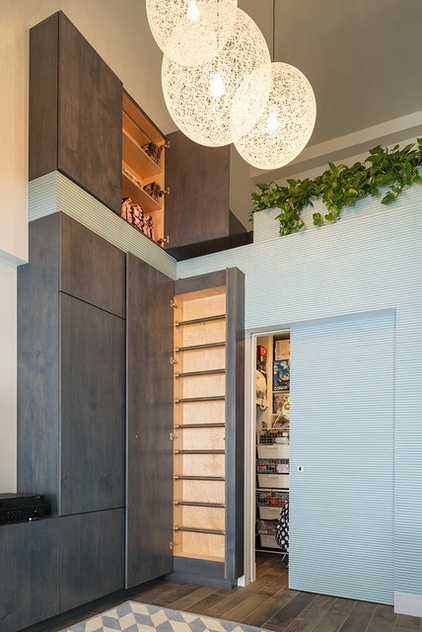
They built an additional 10 feet of gray stained plywood cabinetry to hold items like DVDs and books. The gray cabinetry also conceals a ladder that leads to a loft area and an additional 20 linear feet of cabinetry.
Interior designer Abby Richardson matched the home’s furnishings with the colors and textures of the storage units, creating a seamless and cohesive space.
See more of this home
Related Articles Recommended


