Houzz Tour: Thrifty TLC Transforms a Beach Bungalow
Cayley Lambur has spent some time in the homes of strangers. She grew up as the child of architects, and visiting open houses was kind of a family hobby. Seen more as sightseeing opportunities than real estate prospects, these excursions didn’t end in offers — except for that one time in Venice, California.
Lambur, who is also an architect, had moved to California to work for Frank Gehry. She and her mom, who was visiting, decided to check out an open house near Abbott Kinney Boulevard. “I just saw a sign up and called the agent to see the place for fun,” Lambur says. As soon as she saw the beach bungalow, it was all over. “It was the perfect mix of potential and a dump to work on,” she says. “We went and had a glass of wine and began the offer process.”

Houzz at a Glance
Who lives here: Cayley Lambur; her fiancé, Kyle Blasman; and their cat, Finn
Location: Venice, California
Size: 750 square feet (70 square meters); 2 bedrooms, 1 bathroom
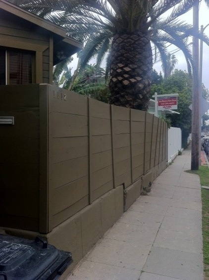
The cottage showed promise from the street but was hidden behind an old wooden fence. Inside, the 1914 Craftsman bungalow was in disrepair, with moldy walls and dated finishes. For many this house would have been a teardown, but Lambur saw more than the home’s “location, location, location” selling point. “I liked the house,” she says.
Bungalows like this one are fixtures in the fabric of architecture in Venice, a longstanding California mecca for designers, including Charles and Ray Eames and Frank Gehry. This dwelling originally served as a changing cottage for early-20th-century beachgoers.
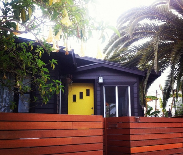
AFTER: Lambur replaced the fence with one made from Mangaris hardwood for curb appeal and privacy. She painted the original front door a cheery yellow and the siding a dark charcoal. An existing Canary Island date palm and trumpet tree help obscure the view of the cottage from the street.
Door paint: Dazzling Daffodil, Glidden; exterior paint: Trail Print and Dark Cavern, Behr
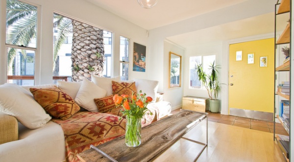
Inside, the light-filled living room spreads out. The coffee table and bookcase were made to fit in the narrow room. They are made from welded steel and wood planks.
Lambur bought the Z Gallerie Palisades Couch at an estate sale. It’s the “most comfortable couch on earth,” she says. The blanket and pillows are old Pottery Barn pieces.

A bulky radiator and a small, screened porch once broke up the living room. A third bedroom jutted into the common area.
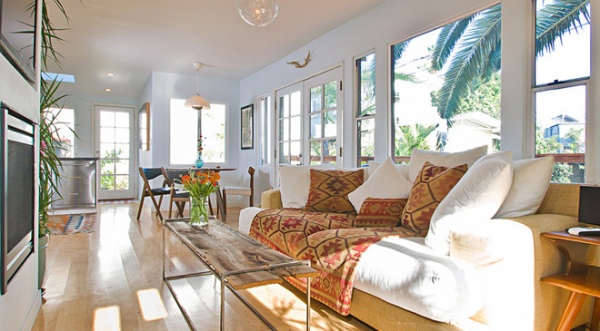
AFTER: Lambur managed the renovation. She opened up the porch at the end of the main living area and tore down the walls of that third bedroom to open the house. She added more windows and a skylight.
The same maple flooring and color of wall paint were used throughout the house. To save money, she and her fiancé did all of the painting themselves and added their wood flooring to another order.
Wall paint: Glistening Moonlight, Glidden
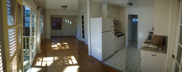
The original galley kitchen wasn’t efficient. The floor plan didn’t flow, and the second wall made the activity of the kitchen too removed from the rest of the house. The door in the kitchen was the only way to access the bungalow’s one bathroom.
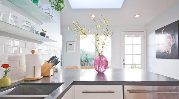
AFTER: Lambur removed the wall that divided the living room from the kitchen and added a peninsula to create an l-shape layout. Bathroom access was moved from the kitchen to the small laundry area, just out of frame to the left. ”I actually prefer small houses,” she says. No space goes unused here, and each item and each square foot can be appreciated.
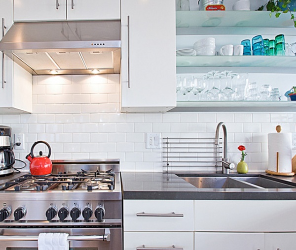
Stainless steel appliances dress up Ikea cabinets. Smaller, European appliances fit the size of Lambur’s kitchen, and she was able to buy one from Bertazonni for less than some of the more well-known brands cost.
Open glass shelving keeps clutter and visual bulk to a minimum, and also gives the kitchen some life. It’s a “small but very functional kitchen,” says Lambur. The countertops are Caesarstone in the color Raven.
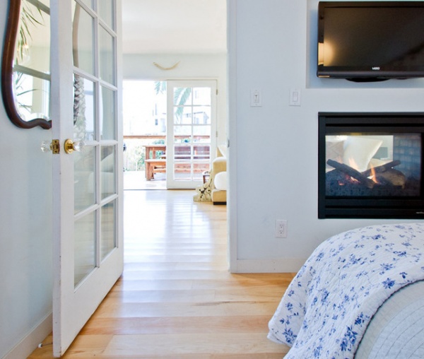
The master bedroom opens to the living room. A two-way fireplace from Heat & Glo replaced the unattractive radiator, and Lambur says it can heat pretty much the entire house. The temperate climate at the beach negates the need for integrated heating or air conditioning, and the fireplace provides a nice window into the living room.
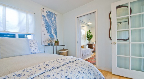
The map in Lambur’s bedroom is an old sailing chart of the Sunshine Coast in British Columbia, where she spent her summers as a child.
The master bedroom now connects to the bathroom. Lambur added this second bathroom entry when reconfiguring the space.
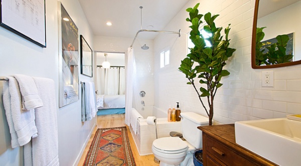
The bathroom continues from the bedroom like an additional living space. Lambur used the same wood flooring and added an Oriental rug runner she picked up at a flea market.
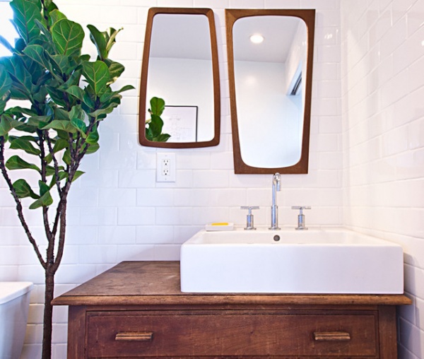
The bathroom’s vanity is made from a dresser Lambur bought at the Rose Bowl Flea Market and a Duravit sink. The asymmetrical placement leaves more counter space for flowers or bath accessories. The two complementary mirrors also came from the Rose Bowl. The fiddle leaf fig tree livens up the sparsely decorated bathroom. Throughout the house Lambur used plants to fill out the decor.
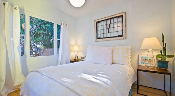
She kept one guest bedroom (though she gave its closet to the master bedroom). A stained glass window hangs above the bed, which mimicks the bed’s placement in the master bedroom.
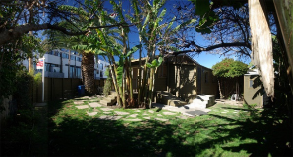
The backyard makeover happened after the home remodel was finished. The house already had a deck, but it could have been bigger and it hid behind the banana trees shown here.
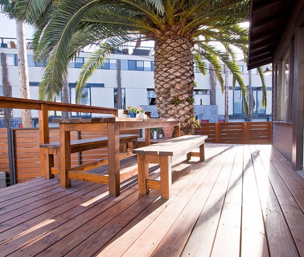
AFTER: Lambur doubled the deck’s size and added cable railings to minimize the visual break from deck to landscape. “The deck makes the house feel bigger than it really is,” she says. Life spills from the living room outside through French doors. The mature palm tree shades a wooden dining table and benches, which Lambur made.
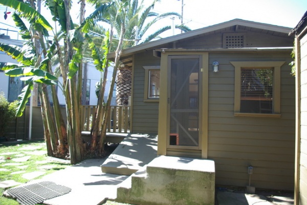
Lambur had intended to redesign the yard herself, starting with picking up free soil from Craigslist. She soon realized that landscape design was not her forte, however, so she hired Travis Brooks, the landscape professional who had posted the Craigslist ad for free soil, to assist her with the planting and design.
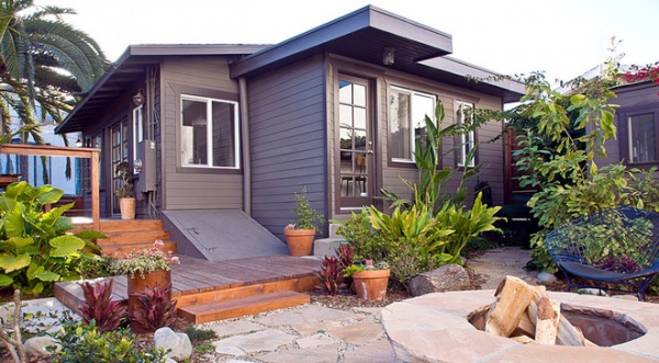
AFTER: They regraded the entire lot and added a parking spot (a great perk for a beach house). Brooks selected plants to create a lush, tropical oasis, including ginger, jasmine, purple princess tree, plumeria, elephant ear and succulents. “We also have strawberry guavas growing, a mango tree, cherimoya tree and Surinam cherries, all of which produce fruit,” Lambur says.The new fire pit was built with an extra-wide top, making it an easy perch on which to rest food and drinks.
More: 28 Great Homes Smaller Than 1,000 Square Feet


