Room of the Day: From Dark Basement to Bright Master Suite
http://decor-ideas.org 07/09/2014 00:13 Decor Ideas
There’s not much sexiness to a concrete retaining wall. But with a few clever design moves, you can certainly dress one up enough to turn a few heads. That’s what the homeowners of this two-level San Francisco hillside house did when faced with an unsightly wall in the basement, which they wanted to turn into a private master suite. They worked with architect Tom McElroy to add stacked-stone tile and a wood-topped display shelf. Before, the wall cast a dark, imposing presence in the former storage room. Now it’s a celebrated focal point illuminated by three of its own downlights.
Photography by Eric Rorer
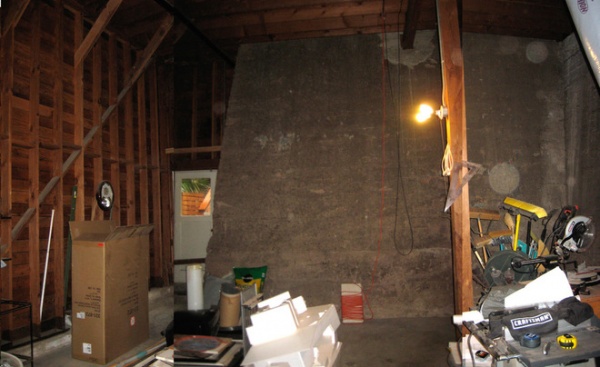
The existing basement was dark and dingy, but did have a 15-foot-high ceiling that would provide the volume needed for expanding living space and creating a new master suite. The door in the rear corner led to the yard.
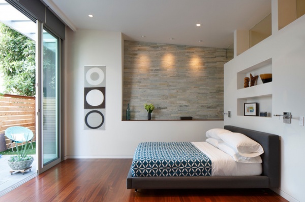
AFTER: McElroy opened the exterior wall with 11-foot glass sliding doors that lead to a new private garden. He then walled up the original exit door to create a garden closet accessed from outside.
Highlighting the large retaining wall instead of fighting it was a key design decision. Stacked-stone tiles cover the wall that continues from the bedroom into the adjacent bathroom. “We didn’t want anything too shiny,” says McElroy. “So we choose stone that has a rough, unfinished texture and color that is reminiscent of the actual concrete.”
The architect and homeowners selected sapele wood with a walnut stain for the bedroom’s flooring. “If we went with concrete, it might have been too close of a memory of what was there before,” he says.
Glass doors: Fleetwood; stone on wall: Island Stone; bed: Tate Bed; Crate & Barrel; lights on side of bed: Swing Arm Wall Sconce, George Kovacs; round wall decals: homemade cutouts from Ikea shades
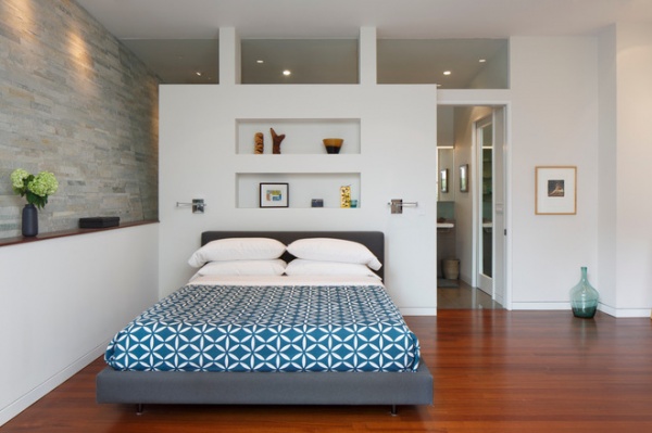
The wall behind the bed acts as a room divider that separates the bedroom from the bathroom. McElroy kept the wall from going all the way to the ceiling, instead installing glass panels that wrap around the left side and on top to bring natural light into the bathroom. “Unlike most walls that are needed for structural reasons, we had the freedom to peel away at it,” he says.
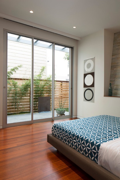
A wood-slat fence and bamboo plants were added to the outside area, which was once a windy corridor without plantings. A semirecessed trough houses automatic shades that rise and fall for privacy.
Shades: custom, Cutting Edge Drapery with Somfy motor mechanism and Phifer Shear Weave fabric; wall paint: Silver Satin, Benjamin Moore
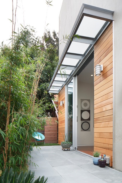
A steel and frosted-glass overhang bolted to the side of the house provides a shady spot. Cedar paneling warms up the exterior.
Sconces: Philips Forecast Lighting
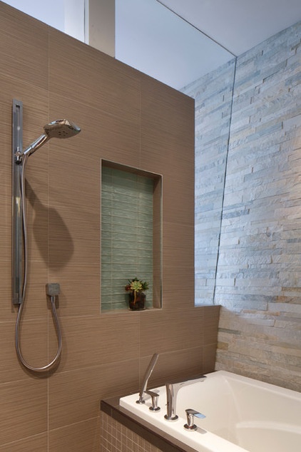
McElroy added a custom piece of clear, tempered glass that follows the slope of the retaining wall.
Chrome faucets, plumbing fixtures: Hansgrohe; shower wall stone: Island Stone; bathtub: Maxx Optik
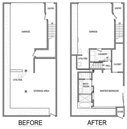
These “before” and “after” floor plans show the improvements to the lower level of the home, including the new laundry room (previously on the upper level), now located next to the master bedroom suite in a less prominent and more convenient location.
“With this master bedroom suite, we have created an entirely private and separate space on a different level of the house,” says McElroy. “It allows you to get away from the house and almost feel like you’re on vacation.”
Architect: Tom McElroyGeneral contractor: JP Builders
See more Rooms of the Day
Related Articles Recommended


