The Best of My Houzz: 20 Entryways That Draw You In
http://decor-ideas.org 07/06/2014 20:13 Decor Ideas
Opening the front door to these unique homes from our My Houzz series tells us much about the creative folks who live in them. After sorting through and choosing 20 favorite entryways, I noticed that many of my choices came from the Pacific Northwest, the American South and Canada. It seems people who hail from these areas have hospitality down pat. Here are 20 welcoming entryways — perhaps one will inspire you to give your own entryway a makeover.
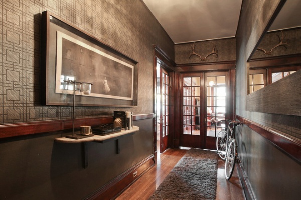
Moody and grand in Salt Lake City. “My grand hallway is a great landing spot to drop keys, bundle up before heading out, check your face in the mirror, feel sorta fancy,” says homeowner Cody Derrick. The gray tones, fantastic finished wood, long mirror and lithograph set a moody, luxe tone his Utah apartment. You also learn right off the bat that Derrick is not afraid of bold graphic wallpaper and that you’re likely to see more antlers inside.
See the rest of this house
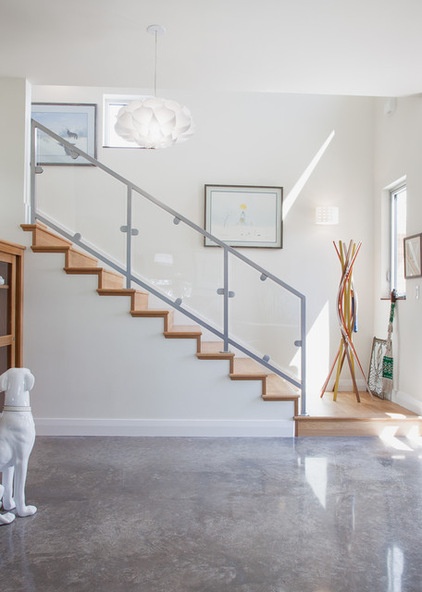
All dogs allowed in Austin. Margaret Hoffman’s country property in Texas serves as her home and a sanctuary for dogs she’s finding homes for. There’s nothing like a prominent ceramic pooch in a minimalist home to represent a passion for saving animals. The sealed concrete floors are easy to keep clean with pets.
See the rest of this home
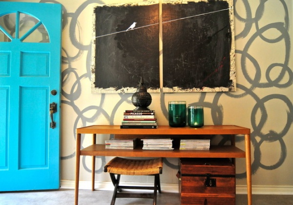
Artfully sticking to a budget in Texas. Homeowners Sarah and Jack Greenman know how to stretch a budget. In lieu of expensive wallpaper, Sarah took inspiration from Jamie Meares at Furbish Studio and painted their striking entryway to look like wallpaper herself. She also made the painting with the little white bird.
See the rest of this house
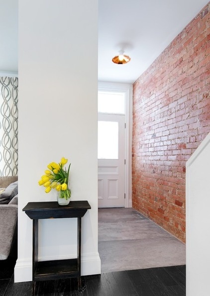
Exposed in Toronto. In Steve and Meg Gardner’s home, most of the Victorian details had been wiped out during prior renovations. While they went for a clean and contemporary open plan, the original exposed brick is a beautiful and historic accent. The wall continues to their bedroom above. A modern light fixture overhead hints at what awaits inside.
See the rest of this house
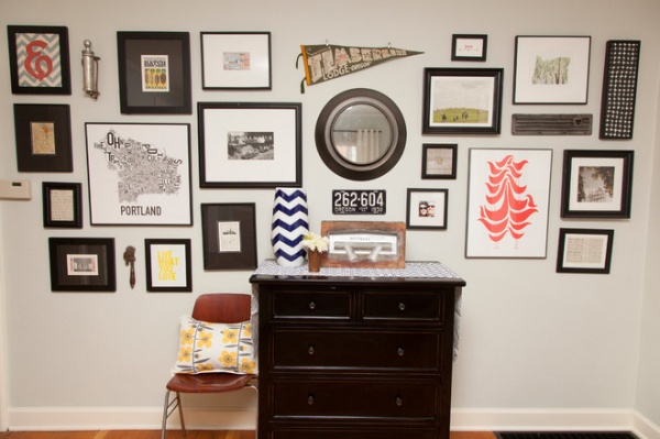
Merging belongings and styles in Portland. Just inside the front door of their Oregon bungalow, a gallery wall combines the personal styles of newlyweds Chris and Jennifer McCormick. A vintage license plate mingles with a map of Portland; a vintage pennant tops a mirror. A dresser provides plenty of landing-strip storage, while a quirky chair offers a great spot for tying one’s shoes. The entry reflects the design compromises the McCormicks made upon moving in together. The result is eclectic harmony.
See the rest of this house
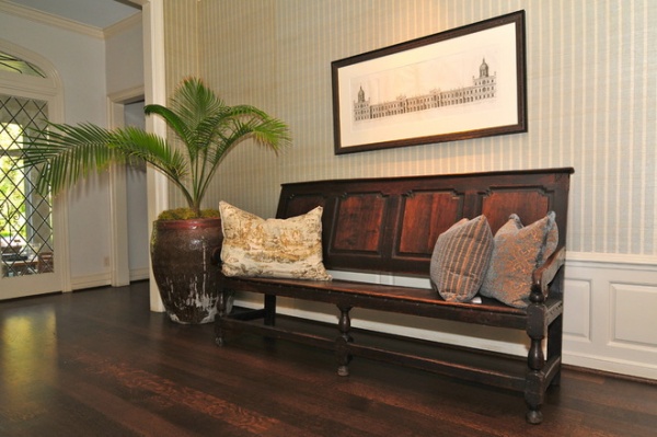
Southern comfort in Dallas. This foyer says an architect lives here, especially if you know what went into restoring the architectural drawing over the vintage church pew. Homeowner and architect Christy Blumenfeld painstakingly bleached the brown spots out of the antique rendering, restoring it and framing it, and it’s one of the first things one sees upon entering. The striped grass cloth wall covering and the potted palm ooze Southern hospitality.
See the rest of this house
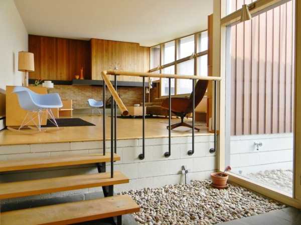
Usonian balance in the Pacific Northwest. At first glance you might think this is an outdoor space, thanks to the expansive window and the bed of river rock that continues from inside to out. What visitors know for sure when crossing the threshold into Scott and Emily Faulkner’s house in Ellensburg, Washington, is that they are taking a step back into the golden age of midcentury modern architecture.
See the rest of this house
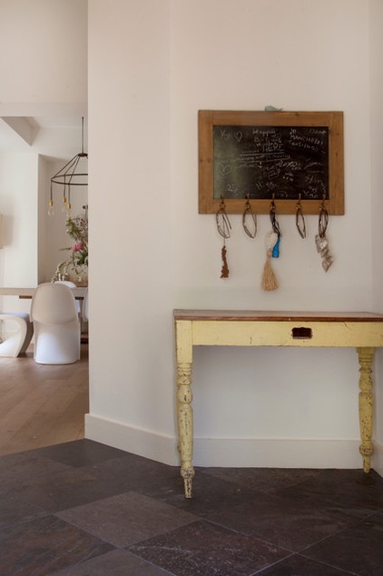
Well traveled in Woodside. Interior designer Beverley Harper has found style inspiration, furniture and artwork on her travels and brought them back to her California home. This primitive antique table hails from Australia; trinkets from her travels hang from the chalkboard’s hooks.
See the rest of this house
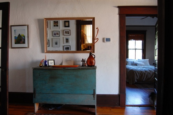
Farm fresh and friendly in Georgia. A vintage feeding trough’s patinated blue paint is welcoming in Zack and Lauren Anne Johnson’s Athens farmhouse. The couple is adventurous when it comes to choosing colors for their home. This vignette hints at the inviting and casual vibe throughout the house.
See the rest of this home
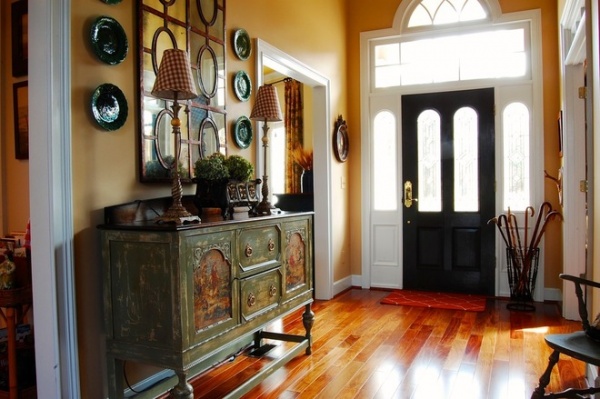
French country style rules the roost in Georgia. In Douglas and Kim Nichols‘ Buford home, a sideboard painted with a weathered treatment has a strong presence, enhanced by mirrors, a pair of tall gingham-topped table lamps and a plate collection. Ocher walls say bonjour, while the door and sidelights wash the space in light.
See the rest of this house
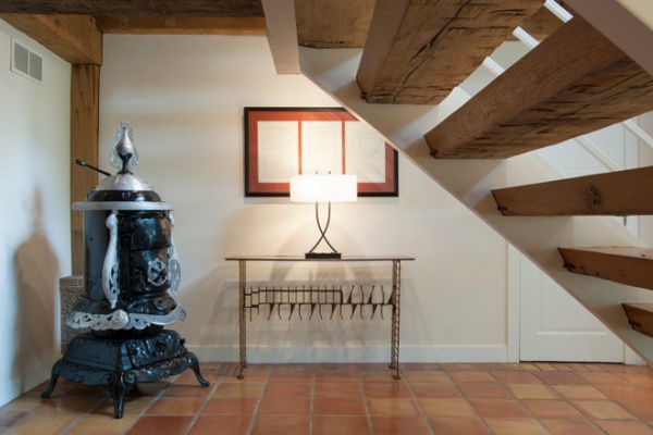
Buried treasure comes to the surface in Akron. The entryway in Tim Frankln’s renovated barn is full of the site’s history. Franklin found pieces of the potbelly stove scattered around the Ohio property, cleaned them and placed the stove as a tribute to the home’s past. The artwork is three original drawings and schematics of the farmland.
See the rest of this house
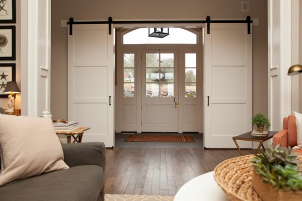
Casual and formal mix in the Oregon countryside. Alli Jensen wanted to create a separate, more formal entry area in her home. However, she created it with a casual touch: barn door hardware. This way her family can decide whether they want privacy in their great room or a clear view to the front door. The three-paneled doors are larger versions of others she used throughout the house.
See the rest of this house
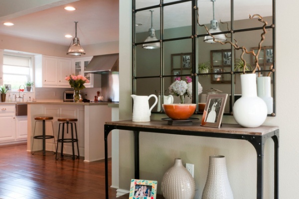
Balancing elegant and rustic in Dallas. This extensive remodel was a labor of love for newlyweds Ilya and Arina Gurfinkel, who completed the bulk of the renovations themselves after work and on weekends. Their style is a mix of elegant and rustic, embodied very well in this console table vignette. The table itself has a vintage industrial look, while the paned mirrors above it look like they were plucked from a Paris salon. An elegant ceramic collection is the icing on the cake.
See the rest of this house
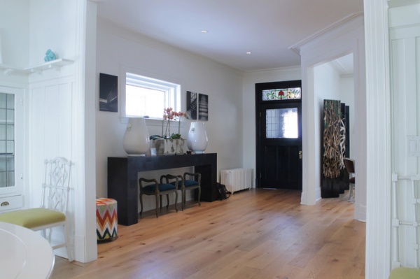
Modern art meets Arts and Crafts in Montreal. The hints in this hallway are subtle, but once you see the rest of the house, you’ll realize you were tipped off. The oversize urns and chunky console table let you know that homeowners Maxime Vandal and Richard Ouellette like to play with scale. The stools reveal that they like to play with old and new. The front door and its stained glass window tell us that they enhanced the best architectural elements of the 1910 Arts and Crafts home, and the brightly colored stool is a clue as to how fearless they are when it comes to bold colors and graphics.
See the rest of this house
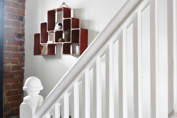
It all started with just one piece in Toronto. When homeowner Peter Andrew saw this sculptural piece, he knew he wanted to hang it in his entranceway, which made him realize he wanted to keep the original staircase, which helped inform other major renovation decisions, which … well, I’ll send you over to the full story so you can find out how the rest of the house turned out.
See the rest of this house
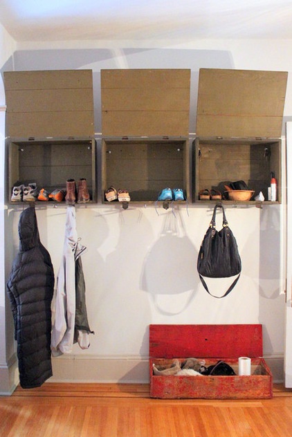
Smart salvage in Pennsylvania. Used ammunition boxes have a more peaceful purpose in Sara and Zach Wasser’s Lancaster colonial home. The couple repurposed them into entryway cubbies and a coatrack. The entire home celebrates Scandinavian simplicity, with well-placed pops of red like the antique toolbox on the floor.
See the rest of this house
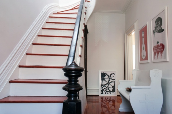
Original details star in an 1887 Montreal duplex. The original staircase takes center stage in Maryline Lambelin’s historic home. The black newel post and handrail stand out against the white walls, while pops of bold artwork hint at what’s to come beyond the entryway.
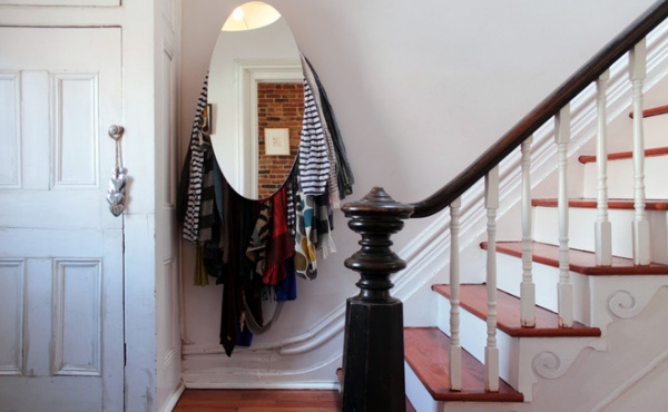
The same entryway also houses Lambelin’s extensive scarf collection, tucked behind a mirror. The collection adds a casual touch to the formal space.
See the rest of this home
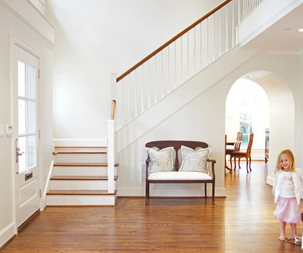
Open and airy in Dallas. This light and bright foyer is calm and cushy, like the rest of the home. Young parents Katie and Steve Aldrich filled their house with light colors and lots of comfy upholstered kiddo-friendly furniture.
See the rest of this home
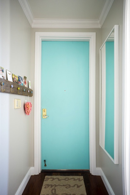
Squeezing energy into a small San Francisco condo. Even if you don’t have enough square footage for furniture in your entryway, you can still make a strong impression. In Eunice Chang’s home, a turquoise door brightens the narrow hallway. A large mirror reflects the light and the bright blue hue, and a simple rack provides hooks for keys and coats and serves as a picture rail.
See the rest of this home
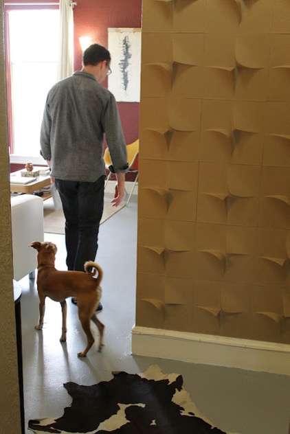
Making the most of a modest entryway in Los Angeles. Mio Culture’s 3D wall panels add depth and unique interest to this tight foyer in a 1926 art deco building. The 3D panels are a contemporary nod to deco that marries residents Shawn Smith and Leah Russell’s modern tastes with the building’s architecture.
See the rest of this home
My Houzz is a series in which we visit and photograph creative, personality-filled homes and the people who inhabit them. Share your home with us and see more projects.
Related Articles Recommended


