My Houzz: A 1900s Edwardian Gets an Eclectic Refresh
Eight months pregnant with their first child, Gloria Apostolou and her husband, Kirk Marshall, were running out of time to find a new home for their growing family. They had recently lost in two bidding wars and were starting to feel dejected, when their agent brought them to a house in Toronto’s Annex neighborhood — a charming area filled with many brick houses from the 1900s. After a 30-minute tour, they were sold. Marshall and Apostolou, the owner of Post Architecture, quickly fell in love with an Edwardian semidetached home. The well-built house hadn’t seen many renovations over the years and retained much of its original charm. Focusing on key areas that needed work, Apostolou embarked on a slow, selective renovation that lasted more than seven years, helping to breathe new life into a beautiful old home.
Houzz at a Glance
Who lives here: Gloria Apostolou, Kirk Marshall and their daughters, Penelope (age 7) and Daphne (4)
Location: Annex neighborhood of Toronto
Size: 2,800 square feet (260 square meters); 5 bedrooms, 3½ bathrooms and a basement office
Year built: 1900
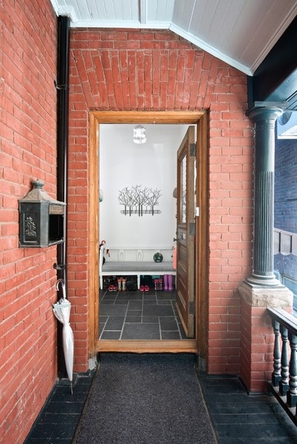
Built at the turn of the 20th century, the home has a style similar to many other residences in the area. While most have an entrance at the front, here there is a generous front porch that leads to a side-facing entry. Because it’s perpendicular to the street, the front door is often left open in the summer, allowing the porch to become a sheltered extension of the interior space.
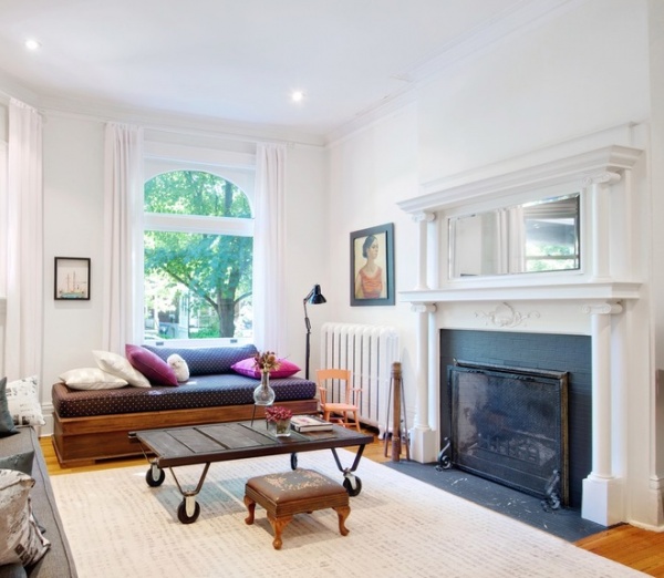
Many of the home’s period details are still intact, including four working fireplaces — one of which can be seen here in the family’s living room.
The furniture and art, an eclectic mix, have been collected over time from a variety of places, leading to a cohesive style befitting both the family and the house itself. The bench underneath the window was given to Apostolou by her former boss, Ned Baldwin, the project architect of the CN Tower. He had designed it for his office but later moved back to New York, and it stayed behind with her. Due to its unusual shape and hinged top, Marshall jokingly refers to it as “the coffin.”
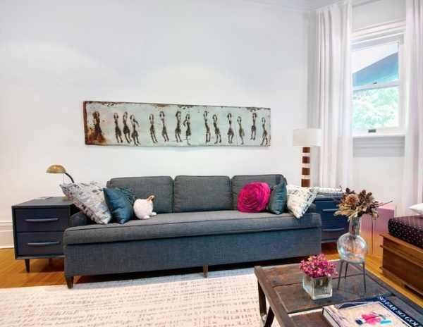
Apostolou re-covered her husband’s midcentury sofa in a gray-green fabric. Toronto artist Scott Griffin created the artwork by soldering bits onto a reclaimed piece of metal.
The couple doesn’t usually go together to look at art; they agree on a budget and buy what they like, hoping the other will too. It’s a process that has worked well, and the house is chock-full of interesting and unexpected pieces that all seem to work well together.
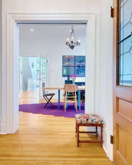
The easy flow throughout the main floor is due to the lack of hallways — all the rooms open into one another. From the main entry, the living room is to the left, the stairs are straight ahead, and the dining room is to the right. Through the dining room is the kitchen, powder room and sliding doors that lead to the garden.
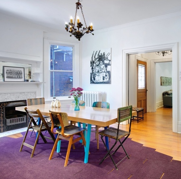
The family’s next-door neighbor is talented woodworker Rob Green of Paus and Grün. He built the dining table following Apostolou’s design. A rift-sawn white oak top is supported by angled steel legs in multiple shades of blue. Anchoring the dining space, the table is surrounded by a mix of chairs, including a few the owners are currently trying out from Anthropologie.
Table: designed by Post Architecture, built by Paus and Grün; area rug: Relative Space
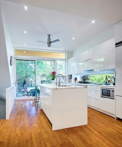
Upon purchasing the house, Apostolou first modernized the outdated electrical, mechanical and structural components. In 2008 she turned her attention to the kitchen, the only room on the main floor to receive a major redesign.
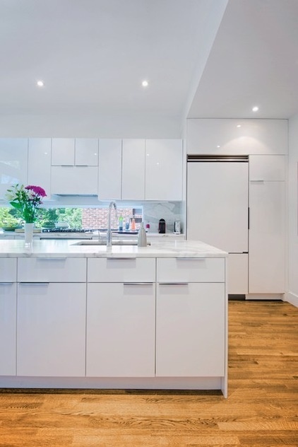
Poorly renovated in the 1980s, it was the darkest room in the house, with only a small window at the back. To make it as bright and welcoming as possible, Apostolou opted for white cabinets and countertops, and installed windows wherever possible. It’s now the family’s favorite room in the house.
Floor-to-ceiling sliding windows open to a tree-filled backyard, and a long, linear window replaced the traditional backsplash. The new oak hardwood flooring was sized and stained to match the existing floors, ensuring a continuous visual flow from room to room.
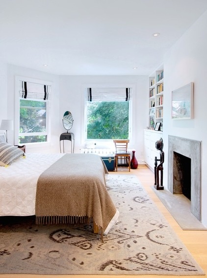
The master bedroom sits at the front the house, nestled among the treetops and facing east to draw in the early-morning sun. Apostolou reorganized the space in 2012 to take advantage of an unused room next door, tucking in a master bathroom and updating the fireplace wall with a minimalist concrete hearth and built-in cabinetry.
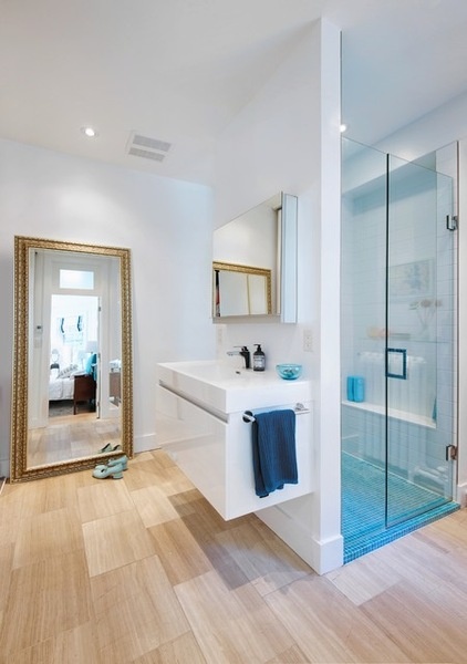
The new master bath is a study in efficiency, cleverly containing the bathroom necessities. There’s an oversize walk-in shower alongside a wall of full-height closet space, hidden behind a row of sliding doors.
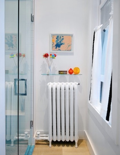
A glass shelf above the radiator holds some small vases. The painting and flowers were created by the couple’s two daughters.
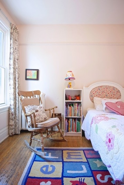
Both daughters have bright and cheerful bedrooms: One overlooks the rear yard, and the other takes advantage of a large bay window at the side of the house. Vintage furniture, Winnie the Pooh lights and an alphabet rug mix it up to create a cozy atmosphere in this one.
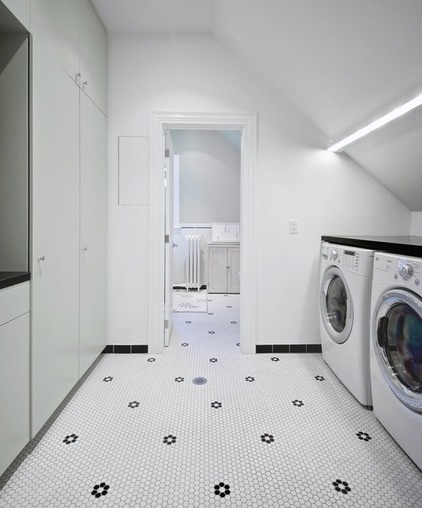
A laundry room and full bath are located on the third level, with a continuous floor made from white and black penny round tiles.
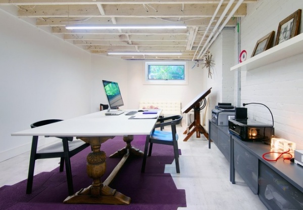
Apostolou interned in offices in Greece, Italy and Finland before returning to Toronto, where she worked with Baldwin & Franklin Architects for 10 years. She began her own office, Post Architecture, in 2006, working out of an office on the third floor of the home.
At the end of last year, she renovated the front half of the basement to house a larger studio space, with room for herself and a newly hired designer; it’s now a walk-out space for easy client access. An antique table base sits on top of a purple area rug matching the one in the dining room. It was purchased from the flooring shop Relative Space, which, until recently, was in the same neighborhood.
With two young children, Apostolou has found that working from home is an ideal arrangement: She can be close to her work as well as to the kids. She often works in the evenings, but with a large amount of flexible time throughout the day, she manages to maintain a great work-life balance.
Chairs: Esbjörn, Ikea
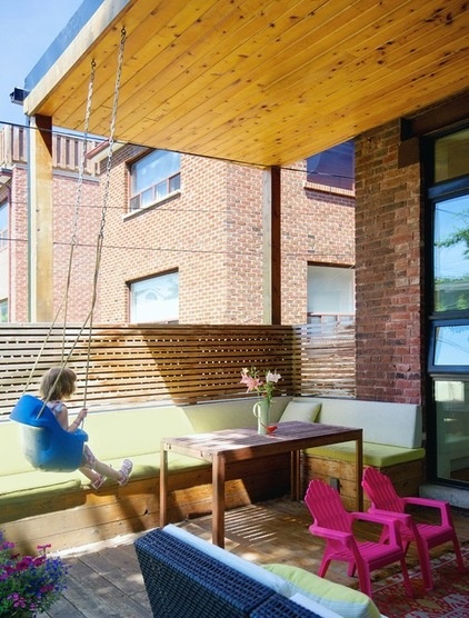
A cedar-clad deck with built-in bench seating and a roof overhang was added in 2009. The deck and rear yard are located just off the kitchen, and tend to be where the family spends much of their time in the summer. Here Daphne enjoys a swing suspended from the overhang.
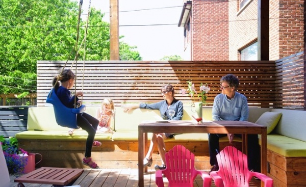
Apostolou and Marshall relax on the built-in bench with Daphne, while Penelope rides the swing.
The west-facing backyard pulls in the setting summer sun and is the perfect place for watching squirrels scurry around, listening to birds chirping and looking over at the neighbor’s yard to see how his garden and baby chicks are doing.
My Houzz is a series in which we visit and photograph creative, personality-filled homes and the people who inhabit them. Share your home with us and see more projects.
Browse more homes by style:
Small Homes | Colorful Homes | Eclectic Homes | Modern Homes | Contemporary Homes | Midcentury Homes | Ranch Homes | Traditional Homes | Barn Homes | Townhouses | Apartments | Lofts | Vacation Homes
More: My Houzz: Polished Urban Sanctuary in Toronto


