Dare to Go Gray in the Garden
Gray has become a popular color choice for interior walls, as it combines so well with many colors without overpowering them. It is what is known as a neutral or achromatic color — that is, a color without color. Gray can adapt to colors adjacent to it, becoming lighter or darker, creating a calm and contemporary living space.
There are many other reasons that using gray in our gardens can also be beneficial. Gray and silver plants have been written about because they tend to be suited to dry climates and because they can create a monochromatic silver-gray garden. But gray can also create a framework for other colors, allowing features to blend or toning down bright-colored plants while acting as a buffer between colors that otherwise might clash.
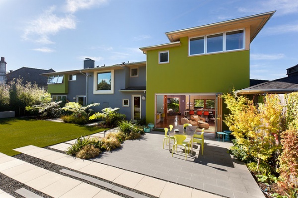
Neutral colors, including gray, can cool or intensify the impact of stronger surrounding colors. On its own this lime green wall could have been too intense, but it’s muted by the gray paving and blocks of darker gray gravel.
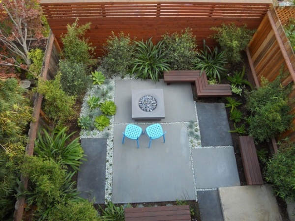
Neutral colors can create the framework that holds a garden together. The poured concrete slabs and fire pit here act as the framework for the surrounding plantings and patio furniture — they do not dominate the design or fight the colors of the plants.
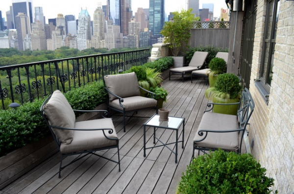
The decking and furniture on this wide balcony, in a restrained palette of warm grays, has an elegant, formal look that shows off the clipped boxwood (Buxus sp) topiary. Lime green joins in, in the almost urn-shaped containers.
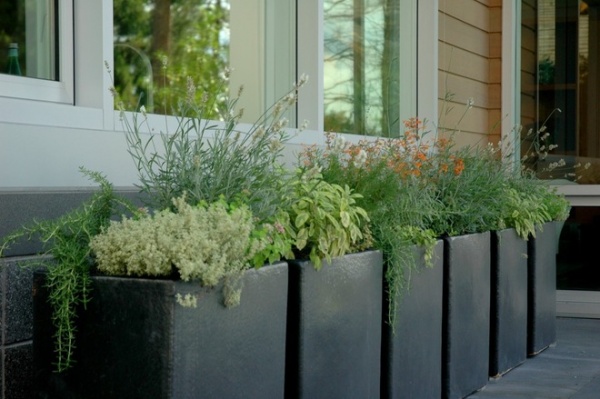
The neutral colors, especially gray and green, we have seen here so far are part of the framework that holds the garden together. The same concept can apply to planters and containers. This mixture of edible herb plants, especially with the differing variegated foliage, feels cohesive — it might have been confused if brightly colored or patterned containers had been used.
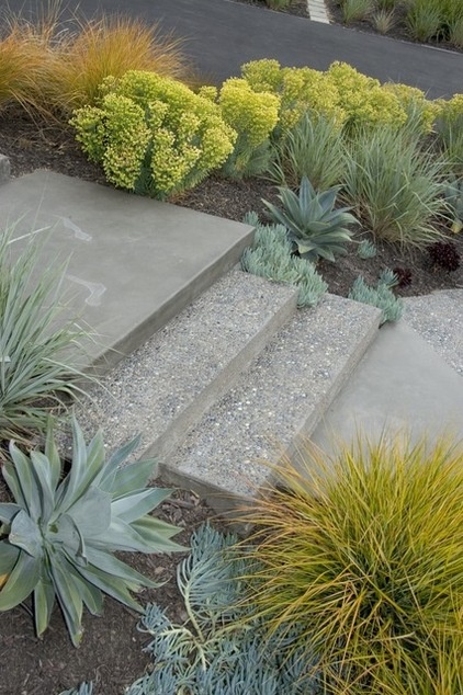
Neutrals, including gray, brown and green, provide a perfect backdrop for other colors. This is especially useful in garden design, where bold-colored plantings can take the front of stage against the gray garden framework of paving, fencing or walls. Here spurge (Euphorbia characias subsp. wulfenii) and New Zealand wind grass (Anemanthele lessoniana) pops against the muted paving, while the gray paving tones down the intense colors.
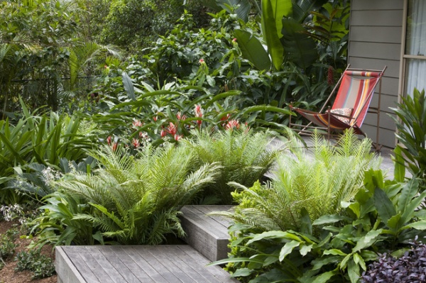
These wooden steps, weathered to a silver-gray, rise through the bright-green Brazilian tree fern (Blechnum ‘Silver Lady’) and the red and white flower spikes of the Heliconia angustifolia ‘Red Christmas’.
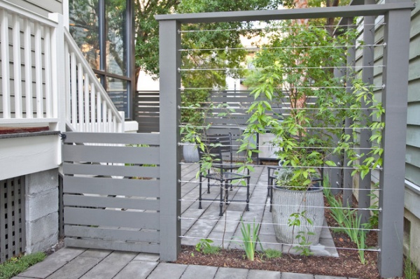
Barriers can be part of the decorative scheme, whether they’re made of intricate wrought iron or they’re an ornamental trellis, but there are situations when barriers need to recede. Taut wires on this trellis support climbing plants as they grow up and fill out the space, creating a living fence and allowing the wire and gray painted support posts to blend in with the background.
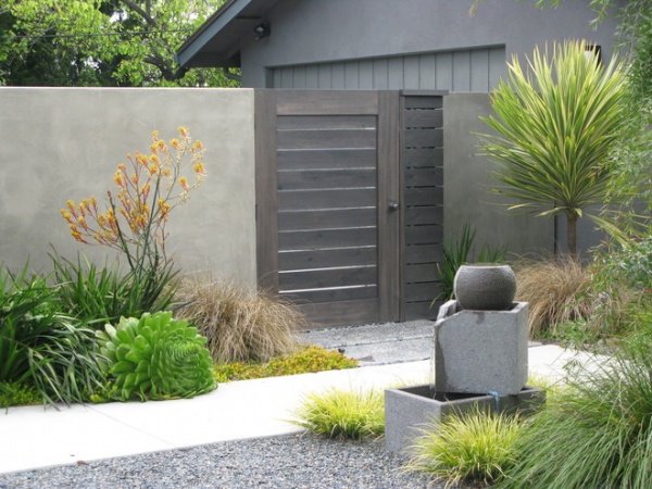
This warm gray gate blends into the garden without overpowering it. The gate, though still a prime feature in the design, takes second place to the plantings — perhaps it would have dominated the plantings and design had it been painted or stained in a brighter color.
I think this use of gray shows how well the color works in contemporary garden design, where it softens bright colors and helps create a peaceful and calming garden layout.
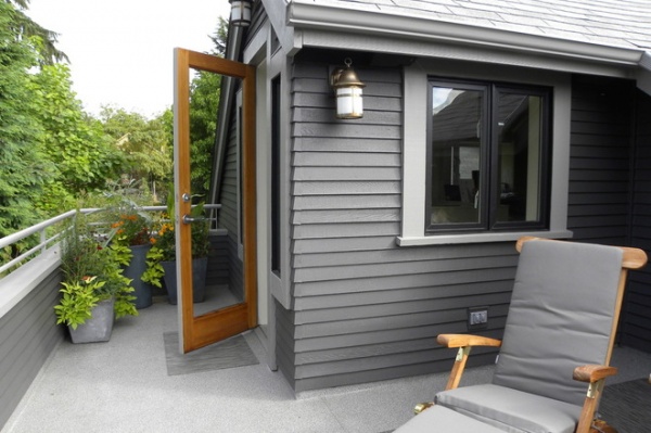
To let surrounding designs stand out, blend house extensions, sheds and other outbuildings into the garden and overall landscape design by painting them gray.
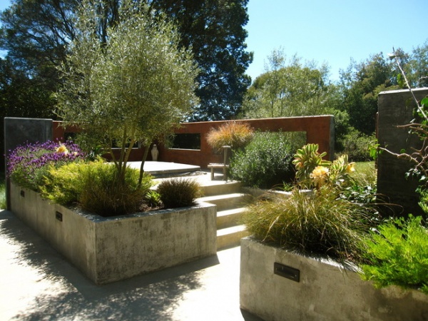
These raised concrete beds, though interesting with their patina, recede behind the plantings in them. The gray concrete blends with all the foliage. We tend to put flowers in vases that do not overpower them, and it is the same with raised beds — generally we want the plantings to take center stage.
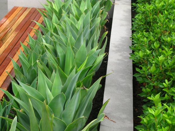
Gray and other neutral colors tone down adjacent colors, and they also create buffers between neighboring colors that might otherwise have a tendency to clash. This gray retaining wall separates the gray-hued agave and bright green Laurustinus (Viburnum tinus) while complementing both.
Gray-leaved evergreens, such as daisy bush (Brachyglottis greyi), lavender cotton (Santolina chamaecyparissus), lavender (Lavendula spp) and silverbush (Convolvulus cneorum) are perfect plant buffers.
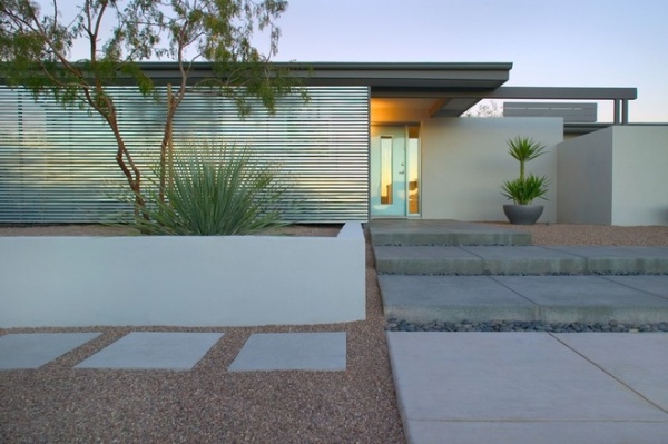
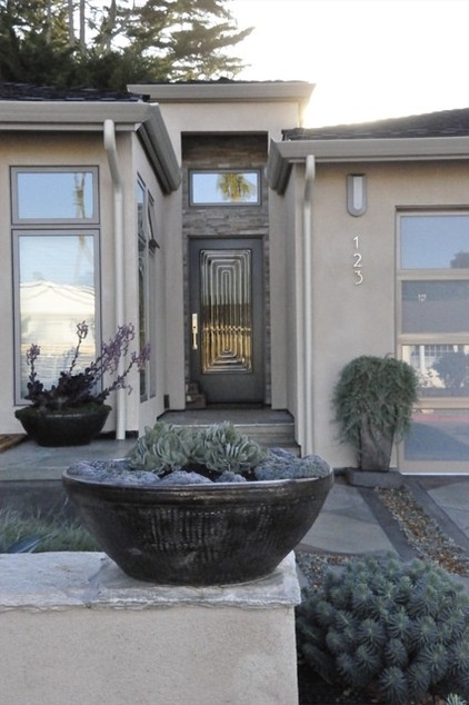
Gray can also be used as an exterior feature color. This entry’s design interest comes from various shades of gray in a variety of textures. The sparse planting picks up the muted tones, and the foliage’s shape and movement overcome the need for flowers.
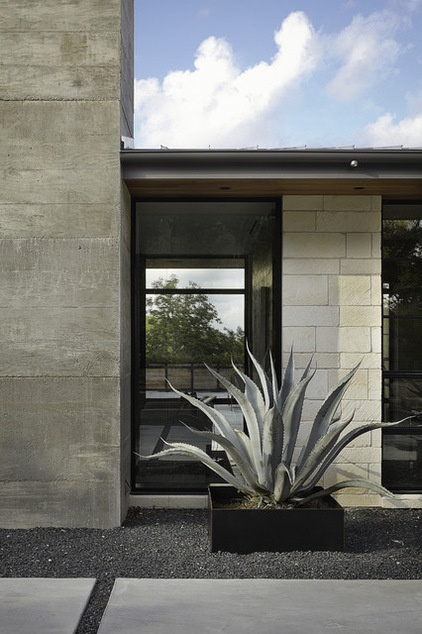
A neutral gray palette has again been used here exclusively. There is a wide variation of tones, from the deep hue of the gravel and raised planter to the warm hue of the concrete paving and limestone walls.
In this example it is easy to see the range of tints and tones that can be achieved by using grays in warm and cool colors. A benefit of using neutral colors is that the strength of the design clearly shows, as it’s not diluted by strong colors — almost like an old black and white photograph compared with a modern colored one.
More: How to Design a Calming Minimalist Garden

