Houzz Tour: Scandinavian Charm in a Cambridge Victorian
http://decor-ideas.org 06/27/2014 19:13 Decor Ideas
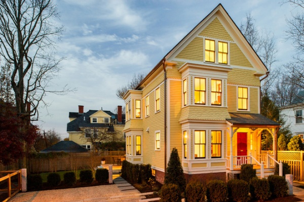
Dee Elms, principal at Terrat Elms Interior Design, was a little nervous about taking on this project in Cambridge, Massachusetts. “One of the owners, Sally Peterson, is part Swedish and wanted a home with a Scandinavian design,” she says. “It’s something our firm had never done.” But knowing that good design is a universal language, she took it on.
Houzz at a Glance
Who lives here: John Stone, Sally Peterson and their 2 daughters
Location: Cambridge, Massachusetts
Size: 2,400 square feet (223 square meters); 4 bedrooms, 2½ bathrooms
Photography by Michael J. Lee
In fact, Elms had passed on the project once before. “My husband and I had actually considered the house for ourselves when it was on the market,” she says. “But we backed off because there was so much to do.”
Little did she know she would get her chance down the road. “The Victorian house had been a multifamily dwelling that had been united into one house, but without taking out the multiple kitchens and bathrooms,” she says. “It had been used as a rental property before that, and it had not been well cared for. It was in pretty bad shape, and any charming details that had been there had long been stripped away.”
But Peterson and her husband, John Stone, saw the potential and hired Elms along with architect Marcus Gleysteen and kitchen designer Kathy Marshall to bring it back to life.
“I wish I could say I jetted off to Sweden to do research, but that wasn’t possible,” says Elms. “Thank God for the Internet.”
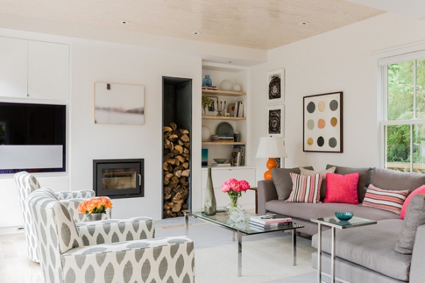
Elms, Gleysteen and Marshall came up with a simple, clean material palette: white walls, Southern pine and gray stone and tile.
The palette is on display in the living room. Southern pine lines the ceiling and makes up the floor and bookshelves. The walls and sleek flat-front cabinets are pure white. The hearth under the minimalist Scandinavian fireplace is light gray, and dark gray stone lines the built-in firewood storage box.
The designer took a clean-lined approach with all the choices, down to the television set. “The TV, seen on the left, is from Bang & Olufsen, and the white panel you see on it is actually a speaker,” she says. “To us that makes it fade away more than a standard television.”
The armchairs swivel, allowing the residents to take in the set or the yard behind them (not pictured is a large floor-to-ceiling window).
Television: Bang & Olufsen; armchairs: Crate & Barrel
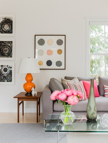
“Sally loves orange and pink, and she wanted to use those colors as accents,” says Elms. “It worked beautifully against the white.” The streamlined background gives the colors and art more impact. “You tend to notice the colors much more,” she says.
Polka dot artwork: Mitchell Gold; rug: Phil’s Felts
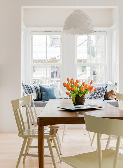
“The owners really wanted an openness to the house,” says Elms. “The living room, dining room and kitchen are all open to each other, with the kitchen being at the front of the home.” At the center point lies the dining room, featuring a midcentury table the couple bought some time ago. It’s enlivened with creamy-hued Windsor-style chairs.
“There are bay windows around the house, and we added window seats in all of them,” says Elms. “This is a perfect place to perch, and during holiday meals you can push the table toward it and have kids use it as banquet seating. It also has the benefit of drawer storage beneath.”
Dining room chairs: Mitchell Gold
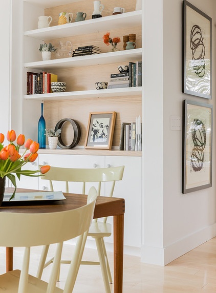
“One of the keys to unifying the house was carrying the material palette throughout, but in different applications,” says Elms. In the dining room, Southern pine backs the bookshelves and gives the room an undeniable Nordic look.
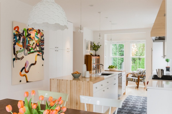
Pine covers most of the kitchen island’s countertop and cascades over the edge. “Kathy created as much storage as possible in this kitchen,” says Elms. The flat-front wooden cabinets include a floor-to-ceiling pantry.
The bay window just beyond the kitchen faces the street. “It gives them more of a connection to the neighborhood,” she says. “The seating area is likely where they have their morning coffee.”
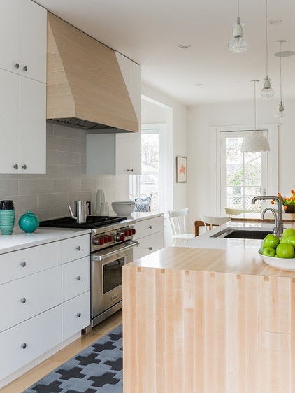
Southern pine makes what the designer calls “a totally cool” appearance in the range hood over the cooktop. The porcelain tile looks like a striated stone.
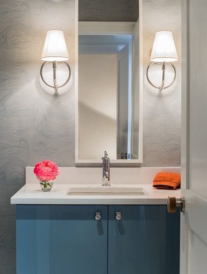
The powder room is covered with a wave-pattern wallpaper that might make a design-minded Norse seafarer’s heart beat faster. “Sally found this early on and fell in love with it,” says Elms. “We added a corresponding blue vanity and circular sconces that mirror the organic wave pattern.”
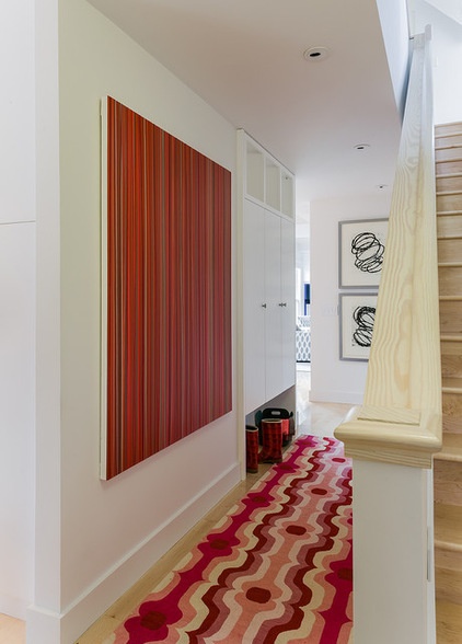
The designer created a pantry-like mudroom. The uppermost shelves hold felt baskets for storage; coats go behind the doors; and boots and shoes get tucked into the niche at the bottom. “There was no space for a dedicated mudroom,” Elms says. “But having this kind of feature was key for the family.”
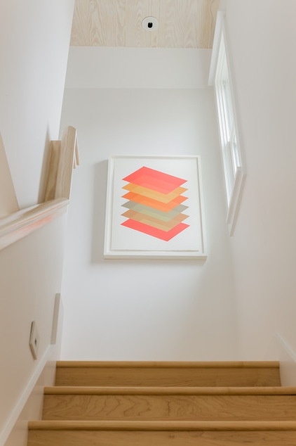
A Southern pine stair rail leads to a landing adorned with a print from a local artist.
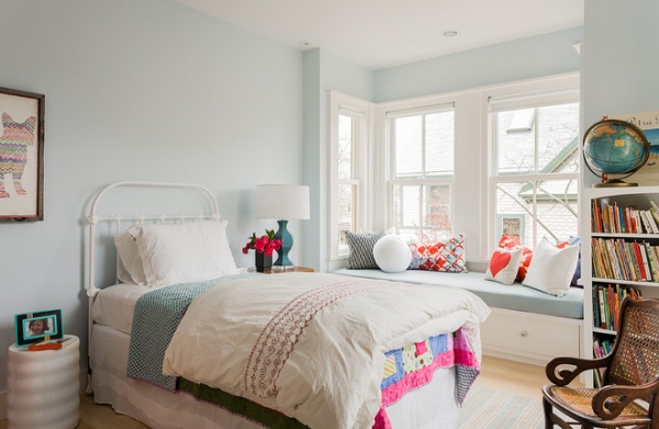
The second floor is dedicated to the daughters. “We gave each girl a window seat,” says Elms. “Sally was concerned with the design being equitable, and kids love to sit on them.”
Most of the furnishings in the girls’ rooms came with them from their previous house. “The family didn’t buy new everything,” says Elms. “They wanted to bring in things from their girls’ world to make the space familiar.”
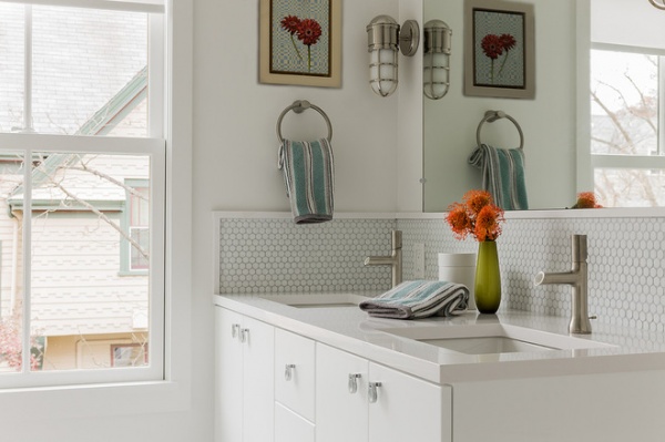
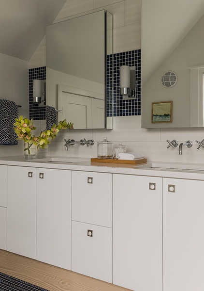
The girls’ bathroom features simple materials and architectural hardware. “Just like the art, you tend to notice them more in this setting,” says Elms.
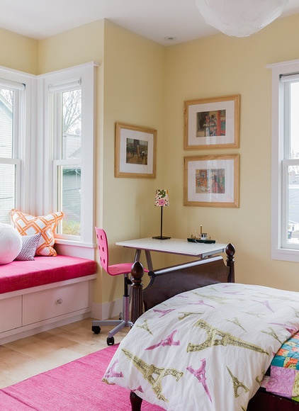
Each daughter got to choose the color for her room at the paint store.
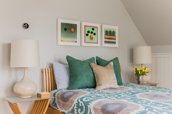
The topmost floor, once an attic, had been converted to a rough living space by a previous owner. During the remodel the architect and designer added a bathroom and storage. “They didn’t put in gables; they kept the pitch of the roof,” says Elms. “We tucked storage in under the eaves — it’s behind the beadboard paneling on the right.”
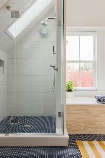
The new master bathroom has accents of navy blue. “Sally really wanted this color in her bath, so we added it with 1-by-1 square floor tiles,” Elms says.
The pitched roof forced the designers to get creative. “We placed a skylight in the angled roof, and it really works,” she says. “I love how the light comes in the space.”
Southern pine appears again in the tub surround and on the baseboard under the vanity.
As the home came together, America watched. “They applied to be on the This Old House program, and the project was accepted,” says Elms. “It was really fun working with the producers of the TV show.”
It was Elms’ second time on the show, so maybe that made her more comfortable working in new design territory in front of the cameras. “I loved working outside of my typical project,” she says. “It’s like anything else — when you are challenged, you grow.”
Related Articles Recommended


