Houzz Tour: A Georgia Foreclosure Gets a Major Overhaul
When you buy a house in foreclosure, you don’t always know what you’re getting. The owners of this 1925 Decatur, Georgia, bungalow hadn’t set foot inside when they submitted the winning bid on the steps of the local courthouse.
Keys in hand, they finally entered the long-unoccupied interior to find evidence of a mishmash of renovations. Vaulted ceilings dwarfed the master bedroom and kitchen, while some classical details and a misguided bay window didn’t suit the scale and style of the home.
The owners turned to Ili Hidalgo-Nilsson at TerraCotta Properties, a local design-build firm, for renovation help. Working with colleagues Luly Melarti, Maruie Hullender and Scott Madsen, Hidalgo-Nilsson gutted the interior and took out some of the later additions like glass block, triangular windows and towering ceilings. “Before you could craft the vision,” Hidalgo-Nilsson says, “you had to undress the house.”
Houzz at a Glance
Who lives here: A couple and their 3-year-old son
Location: Decatur, Georgia
Size: About 3,200 square feet (297 square meters), including the basement; 5 bedrooms, 3 bathrooms

When the owners bought the property, the brick exterior was buried beneath a layer of stucco. The Doric columns, pediment and bay window felt like they’d been imposed on the structure, which didn’t have the scale to carry off such details, Hidalgo-Nilsson says.
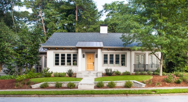
AFTER: The design-build team simplified the exterior detailing and replaced the bay window with French doors and French balconies. They updated the electrical and plumbing, replaced the windows and added insulation throughout.
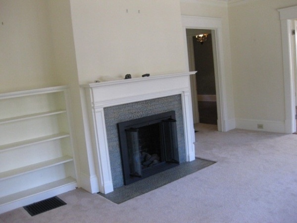
The front door opens directly into the living room, which was dominated by a fireplace that struck Hidalgo-Nilsson as overly detailed for the house. Anyone venturing into the back of the house had to cross diagonally through the living room, which limited the furniture placement.
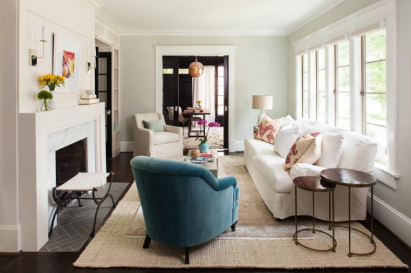
AFTER: The owners wanted the house to feel like a sanctuary — cozy but organized. The team from TerraCotta simplified the detailing, framing the fireplace with Carrara marble and adding a herringbone hearth. A passageway replaced the built-in bookcases to the left of the fireplace, providing more direct access to the neighboring rooms.
Because there was no separation between the entry and the living room, Hidalgo-Nilsson used rugs to define the spaces. The chunky sisal defines the boundaries of the living area, while the bamboo silk rug on top adds a touch of foot-tickling softness in the central seating area. (It would have been too expensive to get a silk rug the size of the sisal, so this solution allowed Hidalgo-Nilsson to introduce a sense of luxury without blowing the budget.)
Sofa: Bungalow Classic; nesting tables: Crate & Barrel
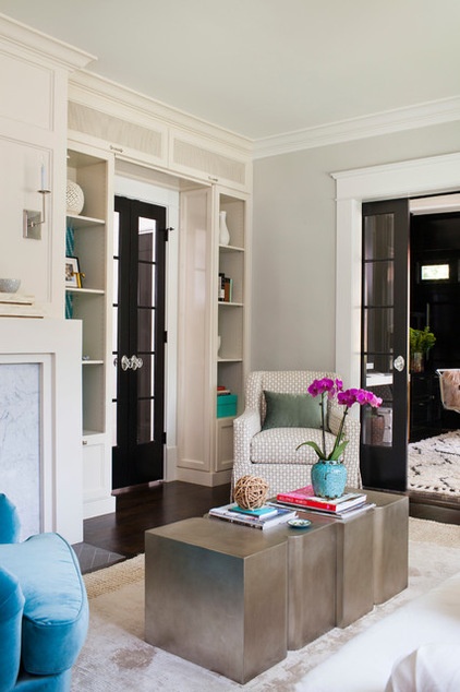
The designer added a pair of Circa sconces over the fireplace, leaving off the shades for a cleaner look. She replaced the French doors into the adjoining library with pocket doors, a characteristically Southern touch, she says.
Silver tables: Dwell Studio
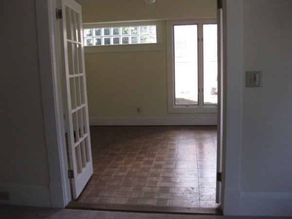
Here’s a view into the library before the doors were replaced. At one time the room was a porch, but previous owners enclosed it and added the glass block.
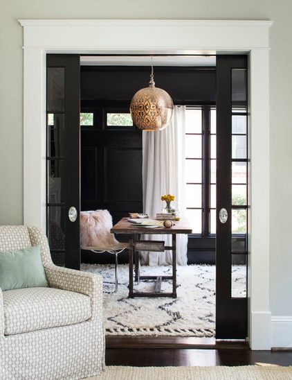
Since the library was such a sunny space, Hidalgo-Nilsson thought it could stand up to a coat of black paint (Sherwin-Williams’ Tricorn Black) — an approach she acknowledges was unconventional but a good match for her unconventional clients.
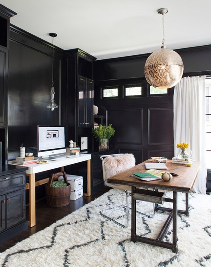
The space serves as a home office.
Rug: West Elm; desk: Anthropologie
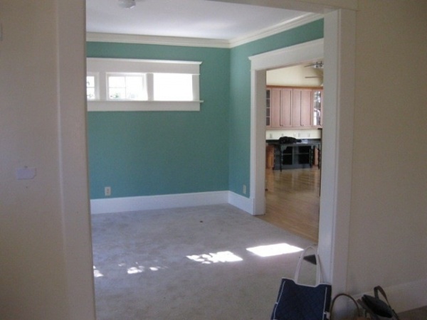
The dining room didn’t need much work, save for new paint and updated crown molding. The windows throughout the house were traded for more energy-efficient models.
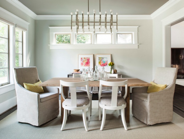
The remodeled dining room derives interest from an eclectic mix of furnishings. A rugged Crate & Barrel table is paired with sinuous painted wood chairs from Serena & Lily and a pair of Lee chairs swathed in easygoing linen. A retro-modern light fixture from Jonathan Adler lightens the mood, as does a pair of artworks leaning against the wall. The room’s variety is reflected in the centerpiece: a collection of clear glass bottles.
Table: Dakota, Crate & Barrel; wood chairs: Serena & Lily; slipcovered chairs: Lee, chandelier: Jonathan Adler; buffet: Bungalow 5
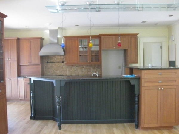
“It was just not functional,” says Hidalgo-Nilsson of the old kitchen, which was dominated by a large traffic-stopping island and an odd mix of Victorian, Shaker and modern designs.
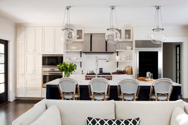
AFTER: The remodeled kitchen looks much more unified, with a consistently clean design seasoned with provocative details — like chrome and acrylic cabinet handles — to keep things interesting. “It had to be warm and cozy, but not fussy in any way,” says Hidalgo-Nilsson.
Pendant lights: Rejuvenation; stools: Serena & Lily
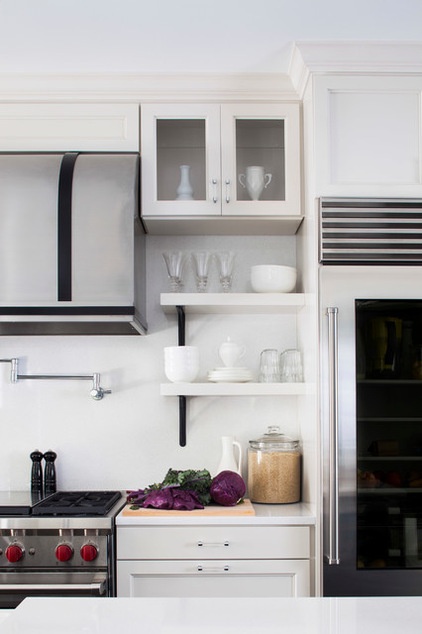
An industrial undercurrent runs throughout the kitchen, exemplified by commercial-style faucets, open shelving and a glass-front refrigerator.
Hidalgo-Nilsson had been eager to use this refrigerator in a project but needed the right client; in this instance she realized she had a client who was organized enough to pull it off.
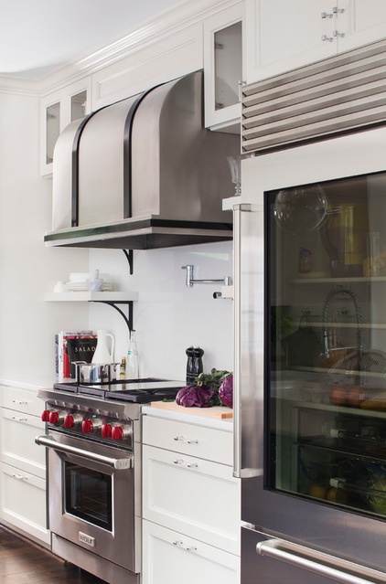
The solid-surface counters and backsplash are from Hanex; the rugged range hood is from Vent-A-Hood.
Refrigerator: Sub-Zero
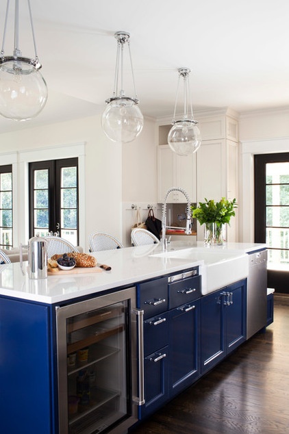
The island’s navy-blue cabinets are unexpected, but Hidalgo-Nilsson campaigned for them, feeling that the room needed a punch of color. An undercounter refrigerator stores wine and other beverages.
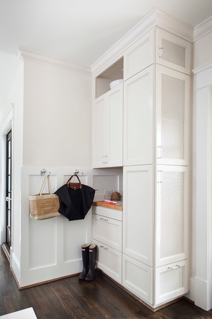
The kitchen needed a “touch-down” area for depositing book bags, bills and keys. This home organization center in the corner features a coat closet built into the side.
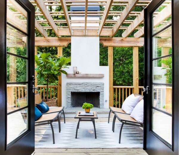
French doors next to the home organization center lead to the deck, which replaced a multilevel deck in the same spot. A new fireplace aligns with the end of the island and connects to the house with a generous pergola that will one day be woven with jasmine. Stairs on the right lead to a sloping backyard a story below.
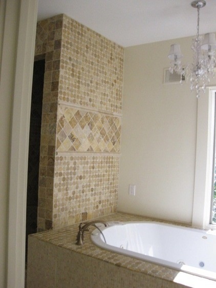
The master bath was contained within an earlier addition. The tapestry of tiles and crystal chandelier lacked the contemporary crispness the owners were seeking.
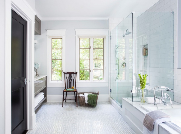
AFTER: The bright, airy bath combines snowy subway tile with marble floors in a herringbone pattern. The generous glass shower takes full advantage of the surroundings and makes the room look more spacious.
Tub filler: Kingston Brass CC108T, Build.com
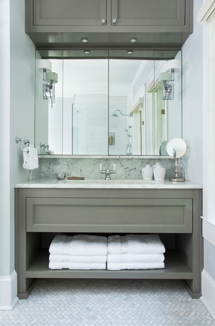
The vanity space was limited, so instead of using two smaller his-and-her basins, Hidalgo-Nilsson opted for one huge sink. Wall sconces are mounted directly on the mirror, which opens in the center; additional storage is available above.
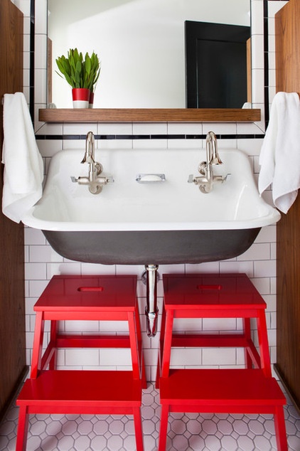
The owners’ 3-year-old son got a big sink of his own.
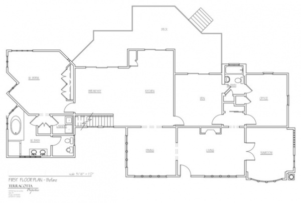
The house is in a flood plain, so updates had to be done within the existing footprint.
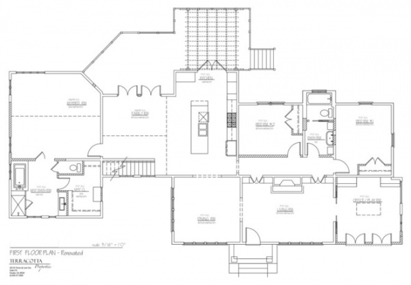
AFTER: The floor plan has not grown in size, but the circulation is now more efficient and the design is cleaner. “This was kind of a diamond in the rough,” says Hidalgo-Nilsson, who turned this neglected jewel into a real gem.
More: 10 Advantages of the Humble Ranch House


