Bath of the Week: Black, White and Classic, With Some Twists
http://decor-ideas.org 06/23/2014 23:13 Decor Ideas
Architect Jason Urrutia takes pride in his firm’s grasp on tradition. “We lean toward classic without being boring or old school,” he says. “We embrace elements that time has tested and give them our own creative twist.”
That thinking drove the design of this bathroom and closet in the master suite of a 1910 home in Sausalito, California. “A white bathroom is traditional,” Urrutia says. “But to keep it from being sleepy, you need to wake it up.” The bugle call for these rooms comes in the form of strong ebony elements.
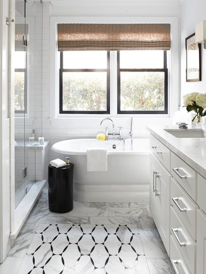
“Before the remodel the house was a duplex. But with a baby on the way and a need for more space, the couple who own the home asked us to make it into one house,” Urrutia says. Using parts of spaces once occupied by a kitchen and living room, the architect carved out a new master bath and closet.
“There’s only 4 feet between the vanity and the glass shower door,” he says, “but it seems much lighter and airier. If we had created a darker bath, it would feel smaller.”
It’s easy for an all-white bathroom to feel “ghostly and superbright,” he adds. Elements such as the black painted trim on the new wooden windows, the black stump-like occasional table and the black tile that forms the equivalent of an area rug in front of the vanity keep the ghostliness at bay.
Wall tile: Pure, Sonoma Tilemakers; floor tile: Ann Sacks; cabinet hardware: Strande Pull, Restoration Hardware
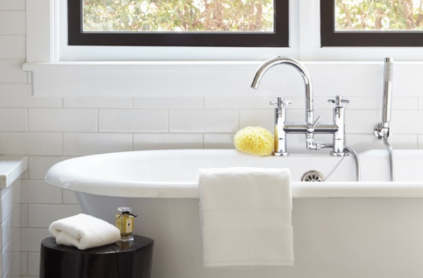
A freestanding tub with classic lines saves space (as opposed to a tub with a surround) while giving a nod to the age when the house was built.
Tub: Regal, Cheviot Products; tub faucet: Hudson Reed
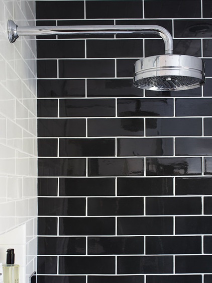
Look inside the shower and you discover a less subtle dark accent: a 7-foot, floor-to-ceiling installation of black subway tile.
The shape of the tile illustrates the subtle touches that are the hallmark of Urrutia’s firm. “We didn’t use your standard subway tile,” Urrutia says. “Typically, this kind of tile is 3 by 6. The tile we chose measures 3 by 9. It’s our way of putting a small modern touch on classic design.”
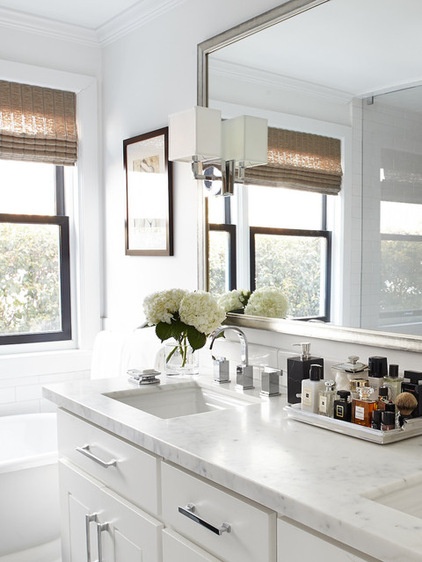
Another modern interpretation of the classics is found in the edge detail of the marble vanity countertop. Instead of the traditional edge details that look either rounded or molding-like, the architects chose a more modern squared, block-like edge.
Sconces: Nolan, Restoration Hardware; faucet: Sirius, Danze; sinks: Memoirs, Kohler
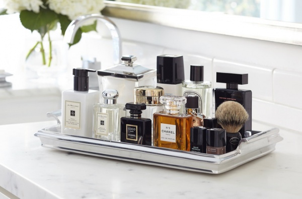
A silver tray adds depth to the design while giving the homeowners a place for elegant toiletries. “For us one of the themes is layering,” says Urrutia. “You might not want to leave out deodorant or a can of shaving cream, but if you have pretty bottles, why not display them?”
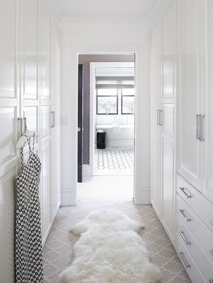
A black door, just visible on the left, marks the entry to the master suite. There is a walk-in closet off the passage to the bedroom, directly across from the bathroom. Urrutia says that although they’re separated, the two spaces work as one.
Cabinet and drawer hardware: Strande Pull, Restoration Hardware; carpet: Stark Carpet; cabinets: Ikea
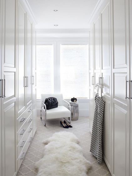
The budget called for a high-low mix. The cabinetry is from Ikea, the hardware is from Restoration Hardware, and the carpet is from Stark.
“It’s all in how you present it,” says Urrutia. “We kept it simple and understated for an elegant look.”
More: Bathroom Remodel Workbook
Related Articles Recommended


