Houzz Tour: Problem Solving on a Sloped Lot in Austin
Kelly Gonzalez, a contractor, an interior designer and a mother of four, likes to solve problems and make people happy. But when she set out to build her own home, she faced a few obstacles, namely: a narrow lot on a steep downslope, a live oak tree in the middle of the property, an eroding stream (with no promise of upcoming embankment), “McMansion” regulations on home size and the needs of homeschooled kids and a work-from-home husband. Oh, and she was pregnant.
The good news is, she and the team at her company, Silverthorn Contracting and Design, pulled it off. And there was only one thing from her request list she didn’t get: an indoor slide. “Once the walls were up,” she says, “the parts just didn’t fit.” She didn’t despair. The slide fit nicely in the side yard, and the allotted space inside fit an extra-large pantry — problem solved, and everyone’s happy.
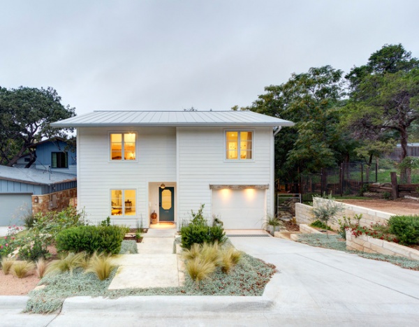
Photography by Michael Hsu
Houzz at a Glance
Who lives here: Kelly and Carlos Gonzalez; their children, Sofia (age 10), Lila (7), Jude (4) and Moses (2); Abbi the dog; and chickens Miracle and Ruby
Location: Austin, Texas
Size: 3,695 square feet (343 square meters)
Year built: 2012
Bouldin Creek is an established neighborhood, and there are only a handful of empty lots left. The lot Kelly Gonzalez found was one of those remaining few. “One of the main reasons it was there,” she says, “was because it had so many problems.”
Gonzalez called in Carina Coel of Restructure Studio to help with designing around the issues, and Coel converted restrictions into opportunities. Permits alone took nine months to be approved, but now the unassuming design fits nicely in the neighborhood, and around back the home extends outward to meet all of the Gonzalez family’s needs.
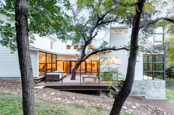
The house progresses down a sloped lot, with increased heft as it goes. It’s squeezed around the oak tree in the middle, and a deck wraps the tree, making it the centerpiece of the design.
A side yard provides space for play, and a pathway of loose rocks works as a swale to guide rainwater to the creek. The home also sits on piers sunk 40 feet into the ground, something Coel engineered to prevent the home from moving due to gradual creek erosion or flooding.
Landscaping: Somos
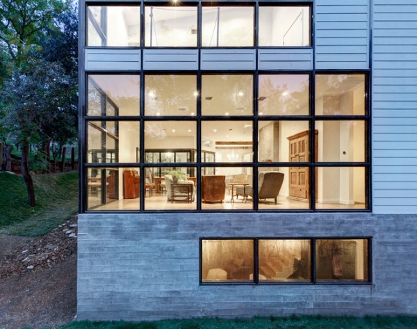
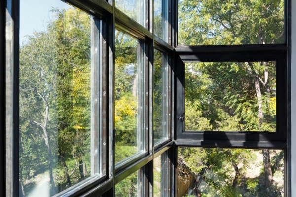
Custom steel windows were built onsite and stretch from floor to ceiling. Gonzalez’s husband lives by the mantra “The more light, the better,” but since moving in, they’ve added curtains. “Without them it’s really bright,” Gonzalez says.
Coel designed the windows to serve as vertical structural supports in addition to forming the window frames.
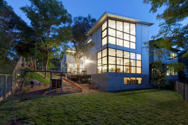
From the base of the yard, it’s easy to get perspective on the home’s slope. The grassy area gives the children space to play, and you can see, behind the left edge of the play structure, the outlet of the slide. From this angle you also get a sense of the size of the oak tree, which wraps around and rises above the house.
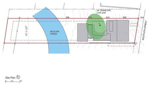
The site plan outlines the difficulties of designing the house. The large green circle represents the canopy of the oak tree and shows what an obstacle it was to work around. Coel made room for the tree and also managed to get city approval for moving the house closer to the street and farther from the creek.
Most of the year the creek is only a foot deep, and it’s possible to pass through the water to the other side of the lot. For safety Gonzalez erected a fence on the house side of the yard.
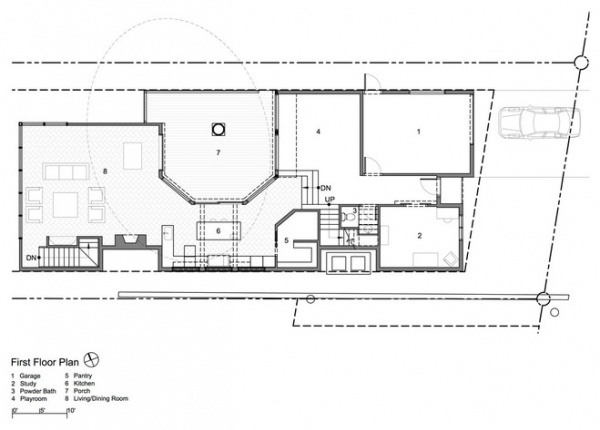
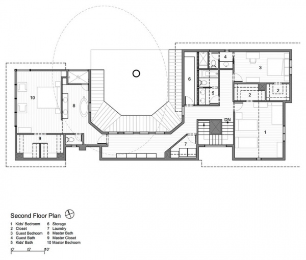
It took nine months for the permits to get approved, which was a hidden blessing. Gonzalez and her husband spent the time finding things for the house like salvaged doors, appliances, a freestanding tub and a piece of driftwood dredged from the bottom of the Colorado River.
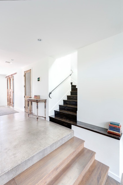
At the intersection of the entryway and two flights of stairs, the main flooring elements meet. The home’s entry sits on a concrete slab, then there are steps down to a cantilevered foundation (it floats above the oak’s roots) with wood floors finished with a gray stain. The stairs are pine, stained a dark ebony.
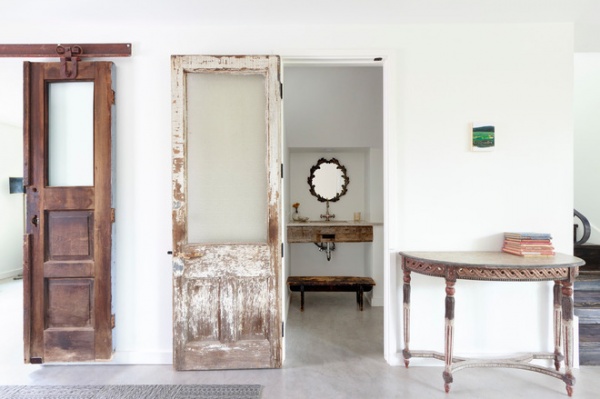
A powder room is nestled under the stairs, and to the left is the office. The doors, both salvaged, were part of Gonzalez’s findings while waiting for the permits. Coel designed the openings to fit the doors; having the doors onsite made the customization easy.
Doors: Pieces of the Past
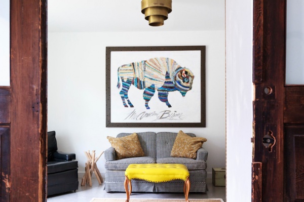
The office sits at the front of the house, away from homeschool activities. Gonzalez’s husband works from home, and here it’s quiet enough for his conference calls. The large artwork is a piece by Midwest artist Dolan Geiman, and, with the otherwise blank walls of the home, it works as a dominant design element.
Photograph and artwork: Dolan Geiman
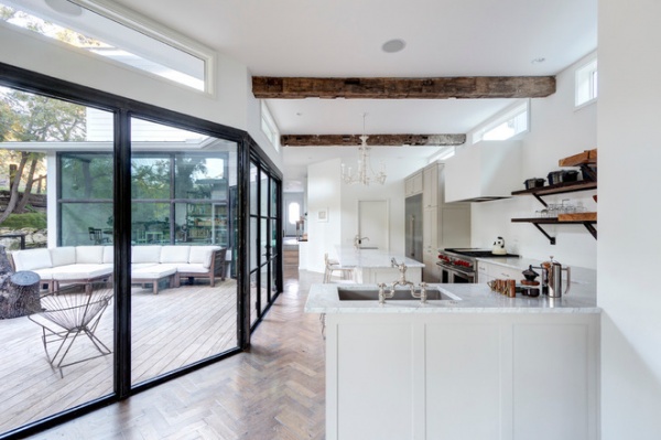
In the kitchen white is right. The countertop is Carrara marble; the cabinets are white and a light gray; and a white chandelier hangs over the island. The backsplash and hood are greenboard painted with an eggshell finish, and Gonzalez attests that any splashes can be quickly and easily wiped off.
The shelves are reclaimed wood from a former spaghetti warehouse in downtown Austin. The brackets are repurposed from the custom-built steel windows.
Shelves: Clifton Craft Work
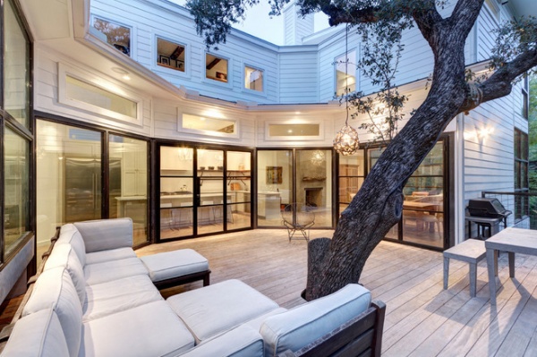
The oak takes all the focus on the deck. Gonzalez hired an arborist to help with preserving the tree, and Coel designed the house to both accommodate the needs of the tree and highlight it. Downstairs the deck and three walls of glass face the trunk, and upstairs a gallery of windows looks out at the branches.
The deck and part of the home’s foundation are cantilevered, allowing the home to sit above the tree and leaving the roots undisturbed. For the decking material, Gonzalez chose garapa wood, which performs like ipe but is significantly cheaper. The untreated wood has faded to coordinate with the finish of the interior flooring.
Decking: garapa wood
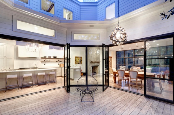
The steel doors open as traditional hinged doors (for quick access in and out), but they also fold together to create open access to the outdoor areas. Gonzalez wanted to be able to move the dining room table outside if she wanted to, and the custom-built accordion doors fulfill this request.
Doors: Durango Doors
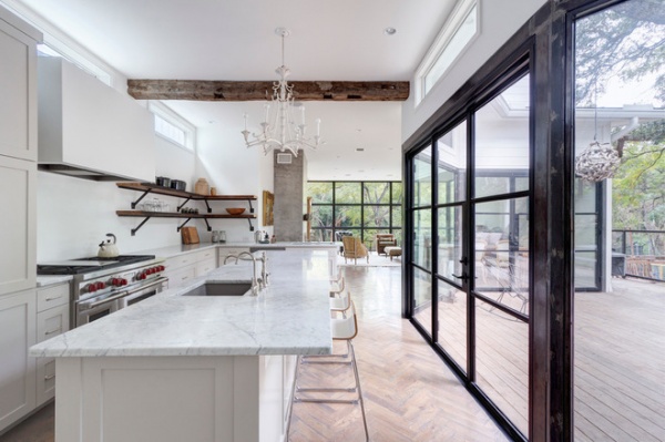
Throughout the home Gonzalez used reclaimed items. The chandelier is a rewired fixture, and the exposed ceiling beams, which are structural, are salvaged wood.
Gonzalez, a self-proclaimed “water nerd,” also installed a reverse-osmosis water filter in the kitchen sink (in addition to a whole-house water filter that reduces chlorine, microbial pathogens and other contaminants). “We hardly ever buy bottled water,” she says.
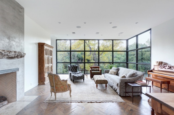
“We wanted [the house] to be modern,” Gonzalez says, “but to have a vintage, industrial feel as well.” This aesthetic is best seen in the living room, where antique chairs mingle with exposed steel windows, and the herringbone floor butts up against the plaster finish of the fireplace.
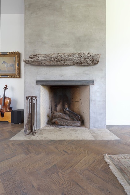
The classic Rumford Fireplace pushes heat into the room and easily warms the living room and kitchen. The steel above the opening is structural, but instead of placing a veneer on top, Gonzalez left it exposed, which increases the industrial feel of the space. She also wanted a mantel with presence, but that didn’t leave room for objects placed on top. This piece of salvaged wood — the tip of an old pylon dredged from the bottom of the Colorado River — worked.
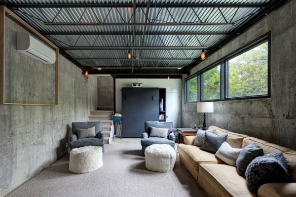
The basement came as an afterthought, mentioned by Gonzalez’s husband. Luckily, it was an easy addition. After digging out an 8-foot section of backfill, the team built a concrete retaining wall and a set of stairs to the first floor. The raw, exposed room works well for movie nights and as a quiet space that’s separate from the first floor.
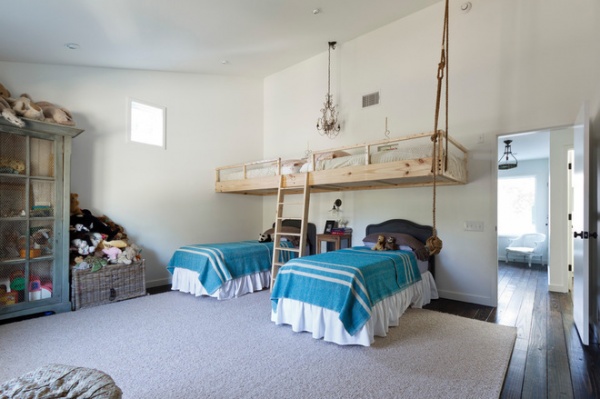
“I’m an only child,” Gonzalez says, “and I’m embracing this big-family thing.” For now three of the kids sleep in one oversize bedroom, (the youngest is still in a crib) and Gonzalez says the late-night talks are one of their favorite things.
When framing the room, Gonzalez planned on the suspended sleeping space, and she had the framers build additional support in the wall. She also added sturdy rope that connects to a ceiling truss and a ladder that also provides structural support. “I’ve swung from the rope and jumped on the bed,” Gonzalez says, “because you know they will.”
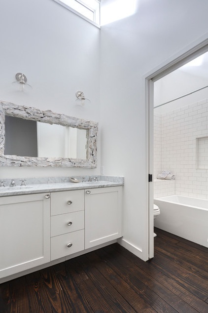
In an effort to save wood, Gonzalez installed custom milled 2-by-6 tongue and groove pine beams for both the subfloor and the finish floor (instead of having a plywood subfloor). She stained the boards a dark ebony to create contrast with the stark white walls.
Clerestory windows allow natural light to enter the space; Gonzalez says that during daylight hours, the kids rarely need to turn on a light.
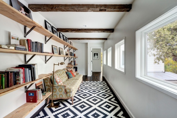
“The second story of a home usually gets neglected,” Gonzalez says, “so I wanted to do something interesting.” The hallway worked as one of those engaging spaces. Instead of leaving a narrow hallway whose sole use was for passage between rooms, Coel and Gonzalez widened the path to create a reading nook.
They also repeated the salvaged-wood beams from downstairs and installed shelving from the excess window steel. On the other side of the windows, the upper branches of the oak tree sway, adding a calming visual. The seating area, to Gonzalez’s pleasant surprise, has become one of her favorite places in the house.
Shelves: Clifton Craft Work
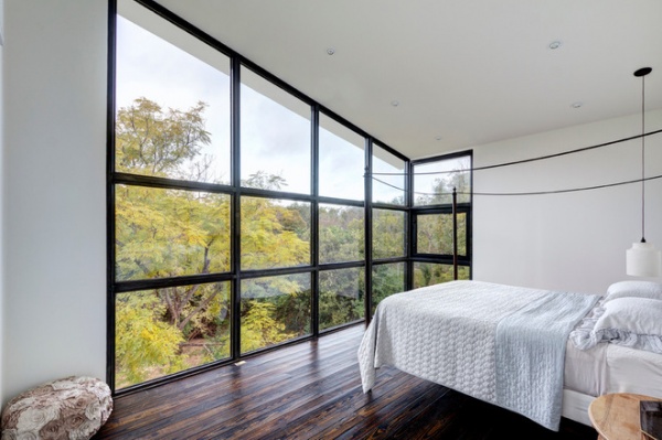
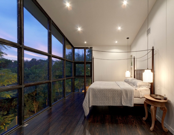
The master bedroom has sweeping views of the creek and foliage beyond; the slanted windows progress from 9 feet to 12½ feet. The bed, made from a old industrial steel grate, is the focus of the room. As for her lack of decor, Gonzalez says, “I don’t need to fill my walls. I feel very comfortable with white walls.”
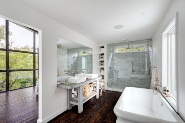
Both the freestanding tub and the vanity — a converted Belgian workbench — were finds that Gonzalez discovered during the long permit process. The tub she discovered as a floor model; she waited until it was being sold at a discount at the end of the season.
Vanity: Carol Hicks Bolton
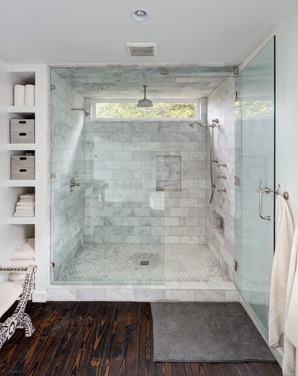
The master shower features three different showerheads. Her husband uses one, the rainshower is shared, and the handheld, Gonzalez says, is used for bathing the kids and the dog. The handheld is one fixture Gonzalez has come to appreciate in motherhood.
Gonzalez says her family uses every square inch of the house. After a full day of work and play at home, sleep is well deserved.
Browse more homes by style:
Small Homes | Colorful Homes | Eclectic Homes | Modern Homes | Contemporary Homes | Midcentury Homes | Ranch Homes | Traditional Homes | Barn Homes | Townhouses | Apartments | Lofts | Vacation Homes


