Design Workshop: The ‘Disappearing’ Guardrail
http://decor-ideas.org 06/22/2014 19:15 Decor Ideas
As an architect, the most common request I receive by far from clients discussing deck guardrails is, “Please just make them disappear.” It’s a tall order. Guardrails are important architectural elements with competing design priorities. For example, they must be low enough to permit a seated view. They need to have intermediates spaced to keep children safe, must prevent climbing and, of course, must be strong enough to lean against without toppling over. Throw transparency on top of these priorities and you can see how complicated things can get. So how can we make the guardrail get out of the way and allow the view to assume center stage while still maintaining safety? Let’s take a look at the options.
The Rules
It helps to know the parameters that regulate guards so we can artfully incorporate them into our designs. Your local codes may be more stringent, but as a general guideline the national code that regulates guards is the Life Safety Code (NFPA 101), and it prescribes that for any change in height between adjacent surfaces of 30 inches or greater, you’re required to use a guard. If your deck is more than 30 inches off the ground, chances are that you’ll need a guard at the edge for safety.
Guards are different than handrails in two key respects: First, they’re taller, at 42 inches high; and second, they’re required to have intermediate members that must be spaced such that a 4-inch sphere can’t pass between them. This apparently equates to something smaller than what the average child can fit through, and it guards against dangerous falls. There are also other, more specific, load requirements (such as it must resist a 200-pound concentrated load), but these are our primary concerns.
Glass Railings
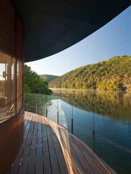
While it’s expensive, it’s hard to beat glass for its transparent properties. If you’re near the ocean, be aware that salt spray can build up on the surface of the glass, and it will readily show off the points where it’s been touched (sunscreen-covered legs, fingers, arms etc.).
It has some distinct advantages. It’s completely transparent, allowing for a seamless visual connection between view and viewer, and it doubles as a windscreen, which can extend the functionality of decks, especially those nearby water bodies that are typically subject to higher winds.
It has its disadvantages too. Glass is expensive (it must be tempered or laminated for safety), and it requires a regular commitment to cleaning. And, because it’s heavy, it requires special hardware to attach it to the deck edge and may require additional structural supports.
Cable Railings
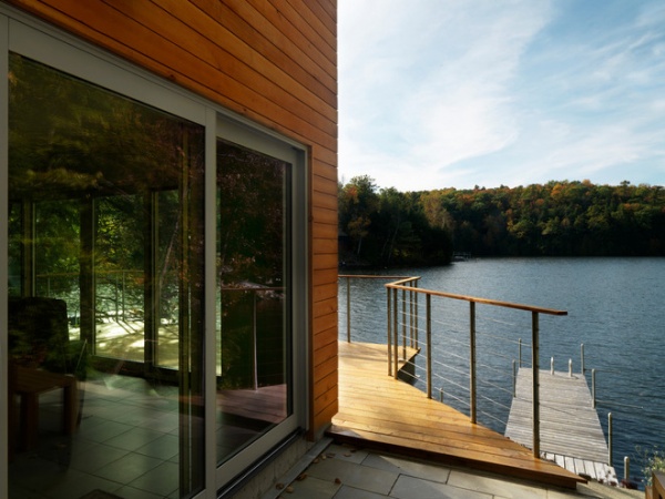
One of the more common means of deferring to the view is to use a cable system. There are many types and sizes to choose from. Feeney makes the most recognizable brand, called CableRail. Vertical posts should be rigid enough to withstand the tightening of the cables. I always equally space my cables at slightly less than 4 inches to account for cable sag midspan.
Opt for thin verticals to complement the low profile of the cabling. They can be made quite thin if fabricated from steel. The horizontal cables, to me, seem to disappear more than the verticals as our eyes naturally orient to the horizon. Equally, when peering back at the building, horizontal lines often correlate with the siding lines and tend to dissolve even further.
The cabling reminds me of boat rigging and is an especially nice reference point for homes near the water.
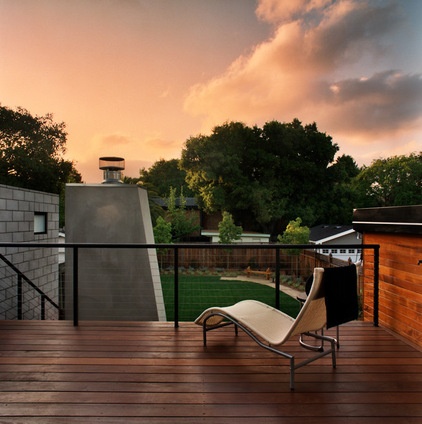
Choosing a dark color for the verticals and top rail will allow the entire assembly to virtually disappear.
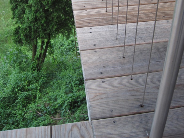
Vertical cable configurations are also possible. This particular design is extremely minimalist and has no bottom rail at all.
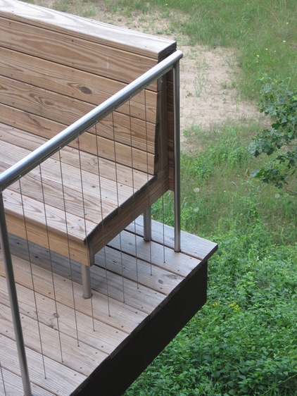
Take care to consider the board spacing and cable spacing together to avoid a cable’s landing in the joint between boards.
Mesh
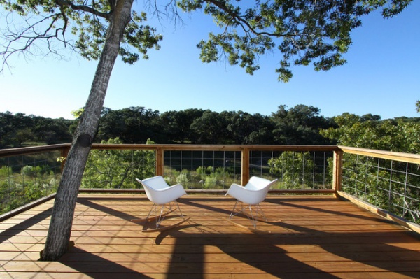
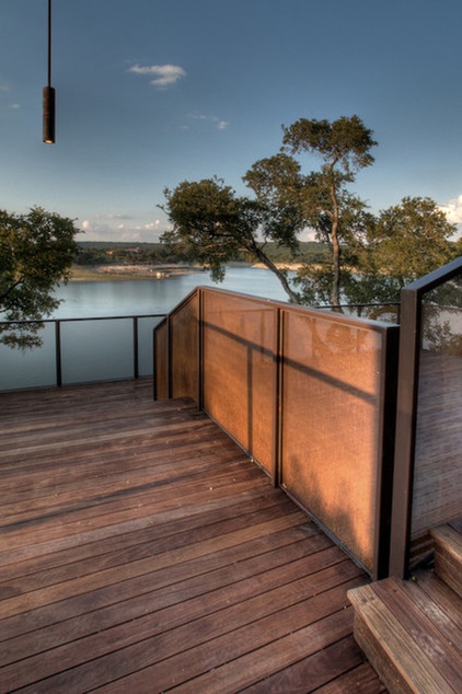
A fine mesh screen has many of the same benefits as glass, but at a lower cost (and weight). It has the properties of a window screen, allowing filtered views through it. Depending on how the light hits it, it can be more or less translucent.
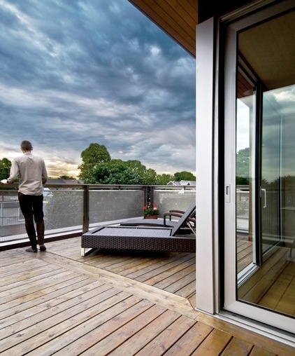
When using mesh, you’ll be balancing the spacing of the mesh (how open it is) and its rigidity. You want to find a mesh that’s rigid enough to withstand the wind at a reasonable panel spacing, but isn’t so rigid as to be visually obtrusive. Also you’ll want to choose a complementary frame to hold it in place; the rhythm of the panels in mesh systems becomes the dominant feature in the view.
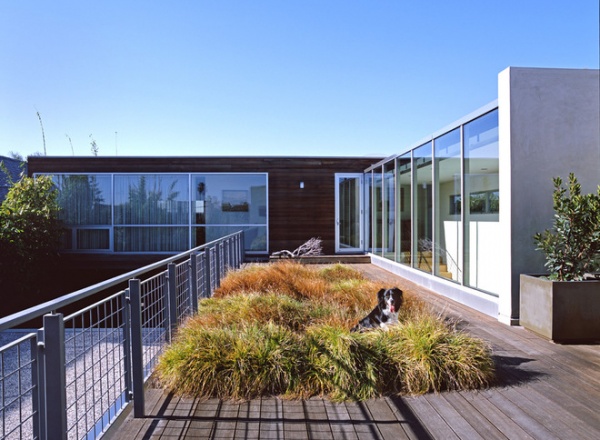
The architect of this home used a common building material in an unusual way for this guard design. The mesh panels are actually welded wire fabric (WWF), a mesh commonly used for reinforcing concrete slabs. The spacing here corresponds with the minimum code requirement.
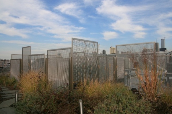
Mesh comes in varying densities, patterns and gauges. I love how these guards mimic buildings in the city skyline. McNichols Company is an excellent source for this material. Peruse their website to get an idea for the wide-ranging selection available.
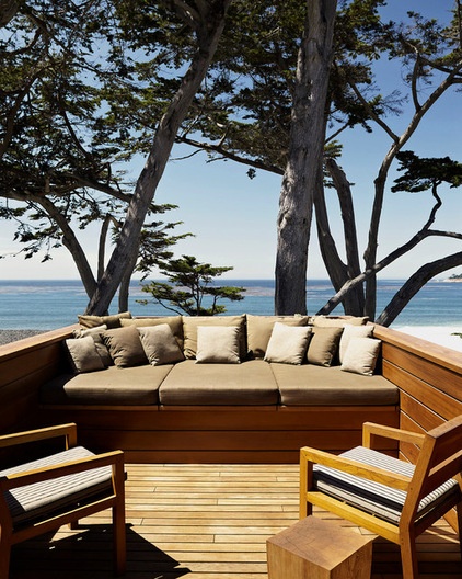
Seating Elements
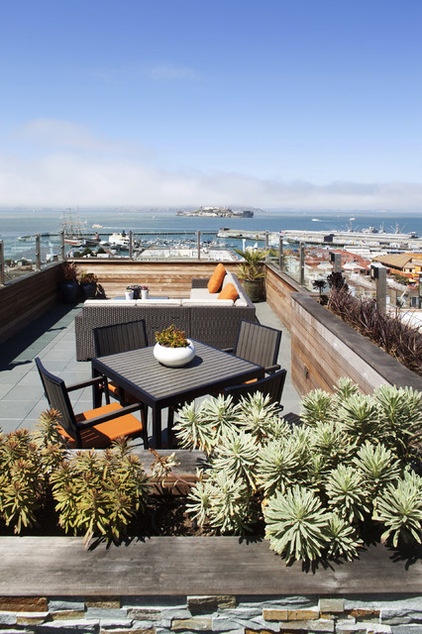
Integrating furniture-like elements into the edge of the deck is worth considering too. I like how the back of this deck wall is just the right height to give a sense of enclosure while not limiting views to the horizon. Be sure to check with your local codes as to whether this is feasible, because the seat could be used as a platform and thus not meet the code.
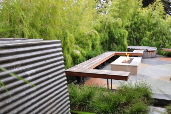
Seating elements such as these geometric benches are so thin, they appear to float. While not technically a guard, they serve the same function: controlling the experience and keeping people where they’re meant to be. These are good solutions when the grade change is close to, but not quite, 30 inches.
The edges are supplemented with thick layers of vegetation, which lend an organic softness to the edges of the hardscape.
Hybrid: Wall + Glass
Hybrids of solid and open elements can creatively meet the code-mandated height of guards without their corresponding visual weight. In this example, a solid wall at a fixed height transitions to glass panels from seated eye level upward.
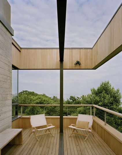
Hybrid: Wall + Cable
Similar concepts can be applied to all manner of combination systems. In this one the required height has been split, leaving some wall to balance the overhead architectural element. I personally like the diversity of a lower solid wall element combined with an upper, more open element. The wind-screening capability is nice, as is the sense of enclosure. Don’t forget to account for the deck drainage with solid wall systems, either via a scupper or internal roof drains.
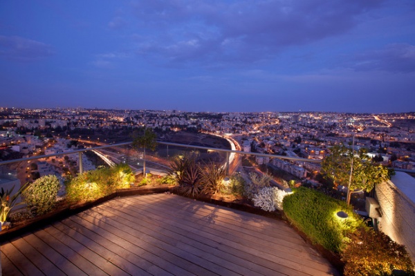
Hybrid: Vegetation + Guard
This rooftop terrace has vegetation layered in front of the guard system, which has the effect of dematerializing the background. One has the sense that the vegetated border is the real guard. With the foreground lit at night, it’s a particularly effective visual trick.
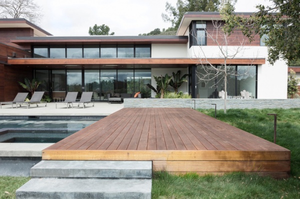
Alternatives to Guards
There are other solutions that completely eliminate the need for guards altogether.
Terraces. Sloping sites can take advantage of a terraced deck configuration to minimize the need for guards. As they step along with the adjacent grade, they maintain a constant relationship to the site that’s always less than 30 inches.
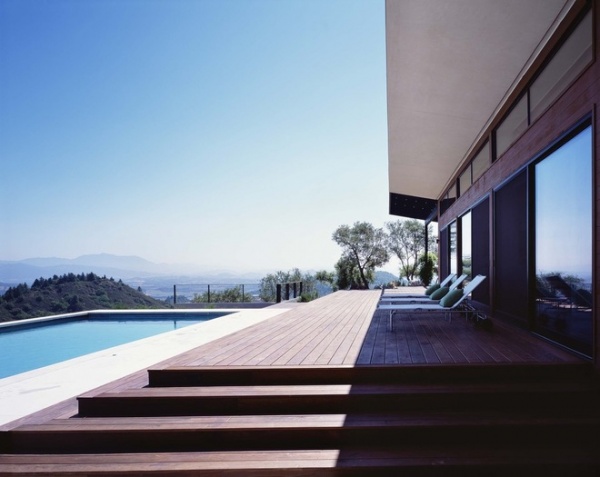
Steps. Use steps to your advantage to mediate grade changes in excess of 30 inches. They can also double as seating areas if sized properly.
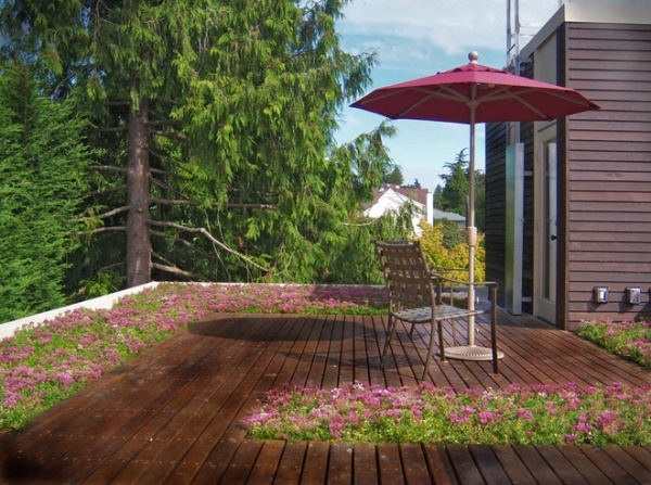
Planted borders. Creating areas that are off-limits or inaccessible due to plantings is another strategy to consider to eliminate the need for a guard.

Here we see a particularly effective edge using both vegetation and a bench element. The natural edge is an aesthetically looser type of boundary.
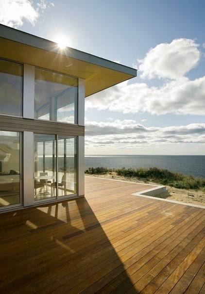
Raise the grade. This isn’t always possible, but when it is, it’s usually the least intrusive of all of the options. When the grade around the house is manipulated to less than a 30-inch differential, the view wins every time.
More: Dream Spaces: 12 Decks That Rise Above It All
Related Articles Recommended


