Houzz Tour: Lowcountry Style With an Eye on Entertaining
http://decor-ideas.org 06/22/2014 03:14 Decor Ideas
“Wherever I go, I’m always taking lots of photographs of homes in the area, getting the style down,” says architect Wayne Visbeen. To prepare for designing a home with local Lowcountry style in Bluffton, South Carolina, he and his colleagues at Michigan-based Visbeen Architects thoroughly researched the regional architecture. Their research taught them about the ways Southerners have been beating the heat (and the bugs) for years. The house takes full advantage of breezes and shade, with plenty of outdoor entertainment space connected to the home. Combining regional architectural elements with modern functionality that makes the most of every square inch, they got the Lowcountry look just right.
Photography by Dickson Dunlap
Houzz at a Glance
Location: Bluffton, South Carolina
Size: 2,877 square feet (267 square meters), 3 bedrooms, 3½ bathrooms. The home also has a carriage house with space upstairs that can serve as a separate apartment, work space or guesthouse.
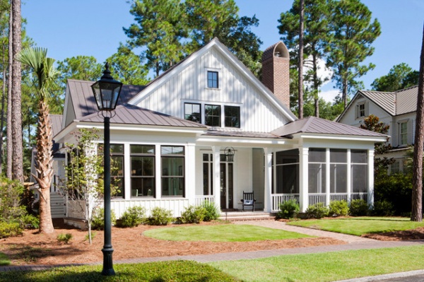
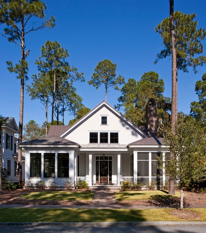
Part of capturing Lowcountry style included using locally harvested and milled board and batten siding and a standing-seam metal roof. The style of the chimney cap is also commonly seen in the region.
It was also important that the 1½-story house fit in with the other homes in the neighborhood through its massing, scale and style.
Classic proportions compose a pleasing front facade. A dining area on the left balances out the screened-in porch on the right, creating symmetry, with a porch in the center. The gable runs from the front of the house to the back, and additional gables give the upstairs floor plan some flexibility. Currently it has two bedrooms, but the existing space can be divided or expanded to include built-in bunks.
Many of the historic homes in the area were built before air conditioning was the norm, and were designed to stay cool. Elements like porches and window and doors placed to take advantage of cross breezes were all important parts of this home’s design. The team nestled the house among existing mature trees that provide shade.
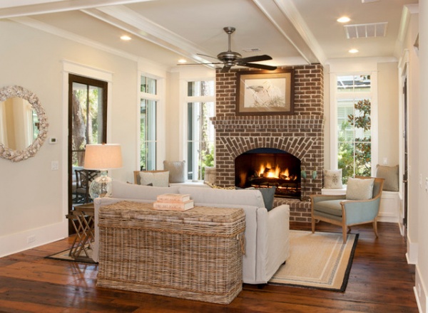
Visbeen’s goal was to keep the house smaller than 3,000 square feet, so making the most of the footprint was paramount. This meant creating flexible spaces that felt intimate yet could open up and have a nice flow for entertaining guests. This is the more public living room, right off the front entry. A door to the right leads to the front screened-in porch; the four-paned door on the left leads to a side porch we’ll look at in a moment.
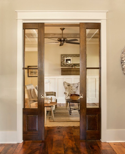
Wide pocket doors open to a second living space. This way the second living room can be a more private space, and noise from a TV in one room can be cut off from the rest of the house. When the doors are open, the plan has an easy flow for parties and family gatherings.
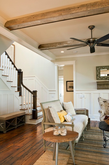
The living room is wide enough to incorporate a hallway. To save a bit on costs, Visbeen used MDF (medium-density fiberboard) for the wainscoting’s back panels and added trim to create recessed boxes, then lacquered it all to match.
Reclaimed pine flooring and other reclaimed wood on the box beams give the space a sense of history.
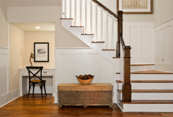
A workspace makes the most of a cozy area under the stairs. “I like to take advantage of every inch,” Visbeen says. “This area could also incorporate cabinets or bookshelves.”
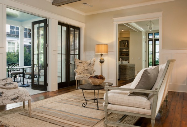
This living room opens up to a favorite gathering area, a screened-in covered porch on the side of the house.
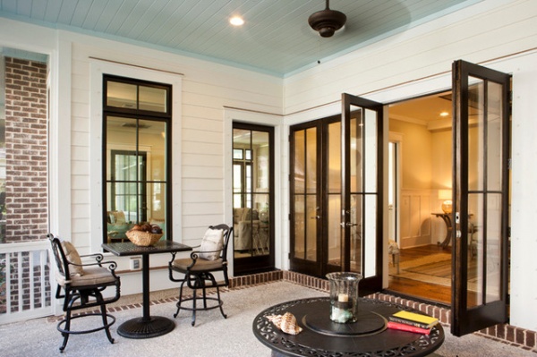
The porch ceiling is a color known as Haint Blue, another nod to the region; lore has it that it keeps the bugs or the restless spirits away.
Learn more about blue porch ceilings
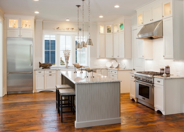
The kitchen is open to the living room and casually coastal. Glass-front cabinets up top serve as wonderful areas for display. “The lights in the cabinets also provide great ambience at night,” Visbeen says.
The layout was set up for cooking and congregating. The island incorporates a microwave drawer, storage cabinets and seating.
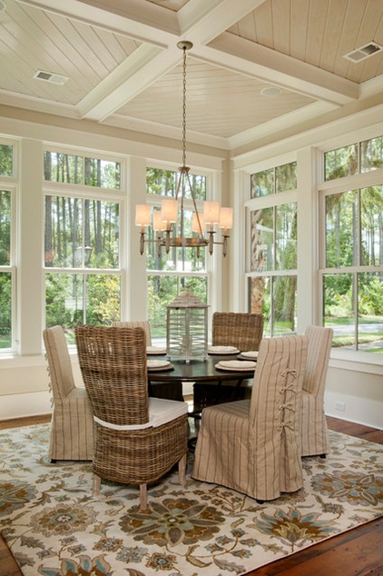
This breakfast area is part of the kitchen and serves as the main dining space (in the first photo, it’s the left wing on the front of the house). “The tall windows create an elegant dining area as part of the kitchen but eliminate the need for a separate dining room, another great space saver,” Visbeen says.
The expansive windows and transoms give the dining area a porch-like feeling, while the coffered ceiling, botanical rug and chandelier dress it up. The dining area also has views out to the water.
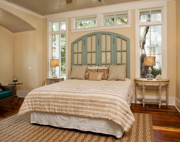
The master suite is on the first floor. Windows and transoms surround the headboard and pick up the cross breezes. A ceiling fan also helps keep things breezy in here.
The headboard is crafted of a window, adding another architectural element inside in a unique way (if you try this at home, use shatterproof glass). The tongue and groove ceilings were painted a warm taupe.
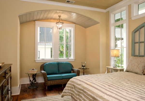
An alcove topped with a barrel-vault ceiling creates a reading nook. Visbeen designed it to accommodate a future built-in bench or daybed with storage underneath.
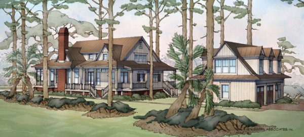
This early watercolor rendering of the project shows where the side porch is and how the carriage house is sited to create a pleasing backyard. It also shows how the team designed around the existing trees. The design changed in a few ways since this rendering, including the home’s no longer being raised off the ground.
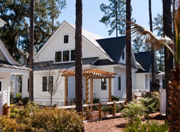
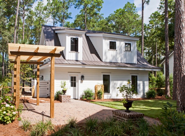
The carriage house has room for two cars, and its second floor can be used as an apartment, guesthouse or a work space. In the plans (below), you’ll see a pullout bed stored in the eaves like a drawer.
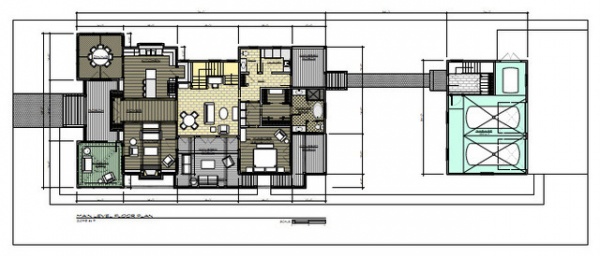
The first-floor plan helps you see how the indoor and outdoor spaces relate to each other, particularly the side porch (on the bottom), which is accessible from both living rooms and from the master bedroom. There were a few minor changes made on the fly after this was rendered, including the addition of the bump-out alcove off the master bedroom.
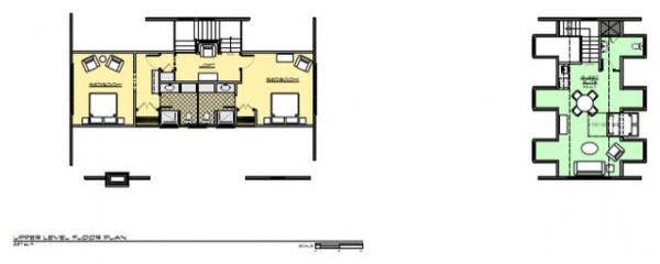
The second-floor plans of the house and carriage house show room for bunks on the second floor of the main house. On the right side of the carriage house, you can see where the bed slides in and out like a drawer.
Team:
Architects: Visbeen Architects
Builder: Custom Classics by David Weekley Homes
Related Articles Recommended


