7 Supermodel Homes and Why Creatives Rent Them
http://decor-ideas.org 06/19/2014 00:15 Decor Ideas
Although Cindi Osborn struggles to pin down exactly what makes a private home the perfect setting for photo shoots, she knows a winner when she sees one. “It has to have that elusive quality of ‘just rightness,’” she says.
Osborn, a onetime art historian and gallery owner, started Mint Locations after working for her husband, a freelance creative director and commercial video producer. She couldn’t find anyone else who specialized in locations that were private homes, so, she says, “I decided to make that my niche.”
Osborn, who splits her time between the San Francisco Bay Area and Sun Valley, Idaho, got her big break by matching a retailer’s creatives with a Piedmont, California, home as the backdrop for their newly redesigned wares. “At the time the house was owned by a Chinese rock star — she was like the Madonna of China — and she was away a lot. The company shot there for an entire year,” says Osborn. The house, done in a grand chateau style with modern touches, launched both the retailer’s new look and Osborn’s company, which currently has a portfolio of 240 homes.
Osborn dipped into that pool and shares some ideas here about what makes them great locations. Not only will you find eye candy, but you might even find a styling idea you’d like to try.
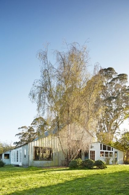
1. Bluewater Ranch, Bolinas, California
Who has shot here: Car companies, clothing retailers
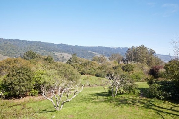
Why it works: “There is a beautiful soul to this place,” says Osborn. On the day of our interview, a major clothing retailer was photographing apparel on 40 cartwheeling, capering children. “I guarantee they are up there having a great time,” Osborn says. “It is a beautiful spot.”
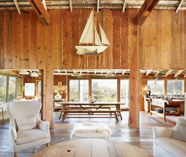
The house was remodeled by the owner, a film industry veteran who uses it as an escape from the pressures of Hollywood. “She used beautiful rustic wood, and it has a patina and a character you can’t find just anywhere,” Osborn says.
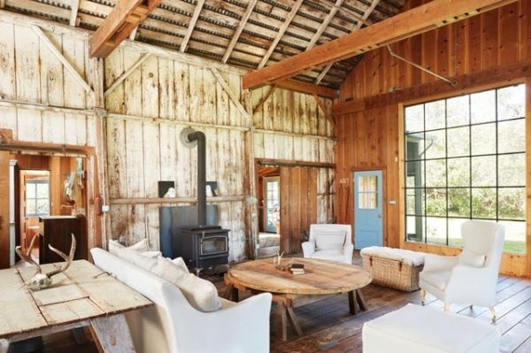
“The owner really let the spirit of the old place come through, and people respond to that,” she says. “The authenticity of this place makes it just right.”
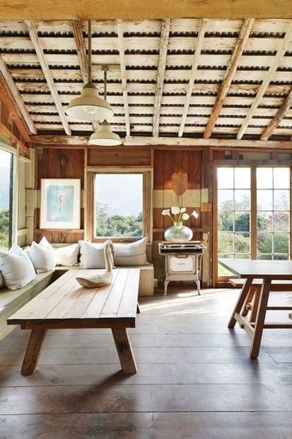
Why creative directors and stylists love it: Wide-plank floors, salvaged-wood paneling and a highly textured ceiling give this location a rustic chic aura. Creative directors “are looking for a place where the design and the architecture are alive in a house,” says Osborn. “A great home communicates something — and that’s usually an alchemy of beauty and a sense of place.”
Design takeaways: We have all seen recycled wood used in interiors, but most people use old wood that has been cleaned, sanded or even remilled. This homeowner recycled wood without stripping it of its character and patina. “She also patched holes in the original floor with tin scraps,” adds Osborn, further dissecting the charm factor. “A neighbor gave her paintings of the original homestead, and she peppered them around the place.”
2. Casa Encanta, San Miguel de Allende, Mexico
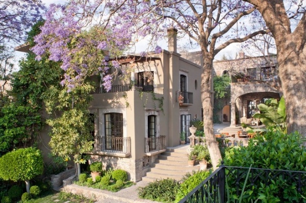
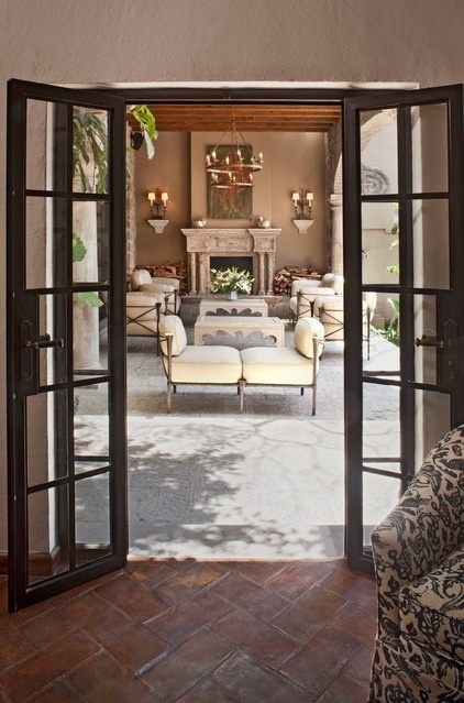
Why it works: “There’s a wonderful sense of place here,” says Osborn. “You know immediately it’s Mexico.”
Osborn says the house is owned by a pair of interior designers. When she saw it, she called the homeowners and found them open to the idea of renting their house for photo shoots.
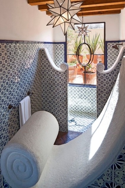
Unique details make this home noteworthy. Like the other homes Osborn represents, this is not a wallflower dwelling. It’s a house with a bold personality. “When it comes to locations, it helps to have a strong, clear point of view,” she says.
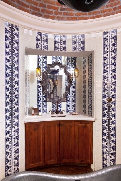
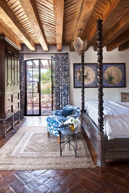
The designers remodeled the Mexican abode with an eye toward displaying the patterns of Mexican textiles.
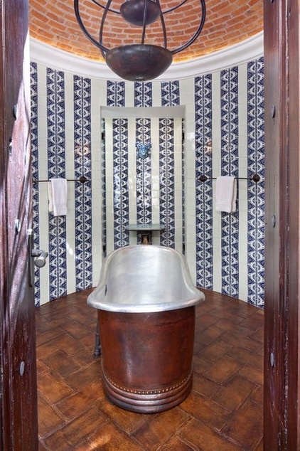
Why creative directors and stylists love it: Nothing says hacienda like terra-cotta tile floors, blue and white tiles on the wall and metal accents. Besides being beautiful, this home is spacious and has many different settings. “It’s like agreeing to work with a human supermodel,” says Osborn. “Sure, he or she looks good, but are they willing to travel? And are they easy to work with?”
When it comes to brick and mortar “models,” space, parking and accessibility are key considerations. “Can the home accommodate a shoot of 20 or even 40 people? Is there parking for them? How close is the nearest airport? These are all things that are considered,” says Osborn.
Design takeaways: “As long as the patterns are great, you can mix as many as you want for great results,” says Osborn. “The look is layered and sophisticated, versus a matching, coordinated, overdecorated look.”
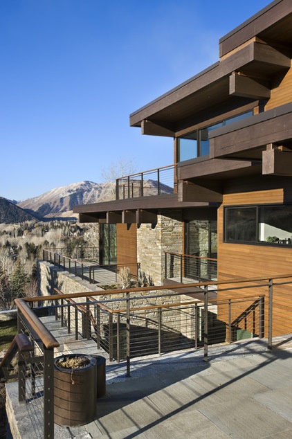
3. Prospector House, Sun Valley, Idaho
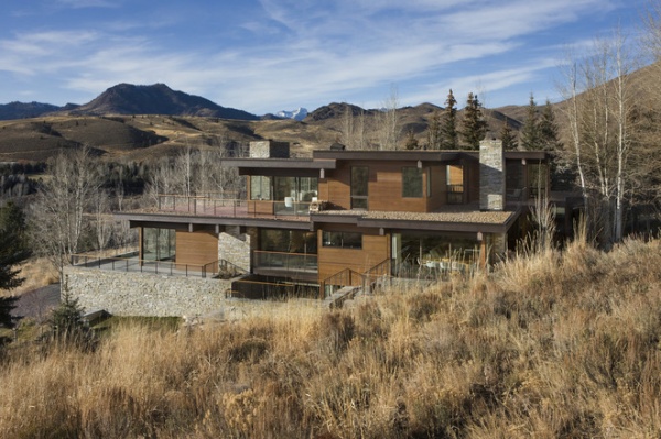
Why it works: “Views count, and this house has incredible views,” says Osborn, who discovered it after attending a holiday party there. “But it can’t just be about the views — this house also has great modern architecture that takes advantage of the setting.”
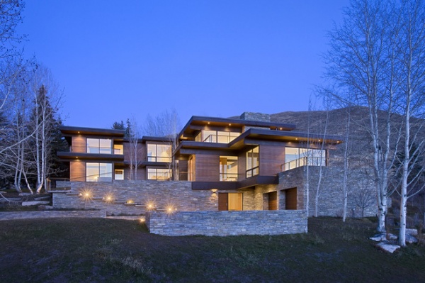
Why creative directors and stylists love it: Rugged mountains surrounding a sleek house? It’s like a classic mountaineer in an Armani suit: manly and classy rolled into one package. Most of the homes used for shoots are the personal expression of a creative person, or the result of a successful partnership between an involved homeowner and great architect and/or interior designer. “Those kinds of expressions are original and hard to duplicate,” she says.
Design takeaways: The organic material mix (steel, wood and stone) makes the home blend seamlessly into the landscape. “These same materials are also used beautifully inside the house,” she says. “They leverage the location of the home and underscore its strength and stability.”
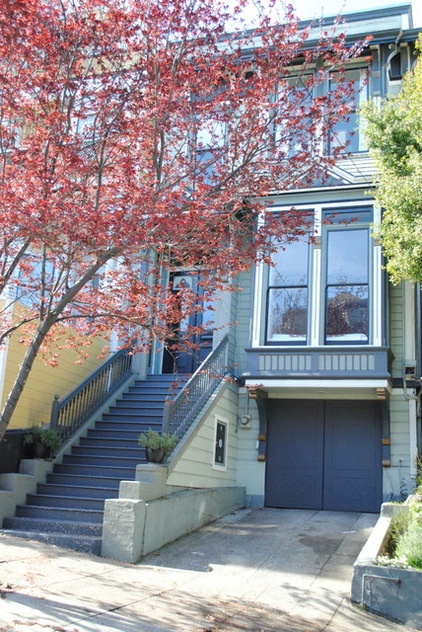
4. London Calling, San Francisco
Who has shot here: Technology companies
Why it works: “This home belongs to a really creative interior designer, and she has a wonderful personality,” says Osborn. “Her spirit absolutely comes through in these rooms. I named it London Calling because she relocated here from London, and I think it has a European feeling.”
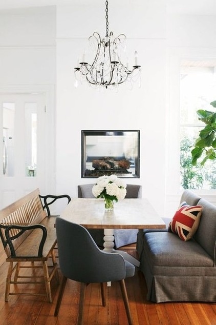
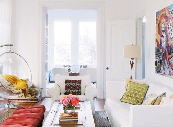
Why creative directors and stylists love it: This Victorian is like that eccentric British cousin you always wanted. Stark white walls and furniture look doubly fresh with vividly hued modern art and colorful throw pillows. An eclectic attitude means that a hanging acrylic bubble chair, a classic wooden bench and modern gray upholstered dining chairs can comfortably live under one roof (and, in this room, around one table). There’s also a wealth of fun details — such as this elevated fireplace that puts the flames at eye level when guests take a seat at the table.
“There is a kind of collective consciousness among creative people across the country. They don’t do what’s popular; they do a new thing or a unique thing — and that’s what many advertisers are looking for,” says Osborn. “To me this kind of house — all white with bold splashes of color — is what a lot of people will be looking to next.”
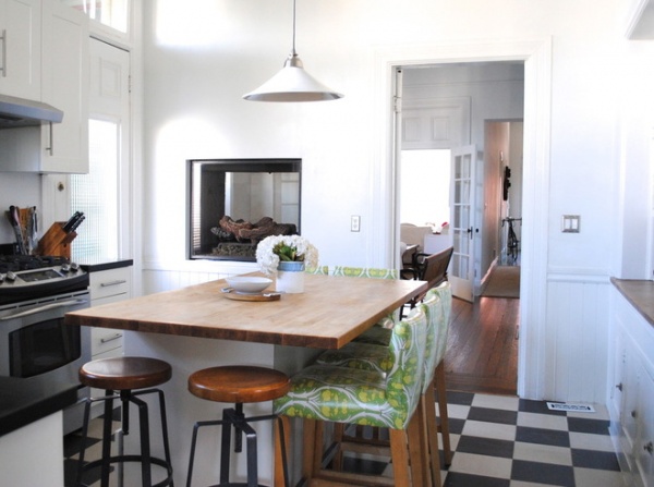
“It’s much more desirable to have many of the background pieces already there,” says Osborn. “Rarely does a company remove every last thing for a photo shoot.”
Design takeaways: “The owner has kids, but she doesn’t sacrifice style for functionality,” says Osborn. “I love the clever use of a bright green, cheerful oilcloth on the kitchen stools.”
It’s just one example of what Osborn calls “colorful decor that paints the all-white rooms.”
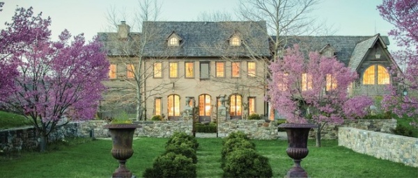
5. Jardin du Bois, Pottsville, New Jersey
Who has shot here: High-end fashion brands. This also has been the setting for several weddings.
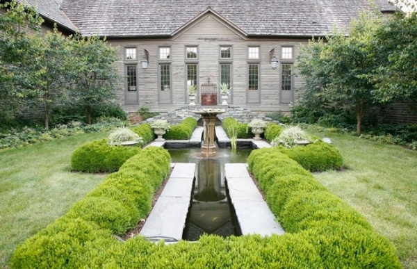
Why it works: “This is one of those fantasy landscapes — it’s textured, layered and dreamy,” says Osborn.
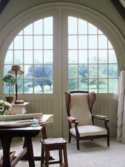
Why creative directors and stylists love it: Stone walls, strictly manicured formal gardens and classic furniture with a modern twist make this Downton Abbey’s more approachable American cousin.
When Osborn says it’s important for a home to have a sense of place, sometimes that can mean another place. “This home feels very European; it could be made to look like many different parts of the world,” she says.
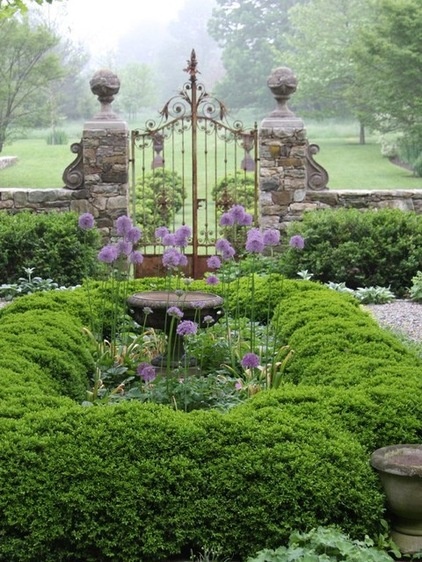
“Walking around this property, you feel like you are on the grounds of an old rambling European estate,” says Osborn.
What you can learn from it: “Formal gardens can be intimate or grand — but they always make statements,” says Osborn. “The owner is a celebrated landscape architect. Here, in New Jersey, she’s lovingly re-created European gardens.”
6. Owl’s Nest, Lake Tahoe, California
Who has shot here: Orbitz, Eddie Bauer
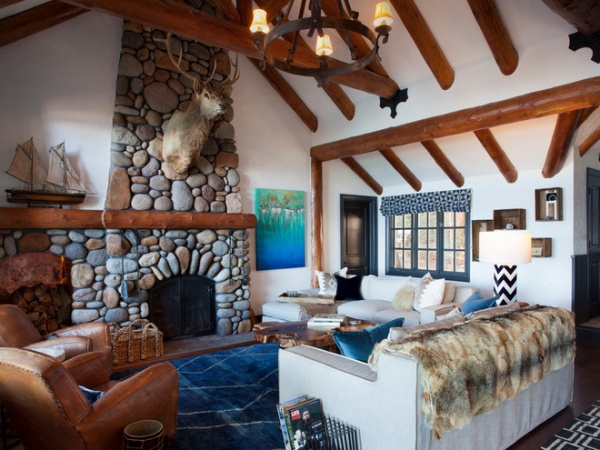
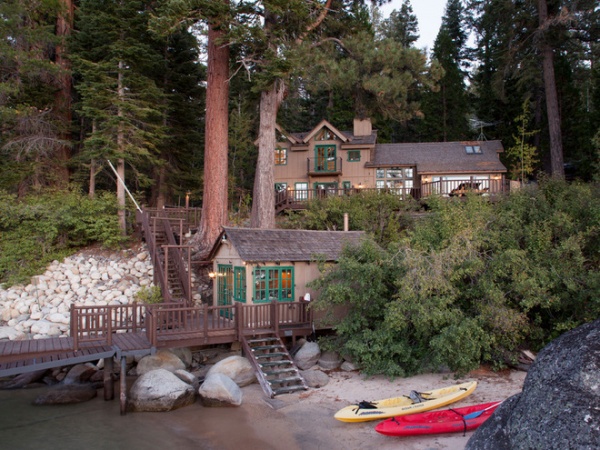
Why it works: “It’s the quintessential lake house,” says Osborn. “This home is located in Northern California, but it could be anywhere — including upstate New York or Lake Michigan.”
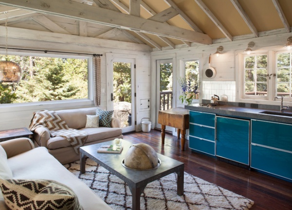
Why creative directors and stylists love it: The house has a great personality and many clever touches (for example, the coffee table with a built-in globe). Rustic timber and stone offset by white walls make this more hip lake house than fusty lodge.
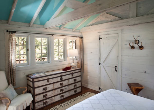
Design takeaways: “To eliminate a heavy feeling, lighten the finishes and use pops of color and bright fabrics,” says Osborn. “It will make the space feel more modern without losing the integrity of a classic home.”
7. Wilkes Warehouse, San Francisco
Why it works: “In this business it is not always necessary to have a big house,” says Osborn. “This is a loft that belongs to a fascinating young couple. They did it themselves, and it looks as interesting as the people who live here.”
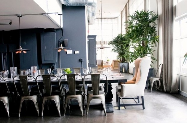
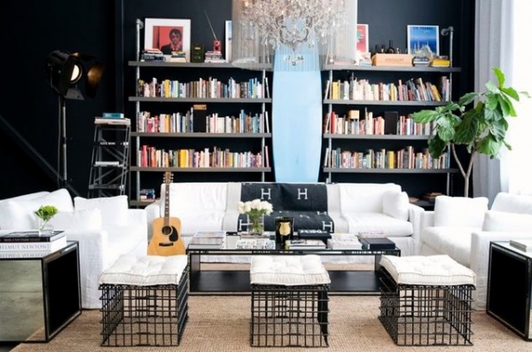
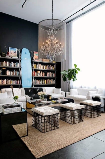
Why creative directors and stylists love it: Each piece in this loft is cool — from the cushion-topped black metal coffee tables to the light blue surfboard leaning between the bookshelves, to the extra-long dining table. “This is a house where everyone would come for a great dinner party or to hang out at the end of the evening,” says Osborn. “Who wouldn’t want to sit around the table or linger in the kitchen for a last drink?”
Design takeaways: “This loft was originally white, and the blocky spaces made it all seem clinical,” says Osborn. “The dark walls now give the space a sexy nightclub feel. Using the same paint throughout the home helps connect the cube-like spaces.”
What’s in It for Homeowners
“There are many reasons people open their house,” Osborn says. “Some people are proud of their homes. Some feel a sense of stewardship, that it’s their responsibility to share the home. But of course, money is part of it too.”
People can make thousands of dollars a year renting their homes for photo shoots, but it does come at a cost. “I’m really up-front with my clients about it,” Osborn says. “If you are uncomfortable with being out of your house for several days, the thought of many people in your house or your things being moved, this is not for you. Although we have people onsite to protect your belongings and your interests, it is a disruption. On the other hand, I have some clients who are able to pay their property taxes on what they make from photo shoots. No matter how they feel about it, I advise my clients to vacate the premises while a photo shoot is in progress.”
Regardless of their reasons for renting, homeowners who create beautiful homes and allow them to be used in photos seen around the world are perhaps unwittingly influencing the way we decorate our homes. Maybe that’s ultimately the reason creative directors choose these kinds of properties — they pick the homes where we’d like to live.
More: Read about one woman’s experience renting her home for photo shoots
Related Articles Recommended


