Houzz Tour: Bling Meets Budget Buys in a London Townhouse
http://decor-ideas.org 06/18/2014 19:16 Decor Ideas
When interior designer Sacha Berger and her husband decided to redesign their home in London’s Queen’s Park neighborhood, they were determined that it would reflect their eclectic personalities.
Berger, who runs her own vintage chandelier and interior design company, took charge of the project and set about creating a light, bright family home that didn’t take itself too seriously. “We wanted it to be a sociable space where we can entertain family and friends, but with two children, it was important to us that it didn’t look too grown up, either,” she says.
Houzz at a Glance
Who lives here: Sacha Berger, her husband and their 2 children
Location: Queen’s Park neighborhood of northwest London
Size: 4 bedrooms, 2 bathrooms
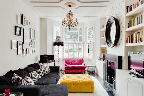
Lots of storage and a mashup of modern and opulent styles are key to the scheme, which features a mixture of investment pieces and eBay finds.
Berger designed the eclectic living room around a bespoke pink Tann Rokka sofa. “It was an investment piece, so I really wanted the scheme to work around it,” she says. “In the end I decided to embrace it and go with the bold colors, which definitely make the room a fun space to spend time in.” The colorful light fixture, from Berger’s vintage chandelier company, pulls the look together.
Sofa: BoConcept; wall paint: Timeless by Dulux
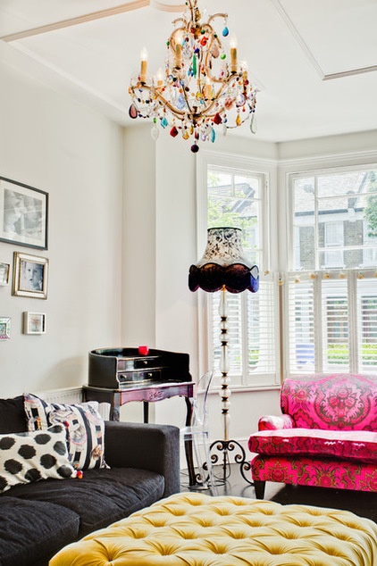
A bespoke ottoman was another investment buy. “I love to include investment items with cheap buys from the Internet,” she says. “It creates a much more eclectic look, and it’s nice when different patterns clash.”
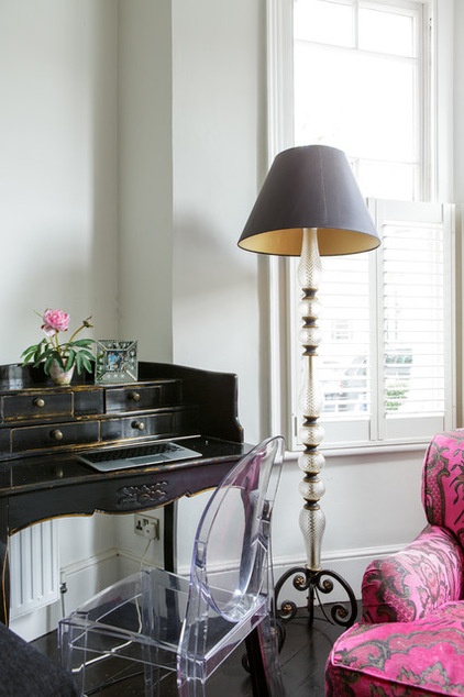
This bureau was one of Berger’s eBay purchases and cost about $300. She discovered the lamp base in a local antiques shop.
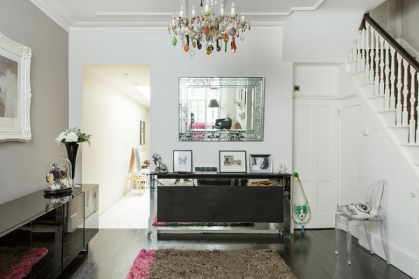
She wanted to make the most of the dead space leading into the kitchen, so she created a feature wall using Farrow & Ball’s Dovetail paint. “I wanted the limited-edition Mary Anstell painting to create a juxtaposition with the modern sideboard,” she says. The frame was originally gold, but she wanted a more Shabby Chic look, so she spray painted it white.
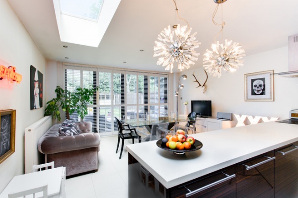
A bulky taupe sofa complements the kitchen. She chose the comfortable piece to encourage people to actually use the living room.
A neon light box from Berger’s shop and dramatic retro-style pendant lights from John Lewis are statement-making lighting fixtures.
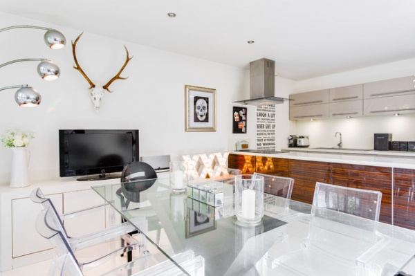
Berger selected a glass table and plastic chairs to let as much natural light reach the kitchen as possible. She customized the stag head with Swarovski crystals to add drama.
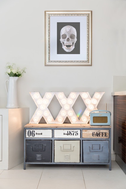
“I wanted to make the kitchen have a bit more of an industrial feel to it,” she says. “I found the storage unit on eBay and decided to make a feature wall with the lights and the Damien Hirst reproduction. We do like a bit of bling, and I’m really pleased with how this corner worked out.”
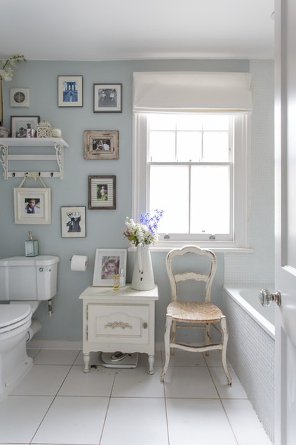
Berger’s mix of styles even reaches into her children’s bathroom. “This is my outlet for Shabby Chic [style],” she says. “It’s a small room, so it has to be light, and this style fits it perfectly.”
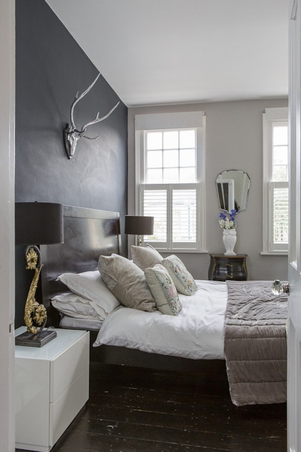
She wanted a boutique hotel look in the master bedroom. Her favorite paint color, Railings by Farrow & Ball, helps achieve this.
Bed: BoConcept
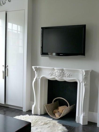
The fireplace offsets the modern elements in the space. “I don’t like any room to look either too modern or too ornate,” she says. “My main aim is to mix it up.”
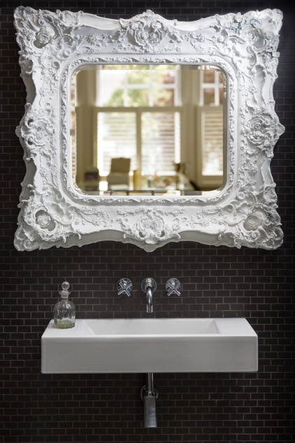
Berger made the en suite bathroom an extension of the bedroom by not having a door. She chose the detailed mirror for its artistic qualities, because it’s visible from the bedroom. “It’s a small bathroom, so I wanted to make it into a feature so the bathroom looks like part of the bedroom,” she says.
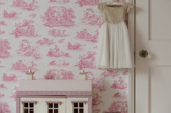
Berger’s 5-year-old daughter wanted a pink-filled bedroom. “I love the toile wallpaper from Laura Ashley,” Berger says. “I’m not a fan of children’s wallpaper, so it was a good way to get the look right without being too childish.” She bought the dollhouse from Toys “R” Us and customized it using Farrow & Ball paint.
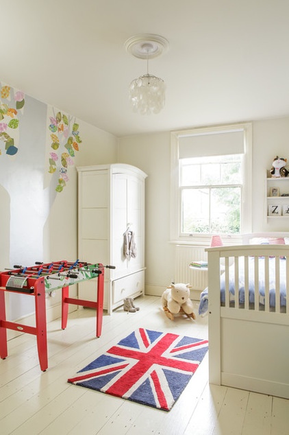
In her 7-year-old son’s room, she created an easily changeable canvas. “There are pops of color, like the rug and the wall stickers, but I wanted to create a room that he can put his own stamp on as he gets older,” she says.
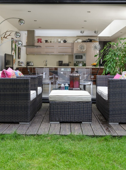
She wanted the garden to feel like an extension of the kitchen, so glass doors fold back to create a bright and welcoming space in the summer, while plantation shutters prevent the kitchen from feeling too cold in winter.
Browse more homes by style:
Small Homes | Colorful Homes | Eclectic Homes | Modern Homes | Contemporary Homes | Midcentury Homes | Ranch Homes | Traditional Homes | Barn Homes | Townhouses | Apartments | Lofts | Vacation Homes
Related Articles Recommended


