Houzz Tour: Opening Up a Midcentury Schreiber Home in Phoenix
After stripping this midcentury Phoenix house of its cabinetry, wood paneling, faucets and other finishes, the homeowner and project manager were stumped. They had a grand vision for the home, built in 1956 by prominent midcentury architects Charles and Arthur Schreiber. They wanted to knock down walls to create a more open floor plan and add a new 600-square-foot master suite, but they soon realized they didn’t have the experience to do that.
So they brought in designer Cavin Costello of The Ranch Mine, whose work they had seen during a local midcentury modern home tour the previous year. “It was too complex, and it all really needed to work together,” Costello says of the remodel, which he completed in May 2014. “The house was in decent shape. The walls just needed to open up, and we had to figure out how to add on without ruining the aesthetics of the original home.”
Houzz at a Glance
Location: Phoenix
Size: 2,178 square feet (202 square meters); 3 bedrooms, 3 bathrooms
Cost: $180,000, or roughly $82 per square foot
There was another challenge too: The homeowner lived in Canada. She was remodeling the house for her kids to live in while attending college at Arizona State University (her daughter now lives in the home with her fiancé), so Costello had to email floor plans and 3D renderings to the client and work mostly with the project manager to execute the design. “I only saw the client maybe two or three times in eight months,” he says. “It was a very different type of project.”
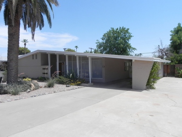
The first thing he noticed about the home was the front exterior (seen here) and its canted columns, big window panes and brick wall with cutouts. “It’s dynamic,” he says. “I knew immediately that I wanted to work that into the addition.”
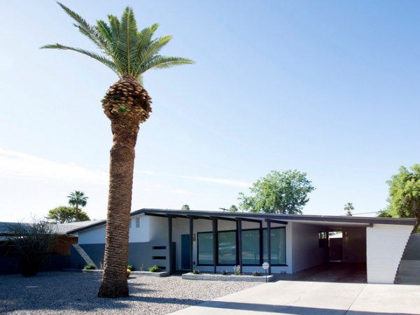
AFTER: Costello tried to preserve as much of the exterior as possible. He had the front block pattern painted gray to help it stand out.
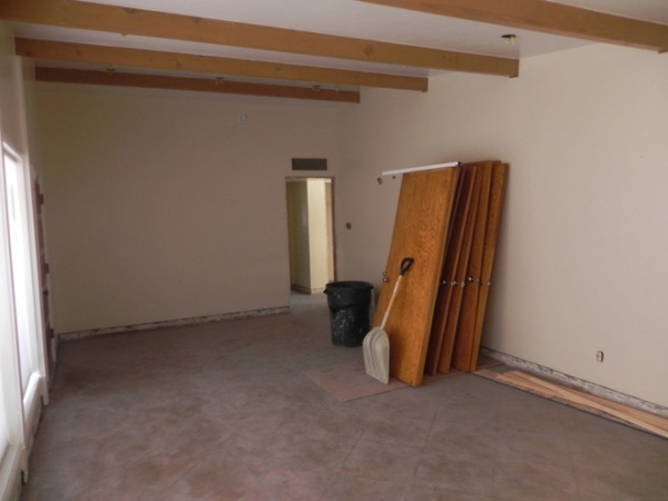
When Costello came onboard, he had nothing but walls, windows and a roof to work with.
Walking into the original home was uneventful. The first thing he saw was a wall. A door on the left led to the bedrooms. To the right, the living room led to a single door to the kitchen. “You walked into the house and everything just stopped,” he says. “With the power of the beams continuing on the other side, why not open that up to see all your property?”
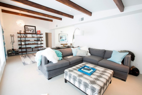
AFTER: Costello had the original beams sanded and restained. These became the main architectural elements that drove a lot of Costello’s design decisions. He then removed a portion of the wall (seen between the first and third beams) to create better flow.
For the interiors Costello used a comfy and clean approach in more neutral colors to let the beams stand out. The homeowner then chose a turquoise blue as a color to carry through the house.
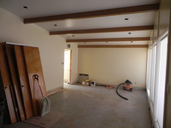
From the front living room, this was the only door to the kitchen. “It was a very circuitous route,” he says. “You went into the kitchen, then through another door to get to the dining and seating area. It was pretty bizarre and closed off.”
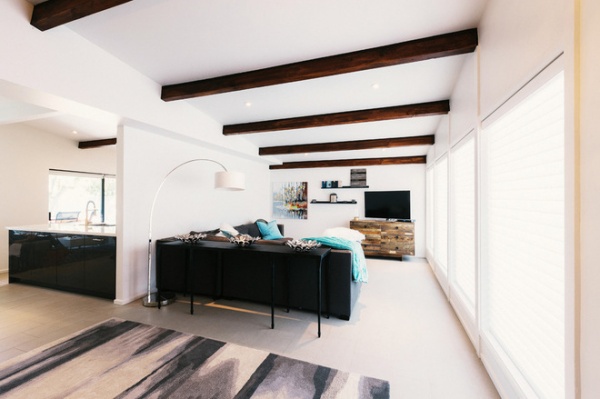
AFTER: With the wall partially removed on the left and better flow established, Costello closed off the original door to the kitchen at the rear of the living room. And now the full extension of the beams is celebrated. “I found it interesting that they go from the front of the house all the way to the back,” he says.
Beige 12-inch by 24-inch porcelain tiles and white paint by Dunn-Edwards also help the beams stand out. “It’s a great white,” he says. “There’s really no color to it, no hints of red or blue, just straight white. We like to use it to really make other elements of a house pop.”
Wall paint: DEW380 White, Dunn-Edwards
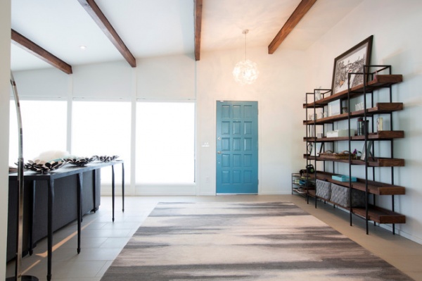
Costello consulted the homeowner on interior furnishings. For example, he suggested an expansive, built-in-style wall unit in a particular color for this entry wall space. The homeowner then went out and purchased a unit from Crate & Barrel.
Rug: Faded Ikat Wool, West Elm; console table: Silviano, Crate & Barrel
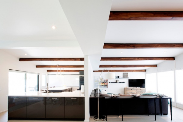
The kitchen and living room basically mirror each other, with the L shape of the sofa and the sink and stone matching up.
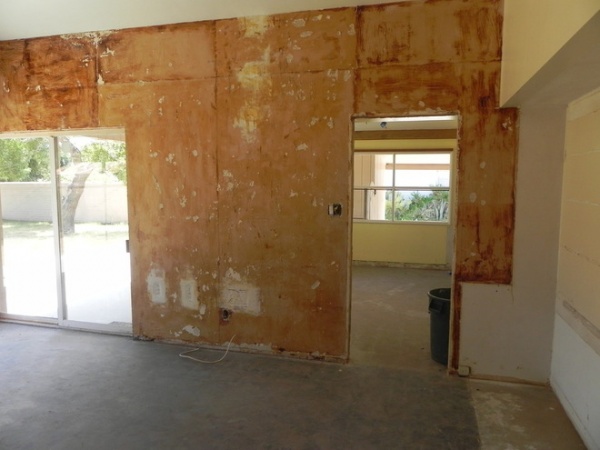
The original kitchen was tucked into the small room seen through this doorway.
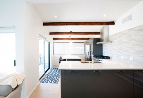
AFTER: This is the same view of the kitchen as the previous image. You can see now how Costello knocked down walls to open the space and better connect it to the dining and TV areas. The same window at the rear — and a set of new sliding glass doors near the island — helps bring light into the spaces.
All the wiring and plumbing were completely redone, and insulation was added (the original home had none).
Cabinets: Abtrakt High Gloss Gray, Ikea; countertops: Silestone White Zeus Extreme quartz; backsplash: Ona Natural, Porcelanosa; sink: farmhouse, Kraus; range: 36-inch, Verona
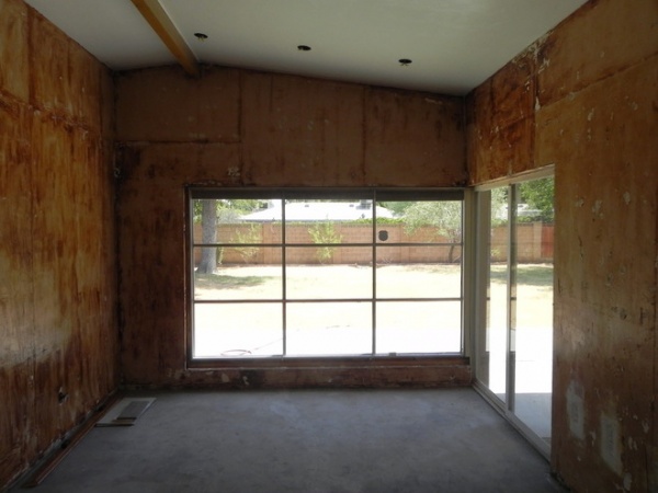
This was once a wood-paneled family room.
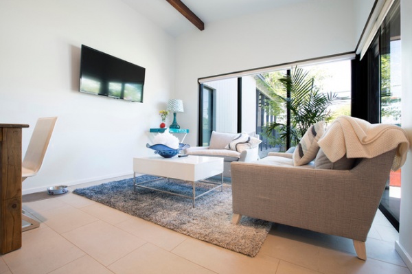
AFTER: It’s still used for the same purpose, but Costello closed off the sliding doors to create a more separate space.
This is the view you see walking through the front door. You get a glimpse of the similar canted columns and brick wall that you see in the front through these windows on the new addition.
Table: Expandable Farm Table; coffee table: Lacquer Storage; sitting area chairs: Bliss Down-Filled, all from West Elm
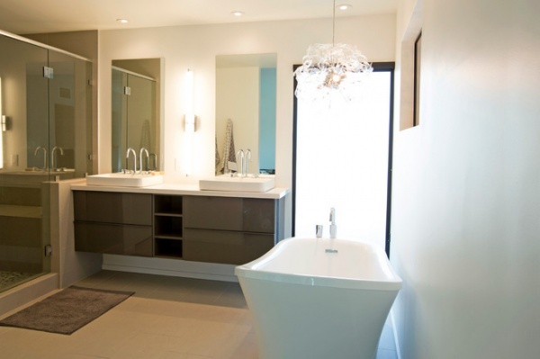
The original window on the back of the house (seen here on the right wall above the tub), was kept to bring light from this new master bathroom into a guest bathroom on the other side of the wall.
Cabinets: Godmorgon in High Gloss Gray, Ikea
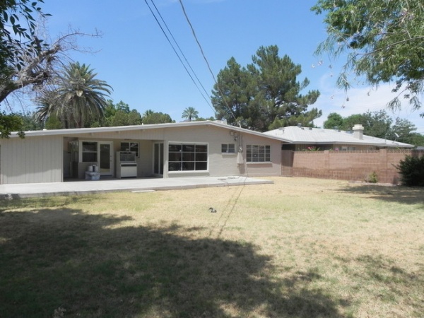
Because Costello felt the house was so interesting and unique, he had trouble deciding where the addition would go without destroying the house. “I thought, ‘OK, what’s the worst part of the house?’” he says. He loved the front, so he looked to the back for space.
He also wanted to move the electrical box and ugly wires directly over the middle of the yard.
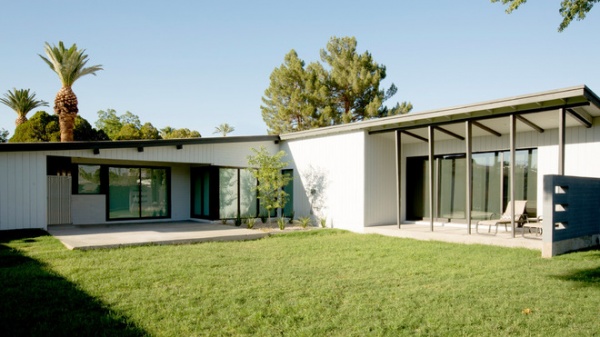
AFTER: The addition extends from center roofline outward. Costello got rid of excess concrete, added a tree for shade to the interior family room and moved the electric box and wires to the side of the house.
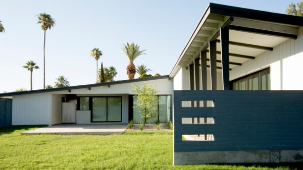
The brick wall with three cutouts and canted columns echoes the original features on the front exterior.
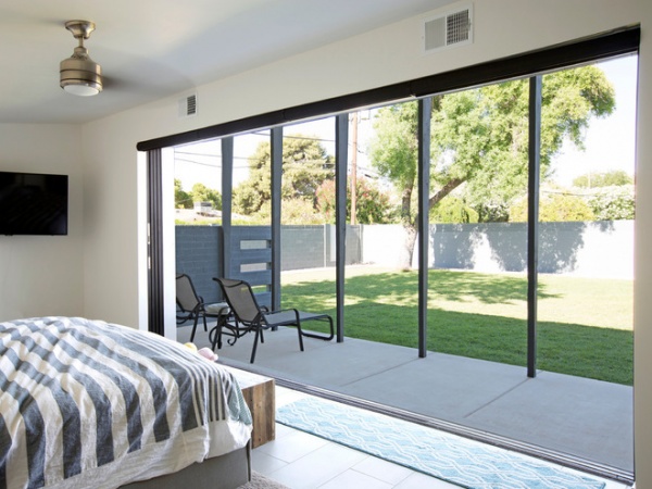
The master bedroom is simple, with a king-size bed and pocket doors that open to the patio and yard.
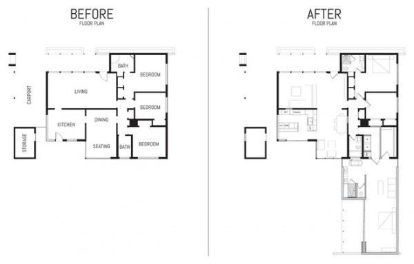
Here you can see the design moves that opened the floor plan and created the addition out back.
Team:
Project manager: Lindsey Stemp, JNL Homes
Project designer: Cavin Costello, The Ranch Mine
Structural engineer: Jeff Barton, Broderick Engineering
Mechanical, plumbing and electrical engineering: Sequoia Trail Engineers
Browse more homes by style:
Small Homes | Colorful Homes | Eclectic Homes | Modern Homes | Contemporary Homes | Midcentury Homes | Ranch Homes | Traditional Homes | Barn Homes | Townhouses | Apartments | Lofts | Vacation Homes


