Houzz Tour: A Happy-Trails Home on a California Field
Before this Mill Valley, California, home was built, the owners told architect Ken Linsteadt that the property had served as the horse pasture for a long-ago (and long-gone) estate. Because he’s familiar with the region’s history, Linsteadt knew the story to be true, but the owner turned up physical evidence to support the claim. “He found a large, old horse jawbone while digging in the garden,” the architect says.
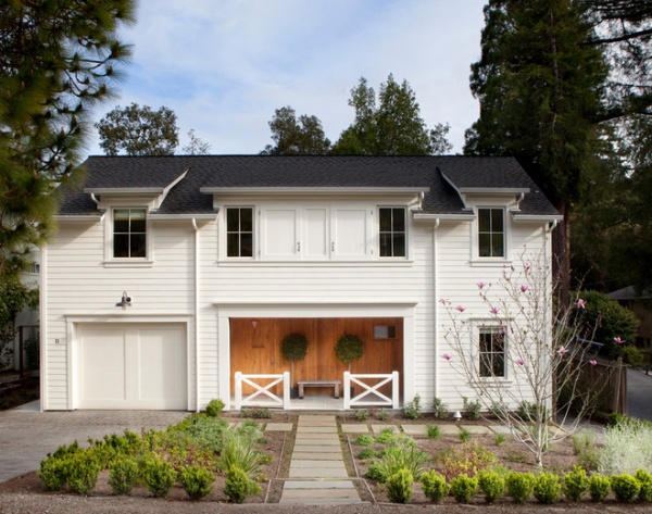
The equine backstory was fitting, as the family members, East Coast transplants and riding enthusiasts, hoped to build a house that loosely resembled a Connecticut horse barn or farmhouse. It was a desire with emotional underpinnings. “They wanted a house with an iconic sense of home,” says Linsteadt. “They wanted a home that was light and bright, one that felt a little modern and very happy.”
Photography by Paul Dyer
Houzz at a Glance
Location: Mill Valley, California
Size: 3,000 square feet (278 square meters); 4 bedrooms, 3½ bathrooms
The front of the house certainly calls to mind an East Coast agrarian building. The textured wood lining the covered entry contrasts with the traditional white siding that has become synonymous with farm structures around the country. “I wanted to provide some elements that were quirky and surprising — you could call them follies,” says Linsteadt. “Here the front door is the same material as the entry siding — it blends in so seamlessly, you almost have to look for it. It’s kind of a speakeasy element.” Look carefully, and you’ll see the front door to the left.
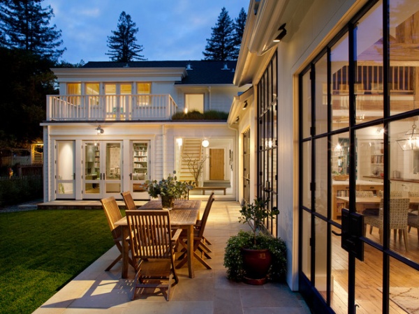
Open the blended-in front door (the interior side is visible here through the large window in the middle of this photo) and you find the first of many revelations. The house is constructed in an L shape. One leg is composed of a two-story structure that holds an entry, a family room, an office and bedrooms. While the street-facing front of the house presents a poker face (it’s pleasing but doesn’t give away much), large windows and doors completely open the rear of the structure to a long, grassy lawn any bygone horses would surely have appreciated. “After you enter, the large floor-to-ceiling window is a terrific surprise,” says Linsteadt. Another unexpected element: A green roof separates the decks off the second-story bedrooms.
Steel windows: Architectural Ironworks
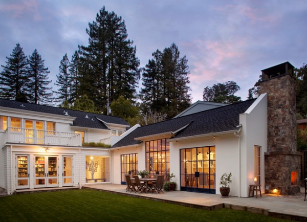
A long, single-story structure with large steel-framed windows and doors to the lawn and a patio makes up the other leg of the L.
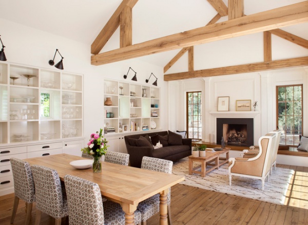
Behind those oil-rubbed-steel doors, a combined living room, dining room and kitchen is topped by a loft hangout for the kids. “We wanted there to be a relaxed feel that was both masculine and feminine,” says interior designer Patrick Printy. The neutral palette runs the gamut from the white walls to the warm wood tones of the recycled oak beams and floor, to the blackened steel doors.
Sofa: Verellen
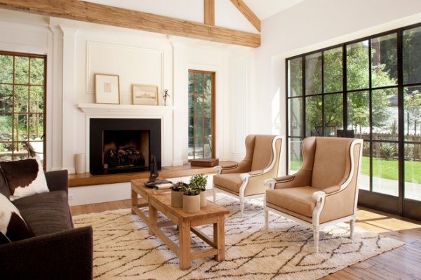
The rustic beams contrast with the Georgian-inspired molding surrounding the fireplace. “In old farmhouses you sometimes find details like this,” says Linsteadt. “It adds a little romance.”
Chairs: Oly; fireplace surround: Absolute Black granite
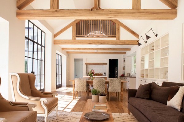
Looking back toward the kitchen and dining room, you can see a small loft. If this were a true horse barn, this might be the hay mow. In this home’s iteration, it’s a place where the kids gather. “I like how it lowers the ceiling and defines the kitchen,” says Linsteadt.
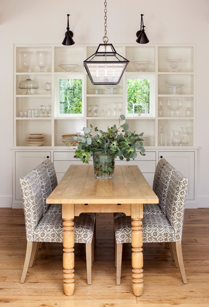
Shelves in the living room hold accessories and books. The shelves that run along the wall in the dining area have a more utilitarian purpose. “We decided to put the glassware and the plates they use daily right here,” says Printy. “The idea is that the table can be quickly set.” Construction necessitated that a tree be felled on the property; the wood was milled and used to construct the dining room table. “The table is narrow, making dining intimate,” says Printy.
Windows in both sets of shelves lighten things up and add a connection to the outdoors.
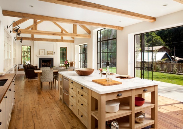
The large kitchen island has prep and storage space on one side and a dining area on the other. Open storage on each end holds large cooking implements and cookbooks.
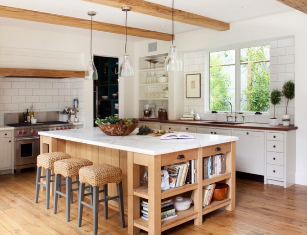
Marble tops the island; the counters under the window are reclaimed hickory. “With a wood countertop, you have to be a little careful,” says Printy. “You have to wipe up water, for example. However, they look great, and this was something the homeowner was willing to take on.”
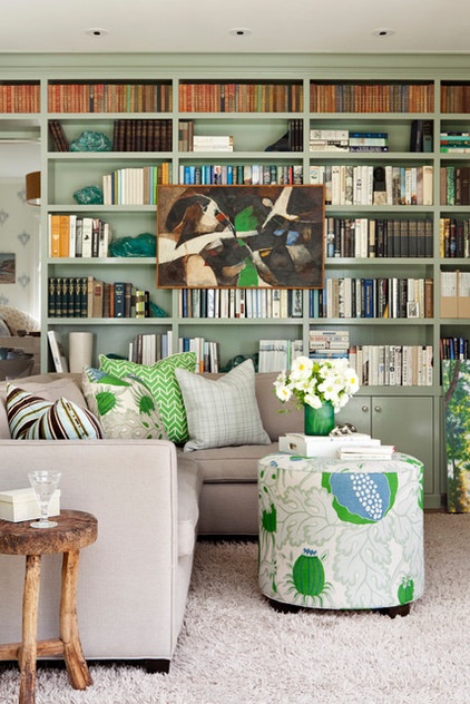
The lower level of the other wing is home to a family room with a wall of shelves painted a soft gray-green. “We wanted an area that was not white,” says Printy. “This is where the family spends time together; it’s where they relax, watch television and do homework. They wanted something that was a little cozier.” You can see a sliver of the office through a doorway set within the shelves.
Shelving paint: Heather Gray, Benjamin Moore
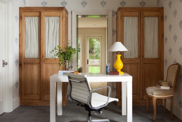
The office is the domain of the woman in the household. “We wanted the entrance to be tucked in the shelves, almost like a hidden door,” says Linsteadt.
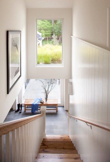
Stairs and a paneled wall rise from the entry. The paneling covers the bedrooms and baths on the second floor.
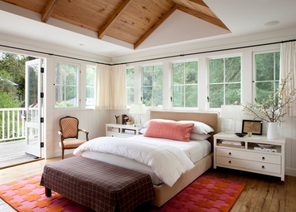
The master bedroom has a warm wood ceiling and is ringed with traditional mullioned windows. Curtains run on the encircling track, allowing the room to easily become cocoon-like or light-filled.
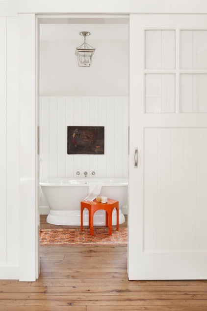
A barn door separates the master bath from the bedroom. A touch of orange adds some fun.
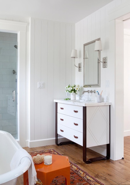
Printy designed two vanities for the master bathroom; one is shown here. “I was inspired by the equestrian theme,” he says. “The handles are leather, and the metal legs reminded me of the curve of a bit and a harness.”
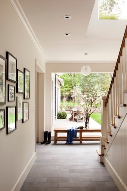
Now that the project is complete, the family is busy forging happy trails in their Connecticut-meets-California dwelling.


