Houzz Tour: Platinum-Rating Hopes for a Sterling Modern Home
Architect David Marlatt has a love-hate relationship with the sun. He’s always looking to capture its natural light for the homes he designs, but at the same time trying to block — or sometimes harness — all its heat.
He had a particularly tough time dealing with that fiery ball in the sky for his latest design, a towering five-level home in San Francisco’s Castro neighborhood. Since the back of the house faces south, he wanted as much transparency as possible. But because he pushed the size of the house to city code constraints, he wasn’t allowed to build eaves or overhangs to cut back on some of the heat gain. Plus, a guest cottage at the back of the lot meant that side would need privacy. So glass windows were out of the question.
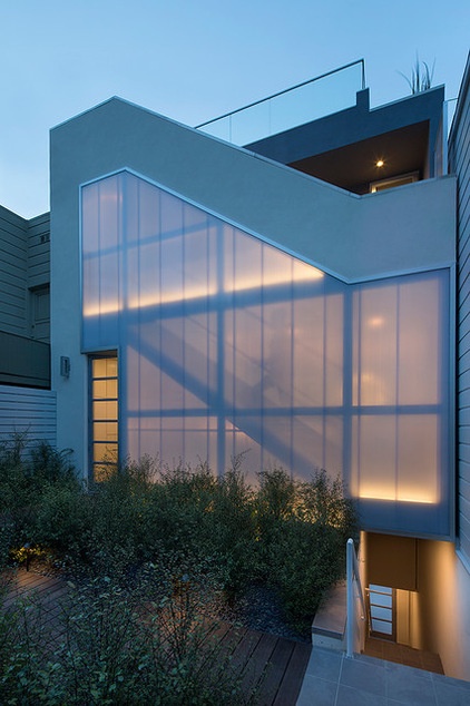
Marlatt’s solution was to create an entire wall of polycarbonate panels that gave him and his client everything they wanted: natural light, less heat gain, privacy and the ability to build to the site’s limits. What’s more, Marlatt hopes the move — and other clever gestures throughout the house — will help the home achieve LEED Platinum status. Take that, sun.
Houzz at a Glance
Location: Castro neighborhood of San Francisco
Size: 1,647 square feet (153 square meters); 3 bedrooms, 2½ bathrooms
Budget: $850,000
The wall of polycarbonate panels on the south side of the house, where the front door is located, filters heat and blocks views from a guest cottage across the small courtyard. Because the street-facing side has all the views toward downtown San Francisco, Marlatt organized the stairs on this courtyard-facing side.
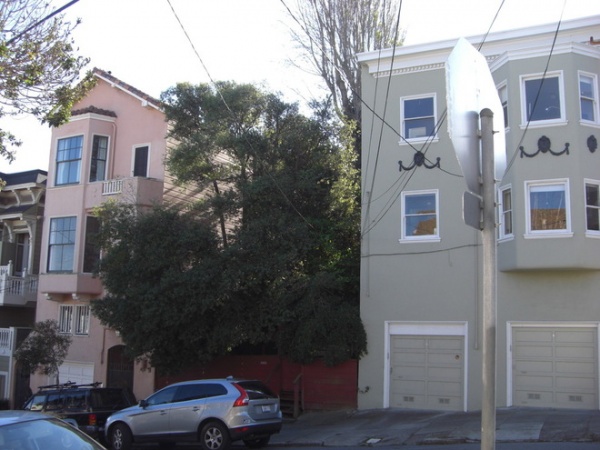
The area with trees shows what the lot used to look like. Only a small cottage, which the homeowner and Marlatt remodeled, sat at the back, about 25 feet above street level.
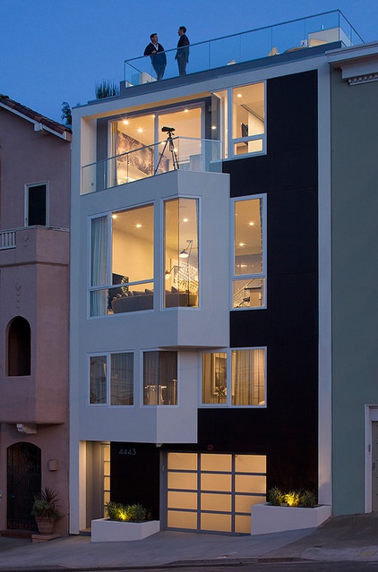
AFTER: The views from the street-facing side dictated the layout. The garage takes up the ground level; the guest room and home office make up the second floor. The third holds a combined kitchen, dining and living room; there’s a master suite on the fourth floor and a roof deck.
San Francisco’s planning code allows exterior extensions of up to 3 feet. Marlatt took advantage of that to add angled punch-outs oriented toward the best view. “They’re really just an interpretation of bay windows,” he says.

The homeowner first worked with Marlatt to remodel the historic 500-square-foot cottage (seen here after the remodel) so that he could live there while his new home was being built. This shot shows the significant slope of the property.
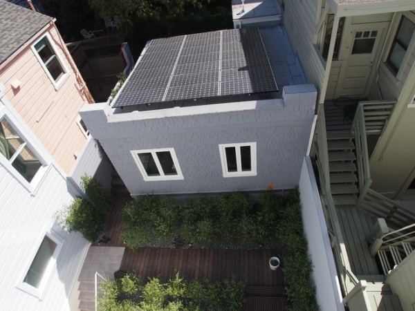
AFTER: Now there’s a photovoltaic system on top of the remodeled cottage that generates energy credits with the local power company. The home is in the process of becoming LEED certified, which drove a lot of the design decisions. Because of San Francisco’s strict planning code, Marlatt says, there wasn’t a lot left for LEED, but it influenced the materials, appliances, insulation and windows.
From a LEED point of view, the home has a lot of points just because it’s in an urban setting and close to plenty of public transportation, says Olivier Pennetier, an architect at Marlatt’s DNM Architect firm who oversaw the LEED aspects for the project. He focused a lot on energy consumption. The home is 30 percent more efficient than the minimum required by the state of California for energy consumption.
What’s LEED All About Anyway?
He sought to earn more LEED points elsewhere in the house with other careful choices, like using dense insulation, a foundation that’s 30 percent fly ash, a bamboo deck, low-flow toilets, an HRV system, minimal landscaping and low-VOC paints, and making sure the house was very tightly sealed.
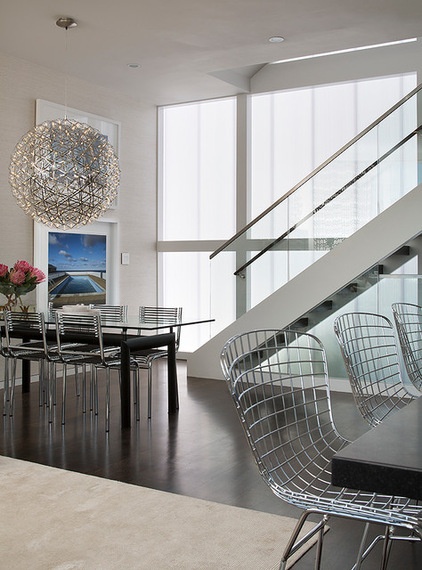
Interior designer Doyle McCullar responded to his client’s love of Bauhaus-inspired furnishings and industrial design with lots of iconic pieces, like a Le Corbusier dining table, Herbst dining chairs and Bertoia bar stools.
“First, I tried not to make a fool of myself and muck up this beautiful architecture,” he says. “Second, I wanted to make the client comfortable.”
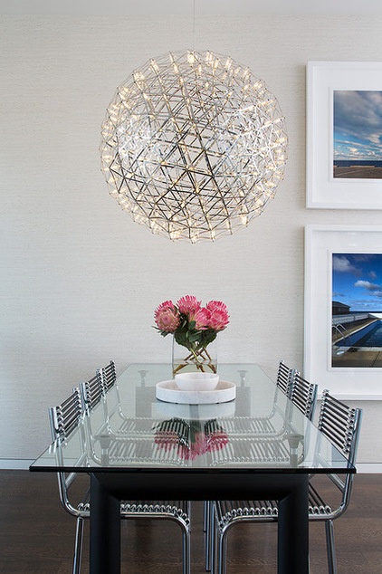
For the dining area, McCullar first selected the large Mooi lighting fixture with 256 LED lightbulbs. An Elitis wall covering in a travertine pattern softens things and creates a solid field for a pair of Glenn Daidone photographs.
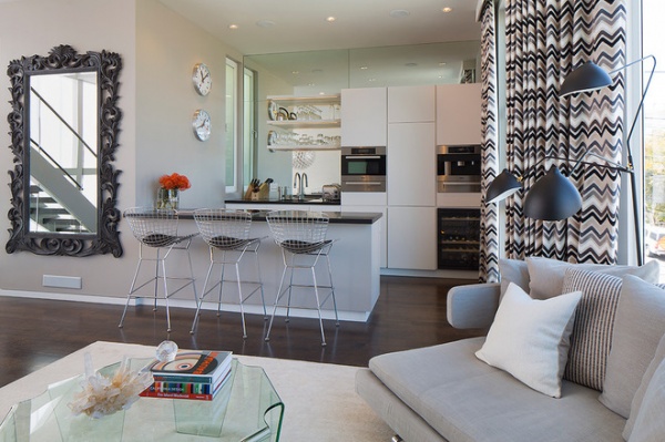
Marlatt and his team designed all the custom cabinetry, plumbing and lighting to keep in line with a minimalist, no-fuss look. The countertop is black granite. All the lights in the house are LED. All the appliances are Energy Star rated.
The windows also play a big role in earning LEED points. Fiberglass frames minimize thermal expansion, which means there’s less space for air to leak in or out, making a more efficient living space.
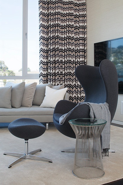
More iconic pieces fill the living room. An Arne Jacobsen egg chair upholstered in a charcoal gray felt fabric is paired with a Platner side table.
“We didn’t want the experience to be trendy, too faddish, but rather sophisticated, sexy, inviting and a little playful,” McCullar says. “These are tag words that we hear a lot, but this is a sophisticated structure, and we still wanted it to be inviting with touches of luxury that create a warm vibe.”
Draperies: custom, Donghia
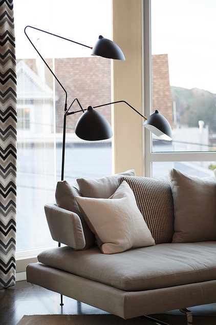
A classic lamp by Serge Mouille stands near a B&B Italia sofa.
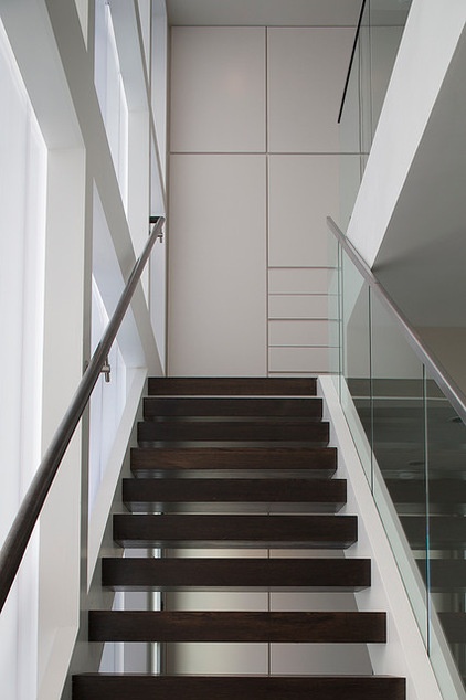
Custom built-in cabinets cover the walls at the top of the stairs on the entry and master bedroom levels.
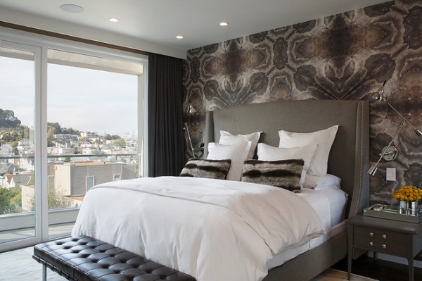
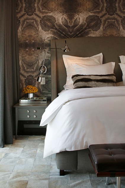
McCullar wanted to make the master bedroom a quiet sanctuary. He gravitated toward dark, soothing colors that are more conducive to sleep, he says. “When you have a house like this, you need a reprise from all that’s going on — you need a rich cocoon that you can wrap yourself in,” he says.
The designer worked with a manufacturer to create the custom wallpaper. “It took several months to get the scale of the pattern and the colors just right,” he says. “I really wanted rich charcoals, bison browns, caramel and off-white ivories as a more robust version of the same colors you find elsewhere in the house.”
Wilhelm Wagenfeld lamps nod to the Bauhaus period. McCullar found the nightstands on Craigslist, had them spray painted and added new hardware. The bed is custom, by Restoration Hardware “I tried to pick the best of the best without going over-the-top or too crazy,” he says.
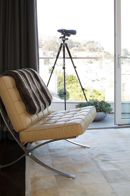
In a bedroom corner, a custom faux-fur and cashmere blanket hangs over a Barcelona chair.
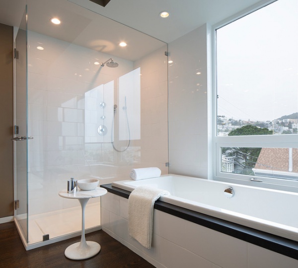
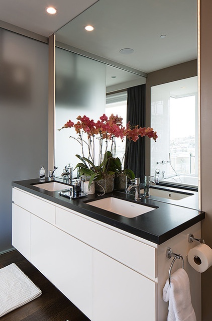
“The master bathroom reflects the fact that someone lives in this house by themselves,” says Marlatt. What he means is there was little concern given to privacy. A large window opens to the view, and large polycarbonate panels can slide away to completely open the space to the master bedroom. “It’s not a family bathroom,” Marlatt says.
It’s not low maintenance either. The homeowner wanted wood floors to extend all the way into the bathroom. Because of this, he has to wipe them off frequently.
Large scale 8-inch by 16-inch tile, a frameless glass shower and a black granite tub deck maintain consistency of materials throughout the house.
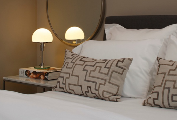
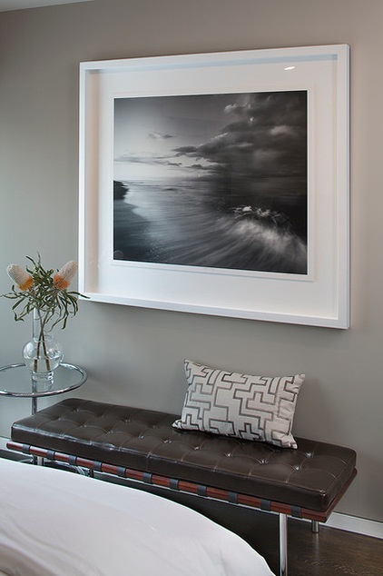
The guest room is simple, with a custom bed and another Wagenfeld lamp. A custom bench in tufted brown leather sits beneath a Glenn Daidone photograph and an Eileen Gray side table.
Pillows: Bed, Bath & Beyond
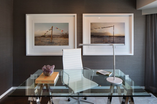
A shimmery natural-fiber wall covering from Crabbit adds an iridescent quality to the home office. For the desk McCullar used a dining table from Williams-Sonoma with a polished chrome trestle base.
Lamp: Pablo Design; photographs: Curtis Speer
See more on the interior design:
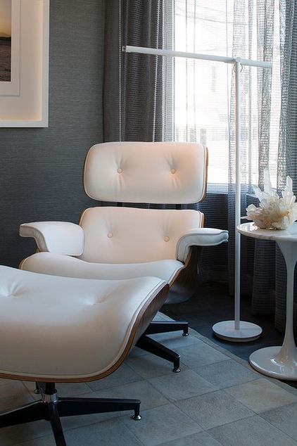
An Eames classic lounge chair and ottoman sit in a corner next to a Saarinen-style side table.

Knitted dissections of a frog, mouse and pig by Emily Stoneking hang on a nearby wall. “They’re just so darn witty and brilliant,” McCullar says.
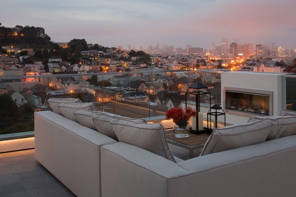
The panoramic view of San Francisco from the roof deck is breathtaking. Sunbrella fabric allows the furniture to sit outside rain or shine. Not seen here is the dining table, the outdoor kitchen and thr dumbwaiter, which extends to the garage and stops on every floor. “You can pull into the garage, load up your takeout food or bottles of wine, and send it to the kitchen or the roof or wherever,” says McCullar.
See more about the home’s LEED goals:


