Kitchen of the Week: Storage, Style and Efficiency in San Francisco
With a 2-year-old child and another on the way, a San Francisco couple with a lower-level flat in a two-unit Edwardian building needed a more user-friendly kitchen that would be a better fit for their growing family. Their existing galley-style kitchen was functional but suffered from a lack of built-in storage and organization. “The kitchen before was oversized and not well defined,” recalls project architect Dennis Budd of Gast Architects. “There was a circulation problem, and it was hard to work in.”
The couple wanted to create a more efficient space where they could enjoy daily meals, relax and feel a connection with their backyard. Key structural and design changes were made to transform the once-closed-off, disorganized kitchen into the central gathering place of this inviting city home.
Photography by Paul Dyer
Kitchen at a Glance
Who lives here: A family with young children
Location: Cole Valley neighborhood of San Francisco
Size: 150 square feet (14 square meters)
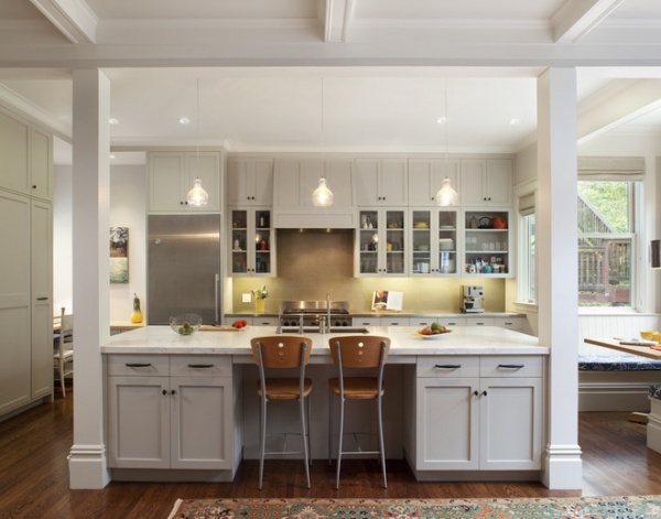
Reconfiguring the flat and removing walls improved traffic flow and allowed room for a large center work island that defines the kitchen and the now-adjacent family room. “The island is both furniture and function,” says Budd. “It’s a divider and where you converse.” The island includes lots of built-in designated storage, including a crafts drawer for the kids and a pullout cabinet for a large mixer and a food processor.
The stunning white Calacatta marble top with light gray veining and gold flecks from local company Fox Marble & Granite adds a touch of elegance.
Mega Bulb Pendant Lights: YLighting; paint: Seattle Mist, Benjamin Moore (full shade on cabinets; 50 percent shade on walls)
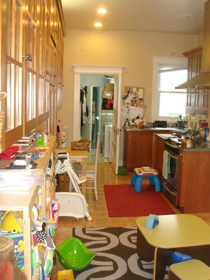
This photo shows the disorganized nature of the old galley kitchen that lacked built-in storage and didn’t fit the needs of the young family.
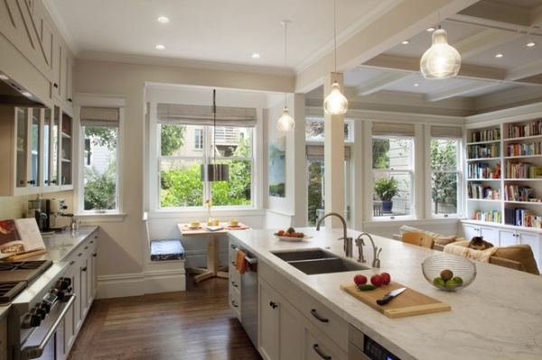
AFTER: This is the opposite angle of the previous shot (see the floor plans below). The back side of the island includes a stainless Miele dishwasher, recycling pullouts and an undercounter microwave. “It’s a nice alternative to having it on the counter,” notes Budd. “It has a stainless front to match the Miele refrigerator.”
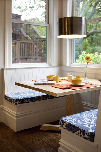
A small addition allowed room for a banquette in the new kitchen bay. “I absolutely love it because it’s casual, and we use it for everything,” says the wife. “We eat three meals there a day, and that’s where the art projects happen. It’s also one of the nicest spots in the house to sit and enjoy the garden.”
The efficient banquette features a flip-up bench that offers hidden storage for toys.
Pendant lamp: discontinued; bench cushions: custom, Van Galen Upholstery in San Francisco; banquette table: ash wood, custom, Stapp’s Fine Woodworking
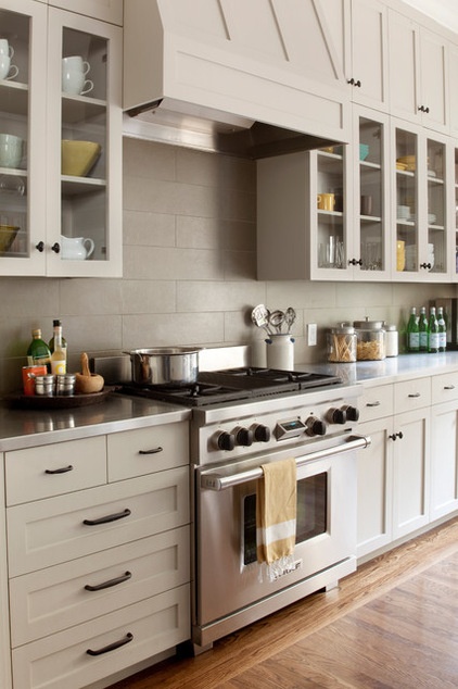
The cooking zone has the same simple palette and symmetry as the rest of the updated kitchen. Long stainless steel counters with a clean edge on each side of the 36-inch gas range (from Wolf) give the family the prep space they desired, as well as a spot for canisters of utensils and dry goods. The counters will patinate over time and nicely contrast the oversize sea-green porcelain subway tiles used for the backsplash.
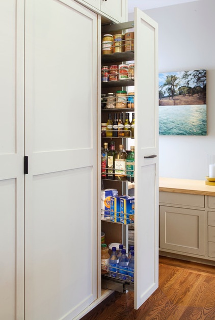
Since the family didn’t have room for a traditional pantry, they included a pullout pantry with simple zinc metal baskets on a frame. “It’s wonderful and such a clever way of maximizing space,” says the wife. “You can see everything that’s in there.”
The washer and dryer are behind flipper doors to the left of the pantry. A hidden pullout ironing board in the island is just steps away. This streamlined solution replaces the unit’s old sloping laundry porch, which was converted into a third bedroom.
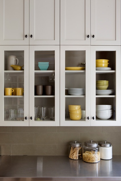
Created to display the family’s nicer dishes and glasses, the upper cabinets feature clear glass fronts. While Budd admits that cabinets with clear glass require homeowners to have some discipline, he says in this case the cabinets provide visual interest, which was important since the kitchen is now open to the adjacent family room.
Cabinets: custom, J. Spix Fine Cabinets in Sausalito, California
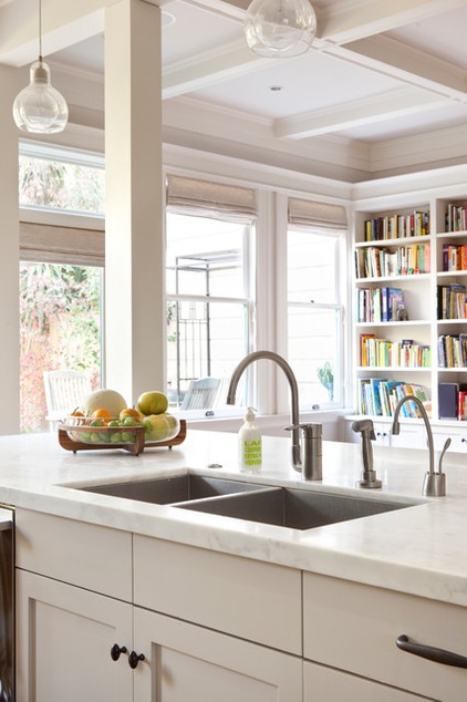
Without the space for a main sink and a separate prep sink, this large, two-bowl Moen Lancelot sink fit the bill. “The length of the island allowed room for this really wide and deep sink,” says Budd. “It has a disposal on the smaller bowl and a hand spray.” The sink also has a dispenser for hot and cold filtered water and acts as a utility sink for various household tasks.
Faucet: 33980 in brushed nickel, Grohe
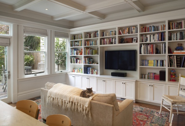
The home’s formal dining room was converted into a handier family room that opens to the kitchen. It features an attractive coffered ceiling, a new door and window configuration, and a linear LED light strip above an expansive wall of bookshelves.
Budd points out that they purposely didn’t build the shelves all the way to the ceiling, to help the room feel as large as possible. “When they arrive home, this is the space they live in,” he says. “What we did for them with the kitchen and family room is create a center spot for the family to live in, to eat, talk and be together.”
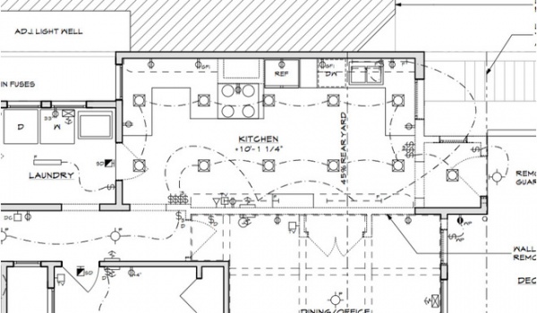
Before the renovation the existing galley-style kitchen suffered from a circulation problem and was cut off from the other public areas of the home.
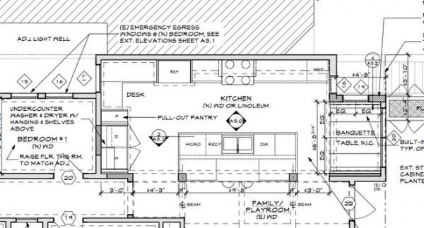
AFTER: The new layout improved the function of the kitchen and the circulation between the kitchen and the adjoining spaces.
Team:
Architects: Gast Architects
General contractor: F.R. James ConstructionStructural engineers: GFDS Engineers
See more Kitchens of the Week
Find a kitchen designer


