My Houzz: Chic Meets Whimsy in Vancouver
Katie and Cedric Lo were living in Singapore when they learned they were expecting a baby. The couple wanted to raise their family in their native Canada and decided to relocate to Cedric’s hometown of Vancouver in 2012. They found a dilapidated property in Kitsilano advertised as “land value only,” and proceeded to demolish the existing structure and build a new home from scratch. “Our choice came down to location,” says Katie, an interior designer. “We were looking for a lot to build a new house on, so existing features were not important.”
With Cedric’s father managing the architectural side of the project, Katie handling the interior design and project managers helping with construction, the home was completed in a year. “We decided early on in this project that we were not going to concern ourselves with resale value,” says Katie. “We personalized the space to meet our needs and to function for the way we live.”
Houzz at a Glance
Who lives here: Katie and Cedric Lo and their 2½-year-old son, Noah
Location: Kitsilano, Vancouver
Size: 1,900 square feet (177 square meters); 3 bedrooms, 2½ bathrooms, plus an 800-square-foot rental suite downstairs
Katie’s philosophy when it comes to decorating: only have things in your house that you absolutely love. “A sense of quirkiness or lightheartedness is important,” she adds.
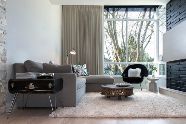
That’s certainly evident in the living room’s vintage suitcase side table, which Cedric, a computer animator, created for Katie after she found the components. “I love that it is something we created together, and that my husband went out of his comfort zone and figured out how to build it for me,” she says.
The fireplace surround, from EKB Innovations, consists of paintable 3D wall panels made of natural plant fibers, bamboo and sugarcane from Rona. The curtains are a linen blend with pinstripe, cream and gray pinch pleats.
Belgian Track Arm Sofa with chaise in Fog: Restoration Hardware; rug: The Home Depot; pillows: West Elm; floor lamp: Ranarp, Ikea; coffee table: Carved Wood, West Elm; side table: Martini, West Elm
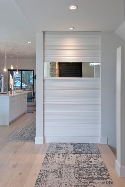
Recessed lights highlight a textured feature wall in the entry. Katie created the wall by mounting lengths of baseboard. “I selected various profiles of baseboard, nailed them to the wall, filled the holes, caulked the edges and painted it,” she says.
The beveled mirror was custom made at a local shop.
Carpet runner: Reoriented in Grey, Flor
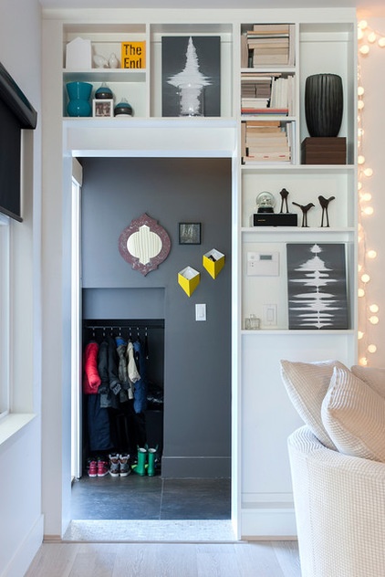
Katie bought the soundwave artwork online at Voice Art Gallery. The two gray and white pieces are the result of a personal voice recording submitted through the site. Other sentimental gifts, vases and books are featured on the custom built-in shelving unit.
The low closet visible in the hallway was designed to store Noah’s stroller, but the couple found that it was not convenient to carry the stroller upstairs and into the house every day. So they converted the closet into a coat and shoe nook.
Mudroom paint: Iron Mountain 2134-30, Benjamin Moore; mirror: HomeSense; mini shelves: Wall Pocket Shadow, CB2; clear vase: Simon Pearce; bird votive holders: Urban Barn
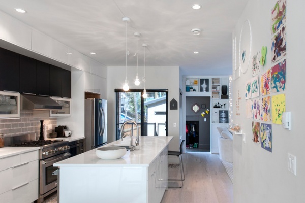
The wall adjacent to the kitchen island is magnetic and one of the couple’s favorite features in the home. It was created using a magnetic paint primer underneath the top coat of paint. “I spend a lot of time in the kitchen and it is right in front of me, always in view. We have Noah’s artwork on display, the string art spelling out our family name, plus the Scrabble board — which to me represents our family’s connection and playful side,” says Katie. “I smile every time I look at this wall.”
Noah uses the lower half of the wall to play with his magnetic alphabet and numbers, and the flash cards Katie made him. “I wanted this wall to be an activity area and evolving art gallery that we could rotate as the years go by,” she says.
Bowl on island: Anemone, 18Karat; bar stools: Glenn, Ikea; E27 pendant lights: designed by Mattias Ståhlbom for Muuto, Design Within Reach; Cut Glass Halogen lightbulbs: CB2
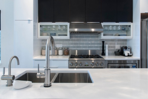
Cedric and Katie splurged on a few key items, like the backsplash tile and fixtures, and saved where they could. The cabinets, a combination of high-gloss white, black-brown wood and glass fronts, were designed by Katie and purchased from Ikea.
Cabinets: Abstrakt and Gnosjo, Ikea; backsplash: subway tile in gray, Olympia Tile; mosaic tiles: Mother of Pearl, Olympia Tile; faucet: Trinsic Single Handle Pull-Down, Delta; hot-water dispenser: InSinkerator, Indulge Modern
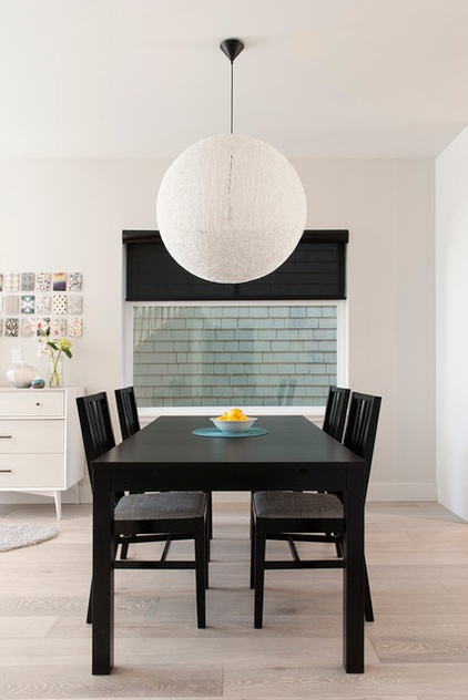
Creating a dynamic home is very important to Katie. “You start with a solid base that is clean and simple and build on that with items that are more easily changed over time,” she says.
Dining table: Bjursta; dining chairs: Norrnas, both from Ikea
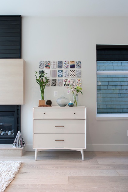
The art installation above the cabinet is composed of postcards from a boxed set, 10 Contemporary Pattern Designers, while the triangular ornament on the hearth is a DIY Christmas decoration that Katie made out of a magazine.
Mid Century 3-Drawer Dresser: West Elm; wall paint: Silver Satin OC-26; ceiling paint: Oxford White CC-30, both by Benjamin Moore
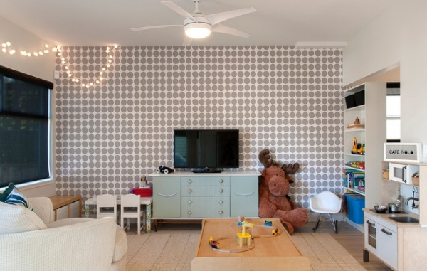
The family spends most of their time in the family room, which doubles as a playroom. “During the day Noah plays there, and I am able to keep an eye on him from the kitchen or office,” says Katie.
The “Café Nolo” sign refers to the nickname Cedric and Katie have for Noah. “I made the sign by creating a stencil of the letters and painting the glass of a shadow box,” says Katie. “There is space behind the glass to put twinkle lights, which turns it into a mini backlit sign for Noah’s kitchen/café.”
Wallpaper: Pienet Kivet Polka Dot in Grey and White, Marimekko; ceiling fan: Hampton Bay, Windward IV, The Home Depot; play kitchen: Duktig, Ikea; art table: Lack, Ikea, with custom fabric-wrapped legs; art chairs: Sundvik, Ikea; train table: Kidkraft
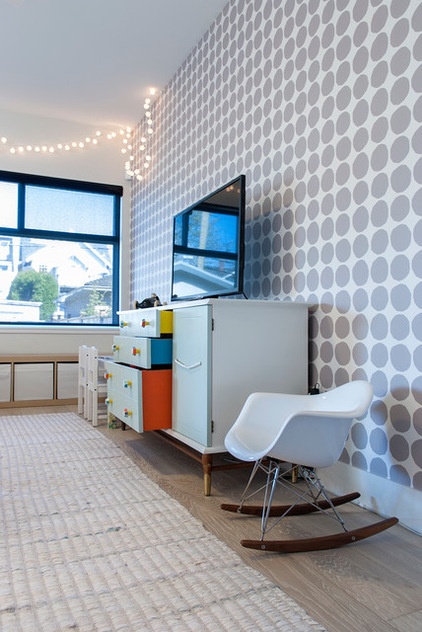
After construction was complete and the couple moved in, they furnished each room to a point where they were all functional. Katie then set out to finish each space individually. The first room on her list was the family room. “As everyone with kids knows, they tend to be the first priority. And plus, who doesn’t love designing or decorating a playroom? You get to think like a kid again,” she says.
Katie refurbished a secondhand dresser with new paint and handles from Anthropologie. String lights add a playful ambience. Katie made these out of plastic golf balls and basic twinkle lights.
Rug: Rags to Riches, Land of Nod; rocking chair: Nood (now closed)
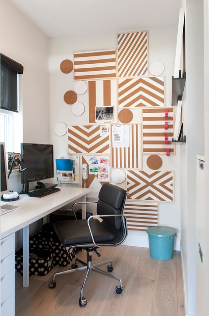
The office is host to a creative installation of corkboards that Katie customized with white paint. The round cork accents are kitchen trivets from Ikea. “The next big project on my list is a custom sliding barn door for the office,” she says.
Make Your Own Stylish Corkboard
Desk: Linnmon/Alex, Ikea; chair: Eames Soft Pad Side Chair
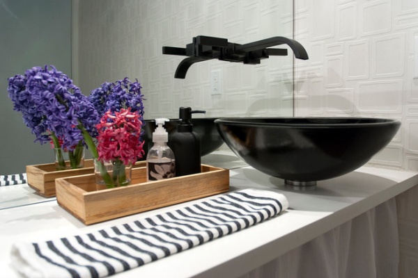
A black glass vessel sink plays nicely with a flat black wall-mounted lavatory faucet from Newport Brass’ Secant collection.
“I think the hardest thing for a designer when designing their own home is actually committing to anything final,” Katie says. “As soon as you do, you find something else that you love more or come up with another solution that you want to try out.”
Wallpaper: Paintable Squares Geometric Tiles, AllModern
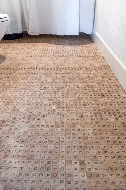
Katie wanted to do something interesting in their compact powder room and saw an opportunity to inject a little fun without making a huge commitment. She ordered Scrabble tiles from China and installed them herself. “I was met with a lot of questions and confusion from our project managers and trades, but in the end, everyone loved it!”
There are approximately 7,000 Scrabble tiles on the floor, each individually laid by Katie. The actual installation of the tiles took two full days to complete. “I had the entire floor designed beforehand, and my husband and I came up with approximately 60 words that are hidden in the floor,” she says. The words include cities they have lived in, family members’ names and inside jokes.
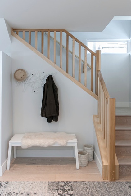
The couple had to compromise on the entryway stairs. “We had originally planned for an open-concept glass stairwell that was light, bright and airy,” says Katie. “But unfortunately, there were too many red flags when it came to building codes and budgets.”
The Los opted for a simple design that they can update in the future if they choose.
Coatrack: Hang On, Norman Copenhagen; bench: Sigurd, Ikea; faux sheepskin: Rens, Ikea
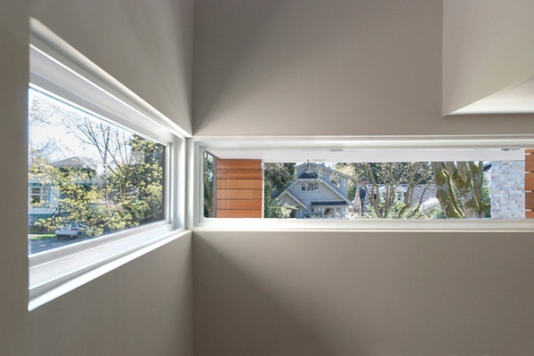
The windows in the stairwell were part of the architectural design. They wrap around the corner and mirror the effect of the large corner window in the living room. The placement allows natural light to filter through while preserving privacy.
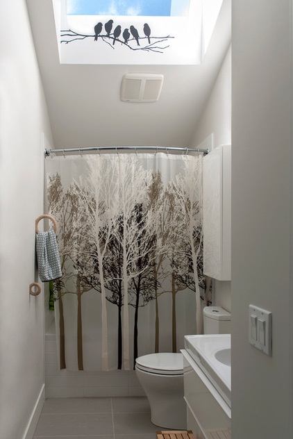
A skylight was added to the upstairs bathroom, adding a ton of natural light and really opening up the space.
Ring towel holders: Gym Hook, Hay; shower curtain: London Drugs; bird decal: Etsy
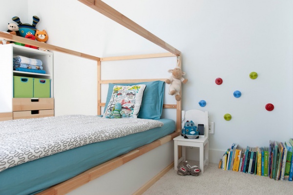
The couple wanted to keep the design of Noah’s room simple and clean. “We knew that his toys and books would add a lot of color to the space, and we did not want it to feel too busy,” Katie says. Punchy green storage baskets and playful colored hooks were added for fun and function.
Bedding: Ikea; dresser: Stuva system, Ikea; wall paint: Palest Pistachio 2122-60, Benjamin Moore
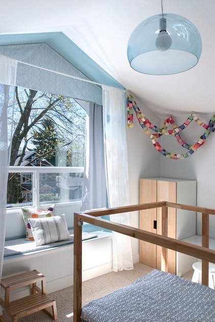
When Noah’s bed is completed, it will resemble the frame of a house — think square with a triangle on top. “We will create a custom tent-canopy that will enclose part of the bed and create a fort for him once he is older,” Katie says.
Pendant: FL/Y lamp, designed by Ferruccio Laviani, YLighting; bed frame: Kura, Ikea; curtain valence: custom; blackout panels; Pottery Barn Kids, customized length
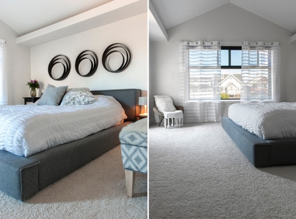
Sculptural mahogany wall art adds a sense of depth and dimension to the open, airy and bright master bedroom. The secondhand chair in the corner is accented with a Mongolian lamb pillow cover from West Elm. Katie re-covered the bench in an upholstery class.
Bed frame: HomeWerx (now closed); Organic Seersucker Duvet Cover, Organic Woodland Pillow Shams, Diamond Dot Crewel Pillow Cover: West Elm
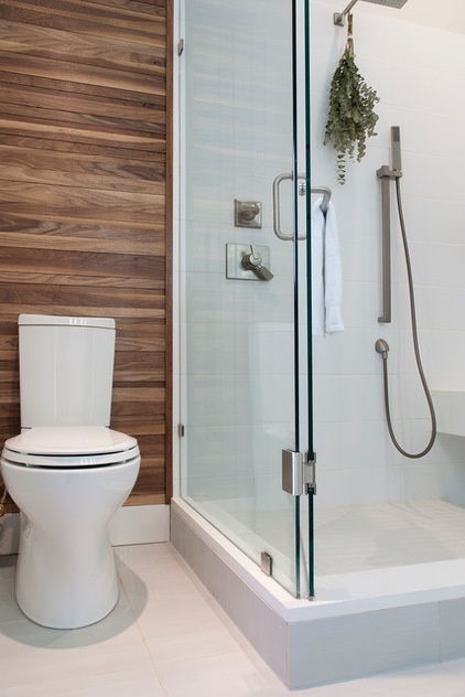
The walnut feature wall in the master bathroom was a custom design intended to add warmth to an otherwise very modern, white bathroom.
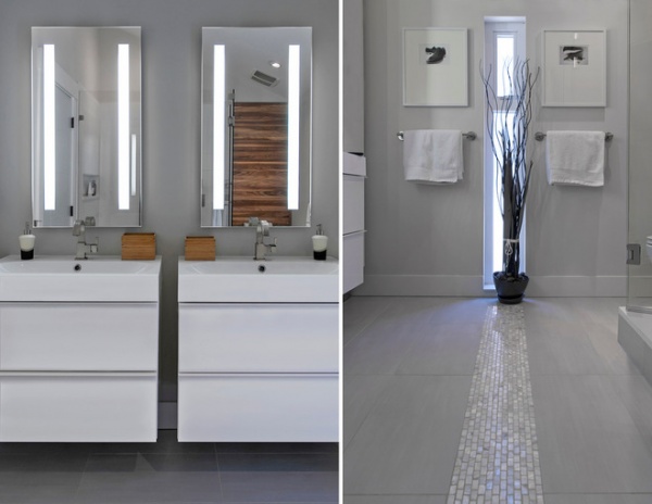
A narrow window in the master bathroom accentuates the linear tile detail on the floor.
Vanity: Godmorgon, Ikea; sink: Odensvik, Ikea; faucet: Delta; mosaic tiles: Mother of Pearl, Olympia Tile; wall paint: Stonington Gray HC-170, Benjamin Moore
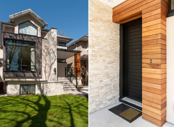
Before moving into this home, the couple occupied a small condo and rental apartments during their time abroad. “This house gives us the space that we need and room to grow our family,” says Katie. “We live on a beautiful street with great neighbors and all the amenities you could ask for just minutes away.”
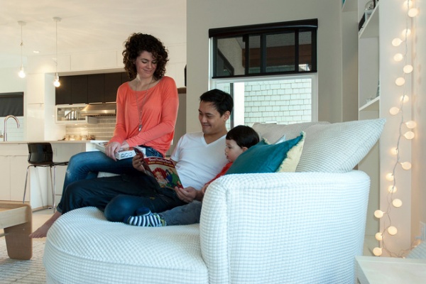
“The big round chair is great for reading books together and for cuddling up to watch movies after Noah has gone to bed,” says Katie, seen here with Cedric and Noah.
Nest Custom Chair: Urban Barn
My Houzz is a series in which we visit and photograph creative, personality-filled homes and the people who inhabit them. Share your home with us and see more projects.
Browse more homes by style:
Small Homes | Colorful Homes | Eclectic Homes | Modern Homes | Contemporary Homes | Midcentury Homes | Ranch Homes | Traditional Homes | Barn Homes | Townhouses | Apartments | Lofts | Vacation Homes
More: My Houzz: Color and Pattern Give a Newlyweds’ Home Zing


