Houzz Tour: Artistry and Illusion Season a Baton Rouge Townhouse
“Wow, what a great old house!” visitors often exclaim when they see Ty Larkins’ home for the first time.
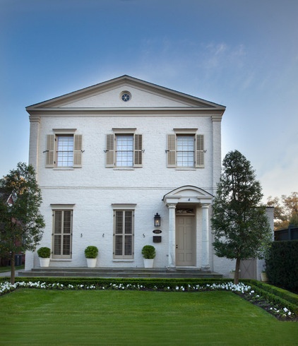
Larkins can’t help but smile. While the structure resembles the kind of Greek revival townhouse that lined the streets of New Orleans 150 years ago, it was actually built in 2004. “I went out of my way to make it as convincing as possible,” says the homeowner, a designer who runs Ty Larkins Interiors, a home furnishings store and design studio in Baton Rouge, Louisiana.
Larkins and his wife, Amanda, love old houses but were unable to find one that suited them. Baton Rouge blossomed in the 1950s and ’60s, so few older houses were available, and what did exist were mostly Craftsman homes or small cottages — neither of which appealed to the pair.
So they found an undeveloped lot in Hundred Oaks Park and built their own homage to 19th-century design — with more than a few unexpected curves thrown in. “I think so much of design is taking something that’s a cliché and giving it a creative twist,” Larkins says.
Houzz at a Glance
Who lives here: Ty and Amanda Larkins and their twin daughters, Lauren and Sydnie (age 12)
Location: Baton Rouge, Louisiana
Size: 3,700 square feet (344 square meters); 3 bedrooms, 2½ bathrooms
Year built: 2004
Photography by Chad Chenier
It took a year and a half to build the home, which Larkins designed with assistance from Le Architect in Baton Rouge. The painted brick facade and shuttered windows overlook a formal front garden, lending an air of reserved propriety that evaporates once you step through the front door.
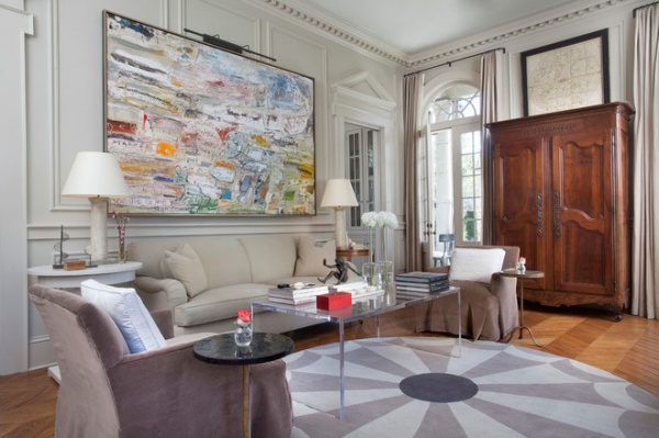
Larkins’ interior leavens period reverence with contemporary brio, for a look that’s constantly evolving. The designer modeled the living room after a Parisian flat, complete with chevron floors, boiserie (paneling) on the walls and a country French armoire dating from 1875. Despite the painstaking period detailing, he chose to paint the millwork the same color as the walls — a custom taupey gray — so that the trim almost blends into the background. A contrasting color would have made the room too busy, says the designer.
Still, he wasn’t above a little manipulation, painting the crown moldings a slightly paler color than the baseboard. “It’s an old decorator’s trick,” he says, designed to compensate for the lack of light up near the ceiling.
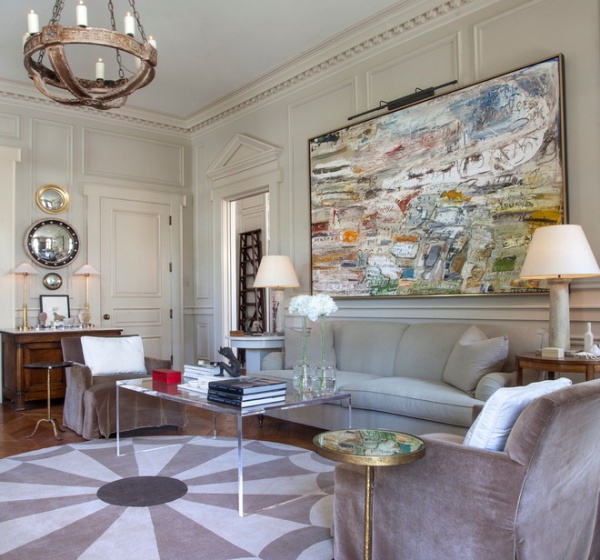
Modern furniture relaxes the formality of the room, as do the contemporary works of art. Larkins likes the tension that results when modern art is placed in a traditional room. “The important thing is making sure the scale of the art you use is correct,” he says. “I have a tendency of going for large, bold pieces.” The work over the sofa is by artist Ralph Turturro, brother of the actor John Turturro.
The designer needed an area rug to anchor the seating group but didn’t want to obscure too much of the floors, so he went with a round rug modeled after inlaid marble floors. At first glance the Lucite coffee table might seem like an odd choice for such traditional surroundings. “I needed something that was airy and would allow the rug to stand out,” explains the designer. “And it’s a good, clean counterpoint to the antiques in the room.”
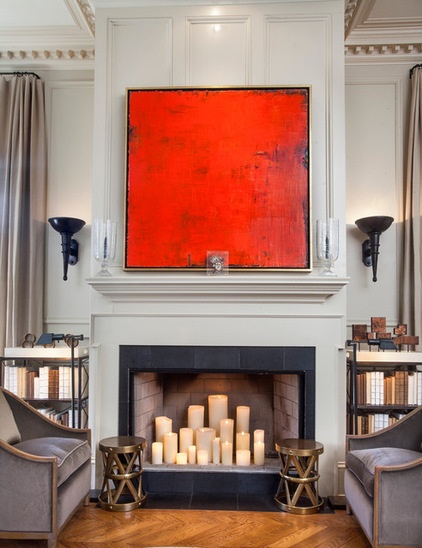
The fireplace opposite the sofa is topped with a contemporary canvas by New Orleans artist James Beaman.
Side tables: Arteriors
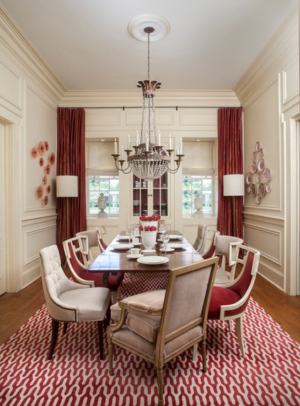
“A dining room is a boardroom with chairs around it,” Larkins says, sighing. “It’s one of the rooms that’s most difficult to make interesting.”
To shake things up, he played with the traditional concept of the red dining room by making nearly everything except the walls red. He hung red curtains at the windows and covered the floor with a hand-knotted red and white rug, atop which sits an antique country French table with a parquet top.
Louis XVI–style French chairs anchor either end of the table, which is flanked by red upholstered klismos-style chairs and French chairs from the 1940s with rings on their backs. “I wanted the chairs to be different but also similar,” the designer says.
Along those lines, he adorned one wall with a collection of handblown glass discs from SkLO, which he placed opposite a display of antique red and white china — a case of old echoing new.
Rug: The Rug Company; chandelier: Niermann Weeks, Ty Larkins Interiors
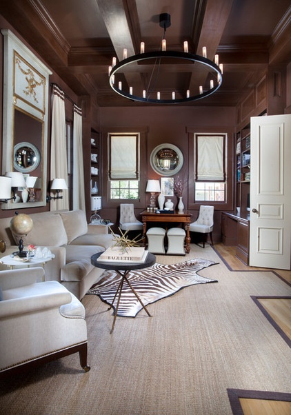
Larkins painted the library a rich chocolate brown. “I needed it to feel old-school — like a speakeasy,” he says. The brawny coffered ceiling enhances that masculine feel, as does the ruggedly understated chandelier.
The designer tried 15 shades of paint before he got the color just right. Fortunately, he didn’t paint the entire room each time. “When you’ve got 50 percent of the room done, you can tell whether or not it’s going to work,” he says.
Paint: custom color; chandelier: Fontana Art, Ty Larkins Interiors
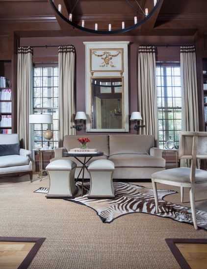
A French trumeau mirror dating from 1800 dominates the library, which features a cowhide rug set atop a custom sea grass carpet. The Global Views ottomans with nailhead trim are available from Ty Larkins Interiors.
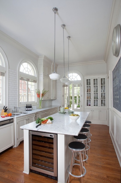
Larkins modeled the kitchen after the staff kitchens that were often sequestered at the back of older houses. Measuring 23 feet long and 14 feet wide, the room is packed with storage and counter space and illuminated by elegant arched windows.
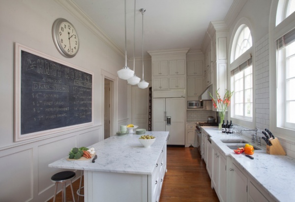
The counters are crafted from Blanco Venatino marble, whose subtle gray veining is echoed in the walls, painted Classic Gray by Benjamin Moore. The bistro-style blackboard is the perfect spot for posting party menus or notes.
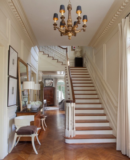
Larkins had admired the chevron wood floors at the Louvre and had taken out a tape measure and recorded the dimensions. He hauled them out years later when it came time to install the salvaged-oak flooring in his new house.
A bird’s-eye maple Louis Philippe chest from 1825 anchors the wall and is flanked by a contemporary goatskin klismos chair made by Scala Luxury and sold in Larkin’s shop. The living room is visible down the hall.
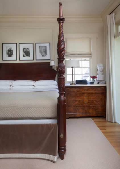
“I want to walk into a room and know that I’m in the master, just by looking at the bed,” says Larkins, who chose a British West Indies–style four-poster from Lexington to anchor his and Amanda’s room.
Paint: Pastry, Pratt & Lambert
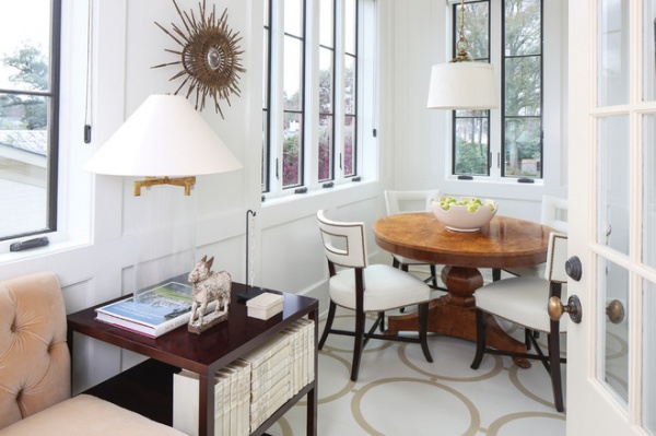
The sunroom off the master bedroom was designed to look like a porch that had been enclosed. Measuring 7 feet wide and 31 feet long, it’s dominated by a 14-foot tufted velvet banquette (the end of which is visible here) that culminates in an intimate dining area where the Larkins like to enjoy breakfast on the weekend.
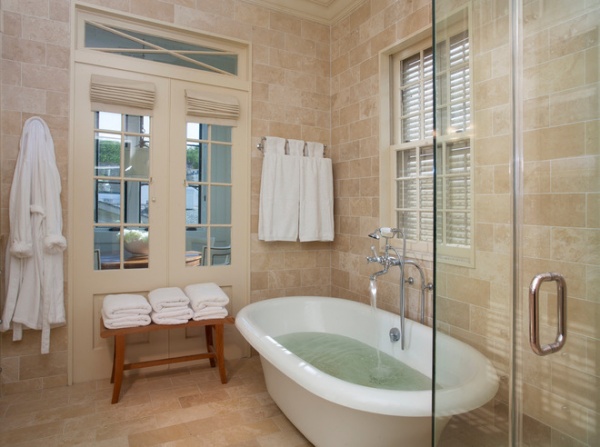
The master bath borrows light from the sunroom and is covered from floor to ceiling in elegant travertine tiles.
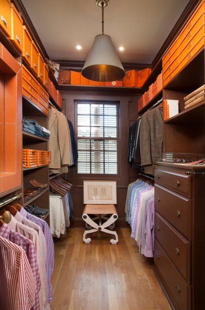
Larkins wanted his closet to feel classic and masculine, like an old-fashioned men’s haberdashery. He brought home a couple of boxes from Hermès, liked how the orange worked with the brown and just built on the palette from there. He added orange file boxes, storage bins and crates.
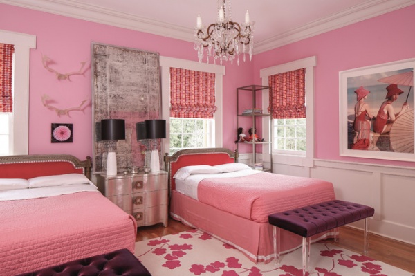
Twelve-year-old twins Lauren and Sydnie insisted on a pink bedroom, so their father obliged, painting the walls Bayberry from Benjamin Moore. The beds were fabricated from a matching headboard and footboard that Larkins culled from a 1725 French bed.
The benches with Lucite legs are from Ty Larkins Interiors; the wall art is an old Vogue magazine photo reissued by Conde Nast.
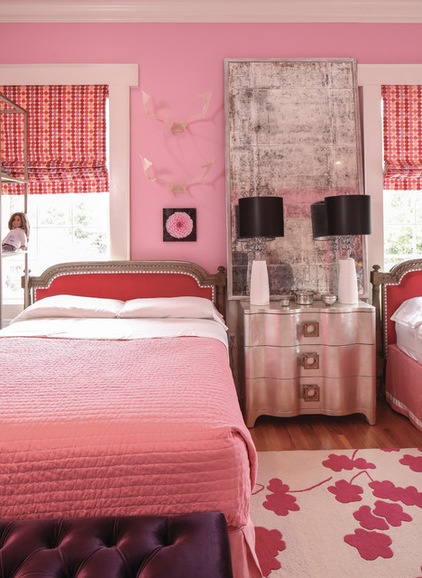
A custom mirror fitted with antiqued glass rests between the two beds atop a silver-leafed Salon Nightstand from Bernhardt.
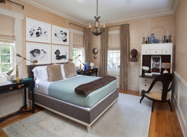
Grasscloth from Phillip Jeffries adds character to a guest bedroom. “I think it’s a fabulous way to warm up a space,” says Larkins. The designer based the bed’s design on an old French model, and topped the headboard with a quartet of dog drawings by Valerie Davide. The secretary is from Hickory Chair; the seductively low-slung spoon chair is a reproduction available from Ty Larkins Interiors.
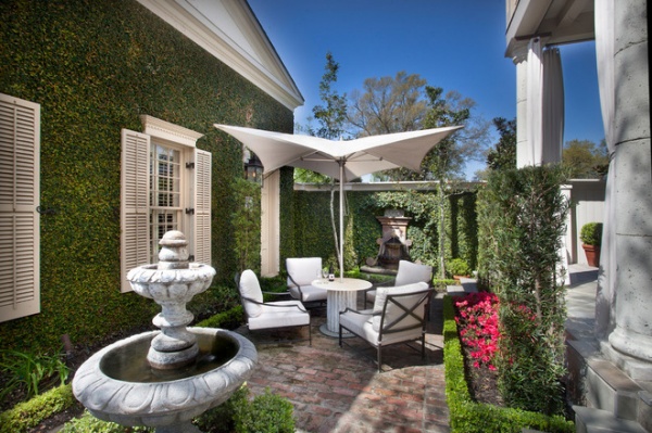
The French feeling continues out back, where walls covered with fig ivy embrace an intimate seating area sandwiched between a pair of fountains. Curtains fashioned from outdoor fabric frame the columned veranda; the garage at left was designed to look like a guest cottage.
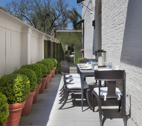
A metal dining set anchors another section of the patio. A mirrored panel on the far wall creates the perception of a passageway to another part of the garden.
The home was completed a decade ago, but Larkins continues to tweak the design. Art and accessories change periodically, so the house is always evolving. But the approach remains consistent: glamour, seasoned with a soupçon of illusion.
More: ‘House Proud’ Celebrates Fearless Louisiana Style


