Houzz Tour: A Brooklyn Townhouse Takes a Warm, Contemporary Turn
http://decor-ideas.org 06/11/2014 01:17 Decor Ideas
Typically a semiattached or attached house shares a property line and wall with a neighbor or two, but not necessarily anything more. And given the ease of communication today, such proximity is no guarantee that we’ll share our lives or secrets with our neighbors any more than with somebody down the block or halfway around the world. So it’s refreshing to know that the owners of this new house near Prospect Park in Brooklyn, New York, are so close with their neighbors in back, that architect Alexandra Barker included a gate to connect the two rear yards.
Of course, there is more to this house than a gate, so let’s take a tour from outside to inside, downstairs to upstairs.
Houzz at a Glance
Who lives here: A family of 5, plus a dog
Location: Brooklyn, New York
Size: 3,750 square feet (348 square meters) spread over 2 floors and a furnished basement; 4 bedrooms, 3½ bathrooms
Photography by Francis Dzikowski
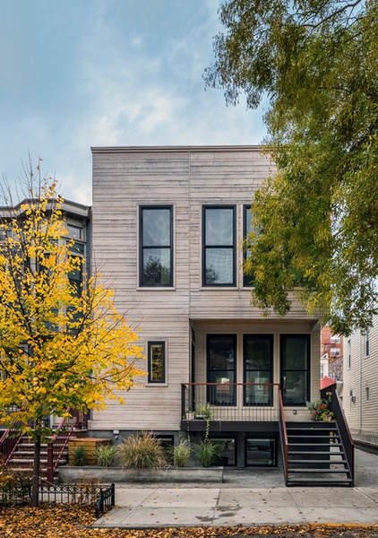
Barker, of Brooklyn’s Barker Freeman Design Office Architects, designed the house to sit upon the foundation of the property’s previous home. Envisioning the new structure as a modern design that pays homage to the past, she carved away at the corners of the boxy form to provide access for the front door (shown here), as well as the back door, which we’ll see soon.
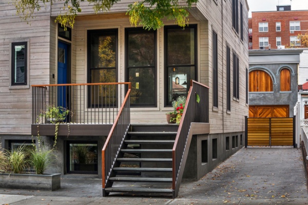
Carving away at the box yielded a modern stoop and a small front porch leading to the blue front door at left. The porch is a good place to sit and take in Prospect Park, only one block away. The driveway on the side leads to the garage in the rear.
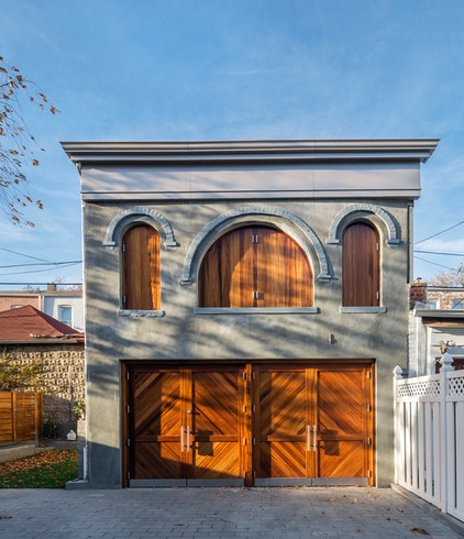
The old garage, with its hayloft, was carefully restored with new stucco and new door and window panels. These traditional elements offer a fitting counterpoint to the more modern main house.
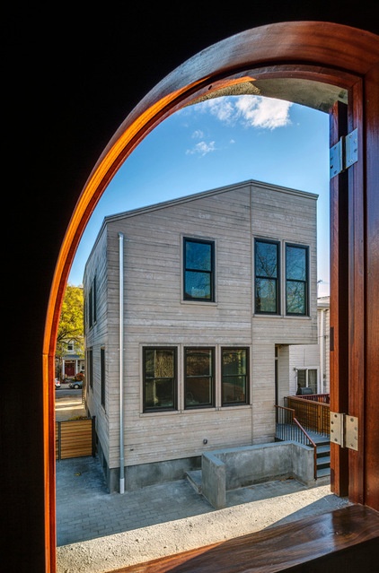
Here is a view of the rear of the house through one of the hayloft’s arched windows. From here we can see how the roof is angled to bring light into the yard on the north side of the house, and how the bottom right corner is carved out for access to the interior.
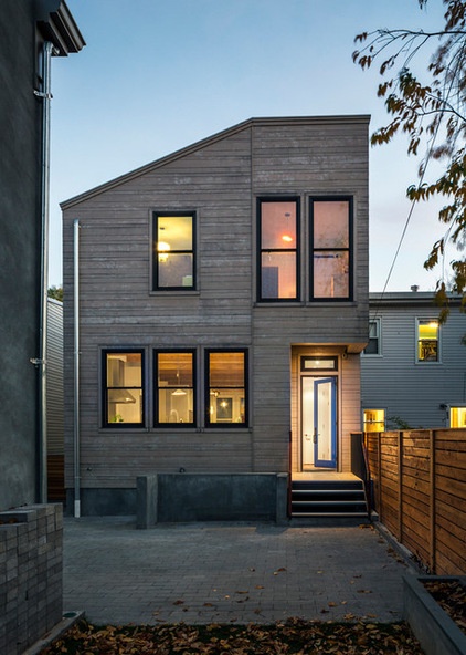
Here we’re looking at the house from a space next to the garage, where another garage once stood. Demolishing the latter created more playspace in the yard and provided room for the gate (behind us) connecting the two houses’ yards together.
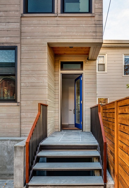
We’ll head inside the house the same way the family would, from the rear yard. Before we do, note the cladding, which is white cedar; the varying heights of the siding give it a subtly unique appearance. The steps and porch are covered in bluestone, as they are at the front.
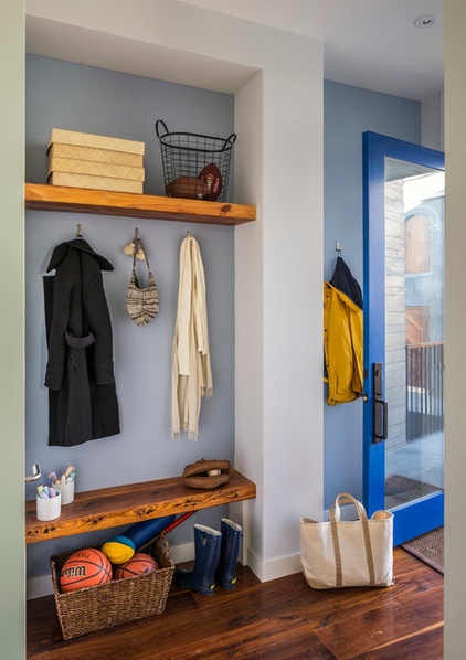
Just inside the back door is a mudroom with a bench and shelf made from reclaimed wood. The door handle visible at left opens to the closet, with more room for hanging coats.
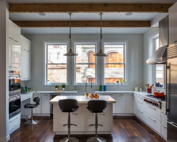
Next to the mudroom is the kitchen, which overlooks the backyard through double-hung windows on one side and is open to the dining room and living room (behind us) on the other side.
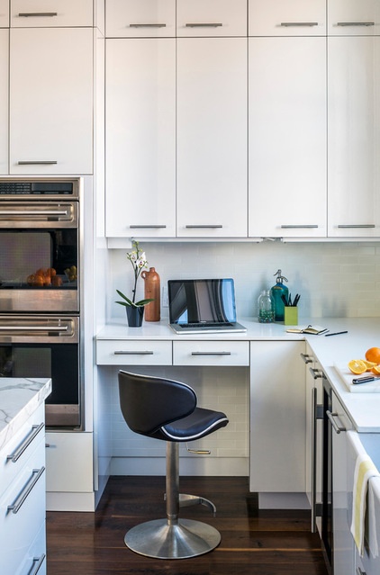
Even with three floors — living space on the first floor, bedrooms upstairs and a family/media room downstairs — taking advantage of every bit of space was important. A small workstation was inserted into one corner of the kitchen; it’s a good place for checking emails and paying bills.
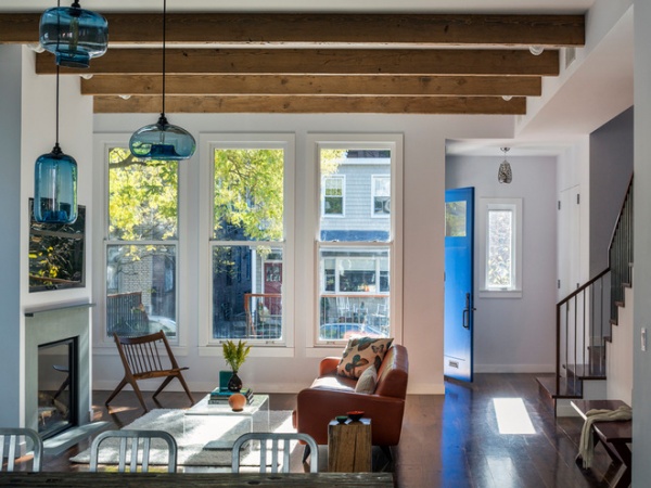
Like the simple, white kitchen, the open-plan living space is one of the home’s modern touches. The exposed reclaimed wood beams on the ceiling are spaced close together, so the room doesn’t feel as long as it is.
Walnut is used for the flooring throughout.
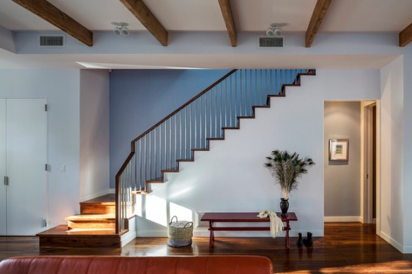
The beams also provide spaces for the lighting and the HVAC grilles. The classic staircase is another nod to tradition, although the simple balusters are a modern touch (repeated on the front porch).
The opening on the right leads to the powder room and the basement, but we’re going to head upstairs to see the bedrooms.
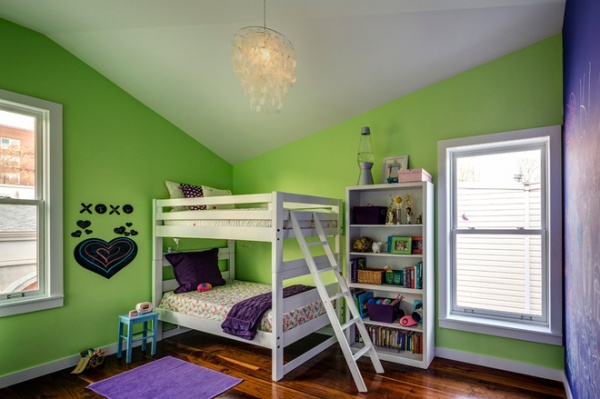
The top floor is split roughly into two halves: the front half, overlooking the street, is the master suite; the rear half contains the three bedrooms for the kids. A pocket door separates the two halves, and pocket doors are also used in the bathrooms and in the master suite, in concert with some swinging doors. (Pocket doors are a great way to deal with tight floor plans.)
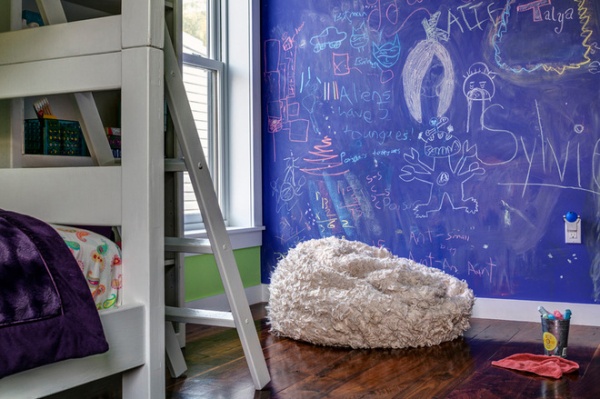
The previous photo and this one were taken in the bedroom under the low point of the roof. Purple chalk paint covers one wall, so the resident child can let us know that aliens have five tongues.
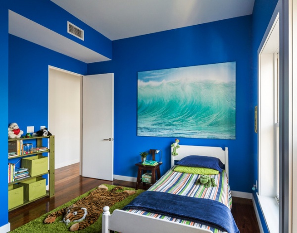
The other kids’ bedrooms are painted in different colors. This blue echoes the front and back doors.
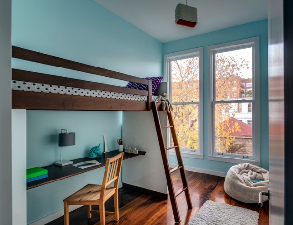
Given the 25- by 50-foot footprint of each floor, the rooms (taking into account closets and such) are not very large, which is typical of city lots. Therefore, loft beds and other space-saving devices are important.
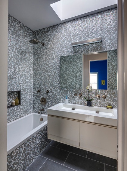
The kids’ bathroom is located along the side wall shared with the neighboring home, so a skylight was needed to bring in some natural light. With three youngsters vying to get ready at the same time, having a separate toilet room is really helpful (it’s just out of frame to the right). The trough sink is also handy, as two kids can use it at the same time.
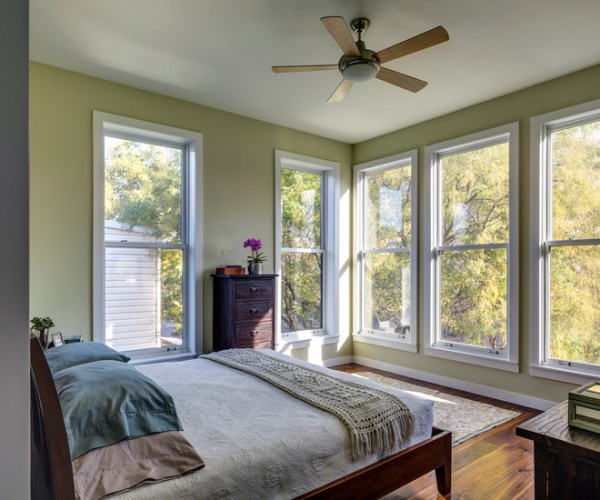
The master suite is situated over the front porch, so it overlooks the street and has some filtered views of Prospect Park through the side windows.
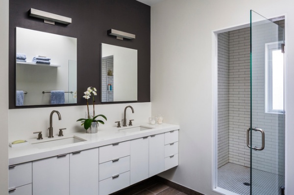
The modern touches continue into the last space we’ll look at: the master bath. The vanity in particular is reminiscent of the kitchen’s simple design. And while this bathroom is also skylit (the reflection in the left mirror hints at the daylight coming in from above), the small window in the shower helps bring in more light, in concert with the glass door.
More: Urban Townhouses Lighten Up
Related Articles Recommended


