My Houzz: A Modern Home Meets Its Neighbors Halfway
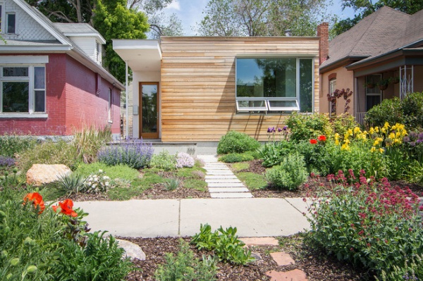
In 2010 Seth and Rachel Striefel saw the potential in a vacant piece of land sandwiched between two Victorian-era homes in the Central Ninth neighborhood of Salt Lake City. “The home on the site had burned down 15 years earlier,” says Seth, an architect. After securing financing through the Redevelopment Agency of Salt Lake City, the Striefels started the design process. Seth talked to neighbors about their construction project, fielding concerns about their plans to build a modern home in a predominantly Victorian neighborhood. The couple thoughtfully took these into consideration as they designed their house. Originally they had planned to build a two-story home, but decided to more closely mimic the surrounding one-story structures.
“Each historic home has a similar width and height proportion, a large window opening to one side of the house, a porch element and a recessed entry,” he says. “The new house references these gestures with its similar scale, large, offset opening containing a series of operable windows, a cantilevered canopy that meets the setback of the historic porches, and a grade-level patio surrounded by an L-shaped concrete wall with a similar street-front relationship as the historic porches.”
Houzz at a Glance
Who lives here: Seth and Rachel Striefel and their daughter, Ryan
Location: Downtown Salt Lake City, Utah
Size: 1,200 square feet (111 square meters) plus a 250-square-foot studio; 2 bedrooms, 1 bathroom
The exterior is marked by a horizontal cedar rain screen exterior system. The spacing and widths of the boards are designed so that they meet the head and sill reveals at every opening. The cedar has been left in its natural state and will naturally weather to a nice gray finish.
“Since the construction of our home, we have seen the establishment of the No Brow Coffee House, Sage’s Café, Atlas Architects, Local First and a neighborhood identity,” says Seth. Many more new developments are already under way. “We love how tight-knit the Central Ninth community is and that we are active participants in its revitalization,” he says.
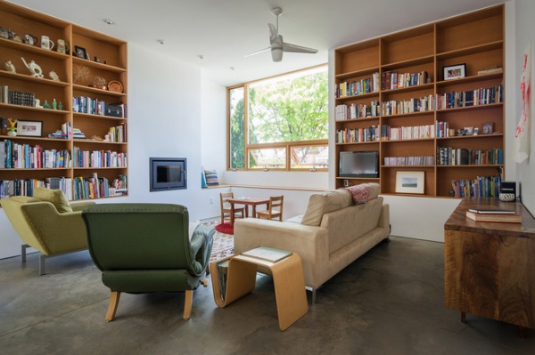
“Restraint, simplicity, precision and thoughtful consideration are the underlying philosophy,” says Seth, regarding the home design’s influences. “Architectural inspiration comes from each project site and its associated conditions, parameters and potential.” For this home he wanted an open floor plan that would encourage interaction among the family.
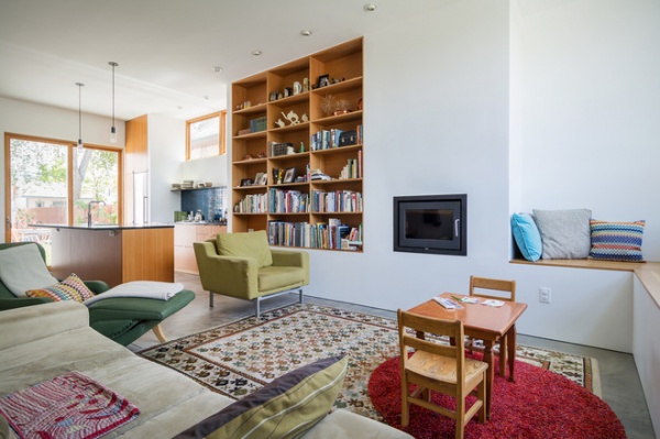
“We love to read and nap, and therefore move around the house, based on the lighting conditions,” says Seth. “There is not really a favorite spot, as it is all linked.”
The built-in shelves and corner bench top here are made of vertical grain fir.
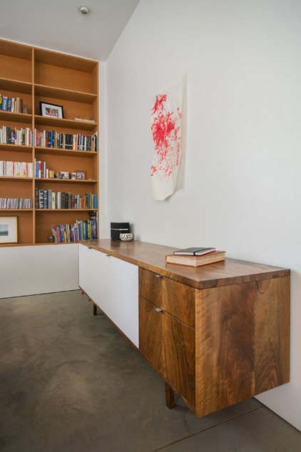
The family’s favorite piece of furniture is the custom-fabricated walnut and MicroDot laminate credenza by Modern Union.
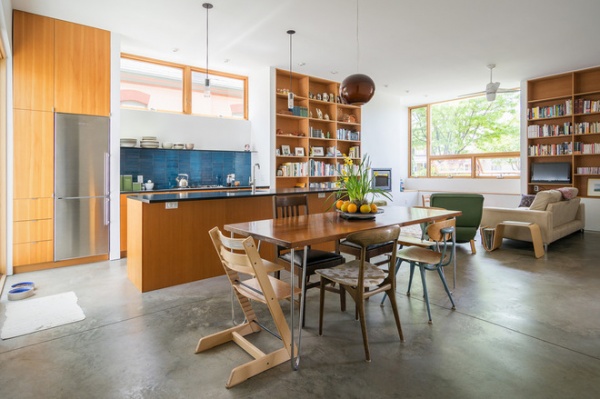
“The biggest challenge was how to create a house that is simple, economical, efficient, open, with privacy, where all the rooms connect to the outside, within an urban environment on a one-tenth-acre lot,” says Seth.
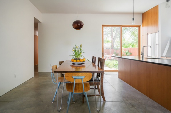
Seth describes their place as “a simple house of three volumes, all connected to the outdoors by way of a courtyard.” In the kitchen the south-facing courtyard is accessed through a pair of sliding doors. The homeowners keep the furnishings and decor to a minimum to match their modern style.
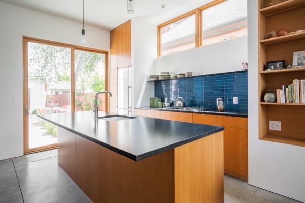
Seth designed the kitchen windows to be higher on the south side to create some privacy from neighbors. The bent steel plate shelf from Magnuson Metals gives the collection of Heath Ceramics dinnerware a place to rest. Henry Lems at Wasatch Tile did the countertops.
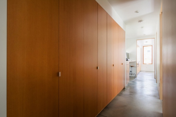
The hallway connecting the rooms was constructed with floor-to-ceiling cabinets to store personal items and keep clutter to a minimum. Jaren Harbertson and Creede Fitch of Modern Union built all the cabinetry.
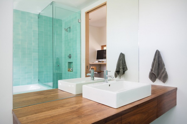
The bathroom features a floating walnut vanity topped with a Duravit vessel sink.
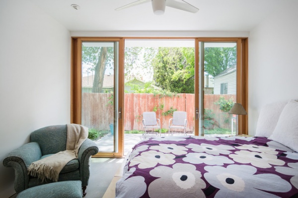
Each space opens to the outdoors and receives a lot of natural light, including the master bedroom. “We also love that for an open house, we have spaces that allow privacy due to the courtyard and window placement,” says Seth. The Striefels moved into the house within two weeks of having their daughter, Ryan. “Her personality, how she grows up and who she becomes are all somehow tied up in the creation of and living in of this place we call our home,” he says.
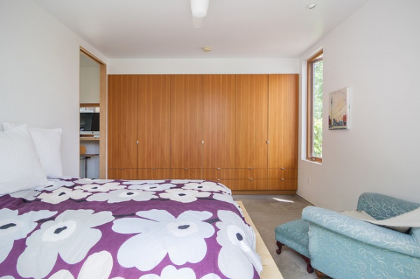
Rachel sewed the Marimekko-fabric duvet cover. The cabinets throughout the house are made of vertical grain fir.
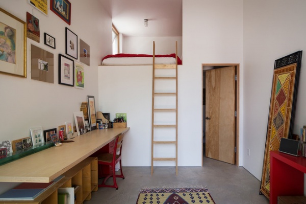
Seth designed a separate 250-square-foot studio behind the house to give the family a place to work on creative projects and to provide a sleeping space for guests. Rachel, a dual-immersion French teacher, spends a lot of time in here working on sewing projects.
A wood ladder custom built by Brad Brinton of Plastik Banana provides access to the lofted sleeping space.
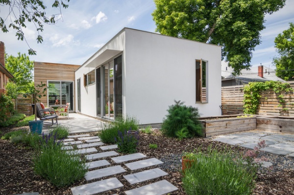
All rooms open up to the courtyard shown here. It was important to the family that all “interior spaces have a direct physical and visual connection to the outdoors,” Seth says. Concrete pavers make for modern, low-maintenance landscaping.
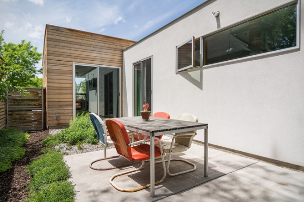
The family enjoys dining al fresco in the courtyard during warmer months.
Also on the team:
General contractors: Mark Haslam, Sausage Space; Garth Hare, Benchmark Modern
Windows: Mark Welch, Contractors Window Supply
My Houzz is a series in which we visit and photograph creative, personality-filled homes and the people who inhabit them. Share your home with us and see more projects.
Browse more homes by style:
Small Homes | Colorful Homes | Eclectic Homes | Modern Homes | Contemporary Homes | Midcentury Homes | Ranch Homes | Traditional Homes | Barn Homes | Townhouses | Apartments | Lofts | Vacation Homes
More: My Houzz: Color This Utah Home Terrific


