Houzz Tour: Modern Personality in an Old Atlanta Neighborhood
http://decor-ideas.org 06/10/2014 01:26 Decor Ideas
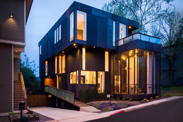
This modern house in Atlanta jump-started two life-changing events for two pairs of people. First, it was where Calvin Florian and Kelly Hart started their family. The two had lived in an industrial loft as well as a rented house in Atlanta’s Old Fourth Ward when they spied a vacant lot while walking their dog one day. The discovery launched a discussion with their friends Brian Bell and David Yocum, two architects who were interested in branching out on their own. “The house was the basis for us starting our own firm, BLDGS,” Bell says.
Here’s a look at how this award-winning project suits the neighborhood, Florian and Hart’s growing family, and their personal style.
Houzz at a Glance
Who lives here: Calvin Florian, a producer at the Cartoon Network; his wife, Kelly Hart, an investigator for the Federal Defender Program in Atlanta; and their son, Nashville
Location: Old Fourth Ward in Atlanta
Size: 2,300 square feet (214 square meters) plus a walk-out basement; 3 bedrooms, 3½ bathrooms
The property is nestled between two historic areas, the Martin Luther King District and Inman Park. The community includes the remnants of an industrial past, a mix of residential units from apartments to lofts to single-family homes, and a big parkway that cuts right through it all. It possesses an interesting character and is currently transforming into a major mixed-use residential area and entertainment destination.
Because Florian and Hart’s lot was not in a historic district, they had some design freedom. That’s not to say the site was without its challenges. For instance, the plan had to include parking space for one car that could not be in the front yard, which shifted the location of the house and the grading.
Florian loved 1950s and ’60s California modern architecture, in which there’s a visual link between indoor and outdoor spaces (think Charles and Ray Eames’ house). Bell and Yocum worked up study models, and the resulting house is a series of stacked blocks, where the outdoor spaces are just as important as the indoor spaces.
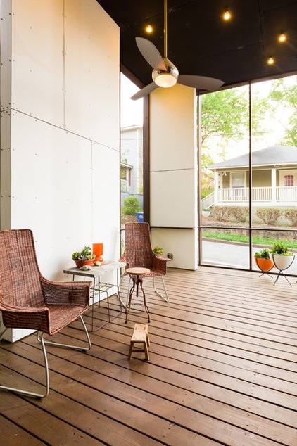
While the house is modern, certain elements mimic those seen in older homes in the neighborhood, like the front porch. “The paradox was creating the necessary fortification and security without creating a bunker,” Bell says.
The house reinterprets some of those traditional elements; glimpse across the street, for instance, and you can see the kind of front porch found around the Old Fourth Ward. Florian and Hart’s home has a screened-in porch that creates a relationship between the street and the sidewalk, and allows the family to interact with passersby.
The house was designed with entertaining in mind as well — there’s a ledge that runs along the walls that is sized for parking drinks on it.
Bullet planters: Hip Haven
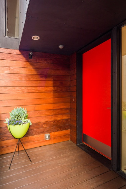
The front door faces the side yard, but the ipe wood at the end of the front walk faces the street. Originally the front door was black, but the couple found that it disappeared into the facade, so they went for a fiesta red that makes it more visitor friendly. A midcentury modern bullet planter foreshadows what’s inside.
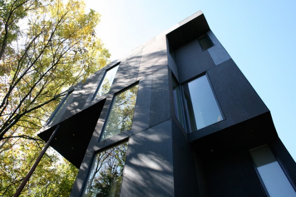
The facade is composed of fiber cement panels and windows that create a unique rhythm. Each window has been carefully placed to punctuate the barrier between indoors and out, creating composed views. There are also long views through the house from one end to the other.
If you look closely, you can see the very precise screw pattern used to hang the panels. It lines up across the house and unifies the facade.
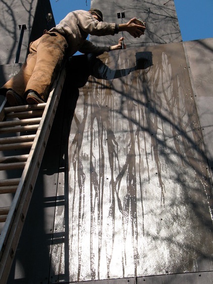
The ubiquitous fiber cement panels were given a unique patina, hand-painted by the late artist John Otte (seen working on the project here). “John was very into the Bauhaus idea of a pattern receding as you walked away from it,” Bell describes. Otte used a combination of paints and methods, including latex house paint, spray paint and drizzling techniques.
Otte even buried bits of graffiti and other surprises underneath in pencil. The experimental idea is that as the siding ages, these details may be revealed and the house will “unpaint itself.” He used metallics like bronze, copper, gold and silver, as well as browns, blacks and grays to add variation. (Here you can see the drips in the fresh paint.)
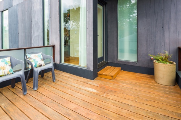
On the master bedroom’s balcony, we get a good up-close look at how Otte’s textures turned out.
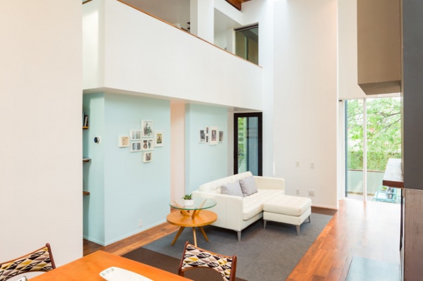
Inside, the volumes emphasize the horizontal and the vertical. A mezzanine for the couple’s offices creates compressed spaces underneath on the first floor. The foyer and staircase are housed below the mezzanine; you enter into a low-ceilinged space, and then the house opens up dramatically.
White paint: Glidden Satin 6211
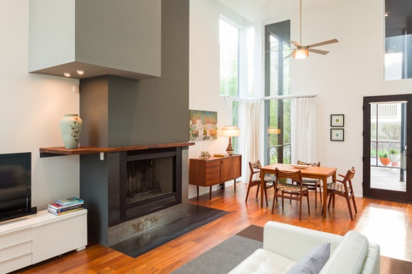
The main floor has an open plan and soaring ceilings in the living-dining area. The variegated patterns in the rich walnut contrast with the crisp white walls and clean lines.
Hart’s midcentury modern furniture adds warmth and character. “Kelly loves midcentury modern furniture and Danish furniture, and she has a great eye,” Florian says. “She loves to scout at stores like City Issue and eBay, and once we even had to take a six-hour detour to pick up a desk from Tampa!”
The fireplace is massed to stand up to the large scale of the room, with its vertical and horizontal elements at play. Note the clever soffit and lighting on the left, which, together with the mantel, throw off the symmetry in an interesting way.
Painting to the right of the fireplace: “Post-Urban Multi-Fleur,” by Scott Silvey; two smaller works: Mark Murphy
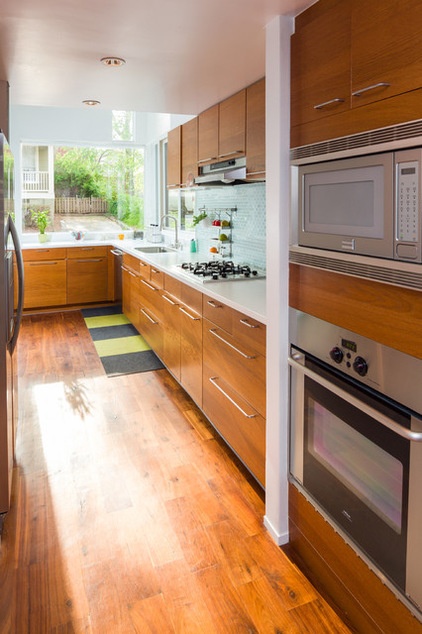
While parts of the kitchen ceiling are low, the large picture window at the end opens up the space. The owners kept everything clean and simple in here, using Ikea cabinets, Arctic White Corian countertops and a glass tile backsplash that reflects the light.
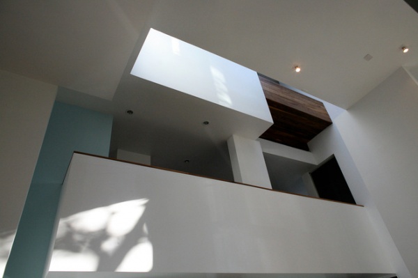
There is a difference of 16 feet between the main floor and the bedroom floor, with the mezzanine sandwiched between the two. “There is a horizontal feeling as you go up,” Bell says.
A large skylight sends a shaft of natural light from the roof down through to the first floor. “This creates an energy-efficient chimney effect for the airflow,” Bell says. The skylight provides a strong connection between indoors and out from the top of the house to the bottom.
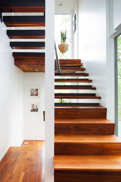
“You can feel like you’re outside unexpectedly, from the middle of the house,” Bell says. An example is the staircase, which opens up at eye level, revealing outdoor views.
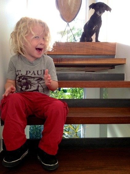
Florian assures us that their toddler, Nash, cannot fit through the openings of the stair, but that it’s a fantastic place to play with a Slinky.
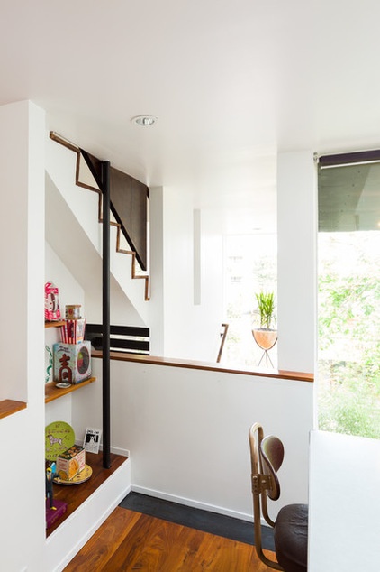
Florian also reports that the mezzanine is an ideal spot to drop a parachuting toy.
Halfway between the main level and the bedroom level, the mezzanine houses office space for the couple.
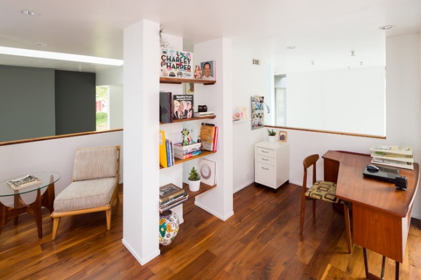
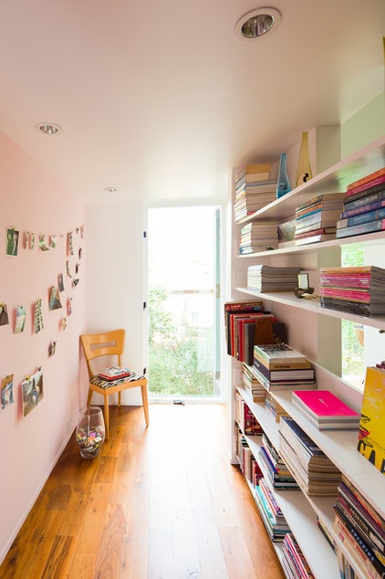
Built-in shelves offer peeks through to the rest of the mezzanine and out through the windows.
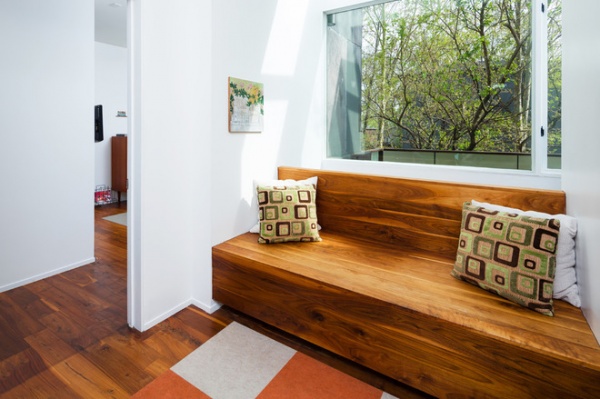
Up on the bedroom level, a built-in walnut bench adds more warm wood.
Painting: “Wild Geranium,” by Scott Silvey
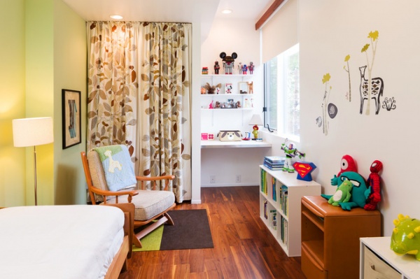
Nash’s room is bright and full of playful touches, like botanical curtains, a green accent wall and decals.
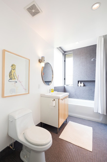
While his wife loves to collect furniture, Florian loves to collect art. The monkey print is called “Animal Rights” and is by artist Mike Mills.
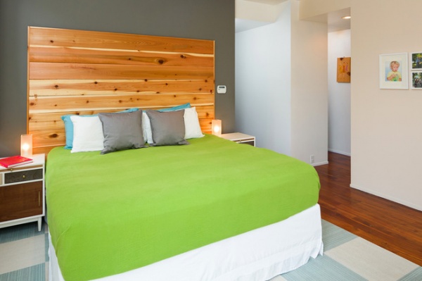
In the master bedroom, the couple had the headboard custom built in cedar; it has the kind of irregular pattern and knots they like so much.
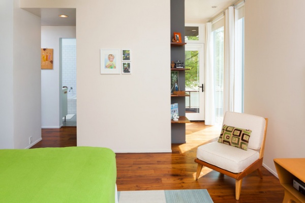
A vintage Heywood-Wakefield chair provides an extra seat. Built-in shelves bring in the walnut used throughout the home; the room is subtly color blocked with white and gray. The entrance to a balcony is visible beyond the shelves.
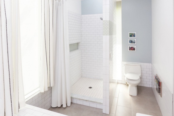
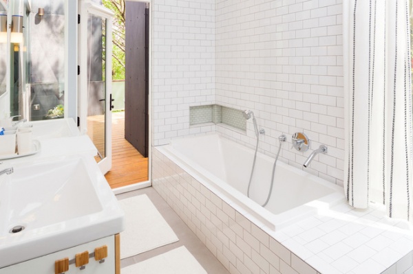
The master bathroom has its own private access to the balcony through a frosted glass door.
“I’m a shower guy, and she’s a bath girl,” Florian says. Thus, they separated the stall from the bathtub. White subway tile keeps things clean and simple.
Bathtub: Philippe Starck for Kohler
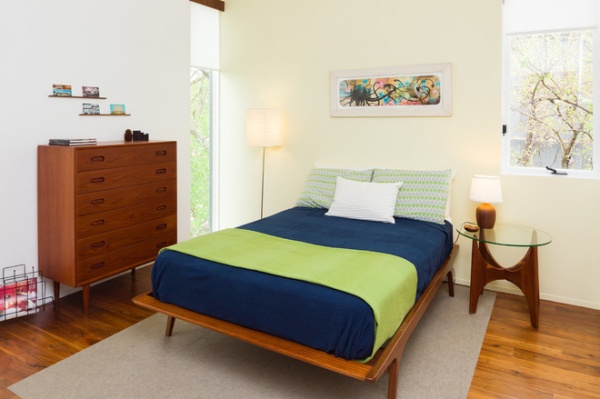
The guest room is a great example of how dynamic the window openings are. Rolling on one’s side and seeing the trees through the floor-to-ceiling glass is quite an experience.
Artwork: “The Duel,” by Jeff Soto
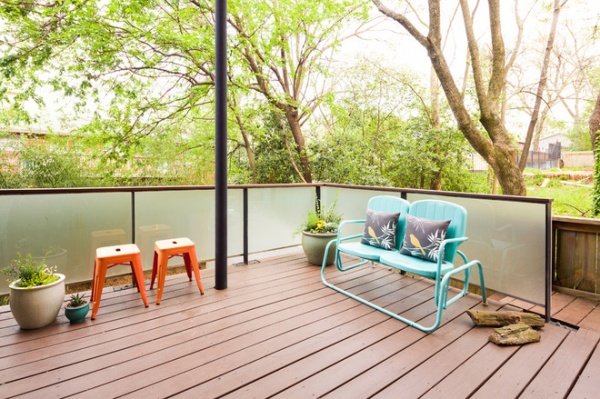
A deck with sandblasted glass railings extends the main level into the backyard. Because of the way the site is graded, there is a walk-out basement with more living space on the floor below, so this deck sits about a story off the ground.
Florian and Hart love their home, and they also loved the design process and all the interesting things that happened during building. They look forward to doing it again someday.
More: My Houzz: Bold and Modern in Toronto
Related Articles Recommended


