My Houzz: Rustic Meets Refined in a Converted Ohio Barn
http://decor-ideas.org 06/09/2014 01:14 Decor Ideas
It is said that good things come to those who wait. That certainly was the case for architectural designer and builder Tim Franklin. After he had been eyeing a nearby farm for many years, it finally came on the market. “I always wanted to design a nontypical barn,” he says. “I jumped on it when it became available.”
Aware of the inherent design challenges, Franklin set out to create a home that paid homage to the building’s original purpose yet stood firmly in the 21st century. From deeply considering ways to recycle parts of the existing structure to employing cutting-edge environmental materials and utilities, he created a perfect union of past, present and future.
Houzz at a Glance
Who lives here: Tim Franklin, his children (ages 10 and 14) and their 4 cats, 2 dogs and 1 turtle
Location: Akron, Ohio
Size: 6,600 square feet (613 square meters); 3 bedrooms, 3 bathrooms
Year built: 1810
That’s interesting: At 204 years old, this barn is the oldest of its kind in the area. It had never undergone any renovation until Franklin’s conversion.
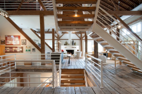
Franklin preserved as much of the barn’s original layout as possible, which saved on construction costs and also helped maintain the integrity of the 204-year-old structure. Rather than completely reconfigure the interior spaces, he worked within them and chose materials like this steel railing to highlight and define each area.
“Creating a dramatic set of stairs without cumbersome framing” is what Franklin considered the greatest challenge during the design process. He came up with a plan of opposing staircases that created dynamic space — and didn’t obscure it — to connect the three stories.
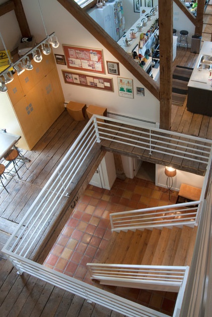
Although massive in its footprint, the stair retains the open-air feeling of the home without compromising strength. Devoid of supporting posts and framework, the staircases seem to float. “The combination of steel stringers and rails, along with the hardwood steps, created enough strength for each set of stairs to literally be anchored by only four bolts,” Franklin says.
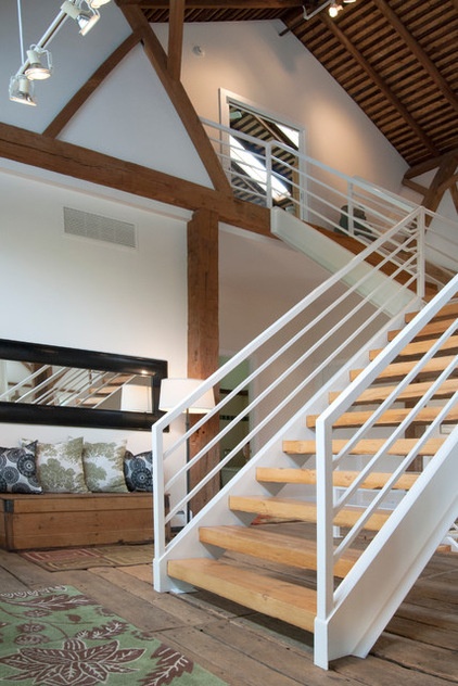
In keeping with the concept of recycling the barn’s original materials, Franklin cut and refinished old beams for the new stairs. Oak, hickory and black walnut treads are coupled with white steel stringers and railings.
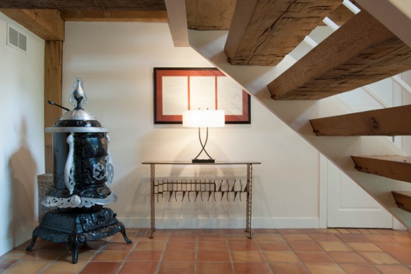
Much of the ground floor houses utility areas for the home, and the main entrance acts as a reminder of the barn that once was. Franklin discovered the potbelly stove buried in pieces around the property. The parts were covered in mud, but Franklin refurbished each piece and reassembled the stove for a handsome reminder of the home’s history. The triptych above the console table displays original drawings and schematics of the farmland.
Sun-dried terra-cotta tiles imported from Mexico give the space a warm, handmade quality and set the stage for the other materials throughout the home.
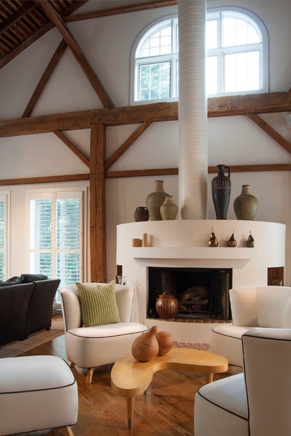
A highlight of the main floor is the cylindrical fireplace in the formal living area. Franklin chose it as an alternative to conventional box-style fireplaces. Its shape, coupled with its grand scale, complement the proportions of the barn, making a statement while naturally integrating with the surroundings.
Franklin designed most of the home’s primary furniture pieces, including these white barrel chairs with black piping.
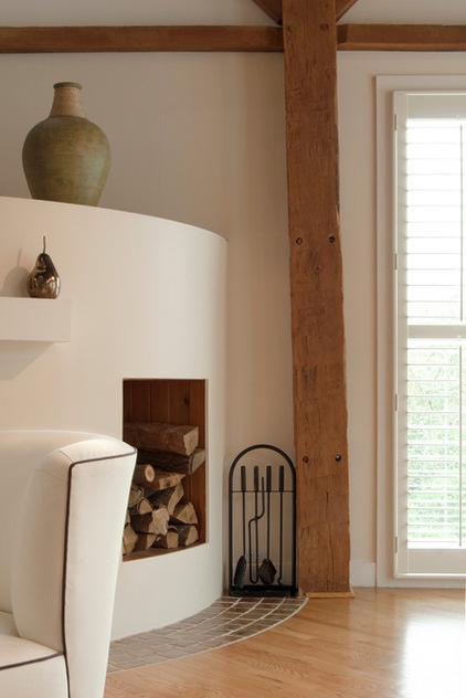
Fresh white walls and clean geometry highlight the barn’s original features. For maximum efficiency, Franklin lined the exterior walls with structural insulated panels (SIPs). Utilizing this system over standard stick-building processes saved time, and SIPs insulate more efficiently than traditional construction.
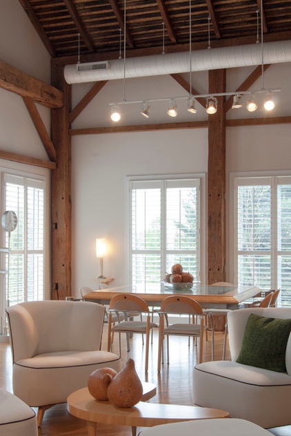
An intimate dining area is endowed with vast proportions, thanks to the soaring vaulted ceiling and 8-foot-tall windows.
The key to transforming the barn into a home, Franklin says, was to scale the windows and doors to the massive existing volume. The majority of the windows are 4 by 8 feet, and the main-level doorways are 8 feet tall.
Franklin designed and fabricated the dining room table out of glass and solid light maple. Its modern design and materials complement the barn’s rough-hewn framework.
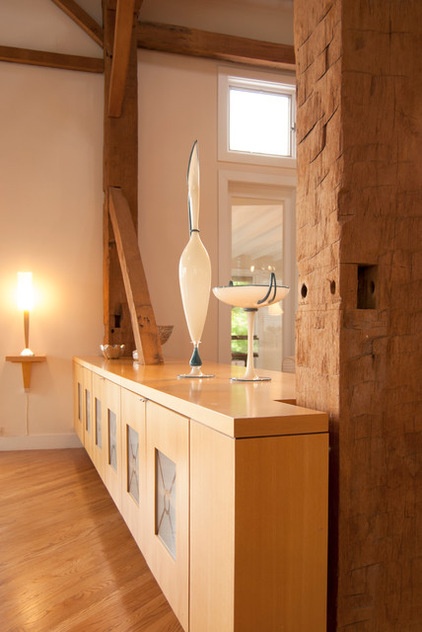
A pear wood storage unit takes advantage of barn posts for support. Minimalist in design, it appears to float effortlessly above the floor and provides ample room for storing extra plates and displaying artwork.
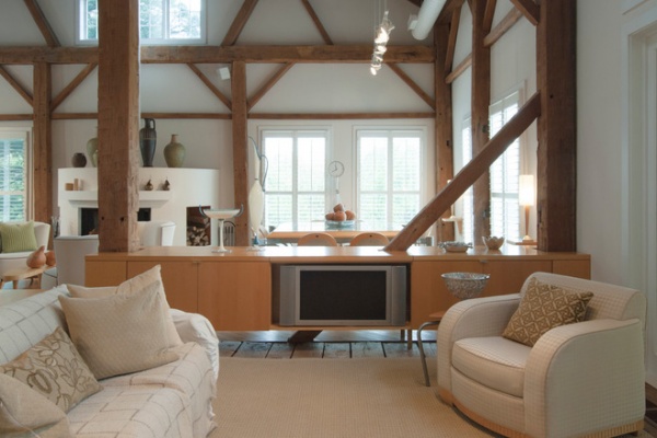
Franklin used the flip side of the dining room storage unit to house his home entertainment system. The cabinet serves many purposes without interrupting the flow of the main floor.
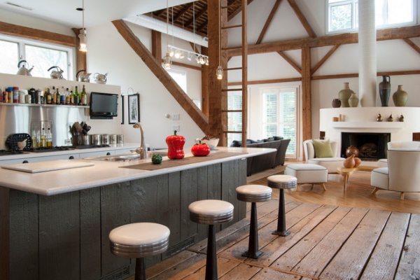
Tucked neatly into an existing bay of the post and beam barn, the open kitchen is the comfortable hub of the home. Rather than create a solid division between the kitchen and the children’s TV area, Franklin just filled in the gap between the floor and the diagonal beam.
The ladder is cleverly integrated into the support post and is one of the original features of the barn. Workers used to climb up to the loft and toss hay down a chute to the feeding area below. Franklin’s children, ages 10 and 14, also enjoy this aspect of their home. “The kids and their friends run, slide, climb up the ladder and have a ton of fun,” he says. “It’s a barn! It’s a place to share with friends and family.”
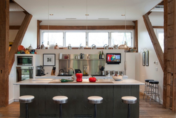
The kitchen strikes a comfortable balance between new and old materials. Franklin clad the island with original barn siding, which he painted gray. The Corian countertop and stainless steel backsplash provide a cool contrast.
The set of antique bar stools was a fortunate find. Sourced from a local bar that had closed, all the stools needed was elbow grease to realize their full potential. It took days to remove years worth of nicotine stains from them, but as Franklin says, “It was worth it, because the old stools found a new home in an old barn.”
The half wall at the rear of the kitchen was designed to address a number of functional and aesthetic concerns. Dividing the workspace from the storage space, it keeps the pantry area out of view and allows light to penetrate this area. Franklin also uses the wall to display his growing teapot collection.
“It’s funny,” he muses, “but I think they can entice people to sit down, have a cup of tea and converse. Imagine that in this world of technology!”
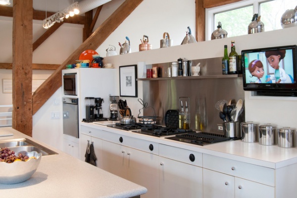
By choosing modular cooktop units over a full range, Franklin kept the open galley kitchen streamlined in appearance and gain storage space to boot. The commercial-grade components sport strong downdraft units beneath the burners to eliminate cooking odors, which are a major consideration when designing an open-concept space.
One of the highlights of the work area is the gleaming stainless steel backsplash that Franklin designed. “I simply had a large piece of stainless steel bent into shape and attached with industrial-grade adhesive,” he says. “Big look, inexpensive price.” The integrated shelf keeps necessities close at hand for easy access during cooking.
Cooktop units: commercial, GE Monogram
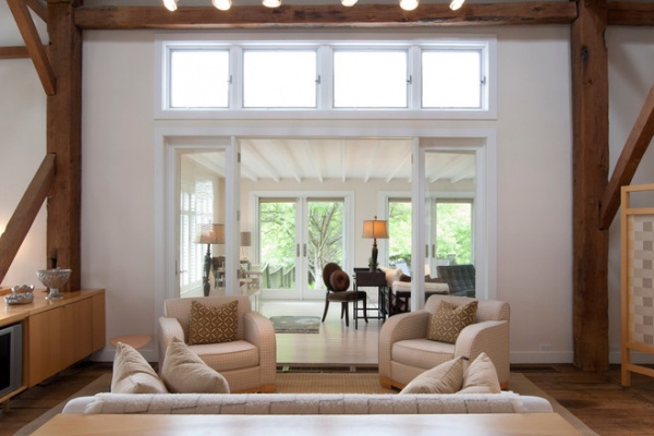
The gathering area was formerly the barn’s main entrance and is the primary connection between the kitchen and the four-season porch. Large-scale glass doors and transom windows mark the transition with a nod to the barn’s history, while offering a virtually unobstructed view to the room beyond.
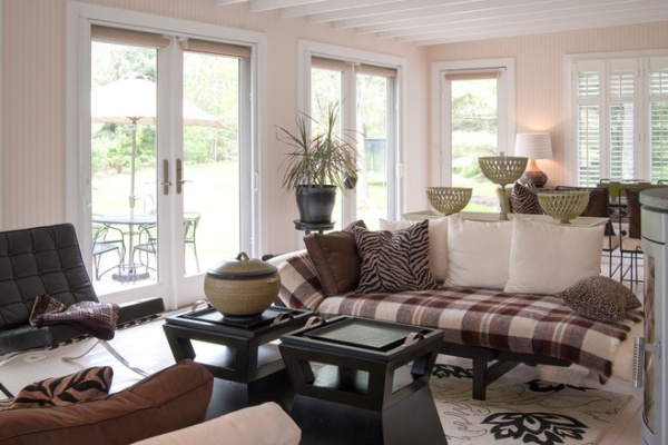
Franklin added the four-season sunroom on to the back of the barn, making it the only part of the home that is new construction. “The design was intended to have a completely different atmosphere yet still work in harmony with the original structure,” he says.
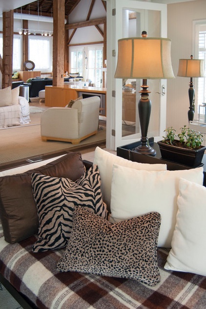
A neutral color palette continues into the sunroom. Franklin chose more graphic patterns for the textiles, such as plaid and animal prints, to complement the dark wood furnishings.
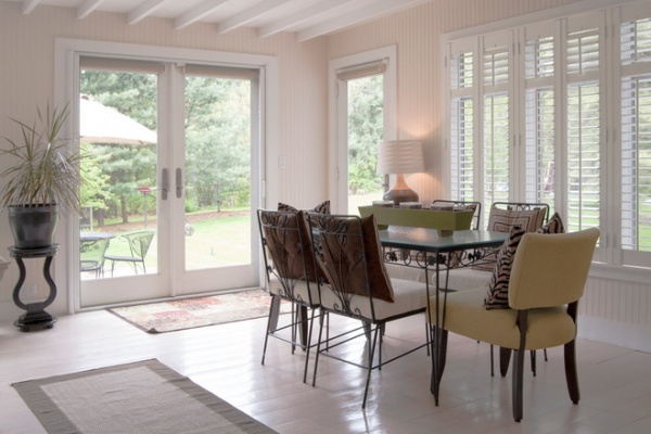
White floors and beadboard-clad walls give the space a beachy cottage feel, while exposed rafters refer back to the rest of the home.
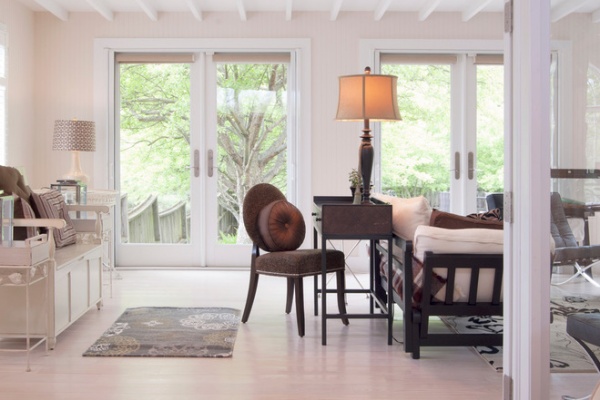
White walls and flooring expand the space, while espresso-stained pieces punctuate the arrangement with a welcome contrast.
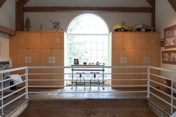
Franklin runs his firm, Franklin & Associates, from this office on the main level. Being in plain view of the stairwell calls for a quick means of concealing the trappings of his workday, so Franklin designed built-in cabinets with bifold doors, which keep client projects and supplies out of sight.
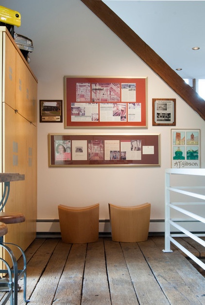
A pair of simple wooden stools anchors his display of design publications.
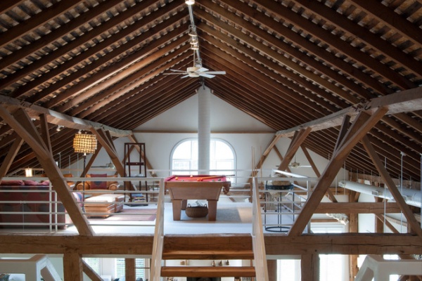
The entertainment loft appears to hover over the living space below. Franklin took advantage of the existing hay track in the ceiling to conceal wiring needed to run the fan and lights. To preserve the quality of the ceiling, he topped the original slats with 6-inch SIPs.
When his children were younger, Franklin recognized the need to childproof the space. “I installed Plexiglas on all the railings so the kids couldn’t climb over them when they were very small,” he says. “While some of the sheeting was removed over time, the Plexiglas on the railings by the pool table will always stay since we are so bad at pool! Too many balls flying off the table could injure someone in the gathering room below.”
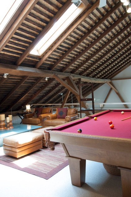
The entertainment loft is the homeowner’s favorite spot in the house. “It’s sunny and cozy,” Franklin says. “I like looking over the railing down to the lower level.” He adds that the 12-foot drop is “not for those who are scared of heights.”
The homeowner designed the custom-made pool table.
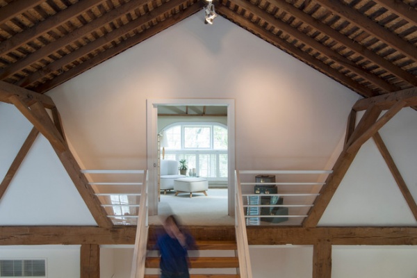
Across from the entertainment loft, the master bedroom is an isolated sanctuary of its own. It’s perched high above the main floor, so you get the feeling of entering a treetop clubhouse on the way up the stairs.
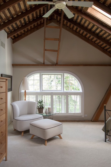
The master bedroom features vaulted ceilings and a wide arched window. The original slats in the ceiling contrast the white elements, while a skylight lends an open feeling. The ladder was also a piece of the original barn. It is an interesting sculptural element, as it mirrors the staircases in the house.
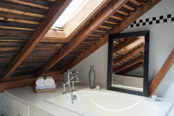
The bathtub is tucked into the eaves for a cozy feel. The white tile walls and tub accentuate the richness of the original wooden rafters and keep the space from feeling dark or crowded. Franklin placed an oversize mirror on the tub’s deck to double the amount of light in the space from the skylight.
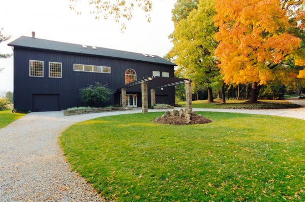
Franklin chose a deep charcoal gray for the exterior of the barn. A standing-seam metal roof adds to the simplicity of the design while respecting the structure’s utilitarian roots.
Part of the owner’s overall design objective called for recycling and reusing as much of the barn’s original materials as possible. He executed this outside by creating planters out of barn stone left over from the renovation.
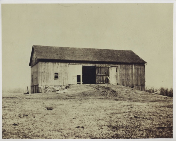
This photograph shows the rear elevation of the barn in the 1930s.
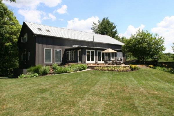
AFTER: The home’s rear elevation today, with the added sunroom and patio. While it’s groomed and put together, the landscaping was designed to be what Franklin calls “managed wilderness” — maintained but not controlled. This was achieved by creating beds of perennials that are informal by nature and left to grow together as they will.
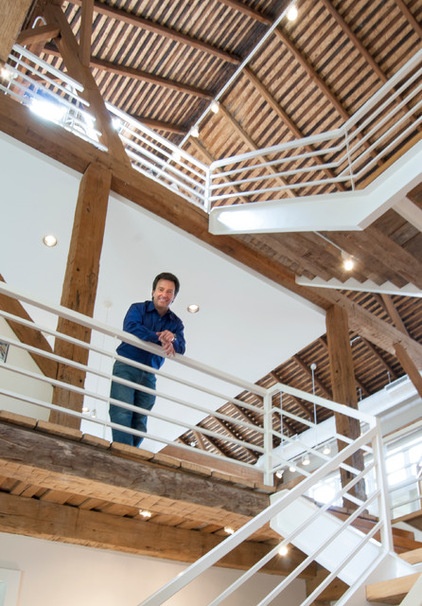
“Everything we did to this barn was challenging, because the structure is out of plumb,” says Franklin, seen here. “My many moments of frustration were erased after the first night I slept there and woke up to a great new space.”
And what does he plan to do with his barn next? “Share it with others,” he says.
My Houzz is a series in which we visit and photograph creative, personality-filled homes and the people who inhabit them. Share your home with us and see more projects.
Browse more homes by style:
Small Homes | Colorful Homes | Eclectic Homes | Modern Homes | Contemporary Homes | Midcentury Homes | Ranch Homes | Traditional Homes | Barn Homes | Townhouses | Apartments | Lofts | Vacation Homes
More: See a Party Barn Shaped Like a Game Piece on the California Coast
Related Articles Recommended


