Houzz Tour: Dancing to the 1970s in an Updated Vancouver Home
http://decor-ideas.org 06/08/2014 20:16 Decor Ideas
Hey, the 1970s weren’t all bad. That’s the spirited approach this father and his three kids took with a 40-year-old house on the outskirts of Vancouver. Though nothing inside the house had changed since disco music topped the charts, everything had been superbly maintained. All it needed was a little refresher.
Interior designer Sarah Gallop stepped in to update the home’s function by opening the compartmentalized rooms, but she maintained the hustle-dance vibe by preserving the original fireplace and wood paneling in the living room. “We wanted to keep the home in that era, because the client is a little funky,” Gallop says.
Houzz at a Glance
Location: Delta area of Vancouver
Who lives here: A father in the media business and his 3 kids, ages 10 to 13
General contractor: Best Builders
Size: 2,120 square feet (197 square meters); 4 bedrooms, 2 bathrooms
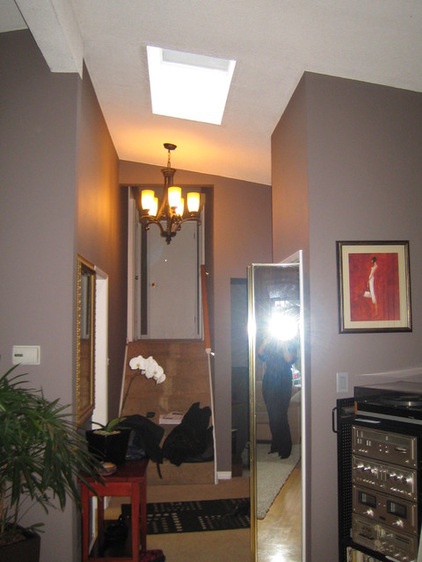
The front door originally led down these stairs and into the kitchen, which was closed off with three walls and a flat, dropped ceiling. “I walked in and immediately thought, ‘This is not the right spot for this room,’” Gallop says.
“After” photography by Ema Peter
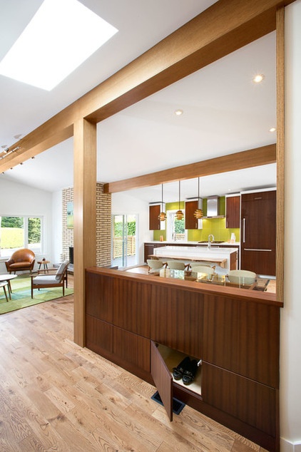
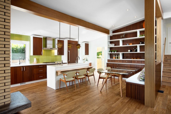
AFTER: Gallop relocated the kitchen to a back wall where the former dining room used to be, to create an open layout that connects the living room and new dining space (in the former kitchen).
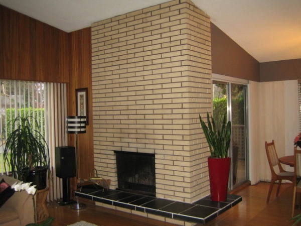
Wood paneling and a brick fireplace anchored the home in the disco era.
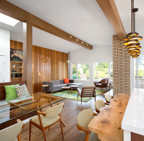
AFTER: Gallop and the homeowner kept these elements but refinished them. They then worked together to source furnishings that made sense for the style.
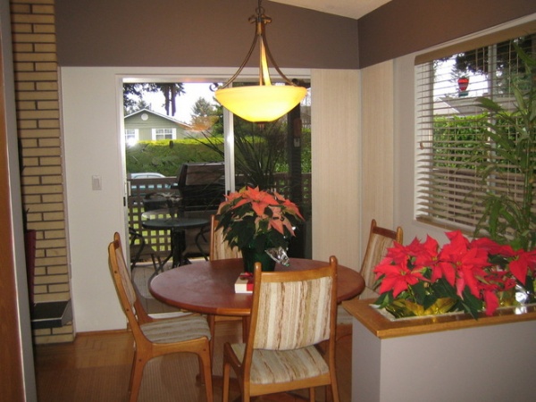
The small dining spot lacked a connection to the other spaces. Gallop used this area to expand the new kitchen.
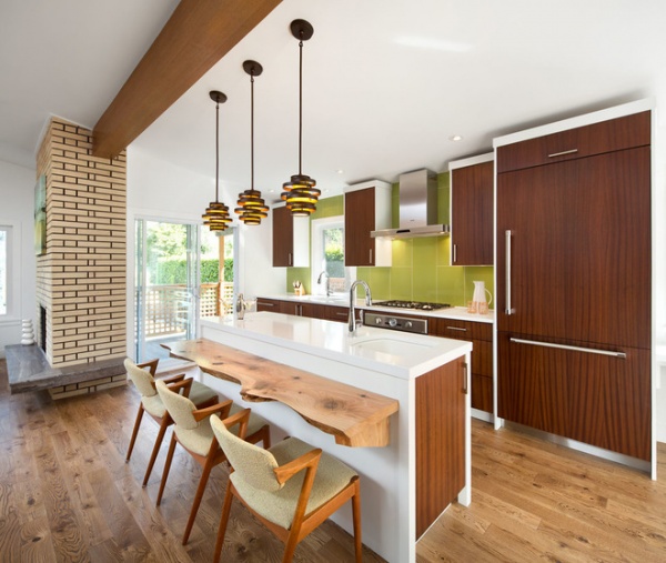
AFTER: New custom dark wood cabinets and a lime green backsplash nod to the home’s roots, while an expansive new entertainment deck and turf field in the backyard bring the party into the 21st century.
Pendant lights: Vertigo, Corbett Lighting; appliances: Thermador; wall paint: Snow White OC66, Benjamin Moore
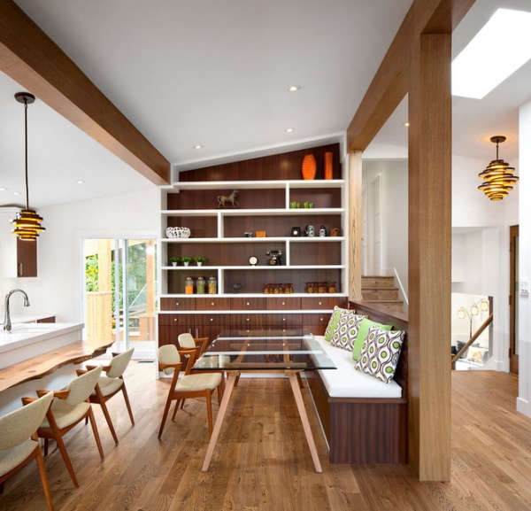
A live-edge bar top sits at a lowered height so the dining area chairs can be pulled back and forth between the two areas for more flexibility.
Lots of wood mixes with pops of lime green and retro furniture to create the throwback aesthetic. “We wanted it to feel natural, comfortable and inviting with that midcentury vibe,” the designer says. “The materials and things we used are what we would expect with that era of house.”
To add contrast to all the wood, she incorporated white framework on the storage and display pieces.
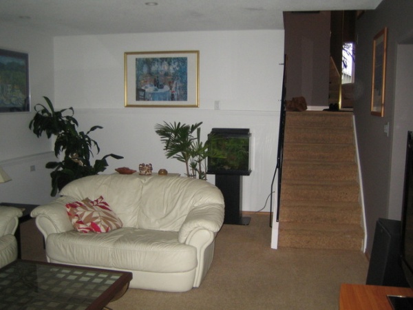
A darkened den area was redundant space for the new homeowner.
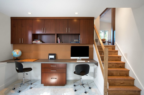
AFTER: Gallop and the homeowner turned the room into a home office and homework area for the kids.
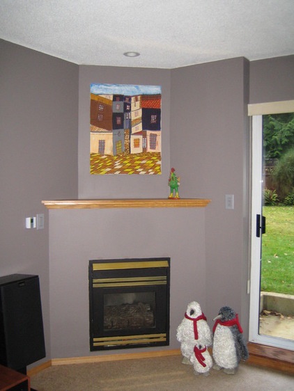
The original recreation room had a corner fireplace that made furniture placement awkward.
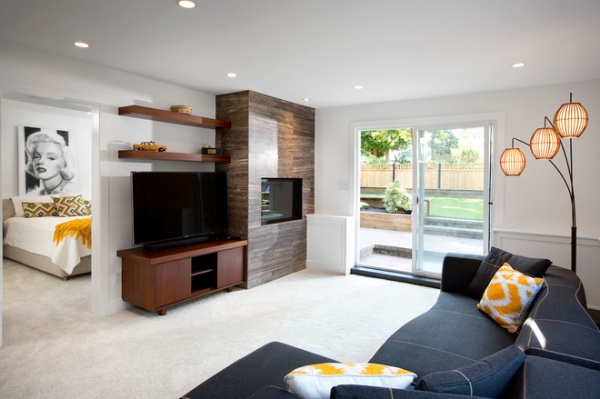
AFTER: Gallop made the fireplace flush with the wall and updated the surround. The new rec room is more “loungey rather than basement-y,” she says, and establishes a better connection to the backyard and the master suite.
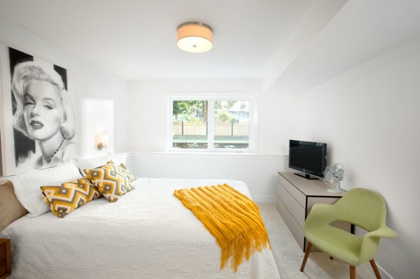
Gallop allocated space from the former ground-floor den, guest room and bathroom to create the bright and airy new master suite.
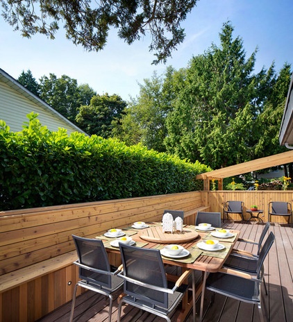
Multiple small levels made up the original deck. “They were just too small for any sort of function,” Gallop says. She created an expansive, multipurpose wraparound deck that goes from the front of the house, around the side to this dining area …
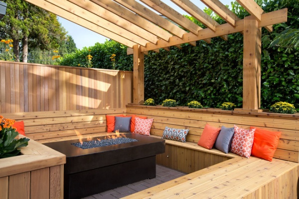
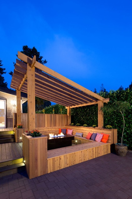
… and then cascades to a sunken fire pit.
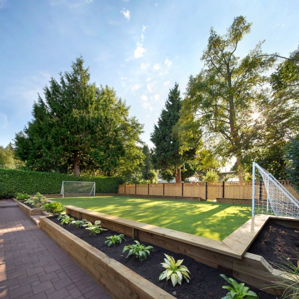
All this leads to a turf field where the kids can play soccer and volleyball. Or maybe one day have a killer disco dance-off.
Browse more homes by style:
Small Homes | Colorful Homes | Eclectic Homes | Modern Homes | Contemporary Homes | Midcentury Homes | Ranch Homes | Traditional Homes | Barn Homes | Townhouses | Apartments | Lofts | Vacation Homes
Related Articles Recommended


