Houzz Tour: Warming Up in Fort Lauderdale
http://decor-ideas.org 06/07/2014 20:06 Decor Ideas
When we think of Florida modern, a lot of our notions come from Miami Vice (or CSI: Miami, for those of you who didn’t grow up with Crockett and Tubbs). We envision cold, wide-open spaces, stark white and clear glass. But for their home in Fort Lauderdale, this family wanted to give their Mediterranean house a more modern style without sacrificing warmth. The interior design team at DKOR brought it in through wood-wrapped accents, luxe surfaces and a palette of grays, creams and beiges; and by resizing the larger rooms to a more comfortable, human scale.
Houzz at a Glance
Who lives here: A family of 5
Location: Fort Lauderdale, Florida
Size: 6 bedrooms, 6 bathrooms
Photography by Alexia Fodere
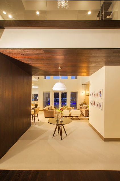
The team framed and delineated spaces with rich wood, thickening the trimwork and other accents to balance the scale of the rooms. The wood makes a big impression in the entry, creating a compressed space and an intimate welcome.
Wood: oak, Pianeta Lengo
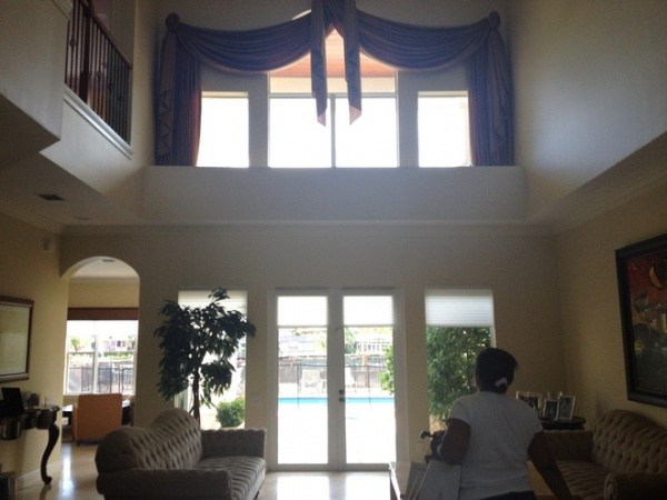
The original home, 15 years old, seemed like it was trying to look palatial with weak nods to Mediterranean style. “So many prospective clients come to us with these outdated builder homes with a Mediterranean feel and want a more contemporary look,” says principal Ivonne Ronderos. They eliminated the arched windows and doorways and the cylindrical columns throughout the house, opting for clean new lines.
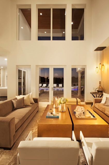
AFTER: The compressed hallway amps up the drama as you enter the living room, which opens up to two-story-high ceilings and expansive water views.
The design team balanced elegant spaces for entertaining with more intimate and family-friendly rooms. The living room is geared toward the former but is laid out to encourage conversation. Much of the furniture was customized to fit the space. Two long gold-leafed coffee tables stand up to the scale of the space and add shine. White leather chairs and accent pillows bring in some contrast. The floors are a light cream porcelain that resembles wood. A luxe custom area rug from Tufenkian defines the seating area with its elegant warmth underfoot.
Sofas: Donghia; accessories on coffee tables: Michael Dawkins and Nest; accent pillows: Threadcount
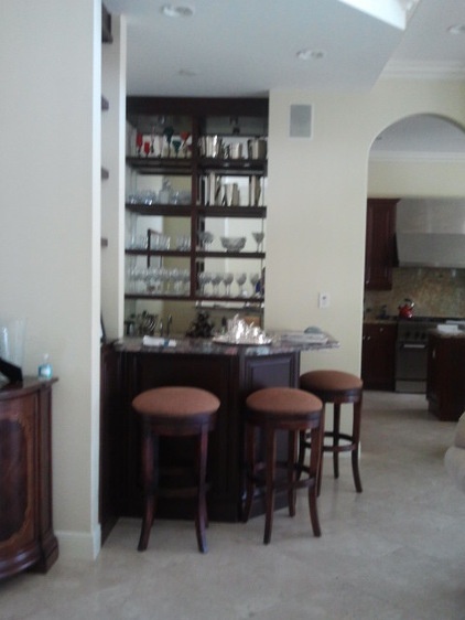
The homeowners had lived in the house for a few years before beginning renovations; these “before” snapshots were taken by the DKOR team for reference during their first design consultation.
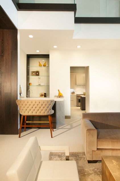
AFTER: The homeowners kept the original wet bar in the living room for convenience when entertaining. “Since it shares the space with the formal living room, we wanted it to feel more like a built-in and not a typical bar,” Ronderos says. Note the thick wood framing around the shelves.
How to Create a Built-In Home Bar
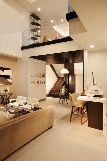
Looking back through to the entryway, one spies the stately contemporary staircase. Its steps are sleek yet chunky, much like the thick trim pieces and wood wrapping.
Artwork: Michael Dawkins
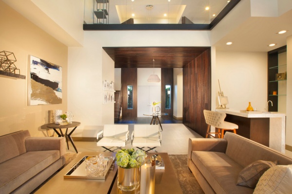
Looking back toward the front door, you can see how the wood defines the entry. The additional trimwork along the floor of the loft level helps to delineate the living room within the open plan.
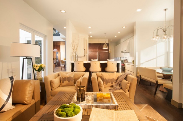
On the other side of the living room’s built-in bar is the kitchen, which opens to this cozy family room.
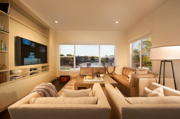
The family room is contemporary in style, but has an inviting, overstuffed feel. “All the furniture is big and loungey so they can curl up and play games or watch television,” Ronderos says.
The television and its components are housed in a custom taupe and white unit recessed into the wall. The team also expanded the windows to open the views.
Sectional: Lee Jofa/Kravet; throw pillows: Threadcount; accessories: Michael Dawkins, News and Niba Home
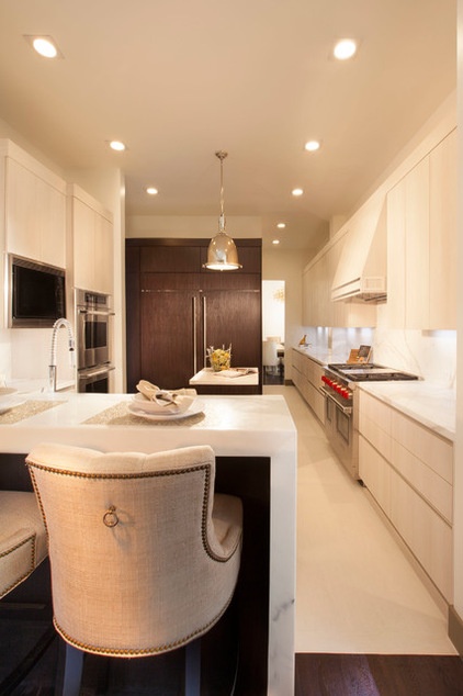
A waterfall countertop in the kitchen also follows the lead of the exaggerated trimwork; it is 2 inches thick. Wenge accents provide a pleasing contrast to all of the marble and light porcelain tile. The large pendant light adds an industrial touch and glint that plays off the appliances.
The team added custom touches to counter stools from Ballard Designs, such as the tufted fabric, nailhead design and ring pulls. “These moves match the level of elegance in the kitchen and keep them in line with the color scheme in the family room,” Ronderos says.
Benson Pendant: Restoration Hardware; floor tile: Cavastone; cabinets: custom
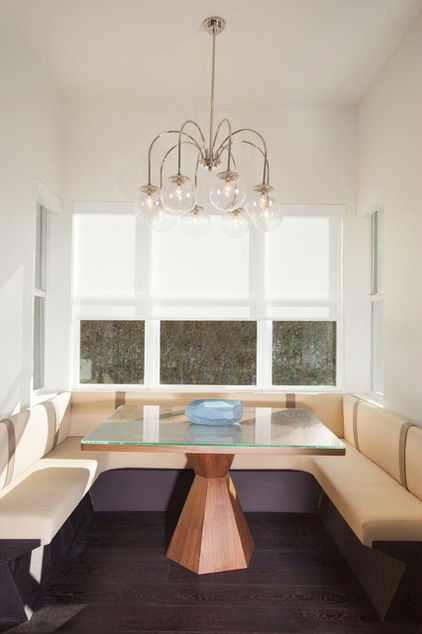
The dining nook, part of the original house, “is a very important part of the home, because it also serves as a homework area, breakfast area and an informal dining area for the family,” Ronderos says. DKOR designed the banquette and table, which has a walnut base.
Table: Rotsen Furniture; blue bowl: Nest
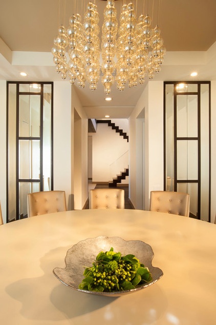
The formal dining room seats 12. A custom round table fits the scale of the room and lets the conversation flow. The custom chairs are tufted in a vinyl that has a luxurious look but stands up to stains; the backs are upholstered in a softer, creamy fabric.
The beveled mirror doors are trimmed out in the same wood used throughout the house. They conceal storage for crystal and other tabletop items.
Custom table and chairs: New Design Furniture; doors: custom, DnG Carpentry
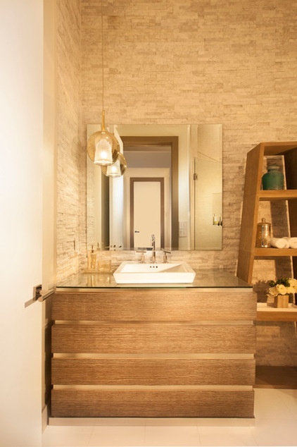
In the powder room, gray mosaic stone on the walls and a vanity and shelving made of whitewashed wood give the room an organic feel. A square sink, polished nickel finishes and metal recesses in the vanity create a balance of rough and clean lines.
Vanity, shelves: custom; sink: Ronbow; white porcelain floors: Cavastone
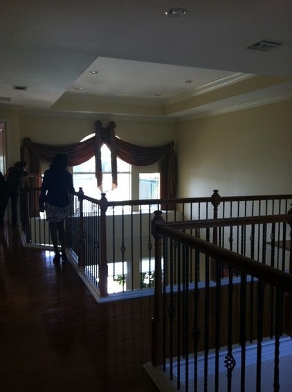
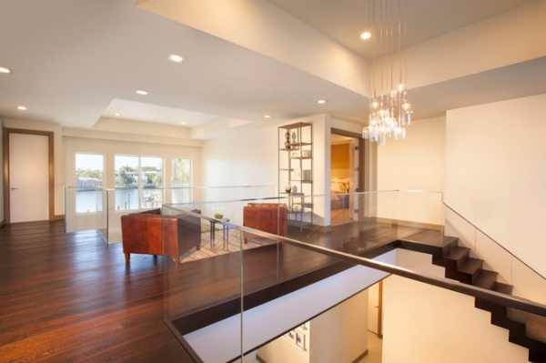
AFTER: The area atop the compressed entryway left enough space for a private seating area in a loft that enjoys some of the best views out to the water.
“The staircase involved a lot of logistics and coordination to get this look completed — notice how the glass is inset in the wood floor,” Ronderos says.
Pendant: Bover; round table: Michael Dawkins
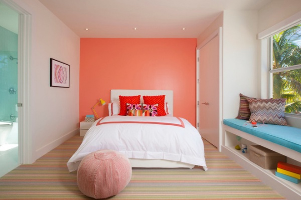
In the daughter’s room, the team pulled colors from the striped rug for the accent wall and window seat.
Rug: Stark; bedding: Threadcount
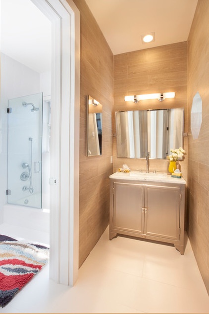
The warmth continues into the boys’ bathroom. Each of the two sons has his own vanity area.
Vanity: Restoration Hardware; tile: porcelain plank, Porcelanosa
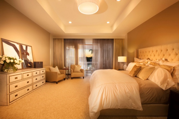
“Our clients wanted the mood of the master bedroom to be very calming with no stark white, so we kept it moody by using neutral tones and textiles,” Ronderos says. Beyond the nailhead-detailed dresser, the team reupholstered and refinished two of the homeowners’ existing armchairs to create a seating area. Luxe bedding, sheers and an upholstered headboard add softness. A tray lessens the scale of the expansive ceiling.
Art piece: Michael Dawkins; pillows on side chairs: Threadcount; box accessory: Lignet Roset; table lamps: Nest; side table: Paxton, Arteriors
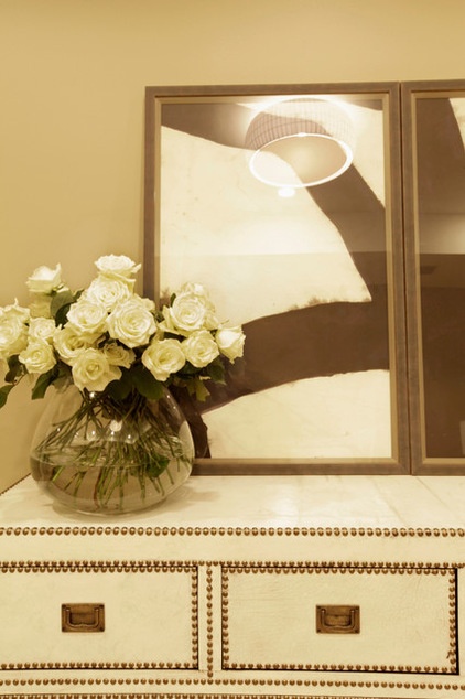
The dresser has more of the fabulous nailhead trim detailing seen throughout the house.
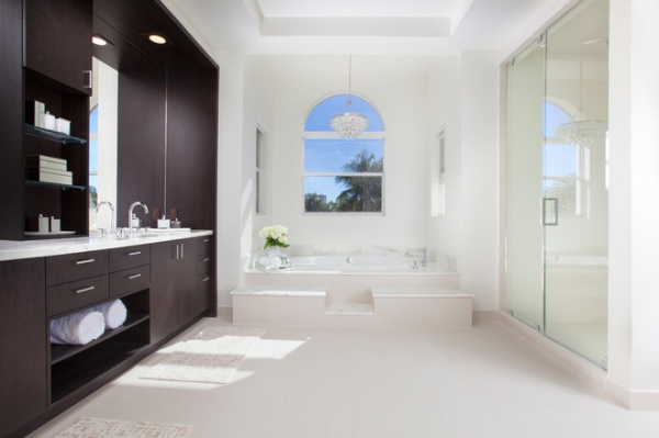
Sharp contrast marks the bathroom, which has Calacatta marble and dark wood veneer carpentry that wraps around the vanity.
Chandelier: Bling, Y Lighting
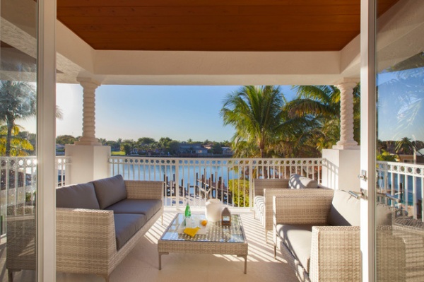
The balcony off the master bedroom is another space with some of the best views in the house.
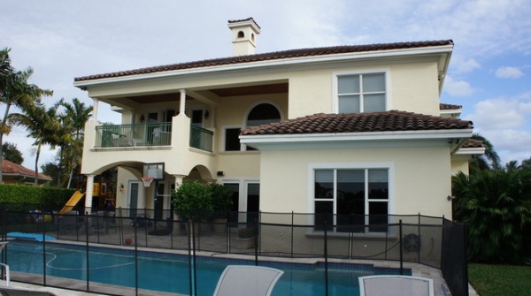
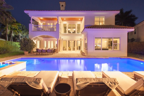
AFTER: Here you can see how changes to the windows gives the back facade a more modern and unified look.
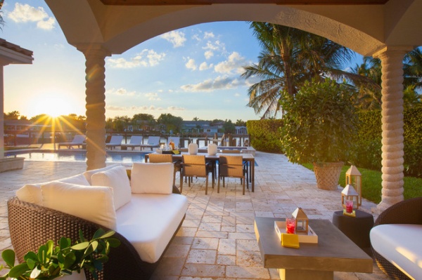
Outside the team continued the palette of gray, taupe and tan and set up several outdoor rooms, including this covered lounge. Beyond it is an al fresco dining space.
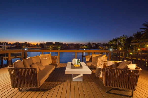
Closer to the dock lies another seating area. For cool nights the concrete coffee table converts into a fire pit.
Furniture: Kettal, Addison House
Team: Ana Maria Hirsch, Margaret Smith, Lindsay Biondo, Samantha Molinero, Chelsea Mayo, Ivonne Ronderos and others from DKOR Interiors
Related Articles Recommended


