Kitchen of the Week: Casual Elegance and Better Flow
The owners of this stately 1930s colonial in Chevy Chase, Maryland, set out to upgrade their kitchen to better reflect the architectural details of their home. As professionals and the parents of two young children, they also wanted a workhorse kitchen that could stand up to the rigors of daily meals and frequent dinner parties. A better connection with their nearby family room and a designated breakfast area for casual meals were also at the top of their list.
They removed two walls of the existing kitchen and borrowed about 12 feet from an adjacent in-law suite to create enough room for a large center island and good circulation. They also pushed out a sink wall a few feet to make the kitchen flush with the family room. A new half wall/architectural screen now defines the kitchen and breakfast area while making a strong connection between the kitchen and family room. See how it looked then and now below.
Kitchen at a Glance
Location: Chevy Chase, Maryland
Architect and general contractor: Gilday Renovations
Size: 200 square feet (18½ square meters)
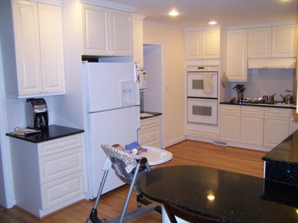
Previously remodeled in the 1990s, the old L-shaped kitchen had no island and only a small peninsula that didn’t offer the workspace or storage the homeowners desired. By removing the wall where the range was and pushing into the in-law unit, they gained the space they needed for the upgraded kitchen.
“The challenge of this project was how to give intimacy for the kitchen while retaining the open feel we wanted for the kitchen, breakfast space and family room,” says project architect Dan Morales of Gilday Renovations.
Photography by Morgan Howarth
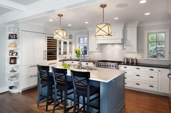
AFTER: This is basically the same angle as the previous photo, only now you can see how the kitchen got pushed back to the wall that was originally in the in-law unit. By doing this, the team was able to add new operable casement windows on each side of the cooking zone that offer views of the side yard outside. “They provide light, make it a friendlier space and anchor the range,” notes Morales.
The new layout allowed room for an impressive custom center island with a large stainless steel Julien sink, two stainless KitchenAid dishwashers and a polished statuario white marble top from 3Cm. The couple painted the base of the island a blue-gray color (Web Gray by Sherwin-Williams) that provides contrast for the kitchen’s white cabinetry and the perimeter stone counters in Kodiak Brown with an antique finish from 3Cm.
Wall paint: 1478 Horizon, Benjamin Moore; paint for ceiling inside coffers in breakfast area and family room: 1480 Sleigh Bells, Benjamin Moore; pendants: One-Light Downlight, Grosvenor
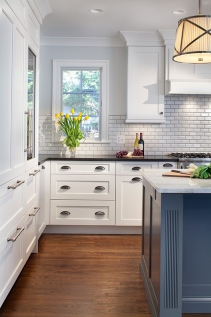
A roomy 48 inches separates the island from the surrounding counters and appliances. “We did this so two people can work comfortably in there at the same time,” explains Morales. The crackle tile backsplash with a custom gray grout along the range wall keeps with the classic look and feel of the home.
Custom cabinets, hood: Greenfield Cabinetry; cabinet knobs, pulls: Top Knobs
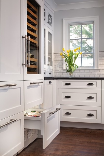
Since the couple loves to entertain, they included a Sub-Zero wine refrigerator along with their large Sub-Zero refrigerator with panel fronts. “We went back and forth about doing stainless or paneling the refrigerator, and I’m glad we went with the panel fronts, because the kids get their fingerprints on it all the time,” says the wife. Below the main refrigerator sit two refrigerator drawers for milk and juice cartons for the kids and two easy-access freezer drawers.
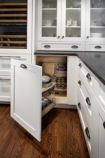
Corners are always an issue in kitchens. Because the homeowners wanted to take advantage of every inch of space, they included a corner lazy Susan for storage of various bowls. A pullout cabinet for additional baking supplies is located in another corner of the kitchen. The range wall has extra-deep and extra-wide drawers for storage of pots and pans.
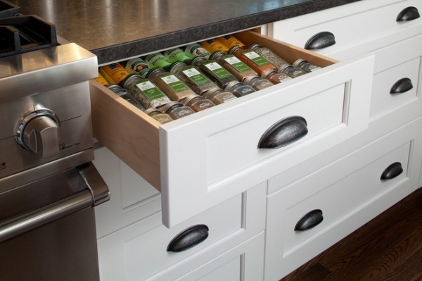
An integrated spice drawer to the right of the Viking range was a handy addition. The kitchen also includes long and lean pullouts for tray storage.
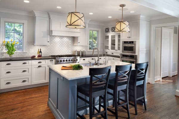
The homeowners wanted attractive but sturdy appliances that would be suited for both daily meals and large parties. In addition to the Viking range, the kitchen now includes a microwave oven and wall oven from KitchenAid.
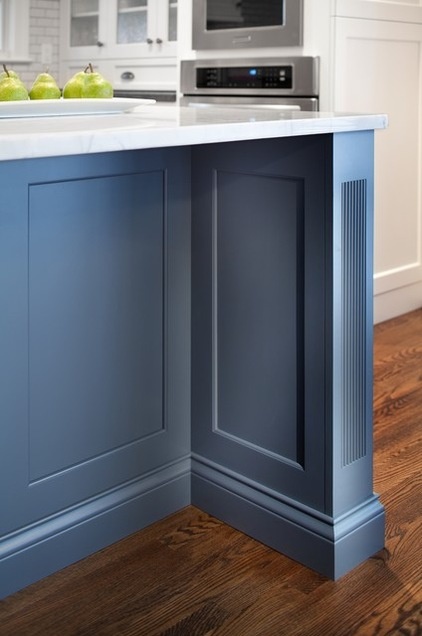
Pulling together the classic architectural details and elements of the home, the base of the island has legs on each side that mimic nearby columns used to separate the breakfast area from the family room.
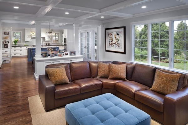
Coffered ceilings in the family room and adjacent breakfast area add architectural interest and help visually connect the spaces. A custom cabinet in the architectural screen/half wall was designed for media storage. “I think overall we gave them a beautiful, spacious and calm space,” says Morales.
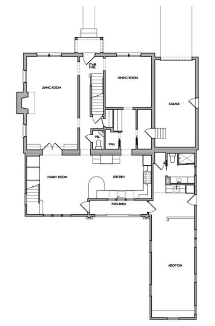
This floor plan shows the limitations of the previous kitchen layout.
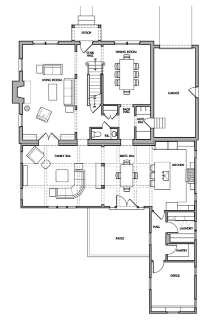
AFTER: The new floor plan shows how the more open layout and other changes created better traffic flow for the kitchen and the surrounding rooms.
See more Kitchens of the Week


