My Houzz: Creative Solutions Transform a Tricky Basement Studio
http://decor-ideas.org 06/06/2014 19:16 Decor Ideas
Rotting, uneven floorboards, serious structural issues and a dark, cramped space are normally features that send potential homeowners running. For Maryline Lambelin, president of the Montreal home decor company ADzif, it presented an exciting challenge. Lambelin didn’t let her lack of renovation experience keep her from creating the perfect studio apartment beneath her duplex — or helping to build it.
Houzz at a Glance
Who lives here: Maryline Lambelin and her Labrador and Bouvier-Bernese mix, Canaille
Size: The studio apartment below the duplex is 500 square feet (46 square meters).
Location: Latin Quarter area of Montreal
Year built: 1887
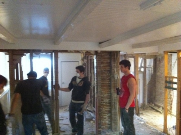
Lambelin knew she had to start from scratch to get the studio the way she wanted it. “I exposed the studio completely. It took three shipping containers to empty it.” Ripping the space apart revealed some puzzling secrets, like the fact that the floorboards throughout the house were made of five different thicknesses of wood.
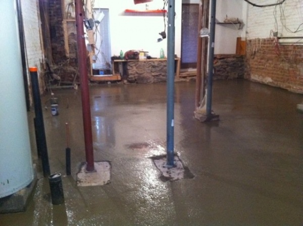
“I had the opportunity to redo all the plumbing and all electricity,” Lambelin says. “While I was drawing plans, I realized that the original bedroom was larger than the living room. My challenge was to open the space for it to look bigger and give more space to the main living room.”
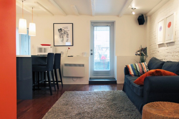
AFTER: Lambelin loved seeing her designs become a reality. “At each step, when you progressively see your personal touches appear, it is a joy to see that everything you imagined works,” she says. “I am always surprised.”
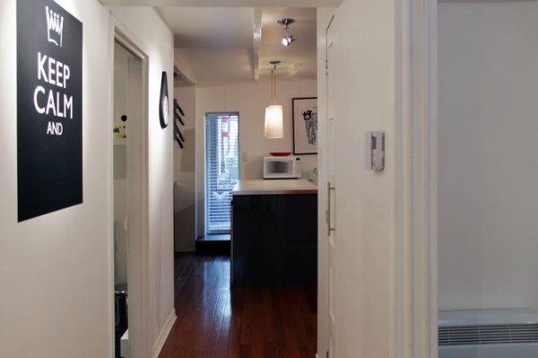
When Lambelin bought the house, “the floor was rotten and moving,” she says. “It smelled like the basement.” The wooden floorboards had been installed directly over the soil, so they had started to rot. The new hardwood flooring instantly freshened up the space.
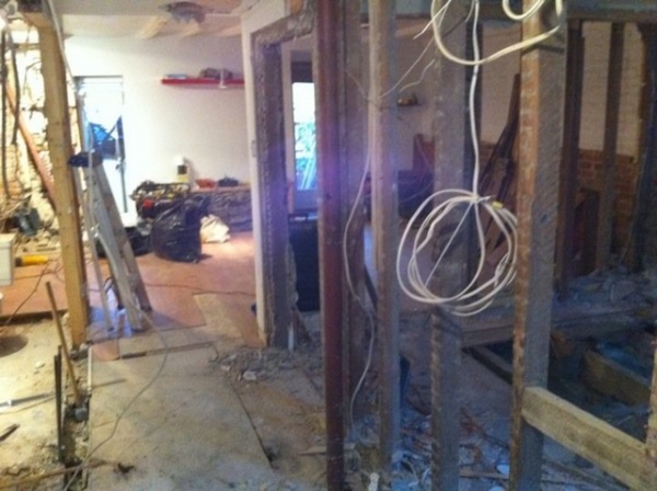
One of the many renovation surprises came when Lambelin tried to remove a structural column, only to find that it had become load-bearing when the former owner cut down the beam above. “I found myself with a column in the center of the passage to the lounge,” she says, “which spoiled the opening of the space I was looking to create.”
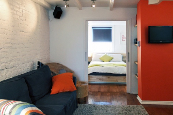
AFTER: Boxing the column allowed for much-needed storage. With floating shelves added, the former obstruction became the studio’s media center.
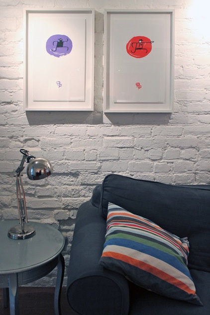
A lover of all things local, Lambelin purchased these two graphic prints from an artist collective in Quebec, Éditions Pow Pow.
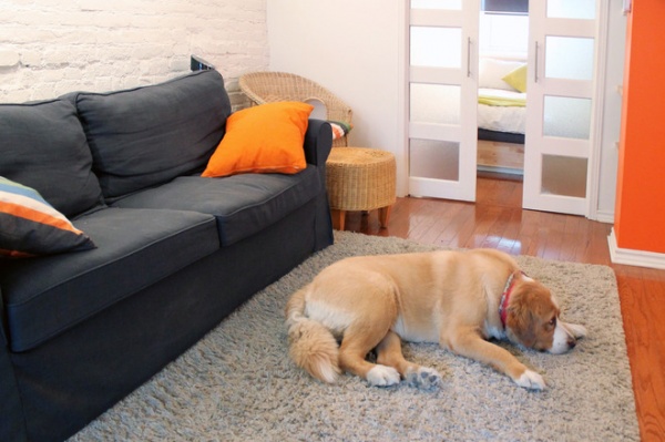
Lambelin installed multipaned pocket doors between the living room and kitchen to maximize space and the flow of light in the 500-square-foot studio. The doors contribute to the open feel and distribute light from the front window throughout the living room.
The homeowner likes the comfort of Ikea’s Ektorp sofa but wanted something a little different. She sourced an anthracite-colored linen sofa cover from online retailer Bemz. “The shipping cost me more than the cover,” she says, laughing, adding that she’s happy with how it has transformed her couch.
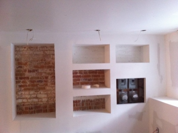
One of Lambelin’s major design challenges with this renovation was her bedroom. “I had an exposed brick wall, and I wanted to leave the natural brick exposed,” she says. “During the process of stripping the wall, Hydro Québec went to install a new meter system. They placed the system directly on my beautiful wall.”
Left with no other option, Lambelin had to be creative and work around the water meters, and this is how the cubbies were born.
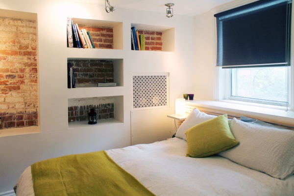
She designed a built-in wall storage unit that covers up the water meters while still preserving the exposed brick she loved so much. “I like how the niches tell the story of the studio. Without meaning to, I had created this great design,” she says.
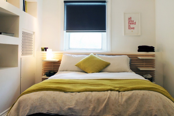
For her bedroom decor, Lambelin began with the bed. “I found the perfect Ikea bed, which included storage and shelving and fit my desired style,” she says. “I literally built around my bed.” This strategy helped her optimize traffic areas, ensuring that no space was wasted.
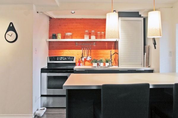
One of the more comedic moments during the studio renovation came when Lambelin painted a kitchen accent wall in her favorite color, orange. “The whole house was white at the time,” she says. “I asked my painter to paint the white brick orange. After every brushstroke, he came to ask me if it was OK!”
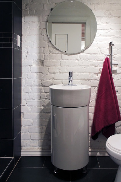
Working alone on the design, Lambelin was hands-on with the renovation as well, enlisting her friend Pierre Paré for the electrical work and demolition, along with a few handypeople. She helped lay the floors and paint the walls and brick.
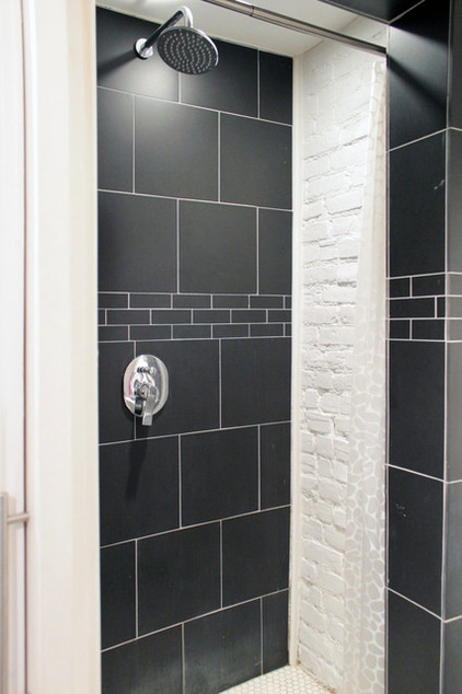
Lambelin’s aim to preserve the building’s original elements led to the decision to expose the whitewashed brick wall in the shower — a unique feature that she loves.
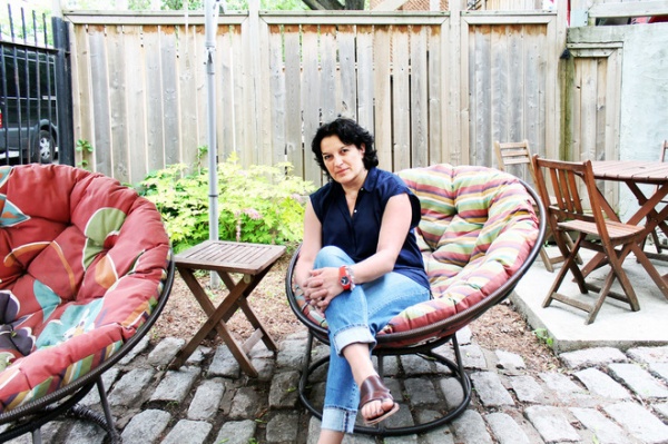
Lambelin, seen here, describes her home as her paradise, a sanctuary that she helped to create. Her advice for other homeowners? “Be imaginative, adaptable and daring. It can produce wonderful surprises.”
My Houzz is a series in which we visit and photograph creative, personality-filled homes and the people who inhabit them. Share your home with us and see more projects.
Browse more homes by style:
Small Homes | Colorful Homes | Eclectic Homes | Modern Homes | Contemporary Homes | Midcentury Homes | Ranch Homes | Traditional Homes | Barn Homes | Townhouses | Apartments | Lofts | Vacation Homes
More: My Houzz: An 1887 Duplex Finds the Sun
Related Articles Recommended


