Houzz Tour: A Portland Bungalow Gets a Major Lift
Designer Michelle Ruber lived near this two-bedroom, one-bathroom house for 20 years and never even noticed it. “It was neglected; the windows were broken, and it had no curb appeal,” she says. However, when she got the opportunity to buy it, she and her husband and business partner, Klaas de Jonge, couldn’t overlook the prime location in a vibrant walking neighborhood, and quickly scooped it up for vacation rental income.
The couple expanded the space by busting through to the attic and lifting up the house to create a ground-level unit. They added space-saving features and a few playful touches to give it a true local feel, incorporating as many reclaimed pieces, local artworks and products crafted by local vendors as they could. In the end they had two completed units with a total of seven bedrooms and three and a half bathrooms.
Houzz at a Glance
Who lives here: This is a vacation rental property.
Location: Alberta Arts District, Portland, Oregon
Size: Upstairs unit: 1,500 square feet (140 square meters); 4 bedrooms, 2 bathrooms; basement unit: 1,000 square feet (93 square meters); 3 bedrooms, 1½ bathrooms
Photography by Kurt Hettle, Heidi Lauman and Vivian Johnson
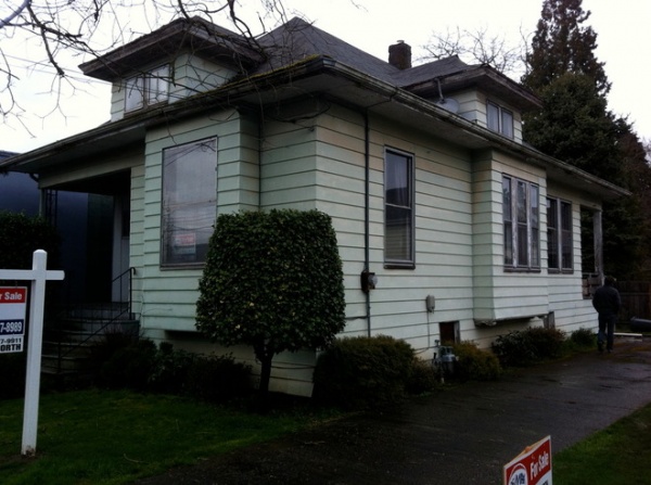
The house, located in Portland’s thriving Alberta Arts District, was the kind of place you walked by and didn’t notice. Ruber and de Jonge’s experience with their primary business, Encircle Design-Build, allowed them to see the home’s potential. After climbing a ladder and popping his head through the hatch to the attic, de Jonge realized they could utilize that space to create a master suite. They also made plans to create a separate unit in the unfinished basement.
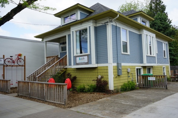
AFTER: Once they compared prices and potential designs, the couple decided to go up instead of digging down to create a light-filled ground-floor unit. They lifted the house about 2½ feet to get a full walk-out basement. “That process was interesting,” Ruber says. “For a few months, it was supported by railroad ties.”
Now the house stands proud, with a much stronger presence from the street. Out back the basement is completely walk-out, with its own patio, and enjoys lots of natural light.
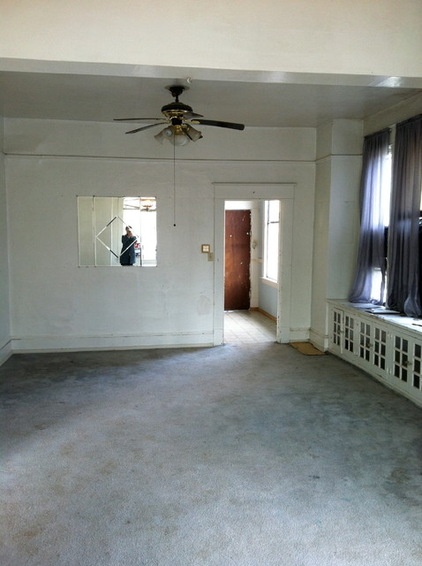
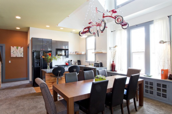
AFTER: “We wanted to give our renters a luxurious getaway feeling that would be a great part of their Portland experience,” Ruber says. The overall atmosphere in the kitchen/dining room is one of an urban loft. The couple removed a wall that used to be right around where the island stands today, as well as an awkward mudroom space, to open up the space and make it feel larger. They also went up, punching through the ceiling and taking it all the way up to the roofline, where they added skylights. The window seat cabinets are original to the bungalow.

A playful bike theme runs through the house and yard. “The bike thing has two meanings,” says Ruber. “First, our company is called Shift Rentals. Second, my husband and I met biking, and we bike everywhere; even all of our vacations are bike trips.”
A pair of tricycles hangs over the dining room table. “I think we had the idea for the trikes after some wine,” says Ruber with a laugh. “We knew we needed something to look at in the space, because the ceiling is 20 feet high here.”
They took the bikes to a metal shop that deals with large craning equipment to have cables attached to make the bikes hang level (that is, no “wheelies”). “At first the guys at the shop thought I was crazy, but by the end, they were really into it,” she says. Renters love to leave dolls or other objects atop the tricycles before they check out.
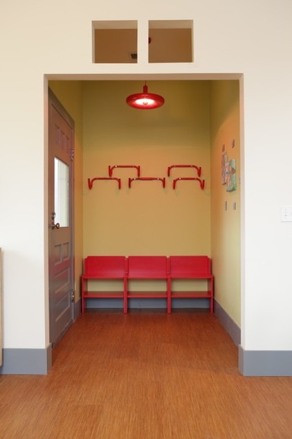
In the entry, bright red bicycle handlebars serve as coat hooks; the parts were purchased right down the street.
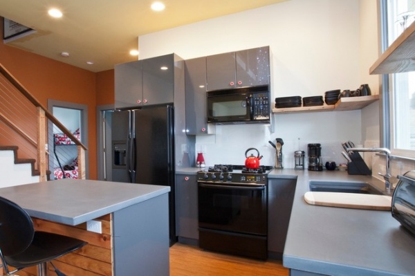
There’s an industrial vibe in the kitchen. It is very important to Ruber and de Jonge to reclaim and reuse as much as they can from construction waste on their projects; the fir on the island was replaned from the old pony wall in the basement. This wood turns up all over the house. The open wood shelves were reclaimed from another project at their design-build firm.
The sleek cabinets and colorful knobs are from Ikea. The countertops are poured concrete, made by Bend, Oregon’s Cement Elegance. “These have a baby’s-bottom-smooth finish and a leathery look,” Ruber says.
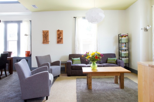
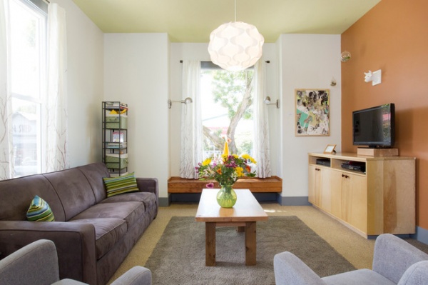
Just off the dining room is a comfy living room with an airy, earthy vibe. The light green ceiling helps define the room within the open first floor. The original window seat in the dining room inspired the window seat in here. Crafted from the reclaimed fir from the pony wall, it warms up the space and adds extra seating.
All of the art throughout the house is by local artists. The media cabinet was found in another one of the couple’s projects, and they made the custom coffee table from reclaimed wood.
Ceiling paint: Leaf.01; accent wall paint: Clay 3, both by Yolocolorhouse; window treatments: Bed, Bath & Beyond; sofa: Crate & Barrel; chairs: Dania; pendant light: Ikea
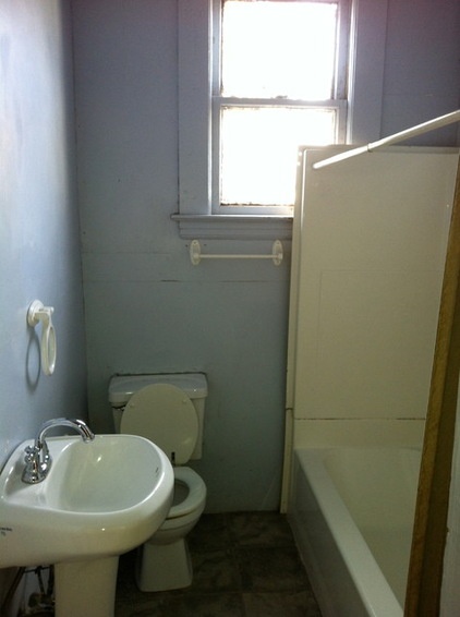
Space was very tight in the main floor’s only bathroom.
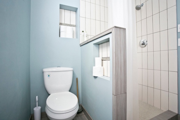
AFTER: The commode and shower were moved, and a pony wall was erected between the two, creating some division while keeping the tight bathroom open. Niches provide all the space needed for storing toilet paper and toiletries. “Little details like this make a big difference,” Ruber says.
Subway tile: Pratt and Larsen
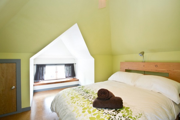
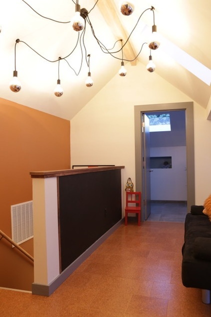
The former attic includes a master suite and a loft room. De Jonge created the bed, which has space-saving built-in nightstands.
The loft room has a futon for squeezing in extra guests. The staircase wall is covered in chalkboard paint for the kids and adults to have fun with. The floors are glued-down 12- by 12-inch cork tiles.
Light: Pure Modern
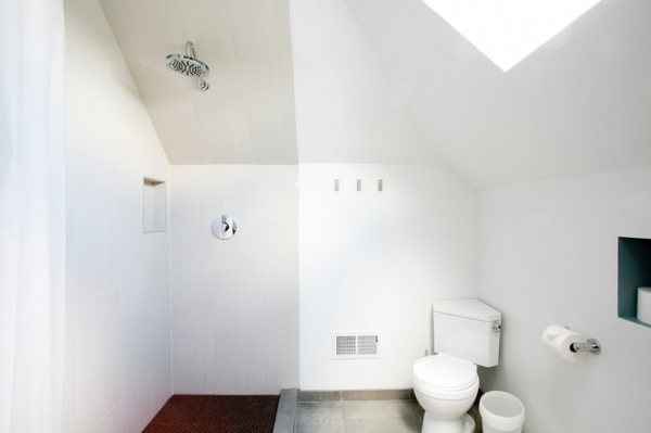
The corner toilet is a real space saver in the master bathroom, where ceiling heights proved challenging to work around.
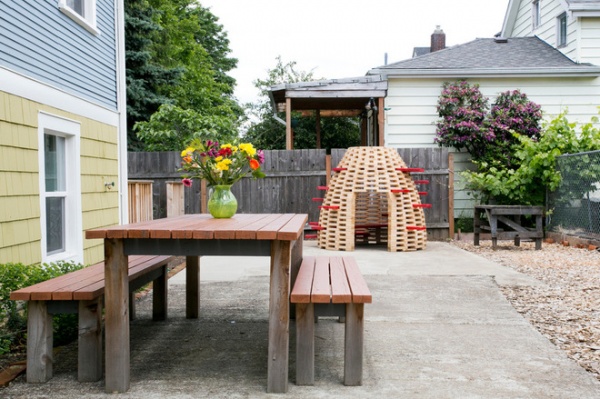
On the patio a table crafted from recycled decking accommodates al fresco dining. The hive is a fun attraction for renters with kids.
Hive design: Thoughtbarn
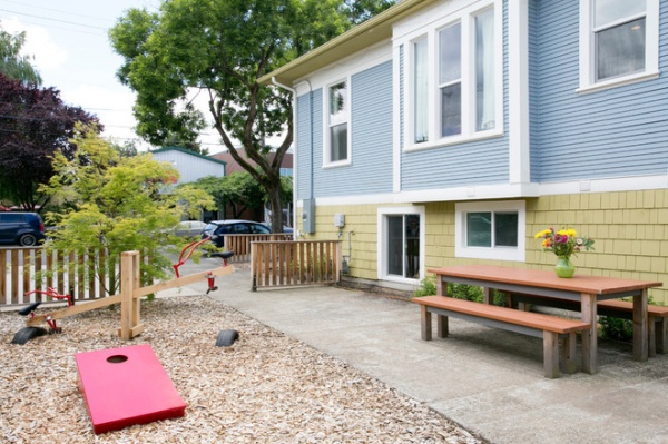
The owners created a custom seesaw using old bike handlebars. The rear railings mark the location of the stairs down to the lower unit’s private patio and entrance.
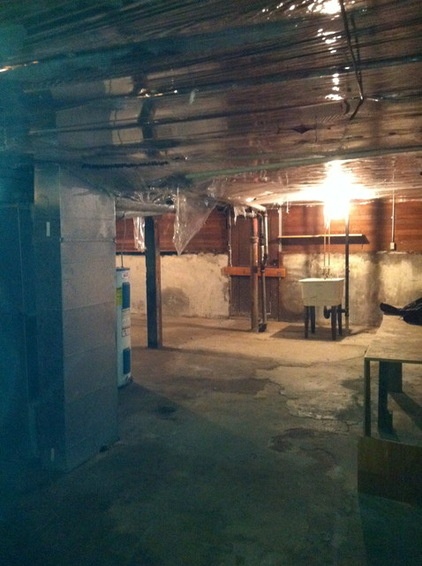
A lot was involved in making this basement livable. In addition to raising the house 2½ feet to increase the ceiling height, the owners installed completely separate utility systems to make the structure a legal duplex.
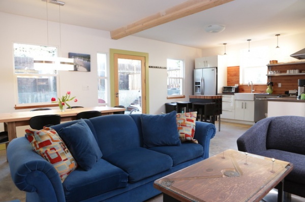
AFTER: While the ground-level unit is separate, Ruber and de Jonge find that many people rent both at once — for example, a big group in town for a wedding, a reunion or another event. “It’s funny: Lots of people say that they weren’t expecting it, but that they wound up loving the ground-level unit the most,” Ruber says.
Lifting up the house meant they could install full-size windows down here, as well as the glass entry door, which make the space light and bright.
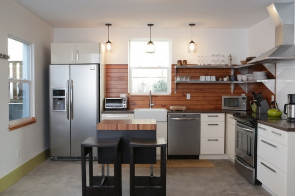
The ground-floor unit’s aesthetic is that of a sophisticated urban loft, with a beautiful balance of reclaimed wood, metal and white. The unit has the same level of finishes as the upstairs, with Ikea cabinets, Cement Elegance poured concrete countertops (in chocolate brown) and more reclaimed fir from the pony wall. Because it serves as a backsplash, the wood is finished with a durable lacquer-like varnish that will stand up to kitchen splashes.
An elegant tile backsplash behind the range reflects the light and adds a break in the wood that highlights the vent hood and draws the eye upward. The metal shelves came from a commercial restaurant vendor and tie into the appliances. De Jonge crafted the island, which includes a butcher block top, open shelves for cookbooks and dishtowels, and holes for wine bottles down the side.
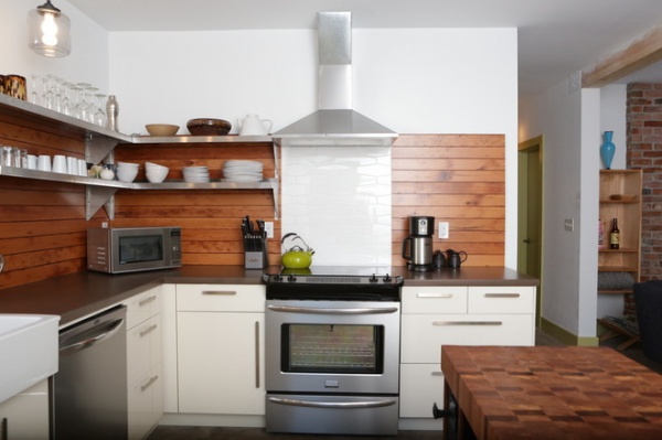
Space-saving tip: Ruber recommends creating an L-shaped kitchen when working with a space like this. It’s functional for cooking, especially because the small custom island creates an extra workspace, and it makes the space feel bigger than it is. “The floating shelves in place of upper cabinets also keep the kitchen from feeling closed in,” she says.
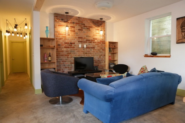
The lower unit has hydronic radiant heat underneath the flooring. This level is full of reclaimed elements, including the bookshelves, the trim and the brick, which was reclaimed from the original chimney.
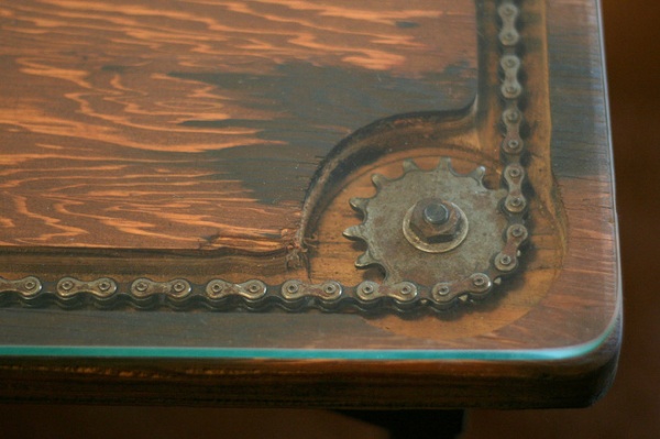
The couple found the unique coffee table at a local thrift shop; it brings in the bike theme in an interesting way. They stained the table, painted the legs and added a glass top.
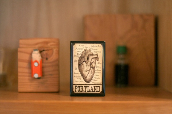
Other small accents nod to the home’s history, the renovation process and the city. The stubby pencil and the little bottle of mystery liquid were found on the site during excavation; the owners backed them with leftover wood pieces. The Portland heart-map matchbox came from a local shop.
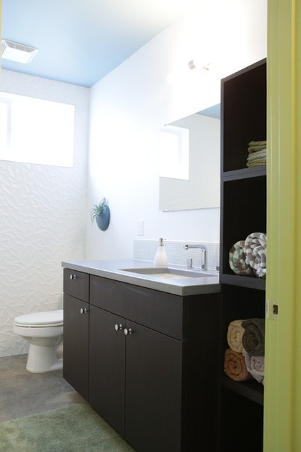
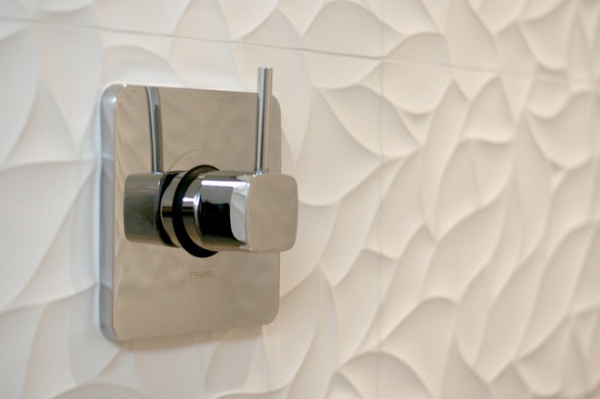
An acid-etched window lets natural light into the full bath, while also maintaining privacy. The bathroom includes a shower with a slanted floor, which eliminates the need for a curtain or door. The relief tile adds a boutique-hotel-like touch.
Tile: Marmi Deco Blanco, Porcelanosa
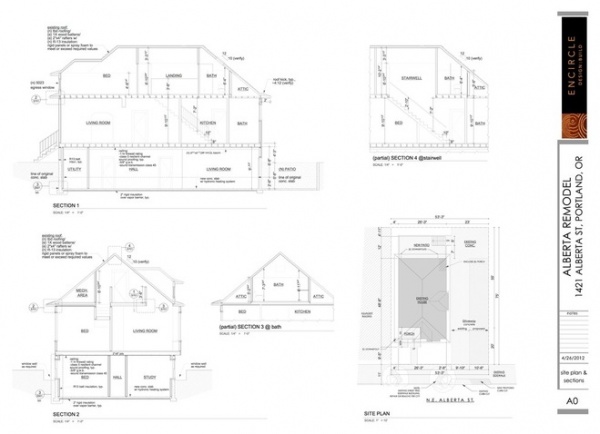
Here are some plans, elevations and sections to help you see exactly what they did to get seven bedrooms and three and a half bathrooms out of a little two-bedroom, one-bath bungalow.
When it comes to creating a great vacation rental property and earning top-notch reviews from renters, the couple advises always keeping the space looking fresh and brand new. “The second we see a scuff on the wall, we get out the paint,” Ruber says.
Pros, take note: A special rental property can serve as great marketing for designers. Some of the couple’s renters loved the space so much, they hired Ruber and de Jonge to design a new home for them in California.
You may rent the property via Shift Vacation Rentals.
More: How to Dig Down for Extra Living Space


